Nearly 70% of people abandon their shopping carts online. That means 7 out of 10 people who add something to their cart leave without paying you.
Thankfully, it’s not the end of the world—nor the end of your sales. With the right cart email strategy, you can get a bunch of cart abandoners (read: 10% or more) to come back and buy, all without any extra work beyond setup.
That may sound too good to be true, but it is true.
So what makes a cart email strategy so special? Well, look at the numbers: Where the average email open rate is only 15%, abandoned cart emails boast open rates of around 45%. That’s 3 times as many people.
In this post, we’ll cover the basics of abandoned cart emails, some great abandoned cart email examples, and how you can create a cart email strategy of your own.
Want to jump right in? Click here for 12 great examples of abandoned cart emails.
What is an abandoned cart email?
An abandoned cart email is a follow-up email sent to someone who leaves a website without purchasing the items they put in their shopping cart.
An abandoned cart email is meant for the 7 out of 10 shoppers who leave without finishing the checkout process. Doing this can often recover around 10% of lost revenue.
That’s not even the biggest benefit: You can set up an abandoned cart email sequence that automatically goes out and wins back revenue with the right tools. Even if a shopper doesn't convert, they'll be re-engaged and your brand will be top of mind.
Not convinced? Check out these figures from Moosend:
- 45% of all cart abandonment emails are opened
- 21% of all cart abandonment emails are clicked
- 50% of those clicks lead to a recovered purchase back on-site
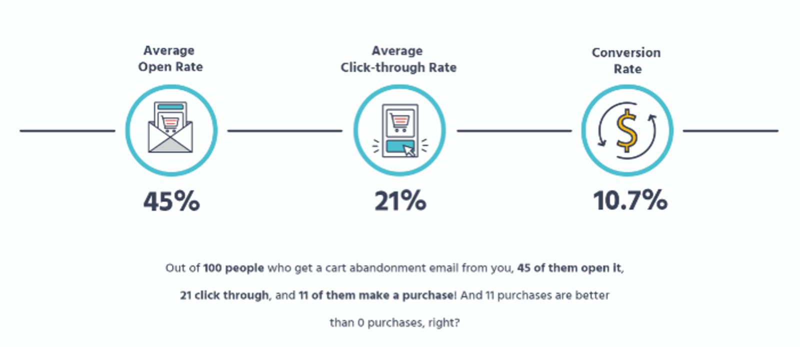
There are oodles of different types of emails you can send your customers. But with numbers like those, abandoned cart emails have a bigger return on investment (ROI) than almost any other type of email.
Achieving this ROI isn’t automatic, however. To write truly effective win-back emails, you first need to know why people abandon their carts in the first place.
Why do people abandon their carts?
Some abandoned shopping carts you can’t do anything about. Some people are just browsing or comparison shopping—they were never going to buy.
But don’t worry about those people. Instead, the people you should focus on are those you can coax back—like those who just got distracted or confused by your checkout process. Unlike people just browsing, these people abandon their carts for reasons you can fix.
Here are the top reasons for cart abandonment that you can do something about.
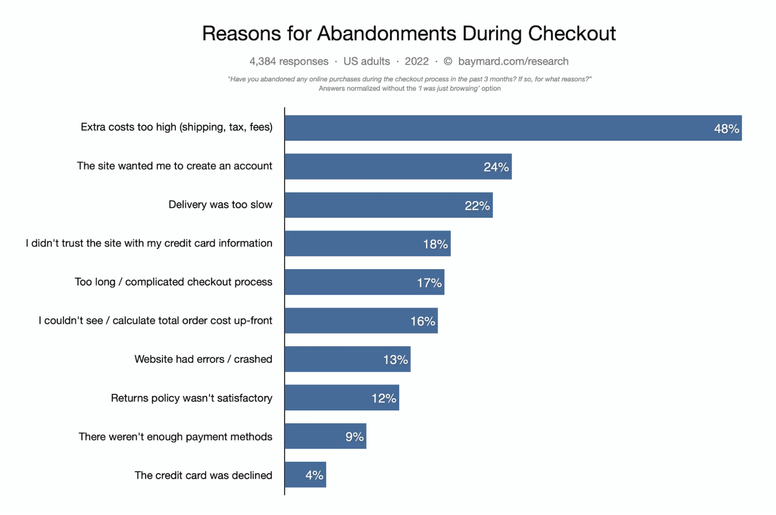
Extra costs are too high. Explore ways to reduce unexpected shipping costs by using cheaper packaging or by changing mail carriers.
Forced to create an account. Many sites that offer the option to create an account still allow people to check out as a guest.
Long checkout process. Is your checkout process too complex? Find steps you can combine or even cut completely.
Can’t see the total costs. Display updated cart totals at every step of the checkout process—and avoid adding “surprise” costs at the last minute.
Didn’t trust the website. Show your ecommerce security credentials with a badge to set your customers’ minds at ease.
Website errors or crashes. While crashes are sometimes beyond your control, that’s no excuse not to test your website across multiple browsers and devices.
Delivery estimate is too slow. In the era of next- or same-day delivery, shoppers expect quick shipping.
Strict return policy. Generous return policies will compensate for extra returns' inconvenience through the increased sales you’ll make over time.
Lack of payment options. Some people refuse to use PayPal, while others use nothing but. Thankfully, it’s easier than ever to accommodate multiple payment options.
Card declined. Little explanation is needed here. However, most ecommerce platforms allow you to make a pretend purchase with fake credit card numbers to test how your checkout process handles declined cards.
How to see your shopping cart abandonment rate
So what about your shopping cart abandonment rate? You can see why people are leaving your checkout process through tools and methods such as:
- Google Analytics: Explore the customer journey on your website to find where exactly they’re dropping out
- Research: Know your audience and their expectations of similar products and purchasing paths.
- Surveys: Ask customers through an email survey about your checkout flow and their purchasing intent to discover pain points you can address.
- Heat maps and click maps: Learn how users really behave by seeing where they click on a page, how far they scroll, and the graphical results of eye-tracking tests.
Once you’ve pinpointed the root causes of cart abandonment, you can recover most sales using the answer to 1 important question: What made your product so awesome that they put it in their virtual cart in the first place?
Knowing why a product was added to a cart is key to recovering lost sales. Once you know the answer, you can begin to draft the perfect abandoned shopping cart emails.
Get Back Your Abandoned Cart Sales
12 great examples of abandoned cart emails
For this post, we abandoned over 50 carts to see how companies would respond (sorry, companies).
Here are 12 lessons learned from our favorite abandoned cart email examples that contain key tips for creating your own shopping cart abandonment emails.
- Build a well-crafted subject line (Evil Queen)
- Give a clear call to action (Bearsville Soap Company)
- Make your copy shine (ThinkGeek)
- Show your product (ThredUP)
- Create catchy graphics (SugarBearHair)
- Create a sense of urgency (Google Store)
- Offer alternatives. Well, maybe… (Vans)
- Address potential objections (Whisky Loot)
- Use reviews and social proof (Brooklinen)
- Offer a coupon, but only at the right moment (Lime Crime)
- Optimize for mobile (LUSH)
- Keep it simple, with 1 call to action (Quip)
After seeing how these strategies are used in the following examples, you’ll be ready to make abandoned cart email templates and, in time, recover lost sales.
1. Reason for success: A well-crafted subject line
“He fretted over the words, attempting to make the content meaningful. I can remember his saying over and over again, as he worked on the 4th or fifth draft of whatever he happened to be writing, ‘Simple is better.’” -Joanne Rogers, in her foreword to The World According to Mister Rogers.
What can Mr. Rogers teach us about writing a good re-engagement subject line?
As he said: “Simple is better.”
If you want to be noticed over the cascade of emails in someone’s inbox, you need to make your message instantly understandable. So pull out your Mr. Rogers sweater because a big part of that depends on your tone.
Think friendly. Think conversational. Think, well, Mr. Rogers.
Be sure to include this information in your email’s subject line:
- Company name: Let them know who is contacting them.
- Customer name: Email personalization may help you get opens.
- Friendly tone: If you can’t imagine Mr. Rogers saying it, rephrase your subject line.
- Product name or details: What exactly did they leave in their cart? Remind them.
- Urgency: If they might lose the items in their cart, let them know.
- Simplicity: Because the decision to open your email is made within seconds.
These are examples of real abandoned cart email subject lines we received:
- Finch, we’ve saved your cart ????
- Did you forget about me, Finch? ????
- We’re ready if you’re ready.
- Lemme Teleport You Back To Your Cart. Free of Charge.
- Your electric toothbrush is waiting (with a free refill).
- Finch, your cart is wondering where you went ❤️
- Your cart MADE us send this reminder 🙂
- Is your wi-fi ok?
What do all these win-back subject lines have in common? They’re not demanding anything of you. They’re not assuming the worst. They’re just checking in—and customers appreciate that (we certainly did).
2. Reason for success: Give a clear call to action
An email call-to-action (CTA) is a link or button designed to get a prompt response from the person seeing it. But remember this childhood lesson: ask nicely.
That means lowering the stakes of what your CTA is asking of your potential buyer. Which of these buttons do you think is best?
- “Buy now”
- “Pay us your hard-earned cash”
- “Return to your cart”
A CTA like “return to your cart” lets people take the next step (clicking) before the sale. In general, avoid words like “buy” or “pay” in your CTAs. These are “high-friction” words because they suggest doing something the person might not be ready to do.
Here’s a great example from Bearsville Soap Company.
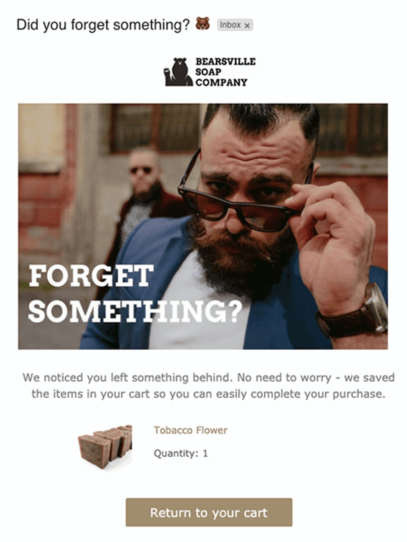
What this abandoned cart email does right:
- The low-friction call-to-action emphasizes how easily the customer can finish the checkout process they started if they’d like to.
- The bear emoji in the subject line is charming, reinforces their branding, and will stand out in your inbox.
- The tagline for Bearsville is “Soap for Men,” and it is made from natural ingredients in the Catskills. Using imagery of fashionably bearded manly men is aspirational, selling an idea of the kind of person that uses their product.
What this abandoned cart email could do even better:
- Product image could be more prominent. The cart recovery product shot is overshadowed by a great photograph to grab attention. It could benefit from a larger thumbnail and some descriptive copy.
- Customer reviews. Soap is a product that lends itself well to reviews (since you can’t smell soap through your inbox). Showing them a review or 2 might be all your customers need to follow through with their purchase.
3. Reason for success: Make your copy shine
Here are the 3 points you need to make in your abandoned cart email copy:
- They liked something enough to put it in their cart
- The cart was abandoned despite their liking it
- They should return and complete their purchase
Like with your CTA, use a casual tone in your copy. The last thing you want to do is barge into a potential customer’s inbox with a bad attitude and an entitlement complex.
Your personality should shine through every piece of your marketing content, including cart abandonment emails. Recover sales by being distinctive in a cluttered inbox. Here’s an example from ThinkGeek that does a great job of combining personality with compelling copy.

What this abandoned cart email does right:
- ThinkGeek’s catalog caters to “nerd” culture, such as video games, comic books, and fantasy. Their copy and subject line reinforce their branding with a playful take on Lord of the Rings. If your store’s personality is highly marketable, use it.
- This is a concise email. Getting your brand persona across succinctly can be tricky, but ThinkGeek does it.
What this abandoned cart email could do even better:
- A CTA button leading directly to their cart. A CTA button with the same humorous language would get more attention and streamline the purchase flow.
- “Related” items that aren’t. It’d be better if all the shown “related items” were actually related.
- Clearer support. Info on how to reach out to “Psychic TimmyBot 9000” for customer service help or directions back from Mount Doom would have been a great touch.
4. Reason for success: Show your product
People might not remember what products had them clicking the “add to cart” button. If they open your email and are still confused, they’re probably going to delete the email—and you’ve lost a potential sale.
Including compelling content can help. For example, 70% of consumers prefer learning about a company through blogs rather than advertisements, making it crucial to incorporate engaging blog content in your abandoned cart emails to reconnect with potential customers.
Instead, showcase the abandoned item(s). Here’s how online consignment shop thredUP does it effectively:
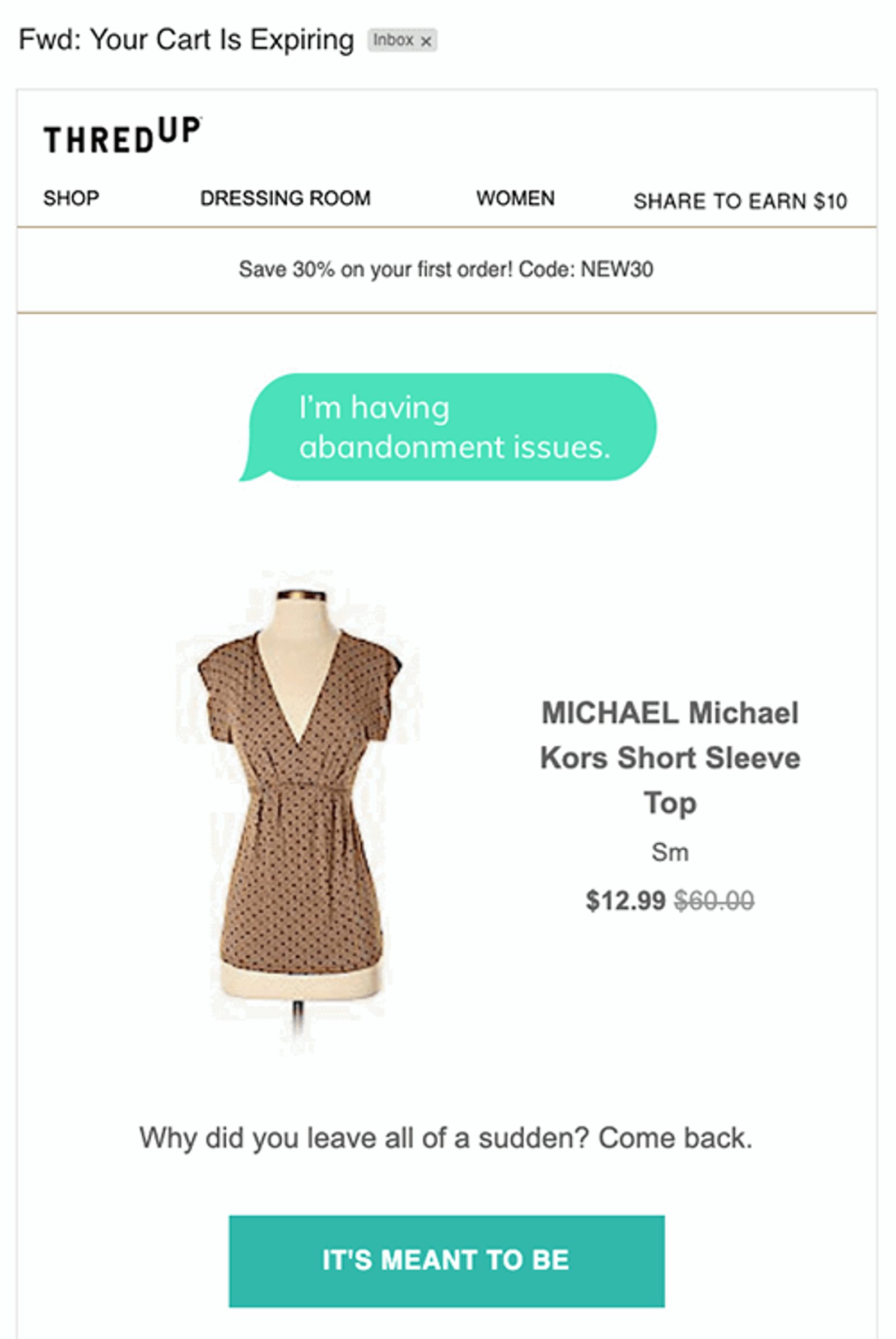
What this abandoned cart email does right:
- It showcases the item.There’s no question what item was left behind.
- Great CTA. The playful and flirty message is a winning combination for thredUP’s branding.
- Clever copy. The word bubble above the abandoned cart item joking about feeling abandoned is a clever design element.
What this abandoned cart email could do even better:
- More interesting subject line. Shopping cart, we’re all expiring. This subject line stands out as being generic and impersonal. It could be about anything—or nothing at all. How existential.
5. Reason for success: Create catchy graphics
With over 306 billion emails sent every single day, you need everything you can to get noticed.
Of course, your subject line, CTA, and email copy are definitely important here. But graphic elements are often your audience’s first true impression.
So how can you make your emails “pop?” Here are some tips:
- Pull your website theme and a condensed menu into your email designs. A consistent, cohesive look reinforces your branding.
- Be careful with stock images. People have become savvy at detecting generic photography. If possible, use elements created especially for your cart email campaign.
- A dynamic design (like a slideshow or an animated GIF) can add energy and interest to your email.
- Use color thoughtfully. Color evokes mood: Our brain is hard-coded to respond in certain ways to viewing certain colors. If you have brand colors, bring them into play.
Let’s look at how haircare gummy vitamin provider SugarBearPro.com wins on these fronts.
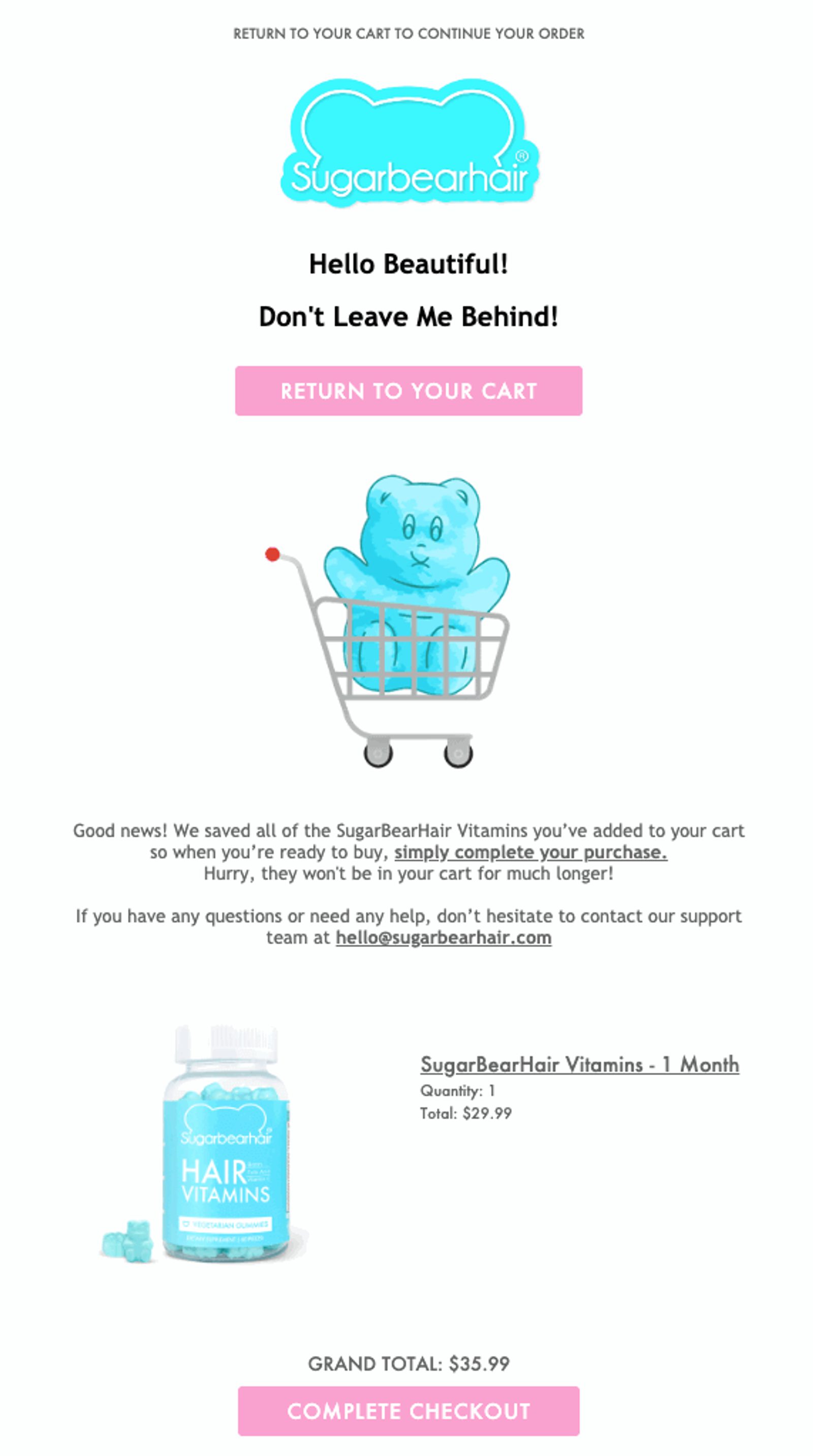
What this abandoned cart email does right:
- Visually outstanding. Americans spend more than $151.9 billion a year on dietary supplements. SugarBearHair stands out from the crowd with playful graphics like this illustrated GIF, which gets people to keep looking at their emails.
- Coordinated colors. The blue hue they chose unites the graphic design with the color of the gummies, and the contrasting pink makes the CTAs pop.
- Easy access to support. Customer support is offered upfront, a smart choice when your product is about health benefits.
What this abandoned cart email could do even better:
- Customer reviews. With so many vitamins on the market, user reviews would be a welcome addition to SugarBearHair’s abandoned cart email copy.
- Be specific using urgency. “Hurry, they won’t be in your cart for much longer.” Why? Are my gummies going on a yoga retreat in New Mexico? Be specific because as you’re about to learn, urgency can be a powerful motivator—or a powerful repellant.
6. Reason for success: Create a sense of urgency
The fear of missing out (FOMO) is real. People pay more attention to what they might be missing out on than what they can get.
Alerting potential customers that they might lose the items they’ve placed in their cart is a great way to tap into the scarcity effect as a marketing tactic, as long as you’re honest. This tactic is also known as loss aversion marketing and is highly effective.
Here are some popular ways to use urgency and loss aversion in your emails:
- Let people know if their item is likely to sell out due to popularity.
- Reserve their cart for a limited time (with a countdown).
- If your item is a limited edition, make clear that it won’t be back in stock.
- Set an alert showing how many other people have the item in their cart
Let’s see how the Google Store does this.
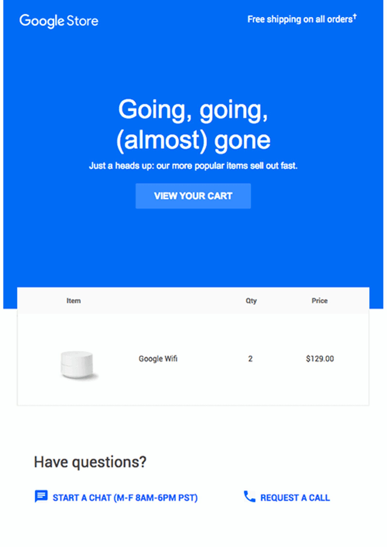
What this abandoned cart email does right:
- Clear sense of urgency.Google Store isn’t here to soothe your FOMO: They make it very clear that their items are in high demand.
- Generous support options.They clearly offer multiple options to reach customer support. Bonus points for including the hours they’re available.
- Simple design.Simple equals high quality in people’s heads—a phenomenon Google Store taps into with this design.
What this abandoned cart email could do even better:
- CTA could “pop” more. Use a contrasting color or have a second CTA placed near the product shot thumbnail.
- Customer reviews. People like reviews, especially when choosing electronics and computer equipment.
7. Reason for success: Feature alternatives
Someone might have abandoned their shopping cart because they were unsure of their choice.
Maybe the item isn’t exactly what they had in mind. But they also might be sold on similar items they missed the first time.
While offering product recommendations is great, don’t overwhelm the original item they put in their cart. A bait-and-switch may lose your customer completely—especially since they liked the first item enough to put it in their cart. Instead, alternatives should support their great taste.
Here are tips for including related items in your cart abandonment email that won’t distract from the primary focus:
- Offer accessories for the main item
- Show different patterns or colors of the same item
- If your products are at a lower price point, popular sellers can be value incentives to reach free shipping thresholds
Check out how Vans does this effectively.
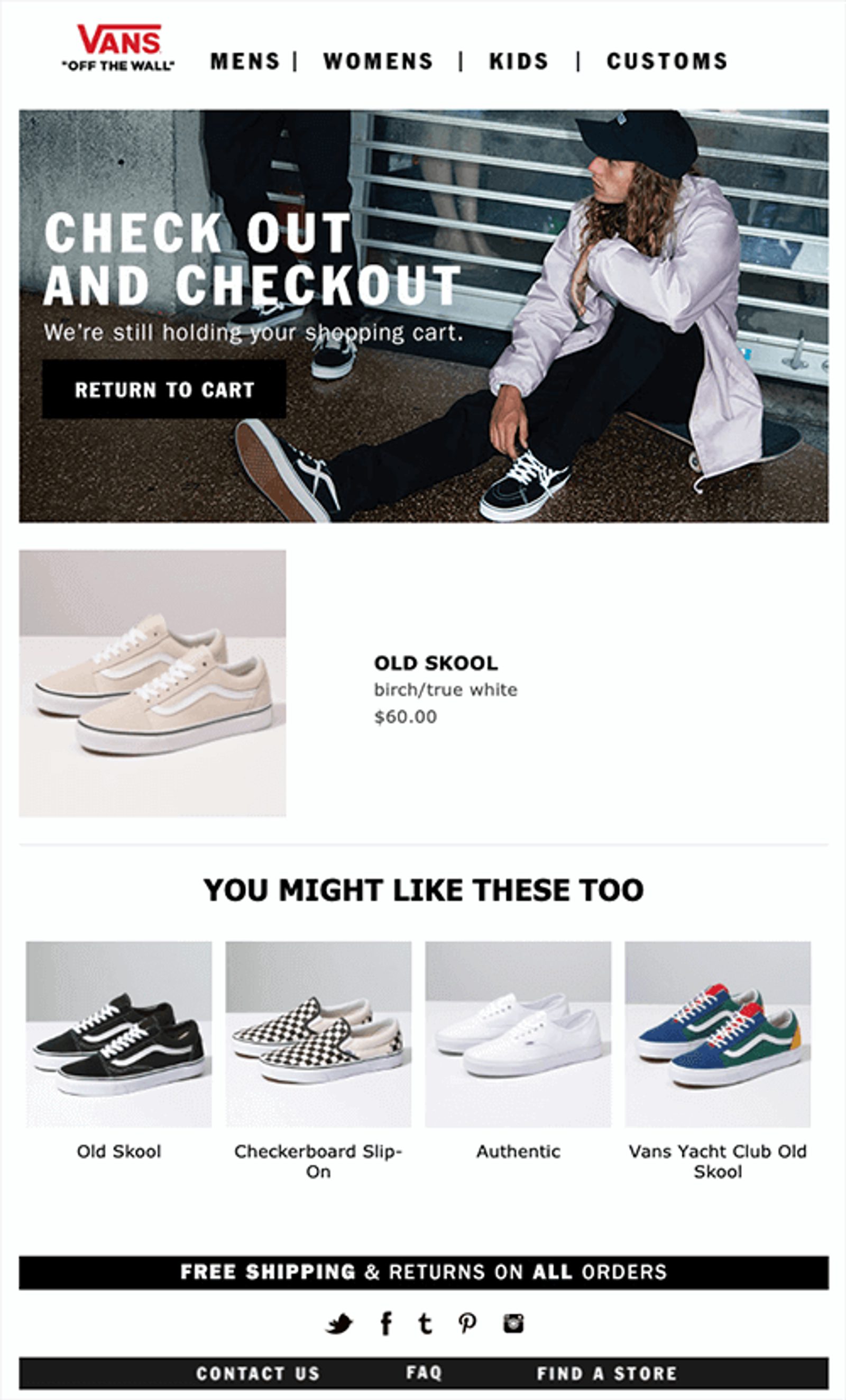
What this abandoned cart email does right:
- Offers alternatives, not replacements. Maybe you would like those checkerboard sneakers now that you’ve seen them. Note that Vans doesn’t say “instead.” They say you might also like the other popular items they present.
- Brand consistency. Vans uses a stripped-down look that mirrors the layout of its online shop.
What this abandoned cart email could do even better:
- Those aren’t the shoes we put in our cart. The same style, yes, but in a completely different color. Always test your emails before setting them free into the wild (either by sending them to yourself or a trusted set of eyes).
8. Reason for success: Address potential objections
There are always reasons not to do something—especially when making a purchase.
It’s your job to tackle these objections upfront. If you can dispel arguments against buying before people even think of them, you’re more likely to recover lost sales.
Address potential objections by doing customer research and usability testing. Understand your customer's concerns so you can uncover ways to address them in your emails.
For example, Whiskey Loot goes above and beyond to outline almost every possible objection a customer might have.

What this abandoned cart email does right:
- Addresses objections upfront.Whiskey Loot is straight-up challenging you to think of an objection they haven’t already addressed. And if by some chance you can actually think of one, they’ve made it easy to reach out with further questions.
- Great copy. The copy of this email is so delightful that it’s easy to forget it’s actually marketing.
- Supportive design.If you have a lot of copy, your design choices matter even more. Whisky Loot doesn’t waste a pixel of space in this email—but still presents it in an uncluttered, appealing way.
What this abandoned cart email could do even better:
- Product shot closer to CTA. Other than showing what was in the customer’s cart next to the “Treat Yourself” CTA, there’s nothing they could add that would further serve their chosen abandoned cart solution.
9. Reason for success: Use reviews and social proof
Do you laugh along with coworkers when the boss makes a cheesy joke? If a group of people looks at the sky, do you glance up too? Do you get a thrill when someone likes your posts on social media?
All of these are examples of social proof. With 91% of people reading online reviews, social proof is a major factor in online purchasing decisions. It’s even 1 of the 6 “principles of persuasion” outlined by legendary psychologist Robert Cialdini in his book Influence.
In short: Convert the unconvinced with reviews.
- Go through your reviews and pull the best ones to include in your abandoned cart email.
- If you don’t have a customer testimonial to share, reach out to your customer base (especially any True Fans).
Let’s see how Brooklinen uses customer reviews to bolster its abandoned cart emails.
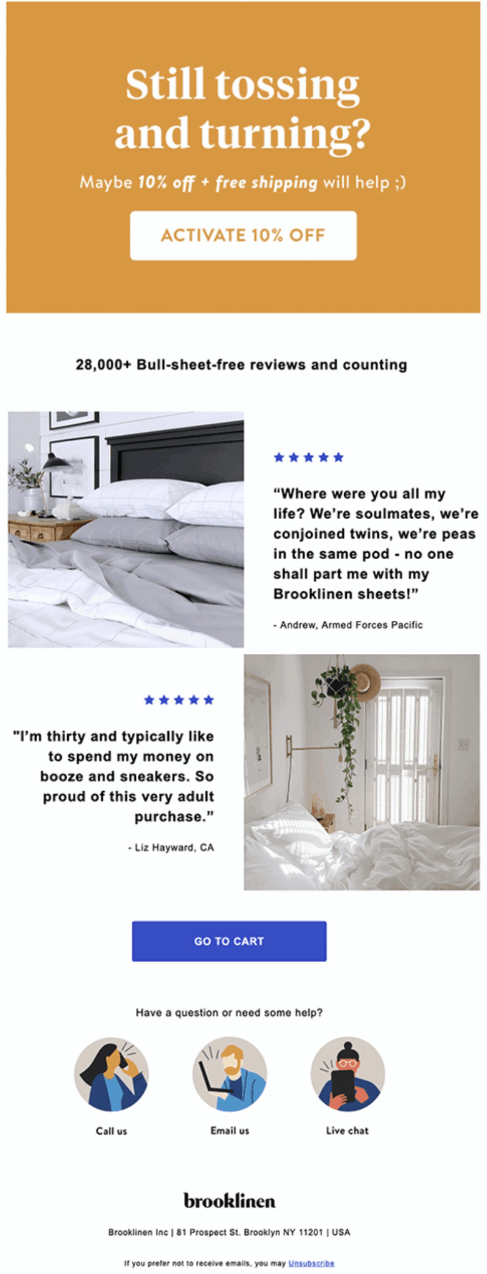
What this abandoned cart email does right:
- Showcases reviews. Brooklinen backs up its tagline “Really Good Sheet” by showcasing 5-star reviews. This confirms that the items left behind are worth buying.
- Easy access to support.The ways to reach customer support are boldly highlighted with illustrated spots that add a spark to the design.
What this abandoned cart email could do even better:
- Hold on to the coupon. Don’t offer discount codes right out of the gate—you don’t want your potential customer to wonder why you “need” to offer a discount if your reviews are so good.
10. Reason for success: Offer a coupon, but only at the right moment
Discount codes are the “Frankenstein's monster” of adding value to an abandoned email. Tread lightly, or your creation can destroy you.
We’ve discussed the risks of abandoned cart coupons before. Coupons are dangerous because:
- You don’t want to teach a customer that your product is not worth your price. Why reward people who aren’t invested in the success of your business?
- They cost money! You might trade your margin (and lose money) for nothing.
- You might offer a coupon to someone who would have been happy to pay full price.
In Confessions of an Advertising Man, David Ogilvy writes, “A cut-price offer can induce people to try a brand, but they return to their habitual brands as if nothing had happened.”
So how do you use coupons without devaluing your product or slowing growth?
- Add value before considering a discount strategy. Push the button on another psychological sales trigger. Do you offer free shipping? Do you have killer reviews? What about a money-back guarantee? Loyalty program incentives? These are all ways to showcase value that doesn’t devalue your product.
- Offer coupons to proven customers. Single-use coupons sent to repeat customers are a great way to make a sale and build loyalty.
- Save your discounts for the end. If you send a cart email sequence, save that coupon code for the very last one. After all, this is your last shot at getting the customer to convert.
Here’s how Lime Crime extends a bargaining chip without sacrificing any integrity.
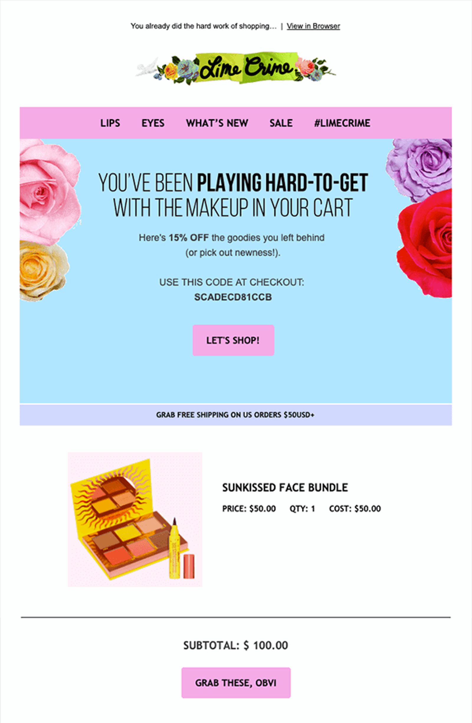
What this abandoned cart email does right:
- Used discounts as a last resort. Lime Crime waited until the third abandoned cart email to offer a discount. The gentle reminder that there’s free shipping over $50 is another value incentive.
- Great copy and CTA. The copy and CTA hit the perfect note for a company whose tagline is “Makeup for Unicorns.”
What this abandoned cart email could do even better:
- Mobile design. This email looked great on my laptop, but on my iPhone, it fell apart since it wasn’t a responsive design. That brings us to the next cart recovery strategy on our list.
11. Reason for success: Optimize for mobile
Today, more than 70% of emails are opened and read on mobile devices.
If your email isn’t mobile-friendly, it will probably be deleted quickly. Also, up to 15% of those recipients don’t just delete your email—they unsubscribe entirely.
Americans check their phones an average of 344 times a day. Test your emails on mobile because the chances are that’s where they’ll first be seeing your message.
Best practices for mobile email design include:
- Space-saving menus. Less is more when it comes to mobile, so keep it concise.
- Mobile-friendly content. Oversized images that don’t scale will frustrate your customer.
- Responsive design. Multiple columns or dense copy will break your design.
- Sticky CTA button. A button (instead of a link) that follows as you scroll makes for a frictionless cart return.
Let’s look at how LUSH keeps its emails mobile-friendly.
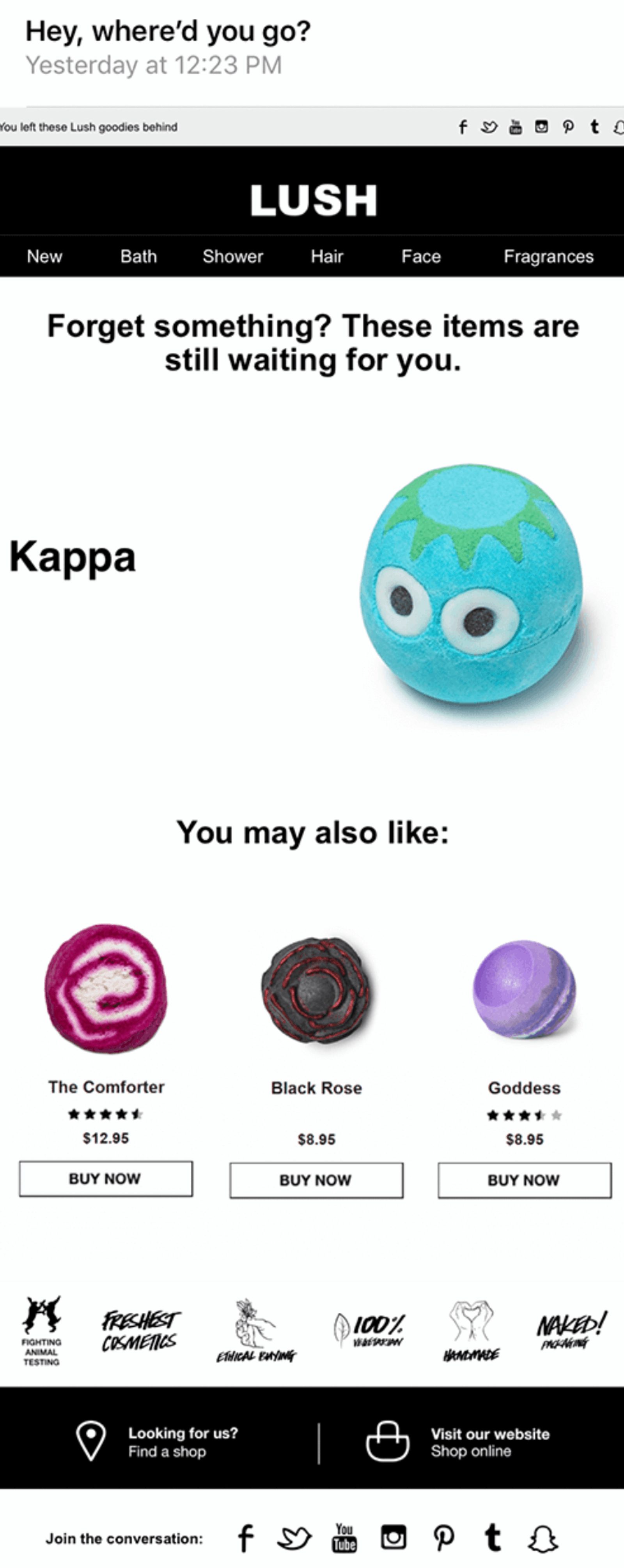
What this abandoned cart email does right:
- Mobile friendly. LUSH is a great experience on mobile. Easy to navigate.
- Cart items are showcased. Do you see how cute that bath bomb is? Of course you do—it’s vividly showcased. There is zero question in the customer’s mind about what they left behind.
- Presents low-cost alternatives. When you have low-cost products, showcasing other options can be smart, especially if you offer free shipping when the order value reaches a certain threshold.
What this abandoned cart email could do even better:
- CTA next to the product shot. A clear CTA button next to the abandoned bath bomb would be the perfect way to complete this great email.
12. Reason for success: Keep it simple, with 1 call to action
With so many options at your disposal, it can be tempting to throw them all into your abandoned cart email template and hit “send.”
Don’t. Holiday fruit cakes are the butt of jokes for a good reason.
You can’t effectively use every single strategy in your abandoned cart email. Some methods will work better depending on your specific product and customer base. Try adding a single strategy at a time to test and track your response.
Quip’s abandoned cart emails do this particularly well.
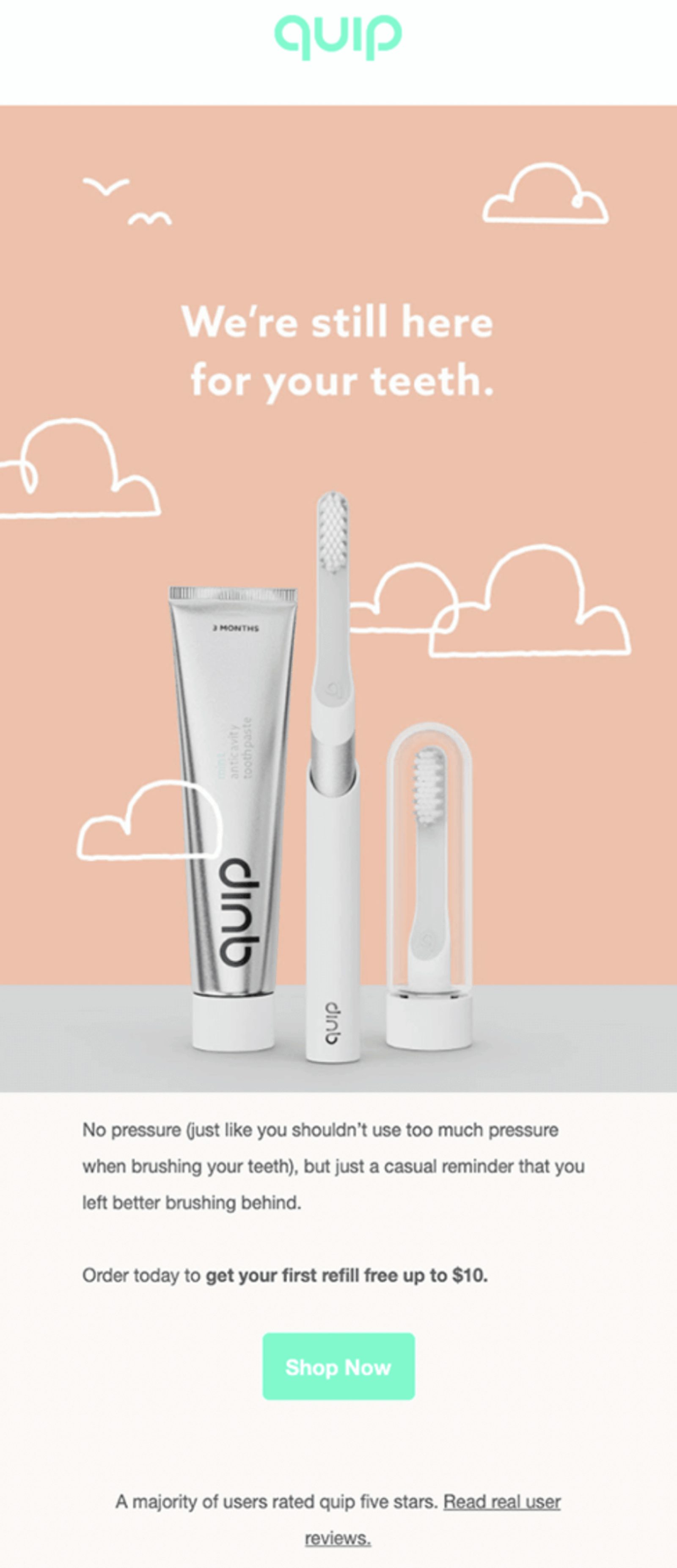
What this abandoned cart email does right:
- Simple copy. This abandoned cart email is not overcrowded with tactics that don’t support Quip’s message. This simplicity translates as confidence in their product.
- Great design.The design choices are soothing, warm, and welcoming. The hand-drawn cloud elements add a human touch.
- Puts the customer at ease. The use of punny copy to reinforce there’s no pressure to buy is charming and clever.
- Reinforces with reviews. Quip points out that the majority of their users rate them 5 stars.
- Clear CTA. The CTA pops with a clear message that invites you back instead of demanding.
- Adds value without desperate tactics.Value is added not with a coupon but by reminding the customer that their first order includes a free refill.
What this abandoned cart email could do even better:
- Address objections. This email truly wants for nothing, but if we had to nitpick, we’d suggest a way to reach out to customer support.
How to time your cart recovery emails to make the most impact
Timing matters when sending abandoned cart emails.
But how much? According to SalesCycle’s research, your timing affects your conversion rate. Emails sent:
- In less than an hour achieved a 3% conversion rate on average
- An hour later was the sweet spot, at an average 6.3% conversion rate
- Sent at 24 hours after a basket was abandoned achieved on average a 2.5% conversion rate
A timed series of 3 cart recovery emails is the most effective way to convert customers from a “maybe” to a “yes.”
Here’s what to keep in mind when designing an abandoned cart email campaign:
- Make sure each email in your series is unique
- Focus on only 1 or 2 different strategies per email
- If you want to offer a discount coupon code, wait until the last email in your series
Look at this series of emails from Casper. An hour after we abandoned our cart, they sent us this:

Take a closer look at this one. This email included:
- Multiple clear CTAs
- Simple design with charming graphics
- What I left in the online shopping cart
What’s not to love? We can clearly see that this recovery email’s focus simply reminds us that we forgot our shopping cart. No more, no less.
But it didn’t stop there. 24 hours later, we got this cart reminder email:

In this second email, Casper chose a recovery strategy of showcasing their great reviews. They are addressing concerns that would stop most people from pulling the trigger. And that’s a good idea—online shoppers trust reviews nearly as much as their friends.
And then, after another 24-hours, they finished their series with a third email:
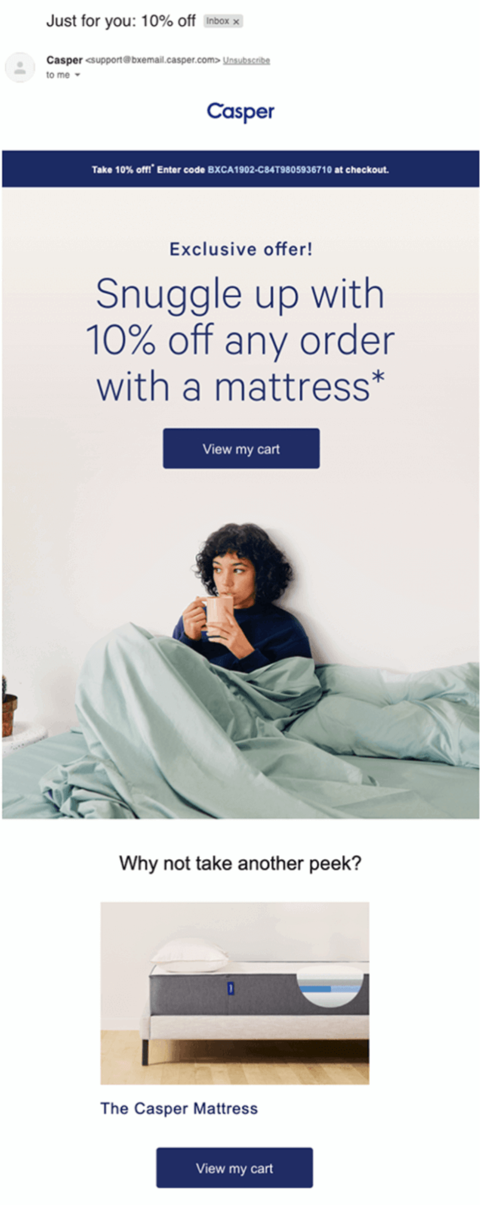
To wrap things up, Casper:
- Showed us 1 final time what we’d left in our cart
- Chose a design using a real person so we’d imagine ourselves being that cozy
- Offered a discount incentive (notice they waited until the last moment, not earlier)
Note again that the discount was their last attempt to convince us. Further emails would’ve seemed desperate and annoying—if customers don’t buy with a discount, they’re probably not interested.
Has Casper cracked the code on how to convert abandoned carts? Well, Casper went from 0 to $750 million in 4 years. A piece of that success is finding recovery solutions to a lower average cart abandonment rate.
Abandoned email cart FAQs
What is a cart abandonment email?
Abandoned cart emails notify customers that they’ve added an item to their cart without purchasing it. Sending these emails is essential for recovering lost sales and building a strong customer relationship.
Should you send abandoned cart emails?
Absolutely! Where regular marketing emails have a click-through rate of only 10%, almost half of all readers click on abandoned cart emails. Combined with their already showing interest in an item, sending abandoned cart emails is extremely effective for increasing sales.
What should I write in a cart abandonment email?
While what you write depends on your product, abandoned cart emails should include short, concise copy, a non-demanding call-to-action, and an image of the product. To increase your odds of success, include customer reviews, alternative products, and, if absolutely necessary, a discount or coupon.
Do cart abandonment emails work?
Yes—and extremely well at that. Across numerous studies, cart abandonment emails have shown click-through rates of nearly 50 percent, with some campaigns successfully recapturing over 10 percent of lost revenue. Combined with email automation, abandoned cart emails are an essential tool in any email marketing arsenal.
How long should I wait before sending an abandoned cart email?
Of the 50+ carts we abandoned, most of our responses sent their first cart abandonment email within a few hours. However, anytime within 24 hours is a good bet. Send a series of emails within 48 hours of cart abandonment for the best results.
Summary
Abandoned cart emails are an extremely effective tool for recovering lost sales. To take full advantage of this power, however, you’ll need the right ecommerce tools.
In ActiveCampaign, you can:
- Trigger email automation when a cart is abandoned
- Schedule when each email goes out
- Integrate those automations with Shopify, WooCommerce, and BigCommerce
We even have an article that will walk you through setting up an ActiveCampaign abandoned cart series.
ActiveCampaign makes sending an automated abandoned cart series easy peasy.
Setting up an abandoned cart series automatically puts you ahead of the curb. Of the 50 carts we abandoned for this post, only half sent a cart recovery email—even though they’re remarkably effective as a sales recovery tactic.
And of those, half sent 2 emails. And only a handful of those sent a series of 3, even though it provides the best conversion rates.
A great cart recovery campaign can make people remember you. With abandoned cart emails that work, you can start turning missed opportunities into recovered sales.
Go forth, and shed your abandonment issues!
Schedule a free demo or contact us today for more information on how ActiveCampaign can help you bolster your abandoned cart emails.

