Reading a bad email newsletter is a lot like reading a bad review.
Cringeworthy copy? Check.
Feel like hugging the business owner? Check.
Worried about doing business with this brand in the future? Check.
Just like bad reviews discourage prospects from trying out your business, bad newsletters discourage readers from staying opted into your email list. Nothing inspires readers to hit the unsubscribe button more than bad email campaigns. Existing customers may even opt out of doing business with you entirely.
It might sound dramatic, but the truth is every touchpoint you have with your prospects and customers should be taken seriously.
Email newsletters aren’t something you can just “wing” and expect good results. In today’s article, we’ll reveal everything you need to know about bad newsletters, including:
- What makes a bad newsletter
- Ten bad newsletter examples to avoid
- Eight tips to follow instead.
Ready to learn more? Let’s begin.
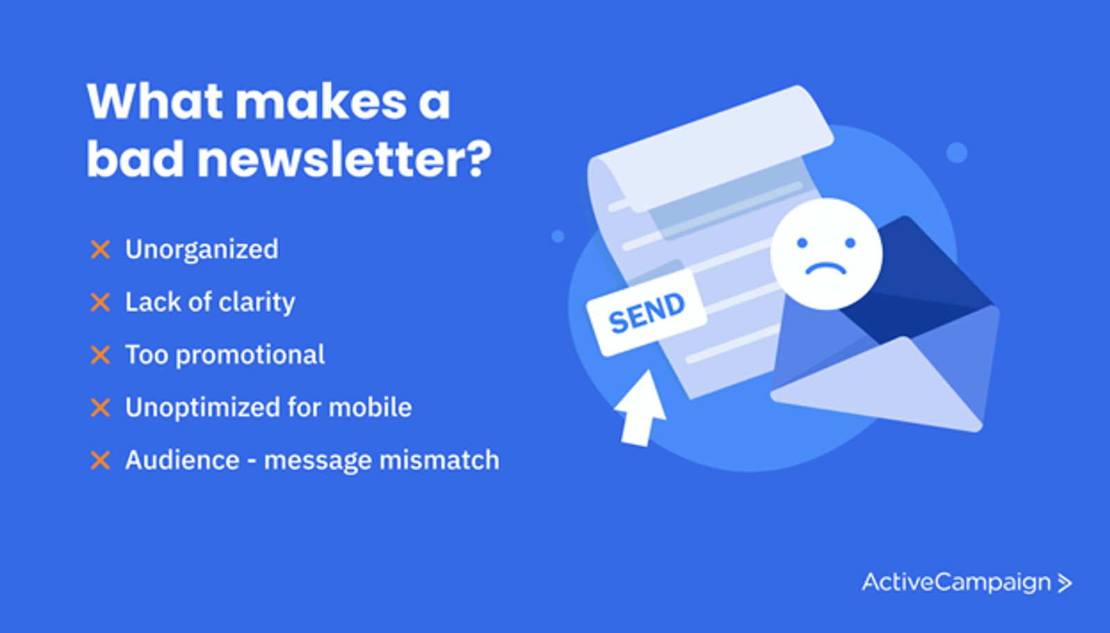
What makes a bad newsletter?
What do you think makes a bad newsletter? Is it the lack of flashy designs or expertly-produced video? Is it because you forgot to include discount codes or links to your latest blog post?
While these things might have a small impact, they don’t make a bad newsletter.
It is actually a lack of intention and clarity that makes a bad newsletter.
If you plan your newsletters without strategy and clarity, how can you expect to nurture your audience in a meaningful way? How can you expect to address your audience in their preferred communication style?
In other words, if your intentions aren’t clear, it’ll be a struggle to connect with your target audience.
So, when you sit down to plan your newsletters, consider your intention. How do you want to serve your audience? What do you hope to accomplish?
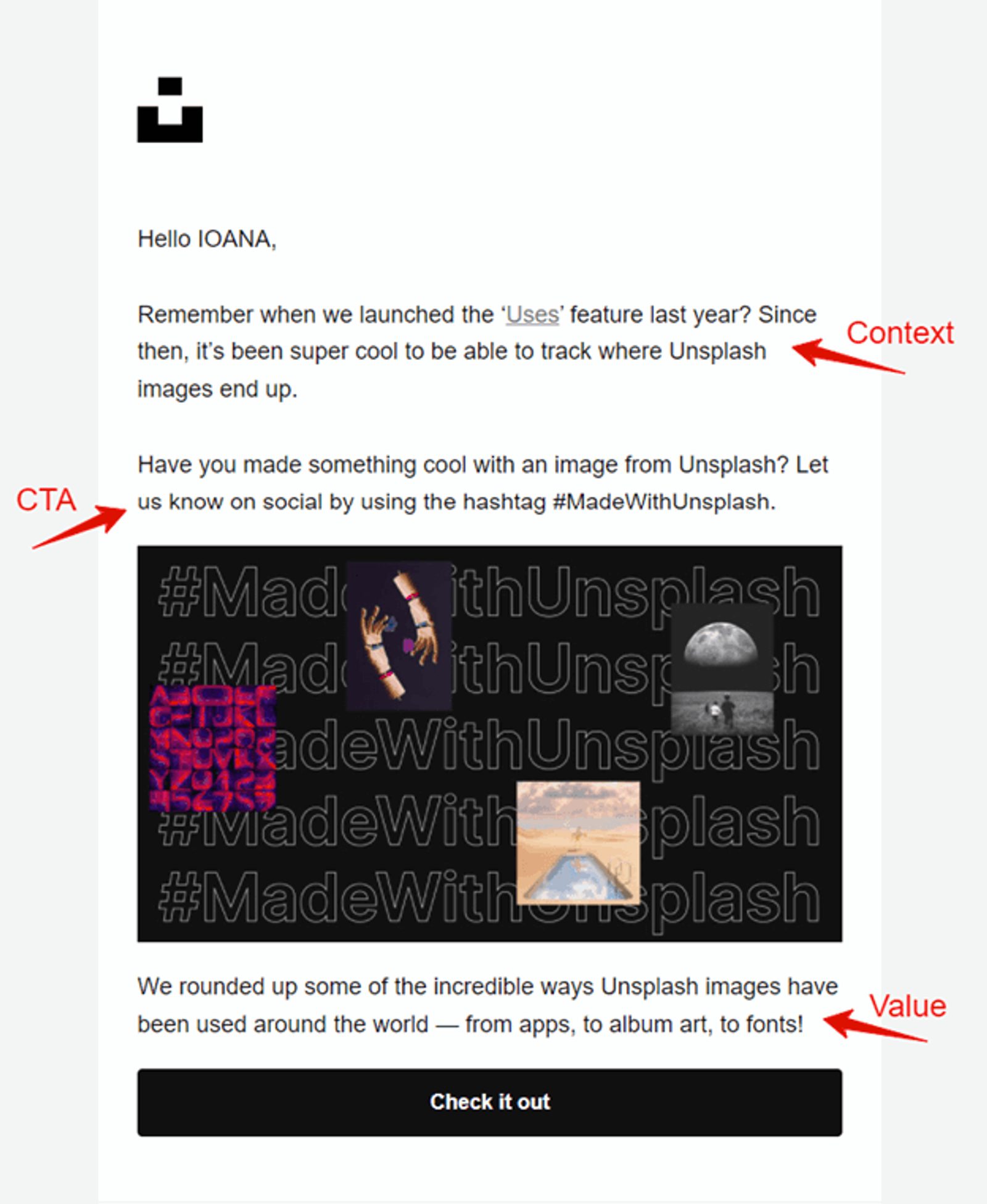
As far as output goes, your final newsletter draft should be clear about the value your audience will walk away with.
For example, are you sharing a free tutorial? Revealing the newest industry must-know secrets? Be sure your copy reflects why they’re hearing from you, what specific value they’re receiving, and what action steps you’d like them to take.
Be sure to pay special attention to bad email design elements, such as small text, blurry images, crowded email body, and poor composition. Expect higher unsubscription and spam rates if your newsletter doesn’t feel intuitive to read or scan.
10 bad email newsletter mistakes to avoid
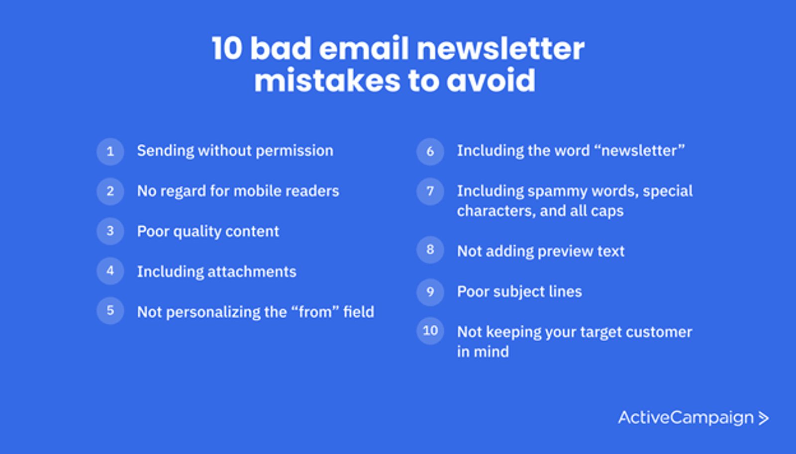
Now that we’ve cleared the air on what makes a bad email marketing campaign let’s look at ten specific newsletter mistakes to avoid.
Bad Newsletter Example 1: Sending without permission
Have you ever received an email newsletter you’ve never subscribed to?
It’s happened to the best of us.
One minute you’re perusing a new brand’s site. The next minute said brand shows up in your inbox.
How? Why? It doesn’t matter.
What does matter is avoiding this practice like the plague. Sending newsletters without permission is unethical, and you’ll risk losing prospects forever. With new privacy laws like the GDPR, sending unsolicited marketing emails (even to existing customers) isn't just annoying; it’s illegal in many countries.
If you want to avoid sky-high unsubscribe rates and legal fees, it’s best to avoid this practice.
Bad Newsletter Example 2: No regard for mobile readers
Now that 41.6% of email opens happen on mobile devices optimizing your newsletter for mobile is a must.
When email subscribers have to stomach newsletters like the example below, they’ll struggle to make out your content.
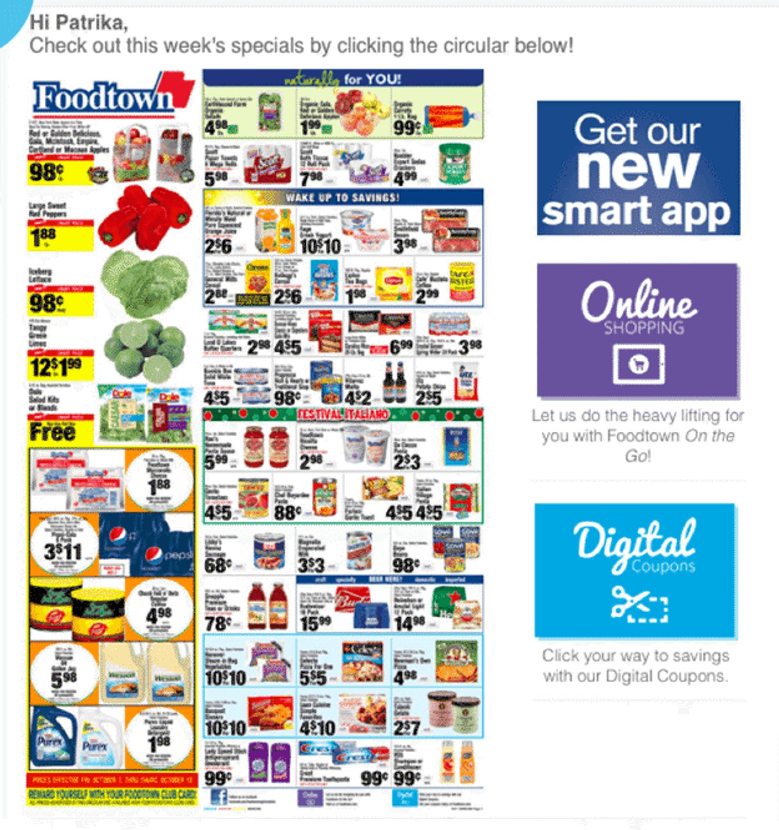
There’s no clear structure in this example, which results in non-existent readability on smartphone screens.
Something else that sticks out about this newsletter is that it doesn’t look like a newsletter at all. It actually looks like a newspaper insert that was ripped out and photocopied.
Optimize for mobile, first.
Bad Newsletter Example 3: Lackluster copy
Readers click on your newsletter out of curiosity, but they stay for the content. If your newsletter is overly promotional and doesn’t convey value to the reader, don’t count on them staying long — or following your call to action.
For instance, take a look at the following email newsletter:
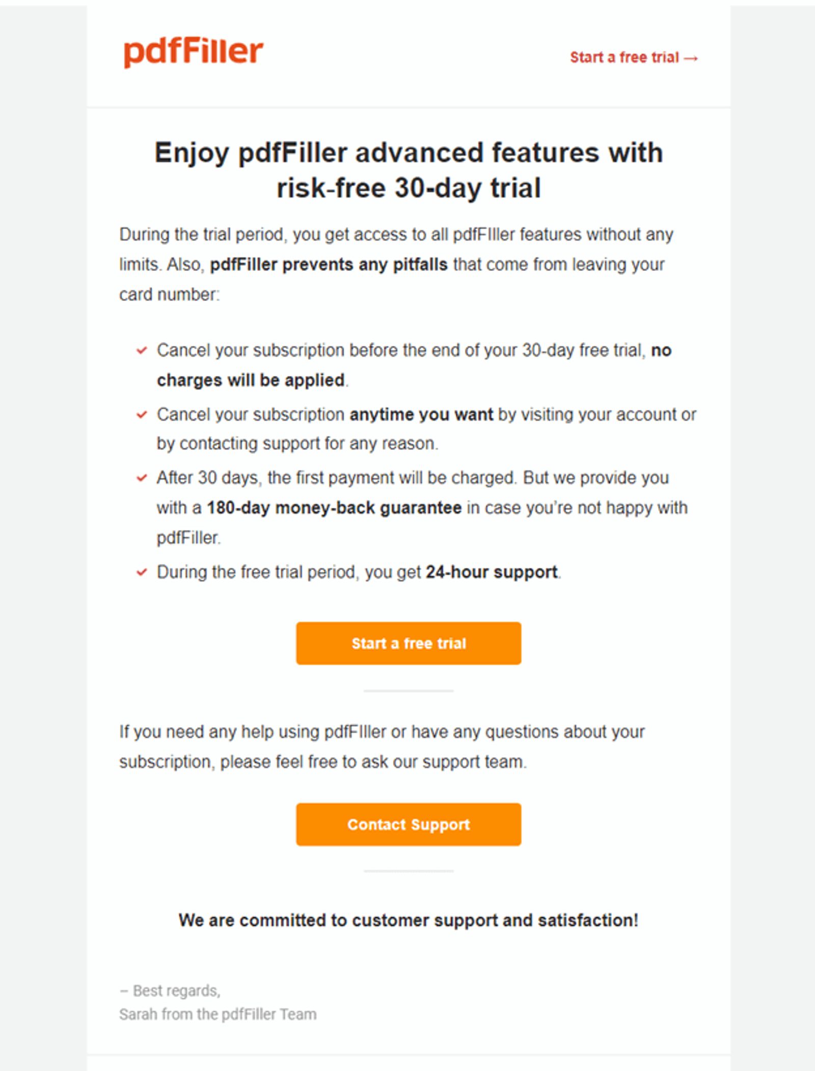
In this example, the newsletter just offers a free trial — and mentions a few features the reader can expect to see if they sign up.
There’s no introduction, no context, no storytelling, and the most crucial part of all — no benefits are listed. In other words, it doesn’t explain how their features add value and what the reader can gain as a result.
Bad Newsletter Example 4: Including attachments
From increasing security risks to losing confidentiality, including attachments in your newsletters or promotional emails is poor practice.
Not to mention the potential risk of having your email address blocked.
If you need to include an attachment in an email, do so sparingly and with specified email recipients.
For instance, if you’re welcoming new registrants for your upcoming webinar, it’s okay to send them a welcome package as an attachment. On the other hand, in your email newsletters, that wouldn’t be appropriate.
Alternatively, you can link to the download page for the attachment you wish to send.
Bad Newsletter Example 5: Not personalizing the “from” field
Subscribers don’t appreciate emails from vague senders.
If your “from” field reads “s4912fq@gmail.com,” your subscribers may never open your emails.
Why? Because they may not remember your email address or who you are. Plus, they’re worried that if they open your email, it’ll be spam.
But, if your “from” field reads “Natasha Riggs” or “June with Linkify,” there’s no questioning that you’re a real person or brand. Or, at the very least, they can quickly Google “June with Linkify” to spark their memory.
Take a look at this example from PayPal:
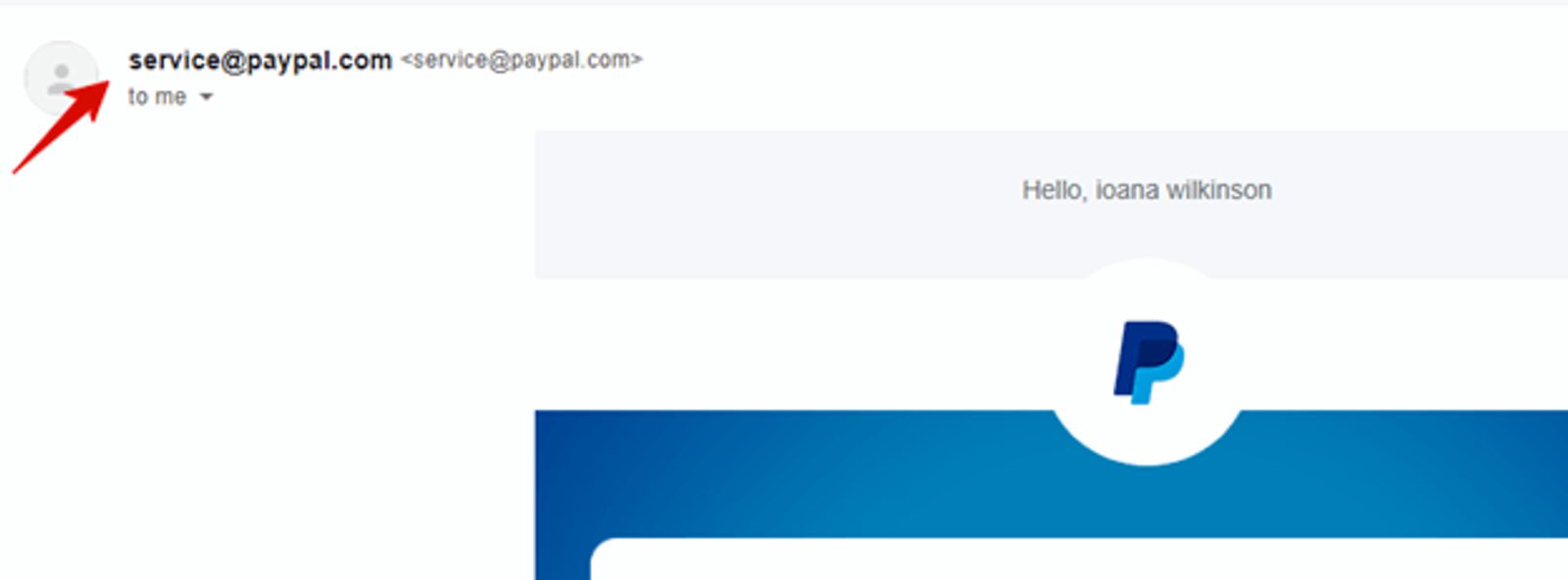
In this example, PayPal uses service@paypal.com in the “from” field. And while most people know what PayPal is, they may not recognize its email address. A quick fix? Personalize the “from” field to names like “PayPal Service” or “PayPal Updates,” for example.
Bad Newsletter Example 6: Including the word “newsletter”
While we applaud you for being transparent, your readers don’t want to feel like they just signed up for another newsletter.
They want to feel like they’ve signed up for valuable brand updates, helpful tips, and maybe a few freebies or discounts.
Instead of including the word “newsletter” in your campaigns, focus on sharing what kind of value the reader will gain.
Bad Newsletter Example 7: Including spammy words, special characters, and all caps
Spammy words like “Buy now,” “Free,” or “Too late” should be avoided or used sparingly and within context.
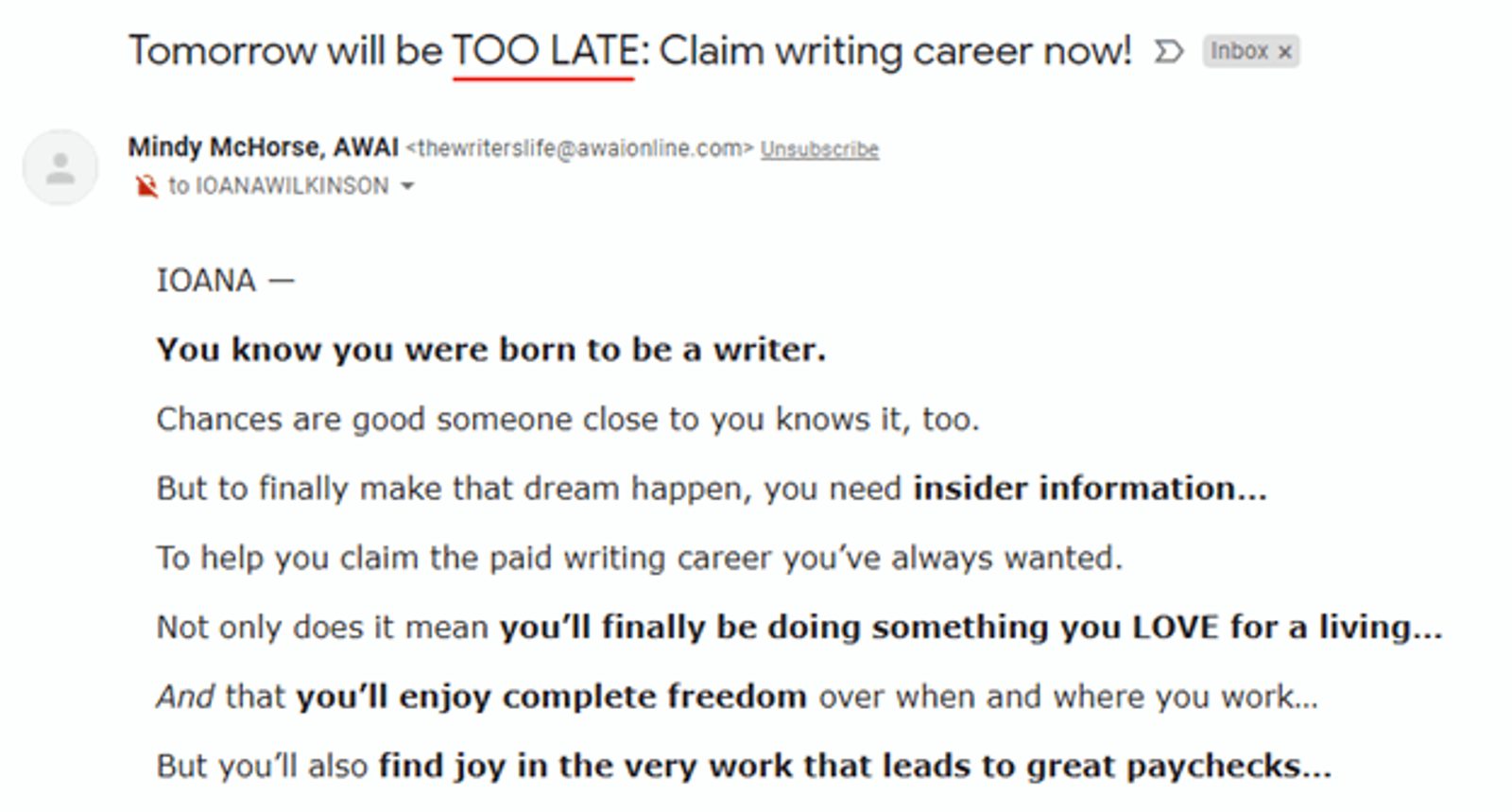
Not only do these words stick out like sore thumbs, but email service providers tend to mark emails like this as spam.
Other details that email service providers flag include special characters like exclamation points, ampersands, and words written in all caps.
Your email will also read as if a middle-aged sales rep with slicked-back hair and way too much caffeine in their system is trying to “get you on the hook” for something.
Bad Newsletter Example 8: Not adding preview text
Preview text is a subject line’s new best friend. Preview text promotes engagement because it provides additional context, enticing readers to open your emails.
Here’s what the preview text looks like:

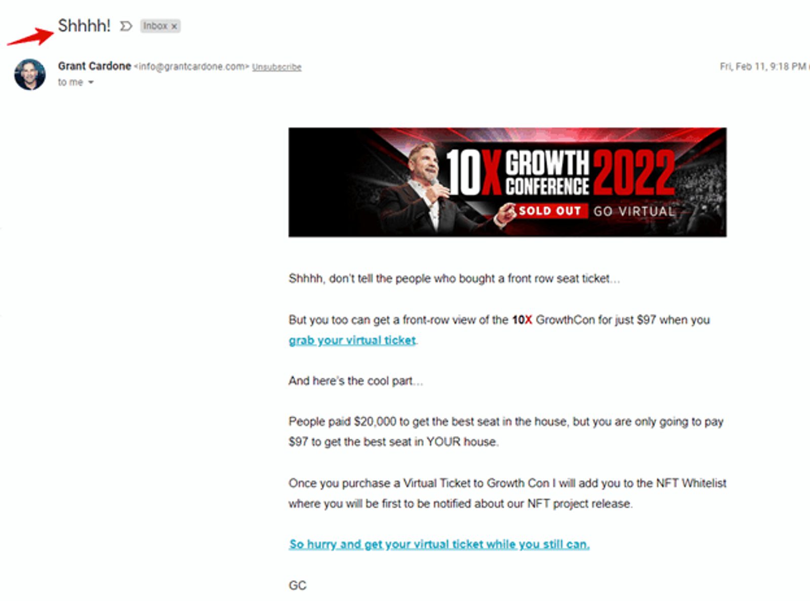
In this example, the subject line “Shhhh!” conveys zero value to the reader. We have no idea what the newsletter will cover or why we should bother opening it.
Writing a newsletter that makes an impact starts with the subject line. (If you need a helping hand, use our free subject line generator.)
10. Not keeping your target customer in mind
Prospects know when newsletters aren’t customer-centric.
When brands don’t keep their target customer in mind, their newsletters:
- Aren’t clear about what the reader should do
- Aren’t consistent in tone, content, and design
- Don’t consider the target customer’s pain points, communication style, or preferences
But when you tailor newsletters with your ideal customer in mind, you can provide unlimited value — and nurture them closer to conversion.
It’s also best practice to avoid sending no-reply emails since they can feel impersonal and harm your brand’s image.
7 tips to improve your email newsletter
Here are some additional tips to help you improve your newsletter.
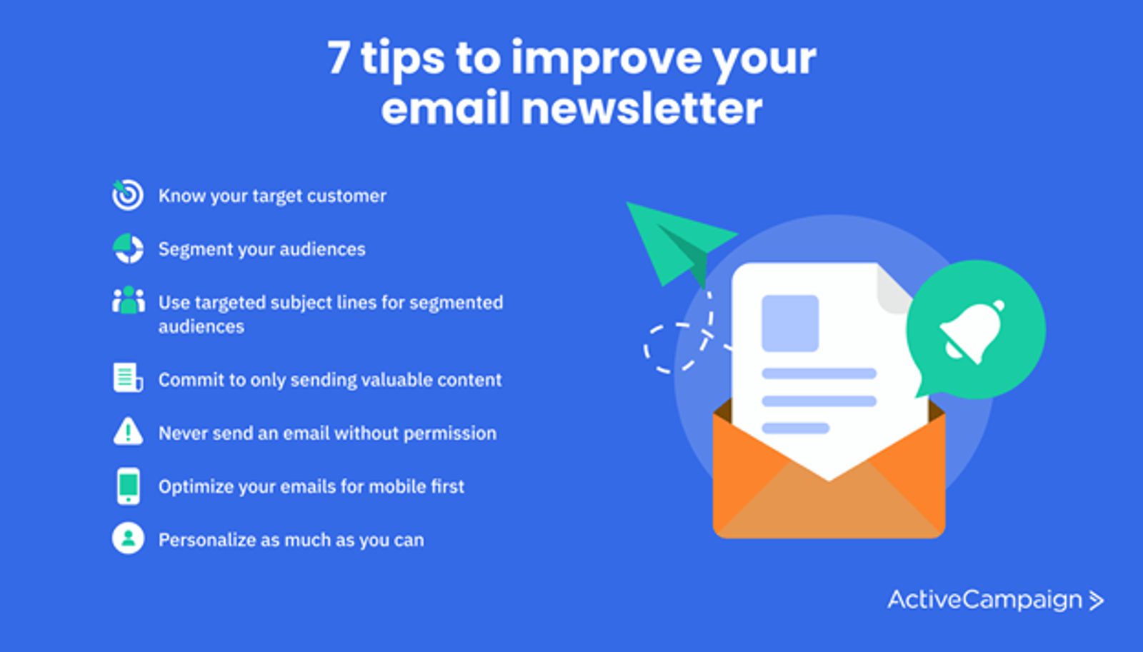
1. Know your target customer
We’ve touched on this already, but it's absolutely crucial to know your target customer.
Your email list becomes a well-curated machine when you know your target customer like the back of your hand. You can build relationships with high-value prospects at scale instead of alienating every person on your list.
When researching your target customer, be sure to consider:
- User preferences and opt-ins
- Preferred communication styles
- Demographic information
- Essential details about who they are — are they married? What’s their job? Do they have kids? What’s their personality like?
- Pain points
- What they need
- Their interests
Once you have a tight grasp on your target audience, tailor all future campaigns with them in mind.
2. Segment your audiences
Segmenting your audiences means breaking your overall list into groups based on shared characteristics.
You can segment your list based on website interactions, demographics, sign-up location, and much more.
For instance, you could group your audiences by their most recent interaction:
- Warm leads
- Hot leads
- Cold leads
Or you could group your audiences by their interests:
- Leads interested in masterminds
- Leads interested in courses
- Leads interested in coaching
When it comes to email marketing, segmenting your audiences can help you ensure the right groups of people receive your emails every time.
3. Use targeted subject lines for segmented audiences
Draw in your segmented audiences even further by personalizing your email subject lines.
For instance, business strategist Marie Forleo adds prospects interested in her B-School training program into one audience segment:
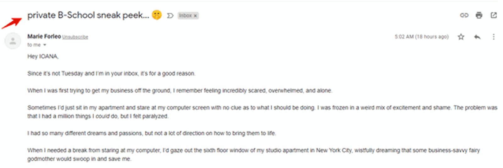
This way, only leads who are interested in her training program will receive B-School update emails.
Another way to personalize subject lines is by focusing on the easy template “personalized hook + value.”
For instance, “Hi Nelson! Our new 2022 fonts are available for download.” Or, “You asked, we provided. 10 best copywriting courses in 2022.”
4. Commit to only sending valuable content
By this point in the article, you understand the importance of sending valuable content to your audience.
To help give you a leg up, consider checking your emails using this valuable content checklist:
Valuable content checklist
- Does my content solve a problem?
- Is my content written with my target audience in mind?
- Is my content based on research, expertise, or social proof?
- Did my audience ask for this content?
- Does my audience need this content? Why?
- How can my newsletter add value to my audience’s lives?
- Am I following the 80/20 rule? 80% of the time, my content is valuable, and 20% of the time, it’s promotional.
5. Never send an email without permission
Instead of spamming people with content they never signed up for, use lead magnets to boost opt-ins.
If you haven’t heard of them, lead magnets are free nuggets of information you give out in exchange for opt-ins. For instance, if you’ve ever read “download our free guide now,” that’s a lead magnet. Or, “click here to claim your spot,” that’s a lead magnet, too.
Check out our article about lead magnet ideas to learn all about lead magnets.
6. Optimize your emails for mobile-first
Optimize your newsletters with the following checklist:
- Make sure all text is legible
- Make sure the newsletter loads quickly
- Make sure all images are clear and add value
- Double-check the layout to see if it feels intuitive
- Double-check that the newsletter looks clear on all major mobile devices
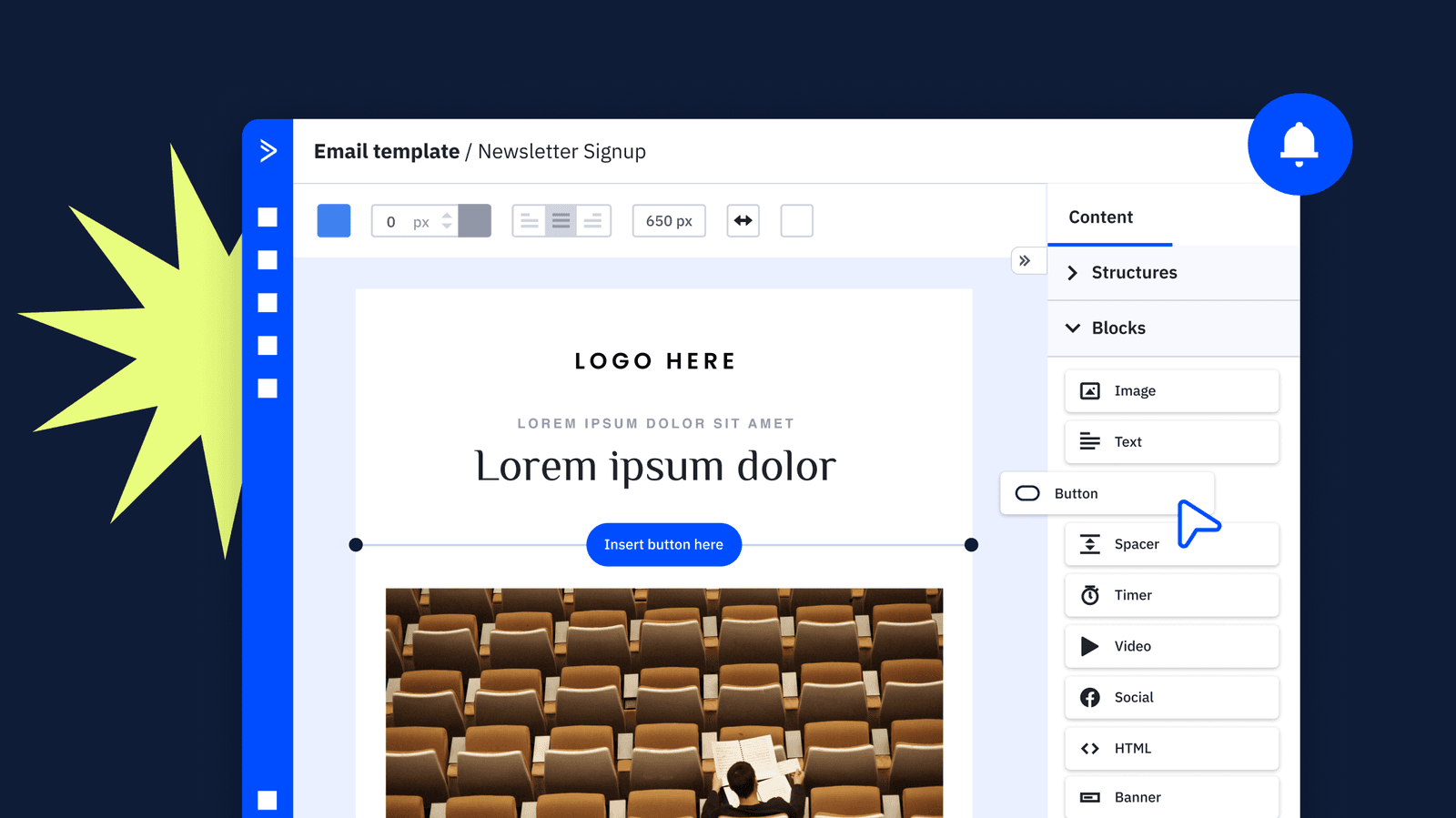
- Use mobile-responsive email templates
7. Personalize as much as you can
Every single email you send should be personalized with your reader in mind.
From addressing readers by their first name to hand-picking products personalized just for them, it’s imperative to tailor your newsletters to your audience.
For instance, the following newsletter would be even better if it addressed the reader by name, but there’s still something special about it. Can you tell what it is?
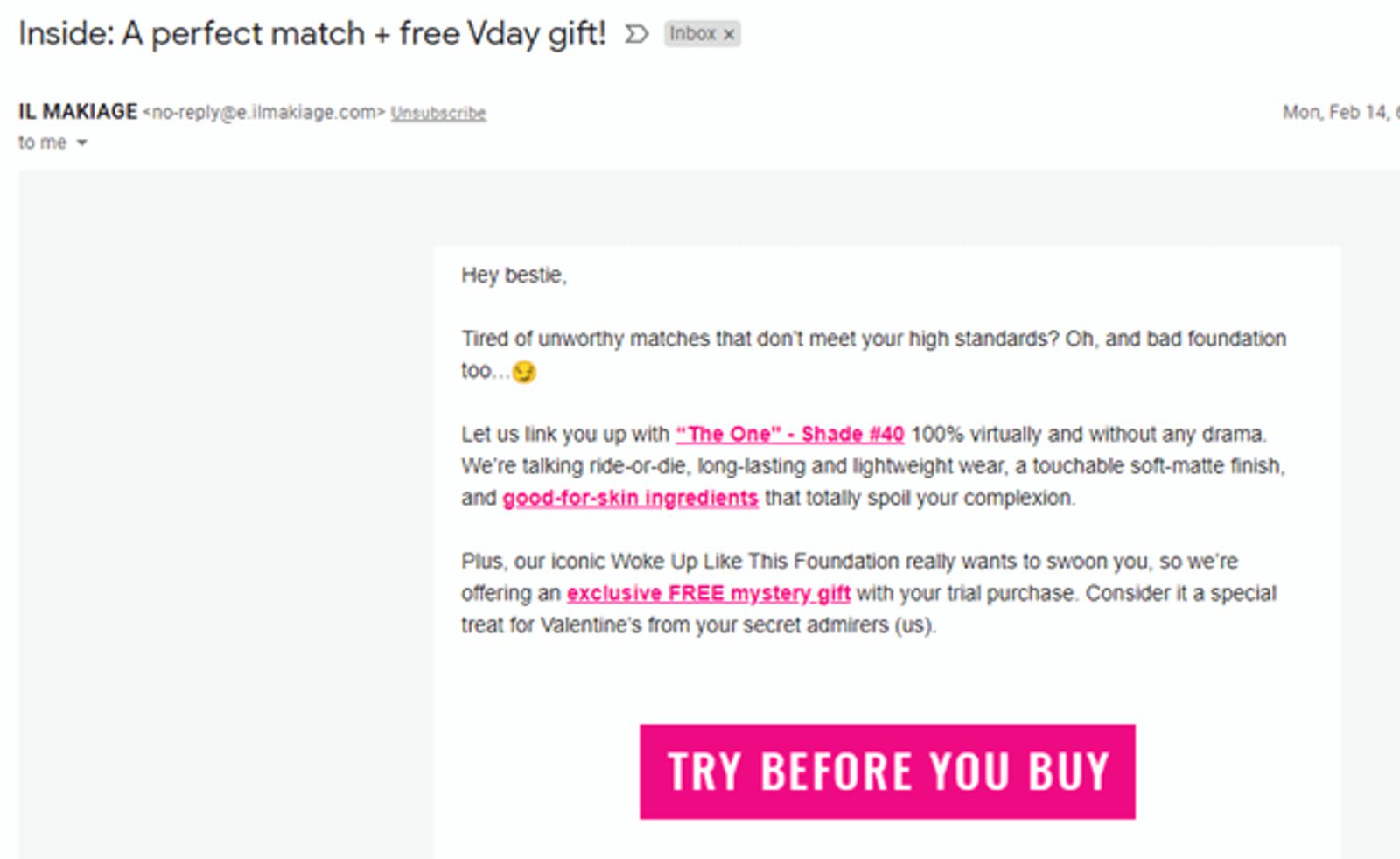
We’ll spill the beans! In this example, the brand mentioned a foundation tone hand-picked for the reader based on a quiz the reader took a few hours prior.
Not only are they continuing to nurture the prospect after the first touchpoint, but they’re also using a personalized approach to re-captivate them.
Of course, sending personalized emails at scale is only possible if you use a marketing automation platform like ActiveCampaign. There are not enough hours in the day for you to manually look through each customer’s recent purchases every time you want to send an email.
Avoid unsubscriptions with better-quality newsletters
Nothing gets readers to hit the unsubscribe button more than poor email newsletters.
By following the best practices we’ve outlined in today’s article, you’ll be on your way to nurturing and converting your audience with ease.
Craving more actionable advice like this? Subscribe to our newsletter for more helpful tips and tricks.

