Confirmation emails rarely receive the attention they deserve. Often, they’re too wordy, too dry, too hard to read, or too uninformative. Naturally, customers get used to bland and useless confirmation emails, so they don’t open them. Marketers, in turn, give up and don’t even try to make them more appealing.
It’s time to break this vicious cycle and make confirmation emails more valuable and exciting for you and your audience.
Let’s talk about what makes an outstanding confirmation email template and how to avoid common mistakes when designing it. We’ll also show you elegant confirmation email template examples and discuss what’s so special about them.
Table of contents
Why do you need a unique confirmation email template?
Businesses put a lot of effort into commercial newsletters but tend to forget about transactional emails, which is a shame. They don’t have to be purely utilitarian—you can use them to convey additional information, guide your customers, and more.
A confirmation email is a type of transactional email used to confirm customer actions, and its potential is largely underexplored. They are usually sent using marketing automation.

There are many reasons to make your confirmation emails shine a bit brighter:
- Instead of interrupting your flow of entertaining, commercial, and educational emails with “boring” messages, create an absolutely smooth, consistent brand experience for your subscribers.
- Improve upon a standard confirmation email template and delight your audience by making it more helpful and to the point.
- Provide guidance for your customers and use plain language to explain what they should do next.
- Help your audience manage their order or subscription with 1 click to prevent customer frustration.
- Make your brand communications truly memorable and unique by paying attention to the little details your competitors ignore.
As you can see, it’s not just about email design consistency—by improving your confirmation emails, you also remove friction from the customer journey.
8 types of confirmation email templates and how to use them
Before you go any further, you need to ensure that you send enough confirmation emails. Confirm every significant action your user takes, not just their purchases. It’ll help your customers avoid confusion, eliminate unnecessary worries, and stay in control of their interactions with your brand.
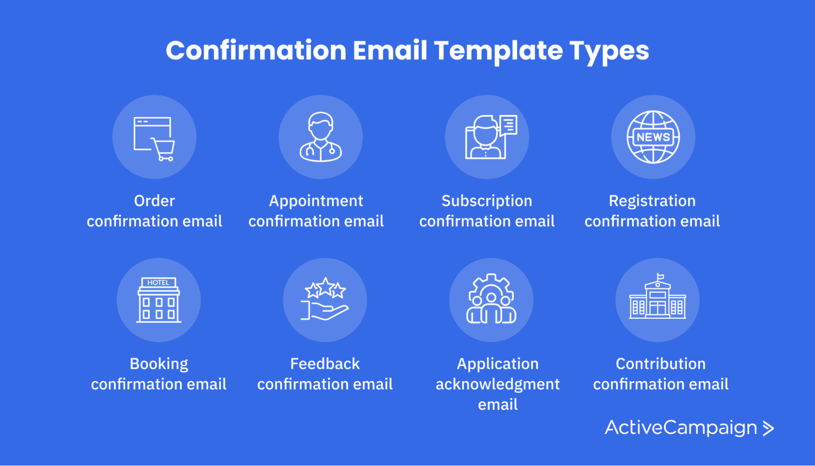
Here are the main confirmation email types and how you can use them:
- Order confirmation email: summarize the buyer’s order and inform them that it’s being processed.
- Appointment confirmation email: notify the user that they have successfully booked an appointment and send them all the important details.
- Subscription confirmation email: confirm that the user has subscribed to your newsletter or service and quickly summarize the conditions.
- Registration confirmation email: let the user know they have registered on your platform and can start using it.
- Booking confirmation email: send the user an itinerary and tips on how to change or cancel their booking.
- Feedback confirmation email: thank the user for their feedback and let them know you’ve started processing it.
- Application acknowledgment email: notify the user that you’ve received their application and let them know when they’ll hear from you.
- Contribution confirmation email: thank the user for providing important information or sharing their opinion and mention how their contribution will help you deliver better service.
8 elements of an effective confirmation email template
Now, let’s talk about making sure your template's anatomy is perfect, from header to footer.

We’ll focus on 8 crucial confirmation email template elements and discuss how to make the most of them. In this section, you’ll also find real-world examples and learn a few clever tricks from successful brands.
#1. Subject line
Without a catchy subject line, you won’t be able to communicate the importance of your email to your recipient. But how do you make it pop without sliding into clickbait or overusing all caps and emojis?
Follow these rules when writing subject lines for your confirmation emails:
- Keep it functional—reserve your creativity for the email body.
- Use active words like “Confirm” or “Get started.”
- Add some personalization: “Here are your trip details.”
- Use exclamation points in moderation.
Here’s a good confirmation email subject line example:

The festive illustration helps get the message across and shows customer appreciation without saying too much. Also, the logo on top makes this confirmation email more recognizable.
If you’re tired of brainstorming creative ideas for your email campaigns, try our free subject line generator to create compelling subject lines in no time and cross this task off your to-do list.
Use Our Confirmation Email Templates To Get Ahead
#2. Personalization
Just to make it clear, confirmation emails are typically personalized by default since they contain specific order details. But it shouldn’t stop you from making them sound friendly, real, and personable.
This example demonstrates why inserting more user-specific information, such as their name, into emails plays a big role.
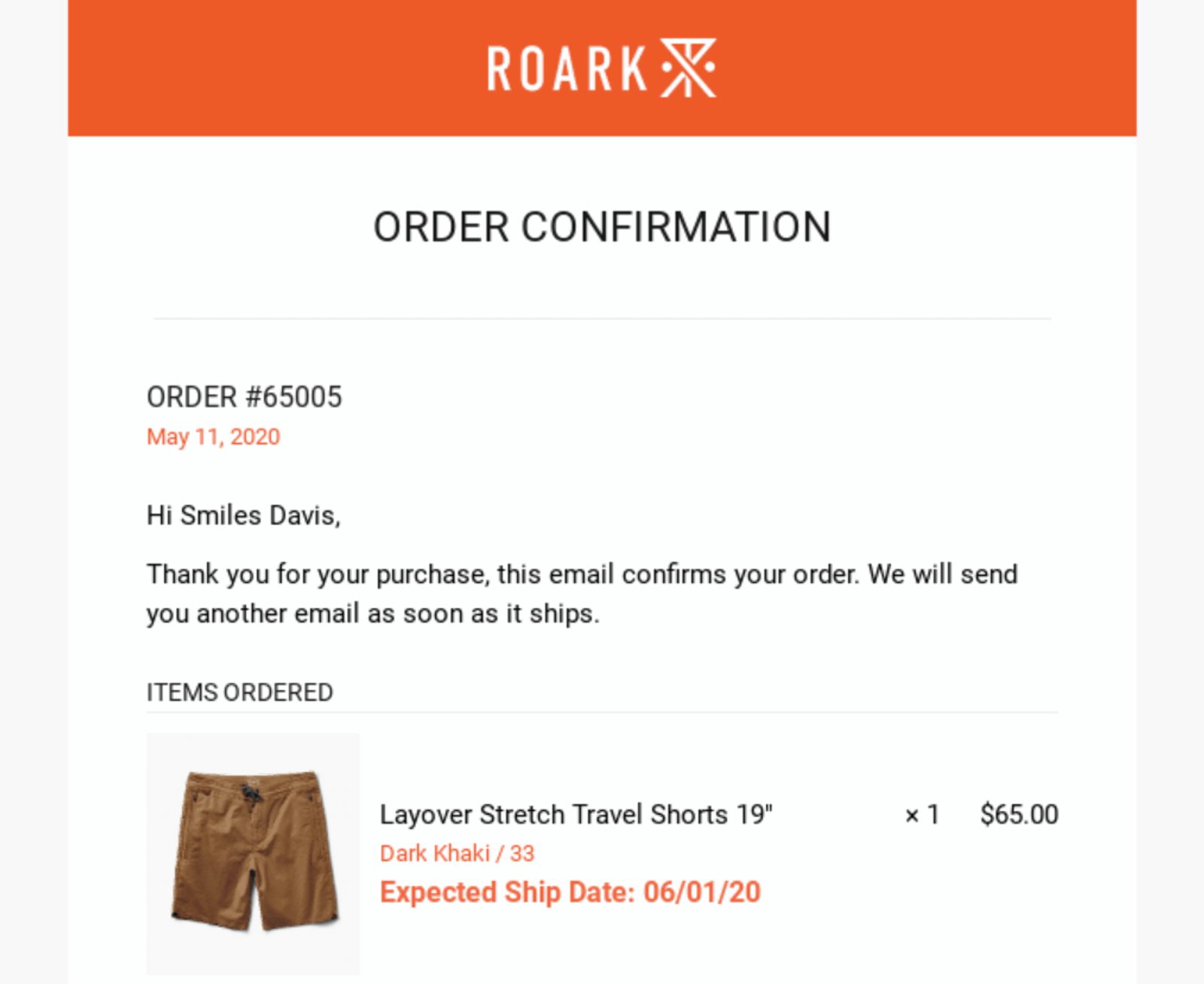
Subtle email personalization makes users pay more attention to the content of the email because they know that it’s intended specifically for them and no 1 else.
#3. Branding
Your confirmation email template doesn't have to scream about your brand, but it does have to support your brand identity and gently remind your recipients who the email is from. Also, branding simply makes an email confirmation more attractive and exciting to look at.

Use the most basic branding elements in your confirmation emails, such as:
- Logo
- Brand colors
- Brand fonts
- Illustration style
- Tone of voice
Moderate branding will help your emails stand out without making them look bulky or overwhelming. You can express your brand personality through witty confirmation email copy, too. Add a few unique touches to a standard text or, even better, write it anew.
#4. Design
Transactional emails are often illustration-deprived, which is unfair because visuals help attract attention, put users in the right mood, and convey a message. Try to use images and typography to dilute the “seriousness” of your confirmation emails and surprise or even amuse your audience.

This example proves a little creativity in their confirmation emails, which goes a long way. Even though it’s a typical order confirmation, the creators of this email managed to make it entertaining, lighthearted, and unforgettable.
#5. Call to action
Like any other transactional email, a confirmation email should be meaningful and actionable. Make it crystal clear to your users what they need to do and why—use 1 prominent, hard-to-miss CTA button and remove any potential distractions around it. To keep things clean and tidy, use your brand colors to add some visual contrast.
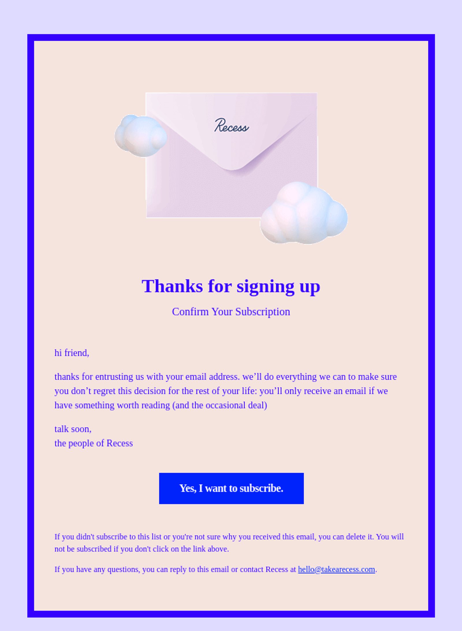
If you need to include another call-to-action, try to make it less attention-grabbing and bring it closer to the footer. Otherwise, you’ll leave your subscribers puzzled as to what you want them to do.
#6. Cancelation instructions
Give your customers instructions on what to do if they need to take a step back. What if they want to cancel their order? How do they get a refund? Who do they contact if their payment method doesn’t work? How do they change or extend their booking?
Make sure to link to your customer service chat or help center in your confirmation message in case your users have these or similar questions. This way, they’ll see that you’re not just trying to sell them something but that you genuinely want them to have a great experience with your product.
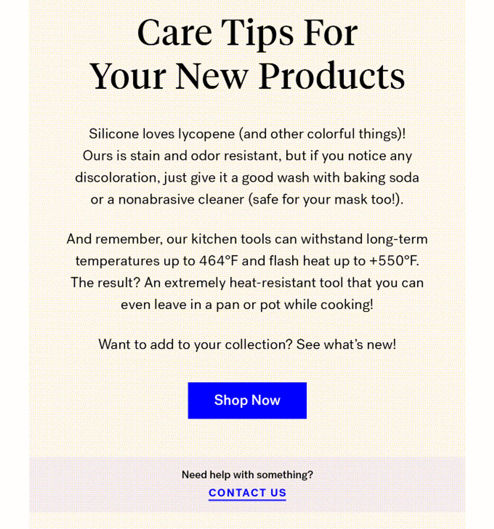
This example also illustrates another great practice—insert little tips in your confirmation emails to help your customers discover new product features, use cases, or other benefits they may not know about. The footer of your email is also a good place for Unsubscribe links.
#7. Sharing options
Order confirmation emails help customers check the correctness of their shipping address, track their orders, and ask for refunds. It's the same story with appointment and booking confirmation emails—they often contain important information, such as directions, a confirmation number, a cancelation policy, and so on. Why let those emails drown in your users’ inboxes when you can easily make them downloadable and shareable?
You can mention your referral program to help your audience share their positive buying experience with their social circle, like in this example.
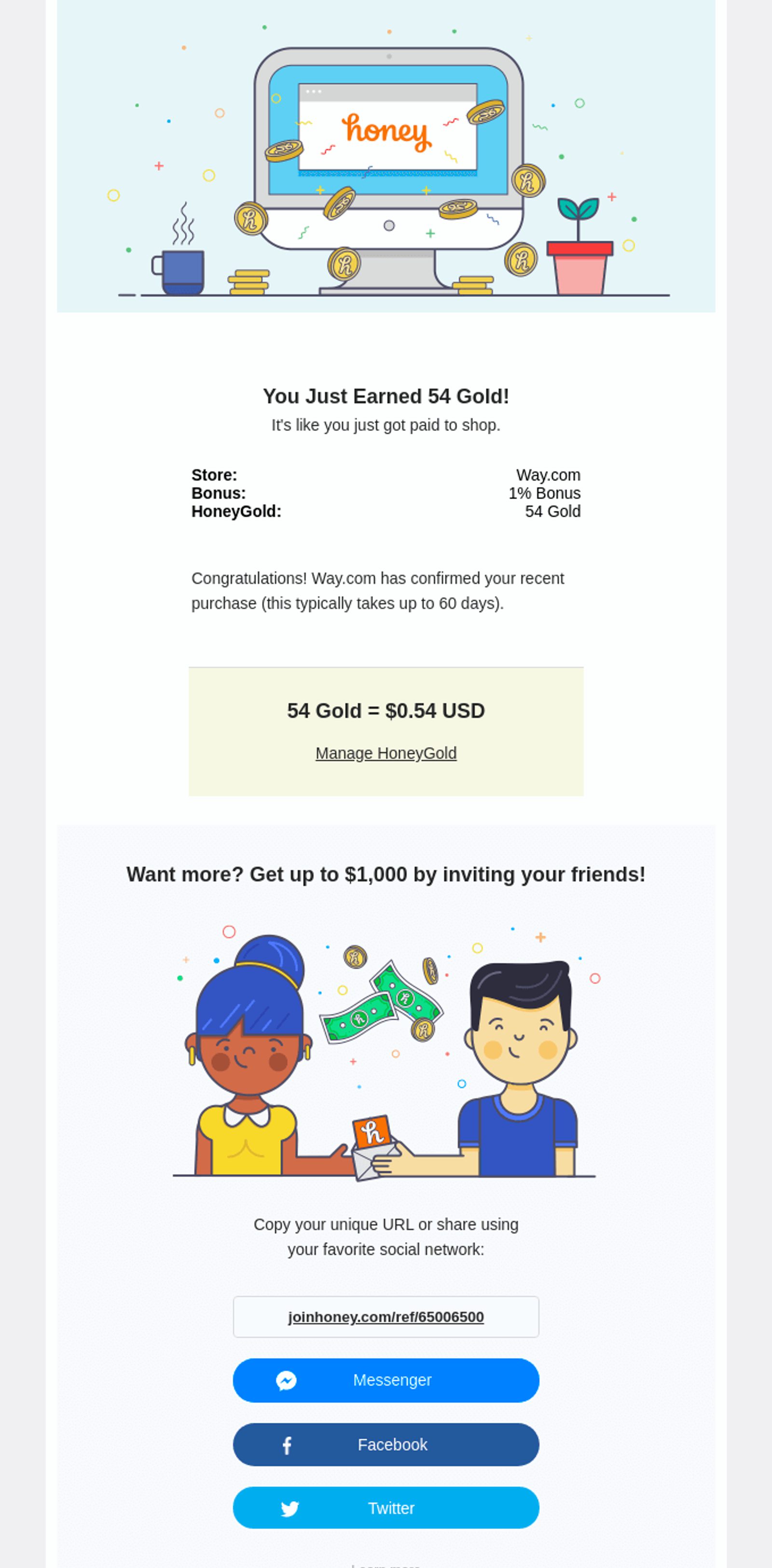
There’s another reason to add a Share button to your confirmation email template. If it’s a booking confirmation, your visitors may want to send it to their friends, family, or people they’re traveling with. Sharing options will help them communicate more efficiently and ensure their safety during the trip.
#8. Signature
A signature is the last but not least component of a well-designed email confirmation. Simply using your mail address for that isn’t always enough—you can go the extra mile and add your name or introduce your team to make a more personal connection with your customers.
Even big brands such as Airbnb are actively using this trick to remind their contact list that there’s a real person behind each email.

The only disadvantage of this practice is that once you mention your name, you need to become available for your customers to live up to their expectations. So, ideally, your confirmation emails should be signed by someone who can help in case your buyers run into problems with their order and decide to contact them.
FAQs
What is a confirmation email?
A confirmation email is a transactional email sent in response to specific user actions. Usually, a confirmation email follows a purchase, sign-up, completed booking, or registration. It contains a short summary of the action that has taken place, includes a thank-you note, and notifies the recipient of what will happen next.
Who can benefit from using a confirmation email template?
Businesses of all sizes can benefit from including confirmation emails in their communications. Confirmation emails aren’t just technical emails—they also provide reassurance, give customers peace of mind, and get them excited about their purchase or an upcoming event. They also help customers easily track and manage their orders, reservations, or subscriptions.
Where can I find a free confirmation email template?
Our professionally-crafted, responsive email templates are free to use with every ActiveCampaign pricing plan. Why not check them out during your 14-day free trial?
Create and customize your confirmation email template in minutes
With ActiveCampaign, you can choose from over 250 customizable templates that can easily be turned into stunning confirmation emails. Once you’ve found the right template, you can make it more on-brand with our drag-and-drop builder—you don’t have to code or design anything from scratch unless you want to.
You can also create an email template yourself to make something absolutely unique and beat your competitors. Send direct or automated email campaigns using your customized templates and support your growth with the help of other ActiveCampaign features, tools, and integrations. You don’t need any specific experience to get started!

