“Make it simple. Make it memorable. Make it inviting to look at. Make it fun to read.” – Leo Burnett
Good copywriting is hard. Great copywriting is really hard.
That’s why so many copywriters keep a swipe file — a collection of tried-and-true copy examples to inspire them when writer’s block hits.
In this post, you’ll get 10 examples of memorable copywriting to add to your swipe file — and learn why each one works so well. That includes copywriting examples for email automation, customer retention, and more.
Keep reading for awesome copy examples from:
- Basecamp
- Rolls-Royce
- Innocent Drinks
- Ricola
- Volkswagen
- Hiut Denim
- Beachway
- Pepsodent
- RXBar
- Moz
1. Know your customer’s pain points — and how you solve them (Basecamp)
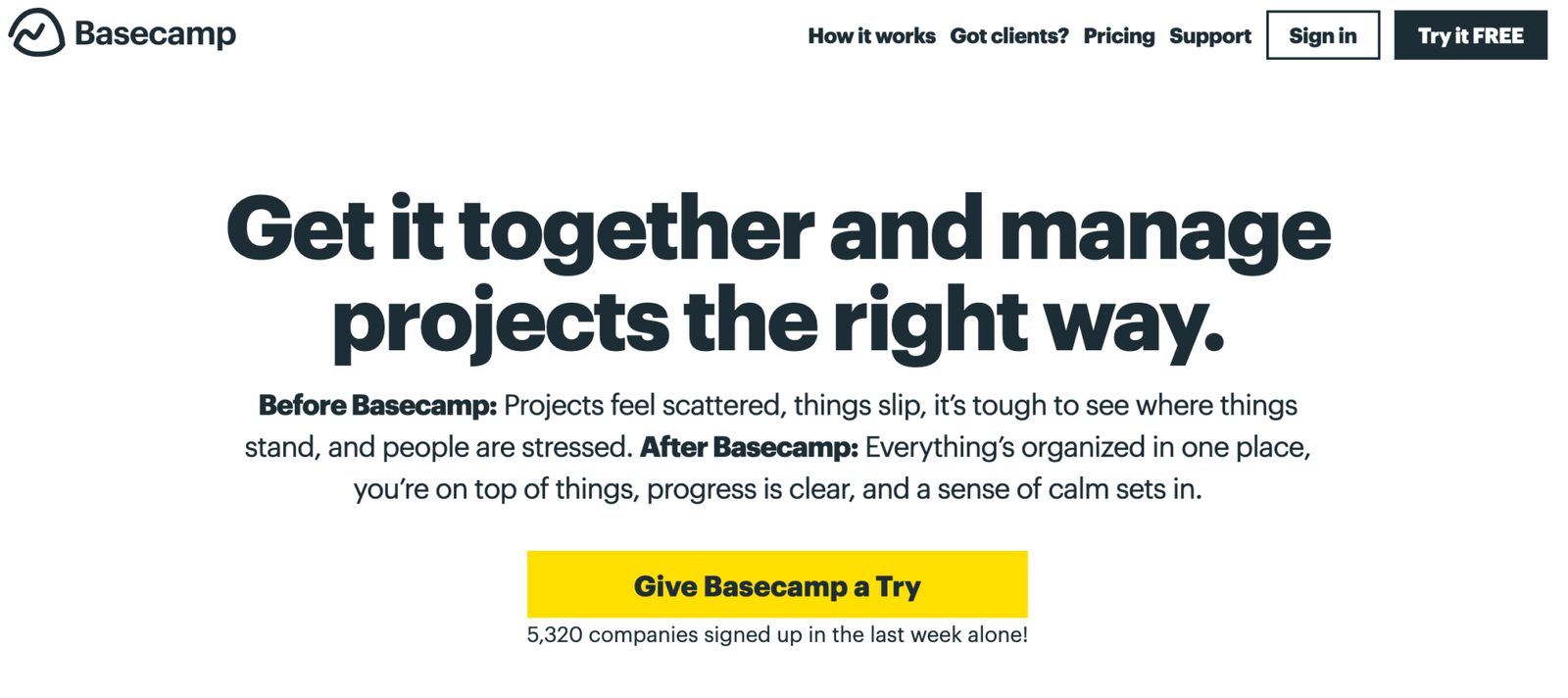
Basecamp’s current homepage (Source)
There’s a reason Basecamp is known for their website and sales copy. They use clear, simple, conversational language — the same kind of language their customers use when talking and thinking about their business.
This copy follows a timeless copywriting formula: PAS, or Problem, Agitation, Solution. PAS works like this:
- Problem: Clearly lay out your customer’s pain point. Here, the pain point is disorganization. Basecamp uses vivid language in the “Before Basecamp” section to show that they know what’s going on inside customers’ heads.
- Agitation: Twist the proverbial knife by making your copy more emotional. Before you offer a light at the end of the tunnel — your product — make your reader want it even more. Basecamp emphasizes how stressful it is not to have project management in place.
- Solution: You finally get to introduce the antidote to your customers’ pain! You can almost feel the relief and ”sense of calm” through the language Basecamp uses in the “After Basecamp” section.
"To use PAS when writing your copy, you simply start with the problem. Then poke at that problem so your reader can’t help but feel it. Then, when they’re itching for relief, present the solution.” – Joanna Wiebe
As a bonus, Basecamp includes some social proof under their call-to-action — if over 5k other companies signed up in the last week, it must be pretty amazing, right?
Try it now, for free
2. Specificity and detail (Rolls-Royce)
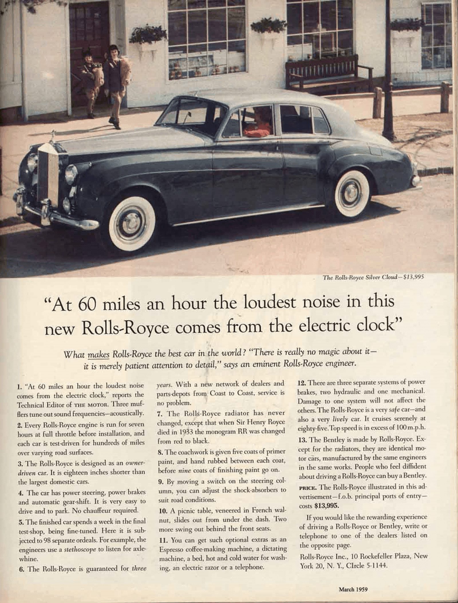
This Rolls-Royce ad originally ran in 1958 in The New Yorker. (Source)
David Ogilvy wrote this ad in 1958. Why is it still widely considered one of the best headlines of all time?
Detail and imagery. The headline could say, “The new Rolls-Royce is a very quiet car.” But the headline Ogilvy chose — pulled directly from the Technical Editor’s write-up in The Motor — offers readers a sensory experience.
The body copy adds even more details: “For example, the engineers use a stethoscope to listen for axle-whine.”
“This car is quiet” is a claim that the reader can choose to believe or not believe. But if you say “we used a stethoscope to listen for axle-whine,” how can your reader not believe the car is quiet?
You can almost feel the peace and quiet that comes from driving this car. (And in post-war America, peace, quiet, and luxury were all things that the upper class — the ad’s audience — craved.)
The lesson: letting the customer paint a picture in their mind immerses them in the ad and makes your product more memorable.
"In my Rolls-Royce advertisements, I gave nothing but facts. No adjectives, no ‘gracious living.’" – David Ogilvy
3. Your values are our values (Innocent Drinks)
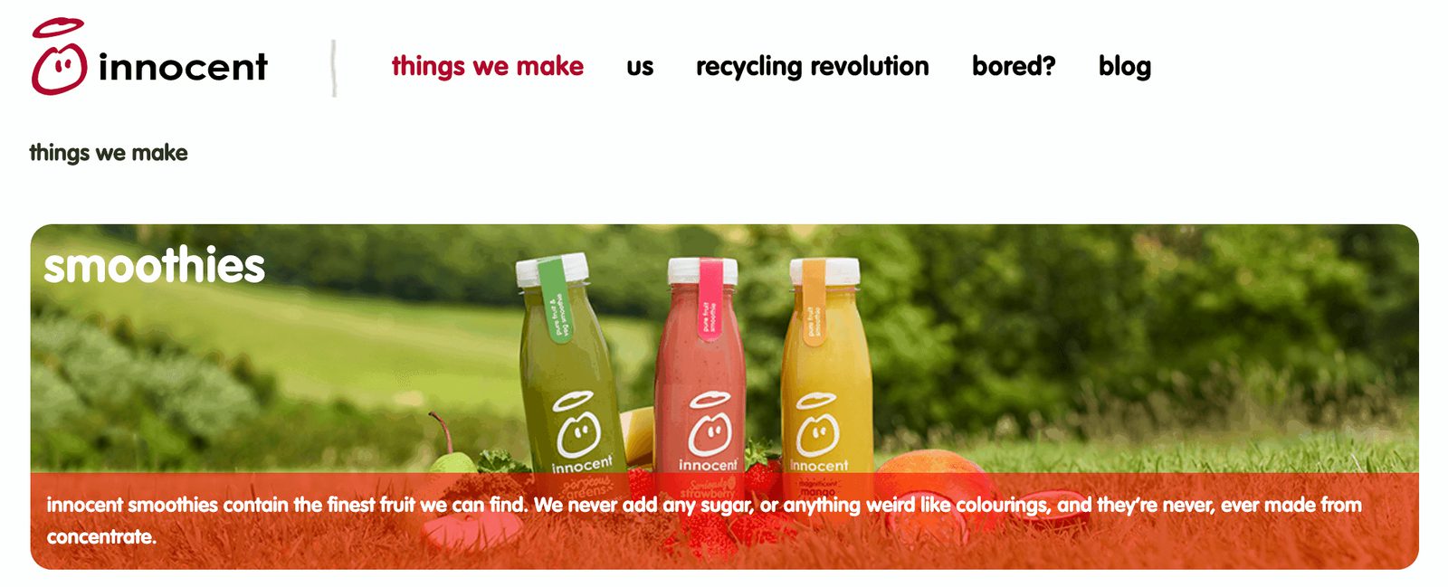
If you click “bored?” in the navigation, you can see drawings, old packaging, videos, and photos from the brand. (Source)
The copy on Innocent Drinks’ website — from navigation to product descriptions — is cute without being cheesy. “Things we make” is straightforward and laid back, like their brand.
More importantly, this copy says exactly what the product is.
It starts with a clear description: Smoothies made from “the finest fruit.” Then it acknowledges what their target customers care about — no “weird things” like additives or artificial colors and flavors in their food. The copy addresses that point right away before the reader can even wonder about it.
When you anticipate your customers’ objections, you can address them before they have a chance to worry. As legendary copywriter Joseph Sugarman says, “If you feel that your prospect might raise some objections when you are describing a product, then raise the objection yourself."
Show that you know what your audience cares about and that your brand shares those values. Customers will be quicker to trust you — and we’re all more likely to buy from people (and brands) we trust.
4. Edgy humor (Ricola)
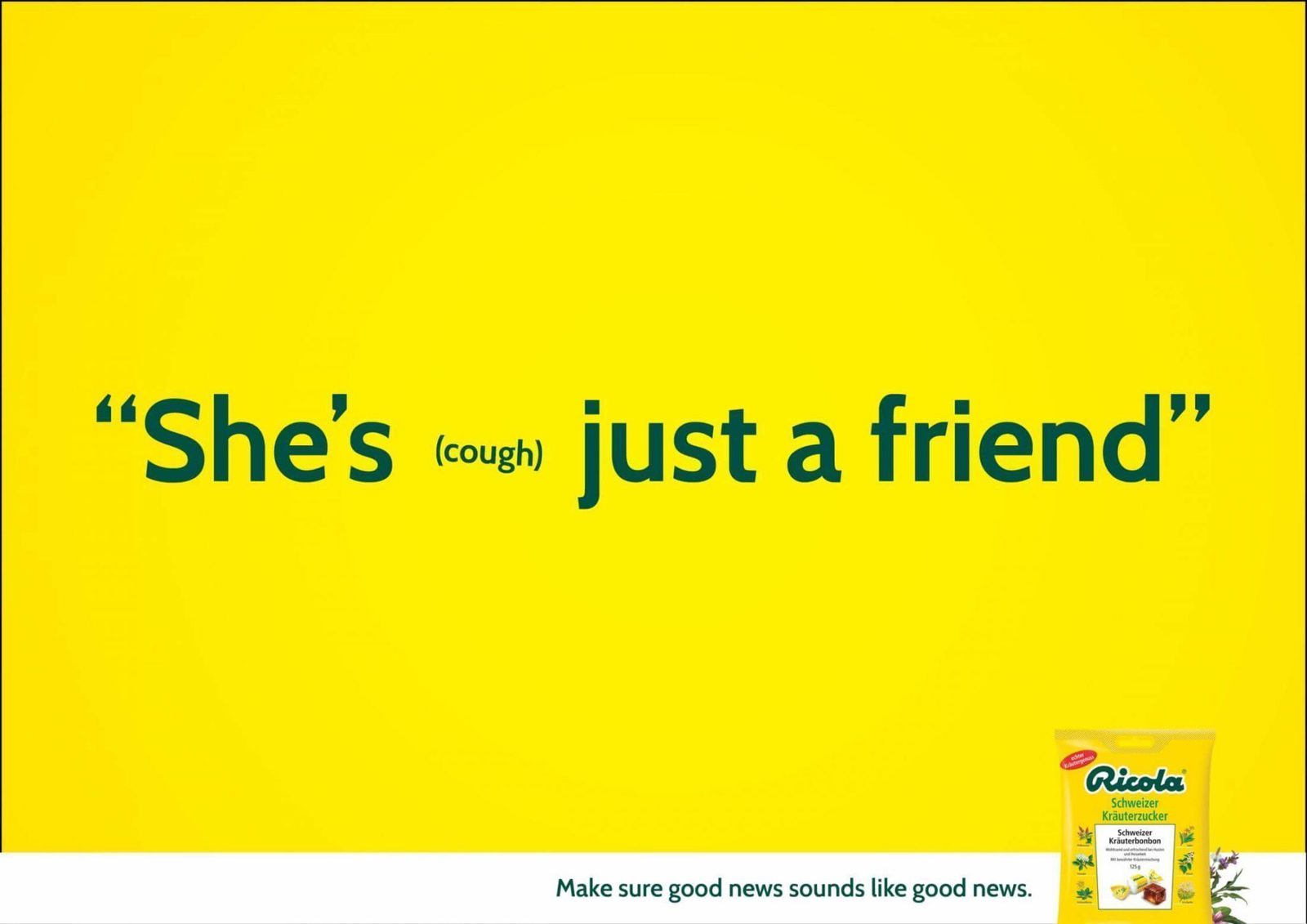
“Make sure good news sounds like good news” is a much better tagline for a cough drop brand than something like “cough less.” (Source)
In 2014, Ricola ran a series of ads with examples of how a misplaced cough could ruin the meaning of a sentence. This ad is:
- Funny — especially for an industry that can often be boring and technical
- Slightly edgy (without being offensive)
- Relatable
- Simple
- Memorable
The ad also shows the product — without trying to persuade the reader that Ricola makes the best cough drops. Instead, it combines the photo of recognizable product packaging with memorable copy. The goal? To keep Ricola top-of-mind the next time someone shops for cough drops.
"For consumers, generally the key benefit of remembering Distinctive Assets is often utilitarian: to help that person find the brand with ease when a future need, where that brand could be the answer, arises." – Jenni Romaniuk, Building Distinctive Brand Assets
Including the packaging (and using the same color scheme throughout the ad) helps consumers find the brand once they're in the store looking for cough drops.
5. Understand your customers’ perspective — then flip it (Volkswagen)
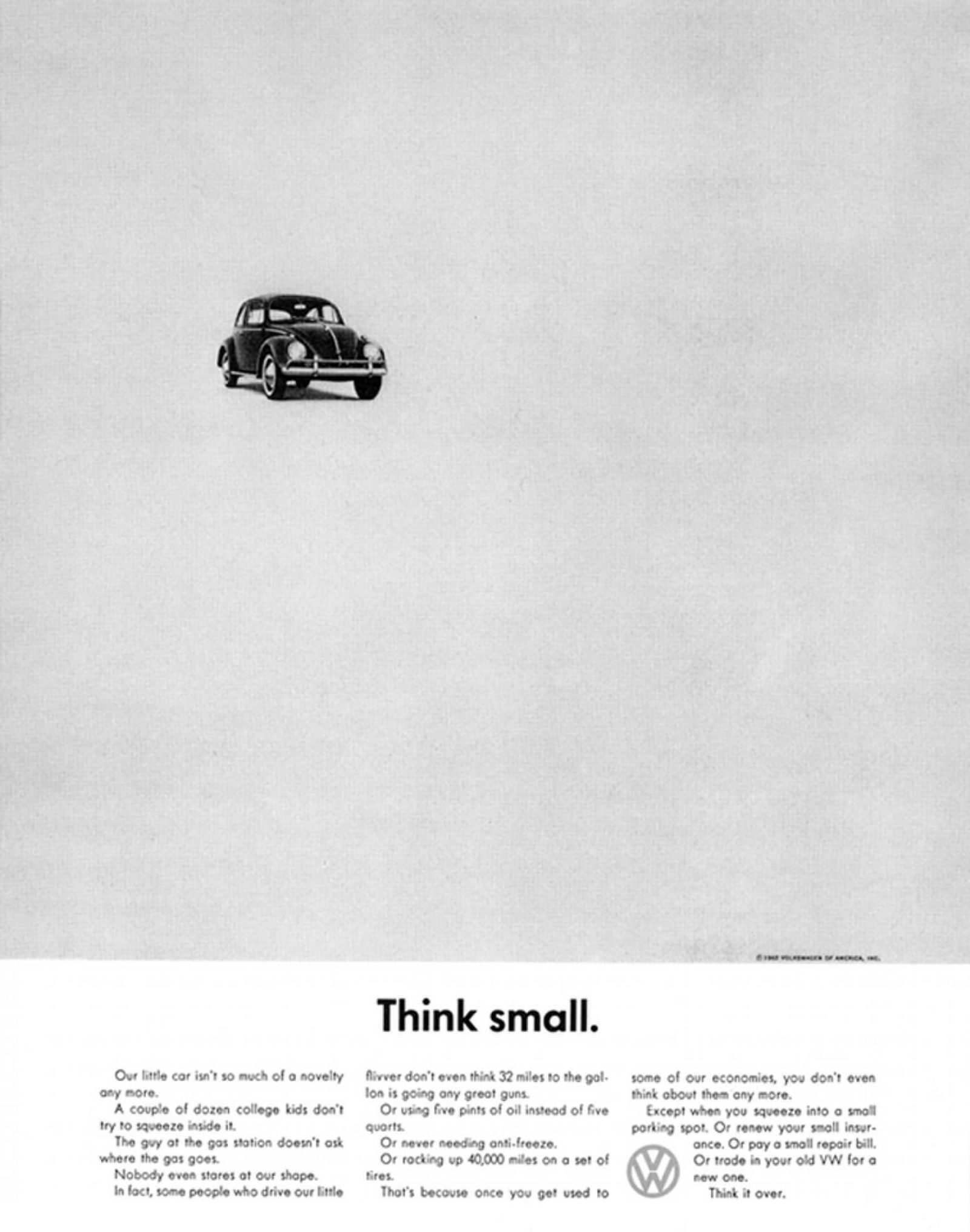
The car points toward the headline to help direct readers’ eyes. (Source)
Ad Age ranked this iconic 1959 VW campaign the “greatest advertising campaign of the century.”
Here’s why.
In the late 1950s, Americans loved muscle cars. Volkswagen challenged ad agency DDB to sell the opposite: a small, compact, odd-looking car. DDB met the challenge by sharing the tangible benefits of owning a smaller car:
- Uses less gas
- Cheaper insurance
- Requires less maintenance
When everyone in America was thinking big, DDB flipped the script with one simple slogan: “Think small.” The ad was printed in black and white — even though full-color ads were the standard. That, combined with the simple slogan and minimalist design, made the ad stand out visually.
In his book Pre-Suasion, noted psychologist Robert Cialdini writes that: “Anything that draws focused attention to itself can lead observers to overestimate its importance.”
Volkswagen needed to draw more attention to smaller cars – because they knew that they could increase sales once they got people to consider their arguments. That’s what this ad accomplished.
To surprise your customers, you first need to understand their perspective. By subverting their expectations — both visually and verbally — you can create a campaign that sticks in their minds.
6. Straightforward meets brand personality (Hiut Denim)
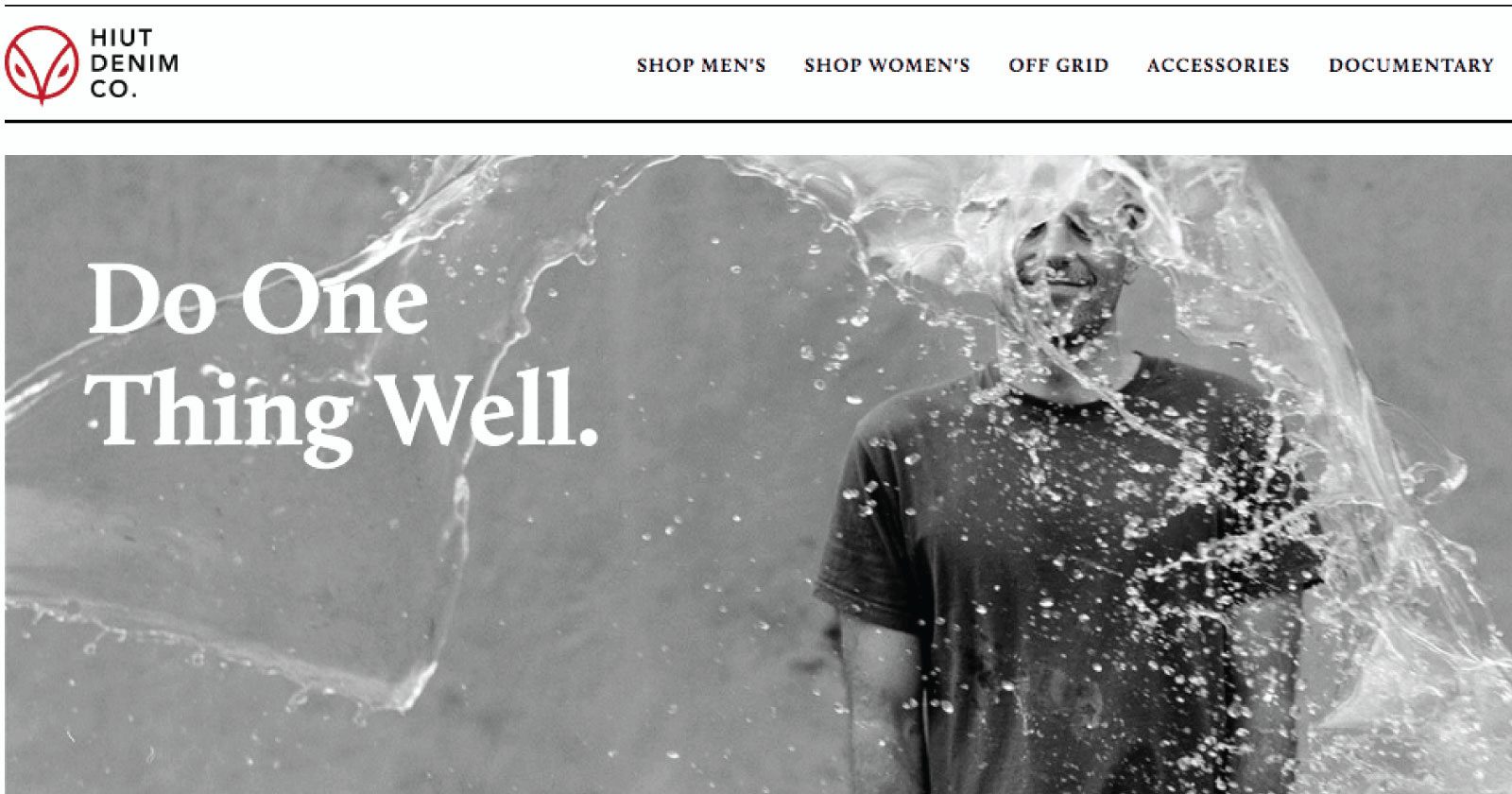
Copy from a previous version of Hiut Denim’s homepage

Copy from Hiut Denim’s website
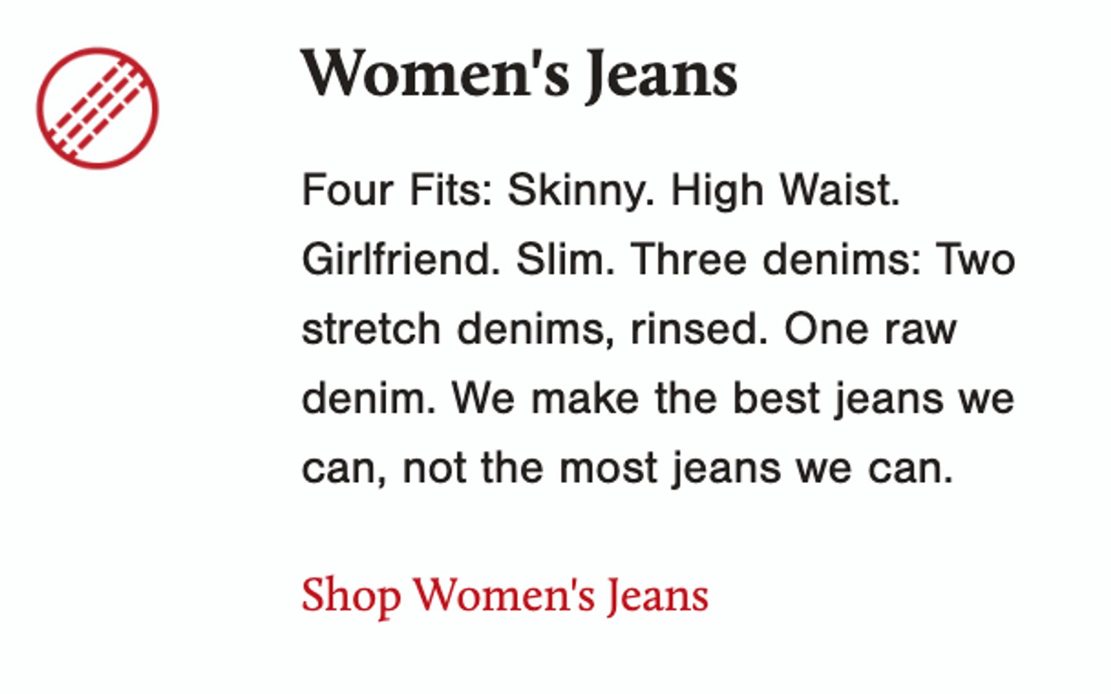
Copy from Hiut Denim’s homepage
Hiut Denim’s brand story and values come across well on their website, from their tagline to their “Our Story” copy.
With copy like…
- “Do one thing well”
- “We make jeans. That’s it. Nothing else.”
- “We make the best jeans we can. Not the most jeans we can.”
...you trust that Hiut Denim knows what they’re doing and that they take pride in their jeans. It gives them credibility and makes you want to be a part of what they’re doing.
Consumers are smarter than a lot of advertisers give them credit for; they know they’re being sold to. That’s why your copy needs to be believable; you need to prove why your product is worth buying.
"The consumer isn't a moron; she is your wife. You insult her intelligence if you assume that a mere slogan and a few vapid adjectives will persuade her to buy anything. She wants all the information you can give her." – David Ogilvy, Confessions of an Advertising Man
Hiut Denim goes beyond “vapid adjectives” — they share real information about their company, the quality of their products, and the work that goes into them.
7. Customer language (Beachway)
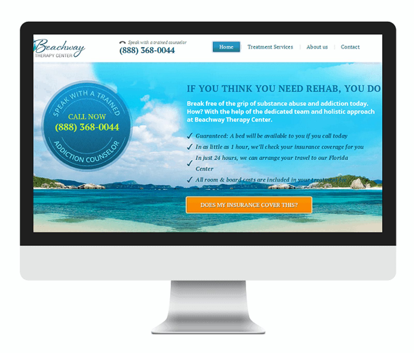
“If You Think You Need Rehab, You Do” was tested against “Your Addiction Ends Here” — and generated a 400% increase in clicks. (Source)
This copy for Beachway, a rehab and addiction therapy center, led to a 20% increase in form submissions — even though the form was on a separate landing page.
For more information on how to write a high-converting landing page, take a look at this guide.
What makes it so effective?
It’s pulled directly from the customer's language. Copywriter Joanna Wiebe wrote this headline based on an Amazon review of a book on overcoming addiction. Using the same words customers use activates their existing mental representations, which helps them organize information.
It also, in this case, creates a strong sense of urgency.
Pro tip: Read 5-star (favorable) Amazon reviews, but also consider more measured 3-star Amazon reviews to find out what people really wanted when buying a book.
“You know that every man is constantly holding a mental conversation with himself, the burden of which is his own interests—his business, his loved ones, his advancement. And you have tried to chime in on that conversation with something that fits in with his thoughts." – Robert Collier
In other words, using customer language lets you say what they’re already thinking. Your customers know you understand them, and your copy instantly becomes more believable.
Online reviews are a goldmine of customer language, including:
- What they liked about the product
- The specific problem that they wanted to solve with the product
- How the product solved their problem (or didn’t)
- Other things they wished the product included
To learn more about how to do this kind of market research for your marketing copy, check out this article.
8. Copy so convincing that it taught the world to brush their teeth (Pepsodent)
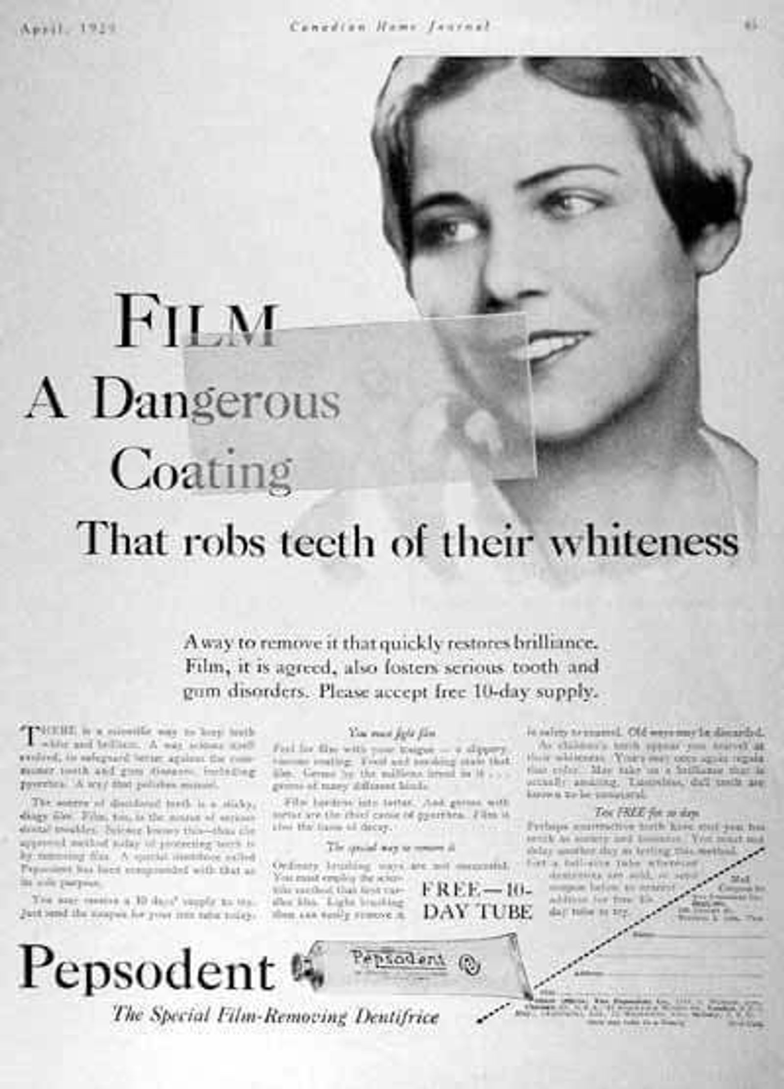
If you read this ad and didn’t run your tongue over your teeth, you’re lying. Or immune to the power of suggestion. (Source)
Before Claude Hopkins wrote this copy in 1929, Pepsodent toothpaste wasn’t selling much.
Why?
Because only 7% of people brushed their teeth.
Hopkins needed to get through to the hardest-to-reach audience: “Unaware” people.
You need to use different tactics to address pain points depending on your audience’s level of awareness:
- Unaware
- Pain Aware
- Solution Aware
- Product Aware
- Most Aware
With an unaware audience, Hopkins couldn't just talk about the benefits of toothpaste. No one knew they even needed toothpaste.
To grab attention, Hopkins wrote about the “film” on your teeth. If you run your tongue over your teeth, you can feel it right away — and that's exactly what people do after reading this ad.
This clever copy:
- Got people’s attention
- Made them aware of a problem they didn’t know they had
- Offered them a solution to that problem
And it worked: According to The Power of Habit by Charles Duhigg, 65% of the population brushed their teeth (with Pepsodent!) within a decade of the campaign.
9. No‑B.S. copy (RXBar)
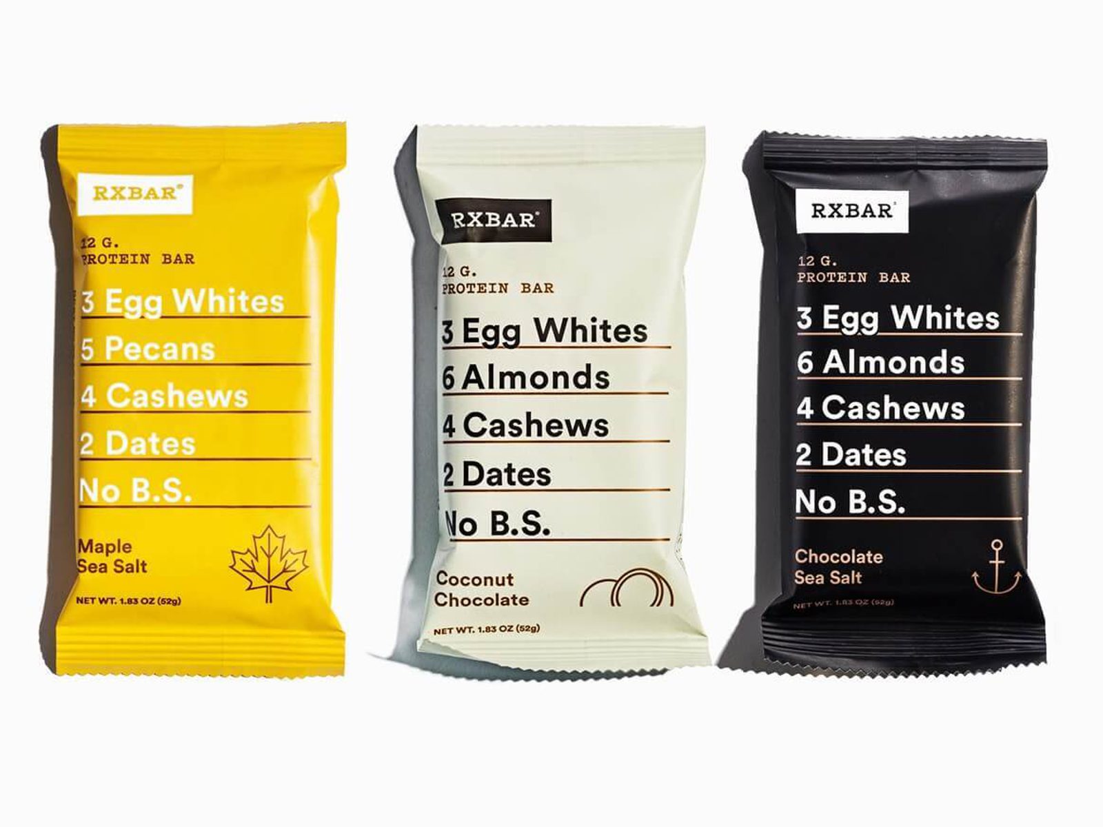
No small print ingredient list here — RXBar makes ingredients the focus of their packaging. (Source)
With RXBar, you know exactly what you’re getting. Their brand values transparency and simplicity — the same thing their ideal customer values. Health-conscious shoppers want to know exactly what they’re eating, so RXBar gives that to them front-and-center on their packaging.
A lot of times, you’ll hear marketers talk about highlighting benefits instead of features. RXBar goes against this wisdom — their packaging just lists features.
But in a market saturated with processed products and unpronounceable ingredients, the features are the benefits: simple, easy-to-pronounce, healthy ingredients.
"Motivation comes from within and drives action. It’s not something you can manufacture with your copy. Instead, the best your copy can do is tap into what’s driving your customers and connect their motivation with your solution." – Jen Havice, Finding the Right Message
RXBar uses the bar's features — its ingredients — to connect with their audience's motivation.
10. Make them curious (Moz)

Smarter than my way? Tell me! (Source)
This copy from Moz uses one of George Loewenstein’s 5 principles of creating curiosity: Imply you know something your audience doesn’t (but wants to!). Moz knows a smarter way to do SEO. And if I click on that “Try Moz Pro free” button, I’m going to find out what it is.
Under the headline, Moz tells you its value proposition without a ton of jargon. Every SEO team wants to increase traffic, rankings, and visibility.
Once I’m hooked by the headline and copy, this page does 2 other things well:
- Minimizes friction with a big, clear CTA button
- Addresses likely questions without you having to ask (Will this be annoying to cancel? How much does it cost?)
Bonus email copywriting example: Re-activation (Dollar Shave Club)
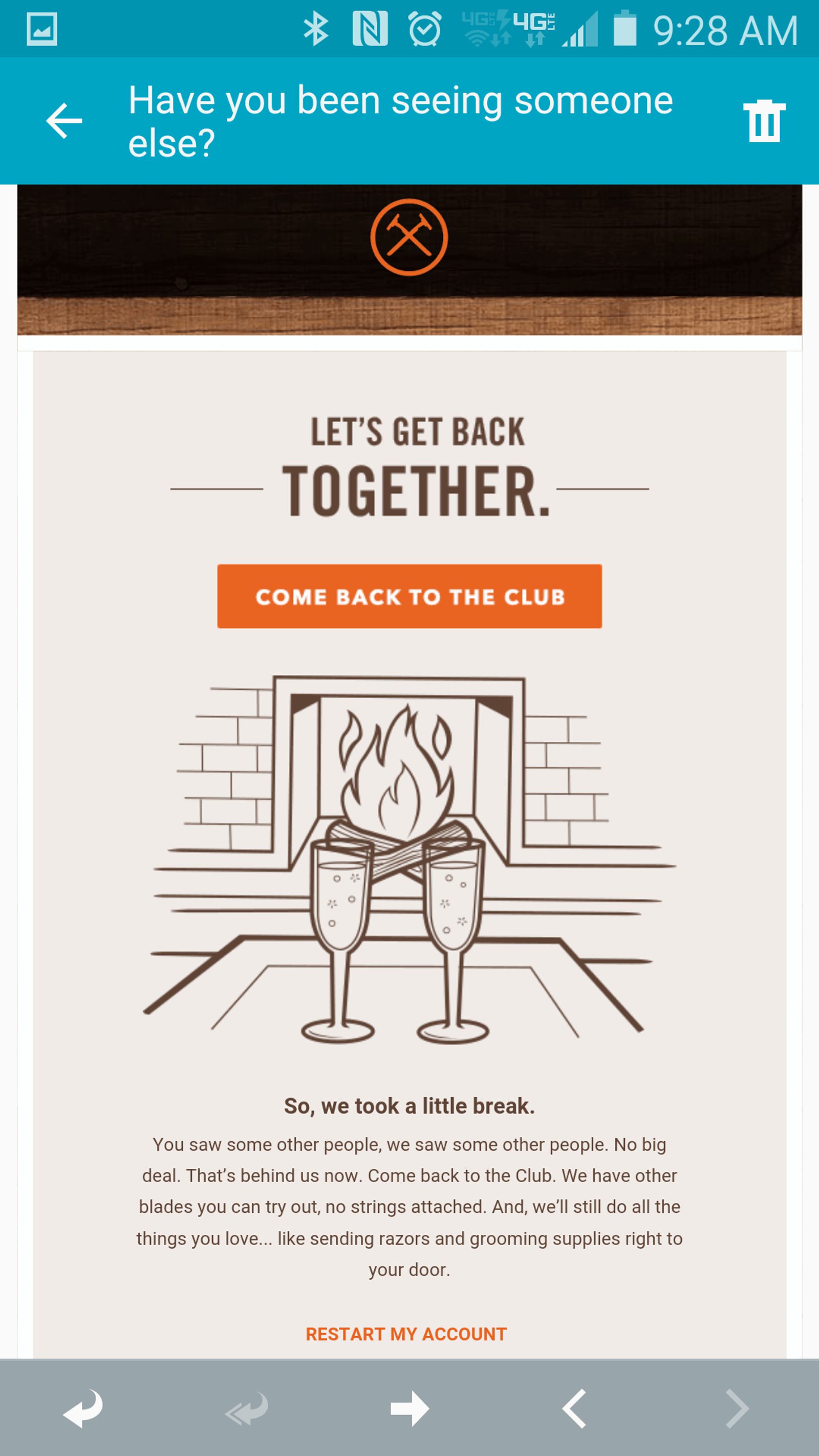
This winback email from Dollar Shave Club is... genius.
DSC's email marketing wins for three reasons:
- Segmentation — This email does not go out to their entire email list. It goes out, automatically, to canceled subscriptions.
- Email subject line — "Have you been seeing someone else?" If I see that in my inbox, I'm absolutely going to open it.
- Body copy — The body copy (and imagery) leans so heavily into what a DTC subscription really is: a relationship. It's not your typical marketing email.
As Dollar Shave Club continues to grow, their investment in their emails will continue to serve as fantastic copywriting examples. Sign up for their email list and keep an eye on their email marketing campaigns, especially their promotional emails. You can also get started right away with ActiveCampaign's free email copywriting templates.
Conclusion: 3 must-follow rules for killer copy
With all those examples in mind (and in swipe files), here are the 3 rules for creating equally effective copy:
1. Clarity > cleverness. First and foremost, you want your audience to understand your copy. It’s okay to be funny, but first, you need to:
- Make people understand you
- Make people curious
- Promise an irresistible benefit
2. Use conversational language. When your writing sounds like a person talking — especially when you use your customers’ own words — it’s easier to understand and believe.
Try the barstool test: Would you say this sentence while sitting on a barstool, in a bar, or talking to a friend? If not, make it more conversational. Short, more common words are easier to understand than long, jargon-y words.
3. Identify your audience’s pain points. You can’t offer a solution if you don’t know the problem. Target your customers’ pain points based on their stage of awareness:
- Unaware: Talk about what people like them do
- Pain Aware: Talk about the pain
- Solution Aware: Talk about options to solve the pain
- Product Aware: Share your product’s value proposition
- Most Aware: Show them your offer (features, pricing, etc.)
Then follow the PAS formula to drive it home:
- Pain: Clearly lay out your customer’s pain point
- Agitation: Twist the proverbial knife by making it more emotional
- Solution: Finally introduce the antidote to your customers’ pain
Follow these rules, keep a stacked swipe file, and don't stop writing — you’ll be well on your way to creating your best copy ever.

