Do pop-ups work?
Let’s just get this out of the way up front: Pop-ups are annoying.
Heck, even OptinMonster, a company known to help businesses create opt-in pop-up forms, can admit it. Among many customer opinions that they heard, these were some of the most popular:
- They’re rude
- They’re insulting
- They make you want to leave a site immediately
- They ruin the user experience
A 2016 study comparing several pop-up styles found that 50% of participants rates pop-ups as “very annoying,” and “extremely annoying.”
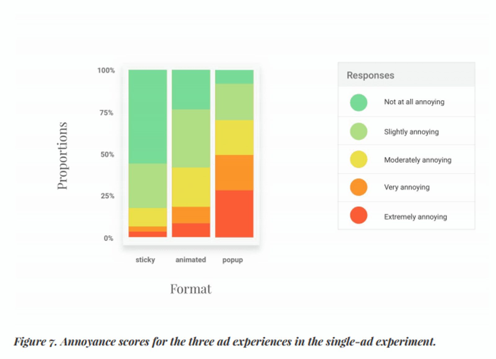
It’s a popular opinion. (Source: Coalition for Better Ads study)
They are, and there’s no disputing that. So, when you hear the question, “do pop-ups work,” it seems like a NO brainer.
Because GOD, they can be so annoying, right?!
Yeah, they can be. But the answer to “do pop-ups work” isn’t “No.”
Because some pop-ups can convert up to 40% of your website visitors into subscribers and leads.
The rest of this post will dig into that statistic (and others). The point is this—pop-ups, just like emails, Facebook ads, and other marketing efforts, have their place and time.
In this post, you’ll learn:
- The purposes of a pop-up to benefit your conversion rate
- The types of pop-ups you can use (and which ones your customers won’t click away from)
- The ways a pop-up can be triggered and what to consider with each option
- The mistakes you’re making with pop-ups (and how the letter P fixes all of them)
Try it now, for free
When does a pop-up work (or fail)?
Like we said before, a pop-up has its place and time. They can be good.
How, you ask? Here’s how:
- They can grow email lists
- They can drive blog subscriptions
- They can promote content
- They can fuel lead generation
Who wouldn’t want all of that? When done right, website conversion pop-ups can be extremely beneficial and effective.
But, they also have their downsides.
- They can feel intrusive or spammy
- They can interrupt the customer experience
- They can bring in leads, but they may not be qualified leads (and therefore a waste of your time and money)
There are pros and cons any way you slice it. But as annoying as they can seem, they’re still perfectly effective in converting more traffic (but only when done right).
Are you wondering what a “done right” pop-up even is? We’ll get there.
But first, here’s what it isn’t:
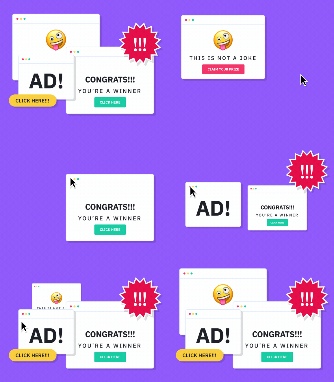
Imagine you’re cruising the Internet. Maybe you’re browsing your favorite retailer or researching something for a work project, and all of a sudden a flashing, neon-colored message aggressively appears.
No!! I'm not a winner! Make it stoppppp!!!
Yeah. Please don’t assault your customers with neon, ALL CAPS, and non-existent prizes. Nobody has time for bad pop-up design (and no one will join your email list either).
But, customers will make time to engage with a pop-up that doesn’t make them feel like they are in a digital haunted house. And that leads to a happy conversion rate.
But, if visions of that flashing, neon pop-up are still making you a pop-up doubter, listen to this:
- Copyblogger discovered that a pop-up strategy significantly boosted email list opt-ins.
- Pop-ups click-through rates are generally good – often around 2% – which is higher than other kinds of ads (according to the Blog Marketing Academy).
Do pop-up ads actually work? Numbers don’t lie. Pop-ups can be effective.
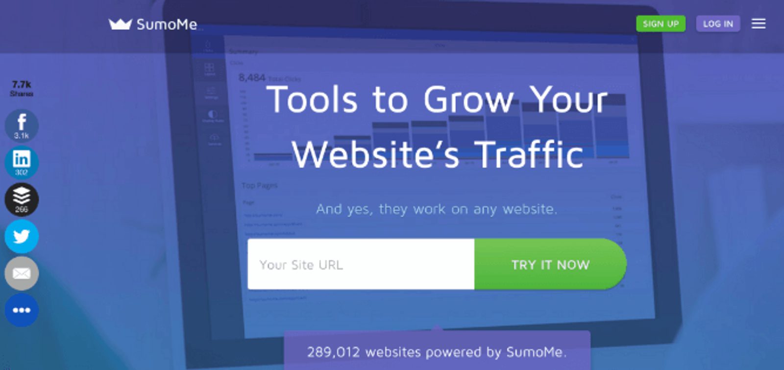
289,012 websites clearly agree.
Who doesn’t want more traffic? Sumo knows you do, and they can help you get it. This pop-up example works because:
- It’s prominently shown on the homepage with an inviting color scheme.
- It’s promising traffic growth (and a tool that works for anyone’s website to get it).
- It’s offering proof that 289,012 websites are already happily using it.
Several elements will make a pop-up work (not the least of which is not promising fake vacations or being obnoxious), but there’s one element that I want to single out.
Context.
This is what makes a pop-up effective, or a pop-up “done right.”
According to Gary Vaynerchuk, “Content is King. Context is God.” And the best pop-ups with good context have conversions rates over 40%.
A pop-up’s success is all in the details. Take a look at the difference context makes in messaging.
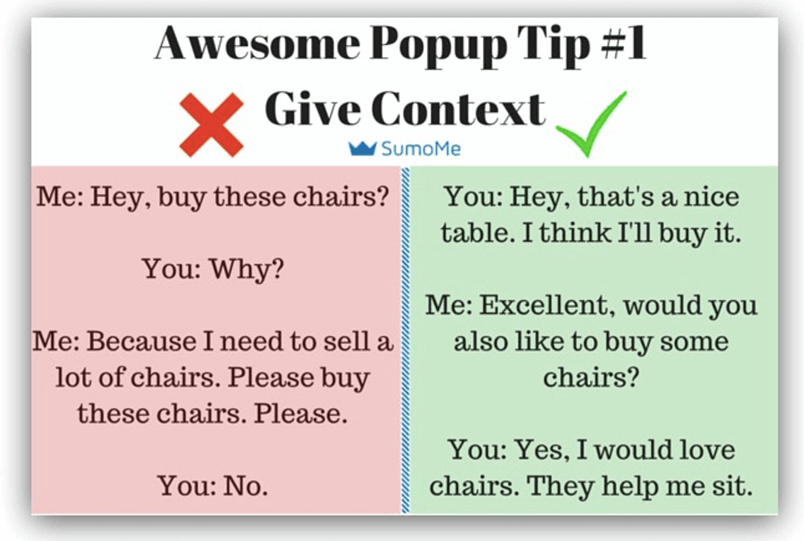
Before Context: Why don’t YOU buy the chairs??
After Context: Sitting is one of life’s greatest and simplest joys. Give me all of the chairs. (Source: Sumo)
So, what if you have context, but your pop-up still isn’t doing its job?
Don’t despair! Everything’s not lost, it’s just not linear.
Allow me to explain.
Any marketer worth their salt knows that the thoughts people have vs. the actions they take are two totally different things. Sometimes, your customers’ behavior shows every indication of converting but then they don’t.
Social psychologist Martin Lindstrom wrote as much in his book, Buyology: Truth and Lies About Why We Buy.
And this can certainly impact your conversion rate. But it doesn’t mean your conversion rate is dead.
Time for a personal example.
I was constantly at odds whether to sign-up for Orangetheory Fitness again after moving. Despite my aversion to most fitness (because sweating is gross and exercise makes everything hurt), I’ve gone before regularly and loved it. When I moved, and it became more expensive, I stopped.
But my communications with Orangetheory didn’t.
After stopping, I still...
- Clicked on website pop-ups to get content
- Opened and engaged with their emails
- Interacted with Facebook ads
- Recommended it to others online and in person.
But, in spite of engaging with the marketing efforts that ask me to sign up for another membership, I kept not following through, for reasons like cost, convenience, and others.
As many behaviors as I’d shown that indicated I was once again ready to sweat like my life goal is dehydration, there were still other factors that stopped me. These, however, weren’t ones that were as obvious or trackable (like my internal musings over my budget -exercise, or DoorDash delivery?).
But this doesn’t mean that their pop-ups and emails and Facebook ads didn’t work on me over time, because I’m once again signed up and ready to make walking hurt. It just took me a minute to come back through my own process.
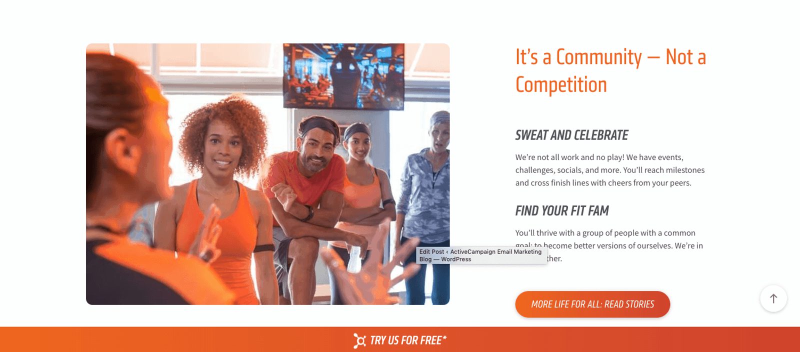
That bottom “sticky” pop-up did not let me forget that I need to stop sitting so much. (Source: OTF)
It wasn’t necessarily a matter of IF I would convert back from a visitor to a member, but WHEN. And I did!
All of those efforts– pop-ups, emails, ads– they may not work immediately, but that doesn’t mean they don’t stand a chance at all (especially if they are well-created and offer an incentive).
Customer behavior tells us a lot, but it can’t tell us everything. The relationships between thought and action aren’t as linear as we’d like, but there is plenty we can do to make the most positive impact on conversion rates possible (including pop-ups), even if it takes time.
So, what is important to remember about pop-ups? It's actually just a single letter.
One letter can help fix multiple pop-up mistakes (hint: it’s after “LMNO…”)
It doesn’t take much to sink or swim with a pop-up, but you kind of want to avoid the sinking part. So, with the help of Andy Crestodina and the letter “P,” you can learn how to avoid mistakes like these.
The 3 P’s of email signup forms
The 3 P’s of email signup forms are Prominence, Promise, and Proof. Each P is important to the success of a pop-up email sign-up form.
- Prominence: The pop-up email sign-up form needs to be visually prominent on the page. This is not only limited to the location of the box but also includes distinguishing traits like the color contrast, fonts, and placing it in more than one location.
- Promise: Let the visitor know exactly what they are getting from you. Signing up for your subscription needs to be a two-way street, so put your promise into words. If it’s a newsletter pop-up, tell them what the newsletter is. If it’s a content download, promotion, or another incentive, provide details.
- Proof: If you’re like me, you read customer reviews of any product you buy on Amazon to make sure that investing your time and money won’t be a mistake. When you use customer testimonials as proof of your subscription’s worthiness, that is gold to your conversion rate.
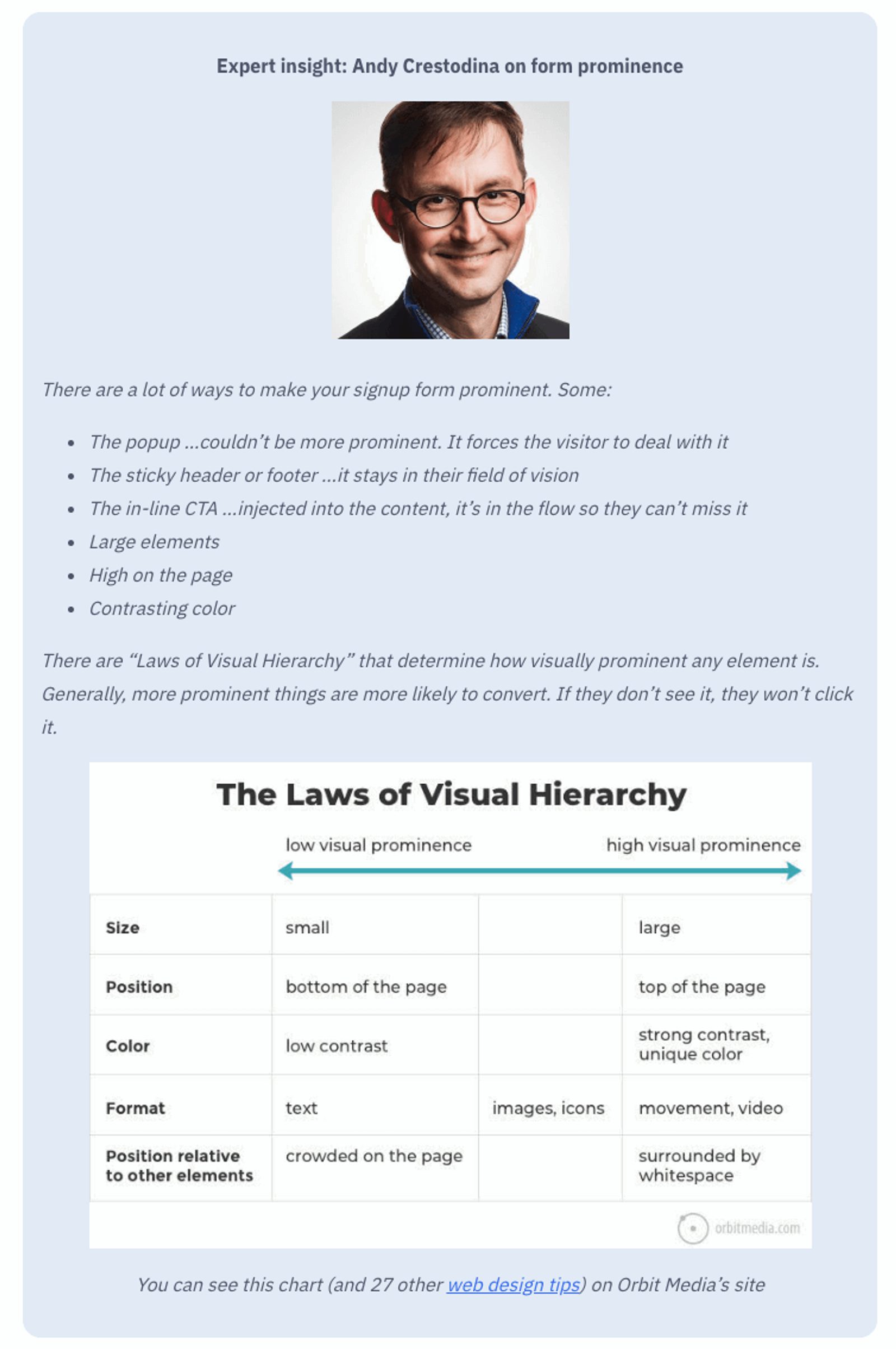
The three Ps can help you avoid making silly mistakes that can sink your conversion rate boat. But wait.
What are the conversion marketing mistakes you’re making?
You might not have a good answer (or any idea), which is why Sumo made this list of “Eight Bulletproof Elements that Increase or Decrease Your Pop-up Conversion Rates.”
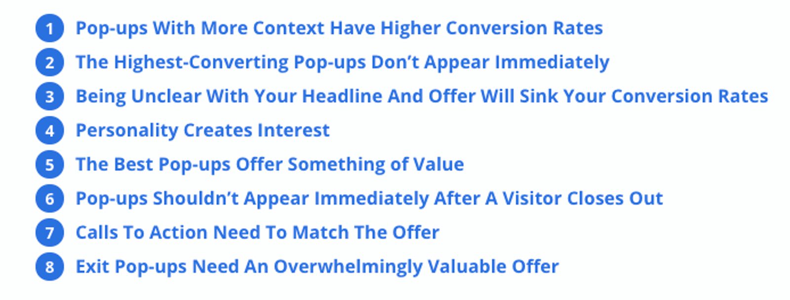
Remember above when we mentioned Gary’s mantra “Content is King, context is God?” Yeah, it’s still important, and if you’re not following it that’s a huge mistake right there.
We already mentioned one very important one, having context, earlier.
Now, we are going to touch on a few more important mistakes to avoid.
“The highest-converting pop-ups don’t appear immediately”
Have you ever walked into a store and been immediately accosted by an overly-enthusiastic salesperson with a smile wider than the Atlantic ocean?
I mean, come on, give me a minute here!!
The same goes for pop-up advertising. As we mentioned earlier, a time-triggered pop-up is popular and will be different for everyone (20 seconds could work, or 40 seconds could work better). But don’t be immediately in someone’s face.
They came for a reason, and it wasn’t your pop-up. Sorry. Wait your turn.
“Being unclear with your headline and offer will sink your conversion rates”
The headline is the first impression, and one that is confusing will all but guarantee you won’t be seeing that person again. Being vague has never helped anyone. “Sign Up for Coupons” is a lot more direct and clear than “Receive Our Emails” (what emails?).
“The best pop-ups offer something of value”
“What’s in it for me?” If you can’t answer this question from your visitor’s perspective, it’s time to return to the pop-up drawing board. This pop-up form is about to begin a relationship between you and a customer, and it has to be a give and take.
Offer something of value, not something that that even you yourself wouldn’t want.
If it’s a new subscriber, they may not just take your word for it that your blog or site is worth it. They need an unbiased opinion right at the sign-up point.
Who knew one letter could make such a difference?
BONUS: Keep an eye out for great pop-up form examples that use the three Ps throughout this post. Maybe one of the examples will inspire you!
What types of pop-ups are best for conversions?
One of the negative implications of pop-ups is the assumption that they all have to excitedly (and literally) POP UP.
This is false. There are multiple different pop-up best practices you can use that aren’t intrusive, and that are way more effective at lead generation and conversion than a pop-up so aggressive that you can almost hear its visual presence screaming at you.
Here are your options:
1. Entrance and Exit Intent Pop-ups
They catch you going in, and they catch you going out. An entrance or exit intent pop-up ensures that there’s never a missed opportunity during your time spent on that page.
You might be worried that a pop-up right upon entering or about to leave sounds a little...well...desperate. It’s not. In fact, it just might be your conversion saving grace.
The Skimm certainly benefited from it with their entrance pop-up. According to a Nieman Lab report. this newsletter had over 1.5 million subscribers as of August 2015.
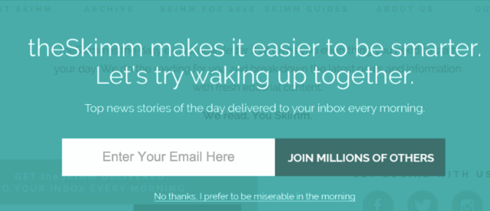
Mornings are already miserable enough. Please, Skimm, make it better.
Waking up on a Monday is the WORST. But The Skimm makes it better with a pop-up that is triggered after a certain amount of time is spent on the page.
- It’s prominently shown on the homepage with an inviting color.
- It’s promising top daily news and a better way to wake up.
- It’s offering proof that you’re not alone in signing up.
Did you know that WPBeginner increased their subscribers by nearly 600% with an exit intent pop-up? One effective pop-up and they went from collecting 70-80 subscribers per day to a whopping 445-470 per day. Don’t knock it until you try it.
2. Overlay, or Modal, or Lightbox
These terms are used somewhat interchangeably. Some even call them out separately from “pop-up.” Nevertheless, they are a type of pop-up.
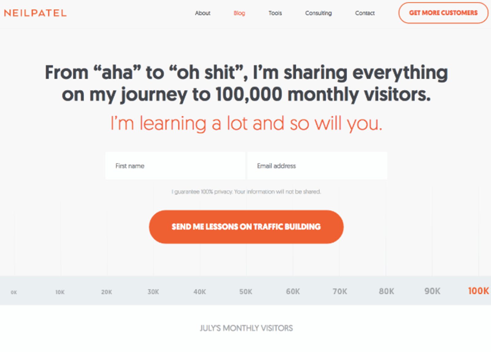
It's like he's inside your head with that kind of copy.
Neil Patel is a marketing household name, and his pop-up displays all the things that a good one needs to draw you in with plenty of social proof and compelling copy.
This popup works because:
- It has a prominently shown, clear headline that uses relatable speech.
- It’s promising a great value in the well-worded headline AND in the subtitle.
- It’s offering proof that this is a group learning effort, that you’re not alone in the process. Also, the CTA tells you exactly what you’re getting.
Here's another example from Coschedule.
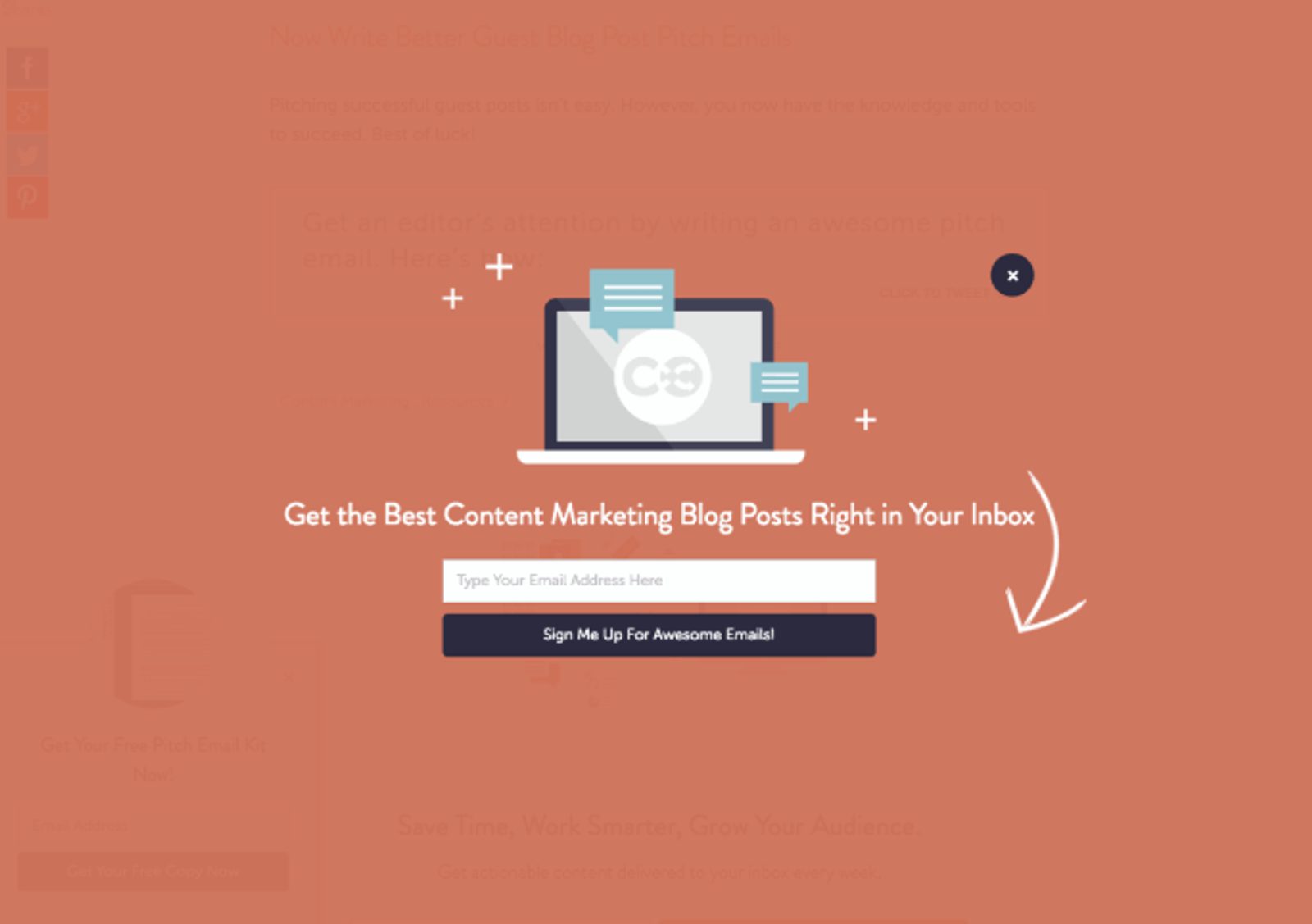
Built-in GPS.
Coschedule is known for producing great content, and they are ready to guide you to it.
This pop-up works because:
- It’s a prominently displayed overlay that isn’t intrusively loud, and the arrow provides a clear, directional cue to make sign-up simple.
- It’s promising quality blog content about marketing. No surprises here, and it’s a promise that can be delivered on.
- It’s offering proof that they will only be sending you those emails by stating it in the CTA.
An overlay typically comes on slowly and unassumingly. You may notice the page you’re staring at slowly starting to fade as the overlay pop-up appears.
No scary pops or crazy distractions. Just a nice, subtle nudge of a pop-up kindly asking you to opt-in.
3. Slide-in boxes
These might remind you of aggressive pop-ups, but don’t sell them short.
You’ll see these sliding into view typically from the side or bottom of a page.
MadMimi analyzed a heat map test and noticed that slide-in subscribe leads had a much better conversion rate than any regular pop-up. Based on this, they concluded that slide-in pop-up box converted best for them at approximately 80% scrolled down the page.
The bottom line of this is, give people a chance to catch their breath before sending pop-ups into action.
4. Sticky forms
You land on a page. A message pops up, then stays up. Forever (or however long you are on that page). They are often stuck to the bottom or side of a page and will follow you wherever you scroll.
This style element of a pop-up can ensure that it won’t be missed, but be careful with the design. No one wants a footer that they can’t get rid of which cuts off a quarter of the page.
In the above Orangetheory example, you’ll notice that their sticky pop-up form is unintrusive, and doesn’t take away from my experience of reading the page.
Any of these pop-up types can be triggered by one of the following:
- Time spent on a page
- Scrolling to a certain point
- Entering or exiting a page
- Performing a specific action (like clicking on a page element)
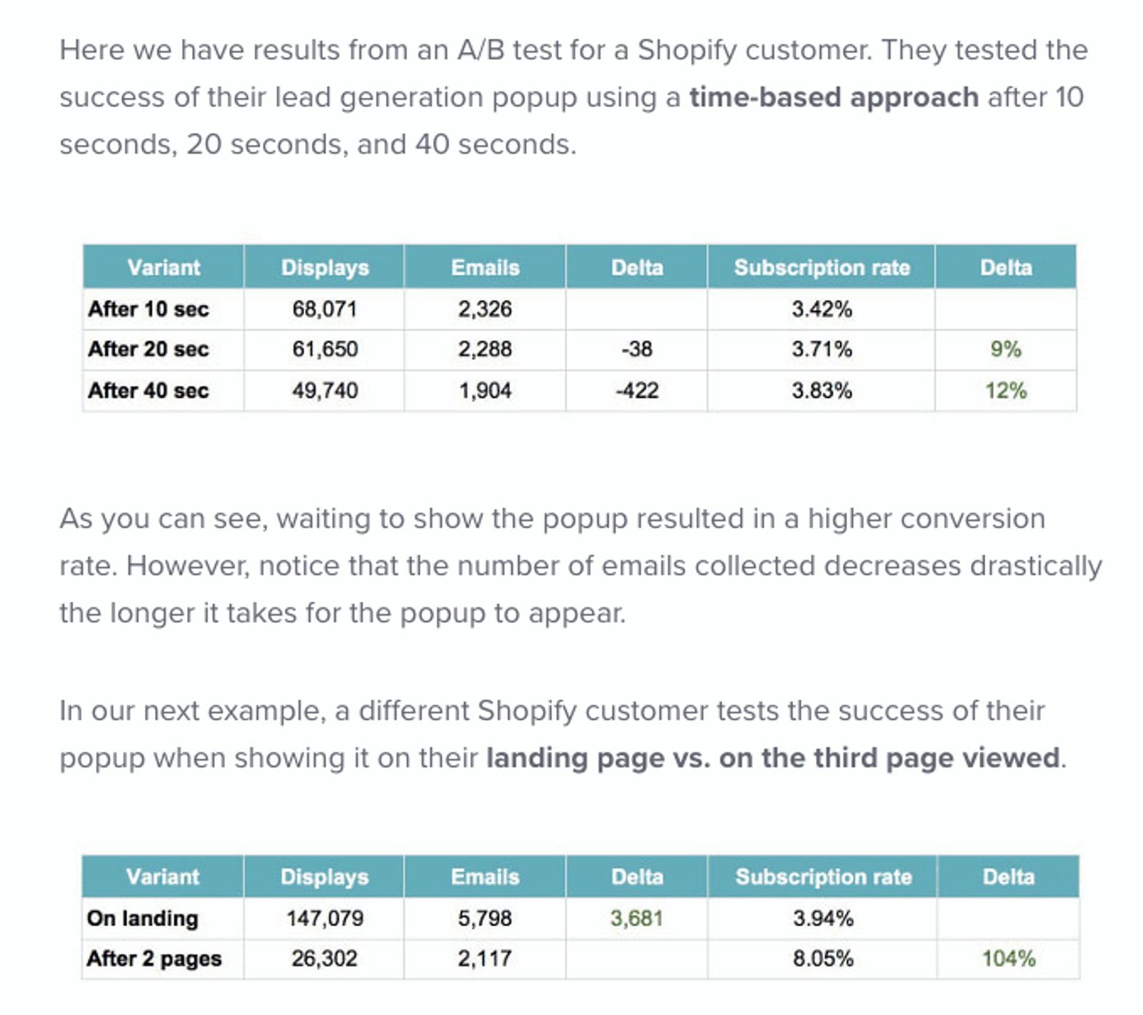
Time triggers are a common practice, particularly for entrance and exit intent pop-ups. These pop-ups will be triggered by a preset amount of time spent on a page. The best timing of a pop-up will vary slightly case-by-case, as it is a balance between too soon and too late.
Take a look at this example of how different timing can affect your conversion rate.
(Source: OptinMonster)
Now, this may be confusing at first, considering that a longer time trigger meant more pop-up conversions, but fewer emails. Just remember, it’s quality over quantity.
In other words, fewer qualified leads that convert well are better than more unqualified leads that only appear to convert well. Test different times to find the best one for you.
Don’t expect your website pop-up message to have an effect in the amount of time it takes for one to even show up. Good things take time. You will need to allow time to gather dependable data about how well they will work for your conversion rate.


