At least 1 in 3 people have their email images turned off.
Lots of people don’t even see your awesome email design. That makes your call-to-action email button your only chance to get conversions.
But if your button is also an image, no one will ever see it.
What if you could protect your email campaigns from that? What if your email CTA buttons were...bulletproof?
Keep reading to learn:
- What bulletproof buttons are
- Four HTML code styles to make your own bulletproof email buttons
- Examples of email design with (and without) bulletproof email buttons
- How ActiveCampaign makes bulletproof email buttons easy
What are bulletproof buttons?
A bulletproof email button is a call-to-action (CTA) button that displays across ALL inboxes. Because it’s written in HTML with no images, the CTA button shows whether the recipient allows images in emails or not.
People decide if they’ll delete your email in under 3 seconds. That’s even when they can see your email graphics.
You spend a lot of time on your emails. Successful marketing campaigns use best email practices in:
- Subject lines
- Email preheaders
- How to write great copy
- Types of emails to send customers
- How to grow your email list
If you use image-based CTA email buttons you’re leaving a dangerous chink in your armor – and those best practices won’t matter.

Your emails should be Wonder Woman: impervious to bullets (or images turned off)
Once upon a time, email clients blocked default image displays to stop spammers from infecting users’ computers with malware.
In 2013, Gmail changed the game by running images through Google’s own secure servers. The “display images below” banner was a thing of the past. This was awesome news for businesses — hyperlink button graphics and product images displayed with a subject line click.
But a year later, Litmus released stats showing 43% of Gmail users changed their settings to turn automatic image downloads back off.
And many other email clients, like Outlook, still don’t automatically download images at all.
Why would people leave email images turned off? Reasons to not display images by default (and why you should use bulletproof buttons) are:
- Practicality. Images may be turned off (or just not display) when emails load at a snail’s pace – because data service is weak or patchy
- Accessibility. A screen reader (a program that “reads” through speech content of a page) can’t see the text in a GIF or JPEG. That will make your email inaccessible for visually impaired subscribers.
- Privacy. Google it, and you’ll find many articles advising people to turn off automatic image downloads so they can’t be tracked
Some good news: many email software programs generate bulletproof buttons. But what if you need to create email buttons with code?
4 ways to make bulletproof buttons in your emails
Here are four coding styles you can use to create your own bulletproof email buttons:
- VML buttons
- Padded buttons
- Border-based buttons
- Combined padded/border buttons
1. VML buttons
VML (vector markup language) is a popular way to make bulletproof email buttons. It can be tricky to get right if you’re not familiar with the coding language. Luckily, buttons.cm will generate VML bulletproof button code for you and make the process easier.
Pro: The entire button is clickable
Con: You have to use a difficult coding language
<!--VML button--> <table border="0" cellpadding="0" cellspacing="0" role="presentation" style="border-collapse:separate;line-height:100%;"> <tr> <td> <div> <!--[if mso]> <v:roundrect xmlns_v="urn:schemas-microsoft-com:vml" xmlns_w="urn:schemas-microsoft-com:office:word" href="https://www.activecampaign.com" style="height:40px;v-text-anchor:middle;width:130px;" arcsize="5%" strokecolor="#19cca3" fillcolor="#19cca3;width: 130;"> <w:anchorlock/> <center style="color:#ffffff;font-family:Helvetica, sans-serif;font-size:18px; font-weight: 600;">Click here!</center> </v:roundrect> <![endif]--> <a href="https://www.activecampaign.com" style="display: inline-block; mso-hide:all; background-color: #19cca3; color: #FFFFFF; border:1px solid #19cca3; border-radius: 6px; line-height: 220%; width: 200px; font-family: Helvetica, sans-serif; font-size:18px; font-weight:600; text-align: center; text-decoration: none; -webkit-text-size-adjust:none; " target="_blank">Click here!</a> </a> </div> </td> </tr> </table>
2. Padded buttons
A padded bulletproof email button uses an HTML table to make the button, using padding in the table cell to form the structure. HTML attributes and CSS are used to style the button.
Pro: Uses HTML, which makes it easier to code and update
Con: Only the text inside the button is clickable, which can lead to user confusion
<!--Padded button--> <table border="0" cellpadding="0" cellspacing="0" role="presentation" style="border-collapse:separate;line-height:100%;"> <tr> <td align="center" bgcolor="#19cca3" role="presentation" style="border:none;border-radius:6px;cursor:auto;padding:11px 20px;background:#19cca3;" valign="middle"> <a href="href="https://www.activecampaign.com" style="background:#19cca3;color:#ffffff;font-family:Helvetica, sans-serif;font-size:18px;font-weight:600;line-height:120%;Margin:0;text-decoration:none;text-transform:none;" target="_blank"> Click here! </a> </td> </tr> </table>
3. Border-based buttons
A border-based bulletproof email button is a lot like a padded bulletproof button. Both use HTML and CSS to build and style the button. But instead of padding in the table cell to structure the button, thick borders are added to the link.
Pro: Simplified code and highly scalable
Con: Outlook doesn’t like these buttons (it doesn’t recognize < a > tags as block-level elements), and will resize them smaller
<!--Border based button--> <table border="0" cellpadding="0" cellspacing="0" role="presentation" style="border-collapse:separate;line-height:100%;"> <tr> <td align="center" bgcolor="#19cca3" role="presentation" style="border:none;border-radius:6px;cursor:auto;padding:11px 20px;background:#19cca3;" valign="middle"> <a href="href="https://www.activecampaign.com" style="background:#19cca3;color:#ffffff;font-family:Helvetica, sans-serif;font-size:18px;font-weight:600;line-height:120%;Margin:0;text-decoration:none;text-transform:none;" target="_blank"> Click here! </a> </td> </tr> </table>
4. Combined padded/border buttons
Combined padded/border bulletproof email buttons use both padding and a solid border, along with a background color.
Pro: Easy to update, and background images are supported
Con: Styling is included in the < a > and < tr > tag, so both need to be updated if style changes are made
<!--Padding and border combo button--> <table border="0" cellpadding="0" cellspacing="0" role="presentation" style="border-collapse:separate;line-height:100%;"> <tr> <td align="center" bgcolor="#19cca3" role="presentation" style="border:none;border-radius:6px;cursor:auto;padding:11px 20px;background:#19cca3;" valign="middle"> <a href="href="https://www.activecampaign.com" style="background:#19cca3;color:#ffffff;font-family:Helvetica, sans-serif;font-size:18px;font-weight:600;line-height:120%;Margin:0;text-decoration:none;text-transform:none;" target="_blank"> Click here! </a> </td> </tr> </table>
Bad, better, best: 3 examples of bulletproof buttons in action
Here are three ways bulletproof buttons can make — or break — your email’s user experience.
Bad (Valfre)
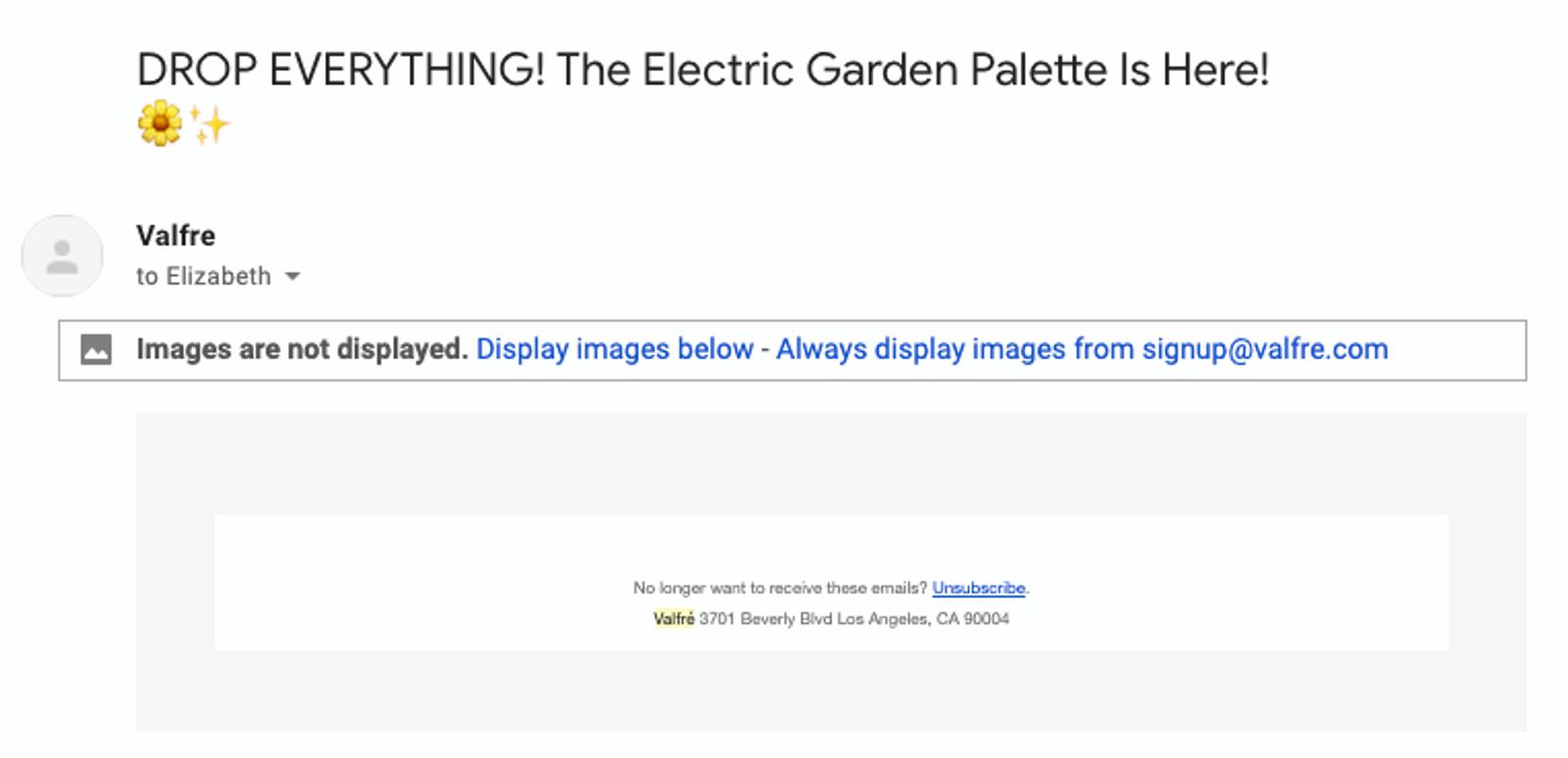
Without images: This is why you can’t rely on images to do your work for you. I will not drop everything, because the Valfre Electric Garden Palette is not here.
Why this image-blocked email doesn’t work:
- No bulletproof email button. You can’t have a great click-through rate if there’s nothing to click
- No text. The marketing copy and call-to-action is in the image, so at least a third of readers can’t read it
- No alt tags. There are no image alt tags to signal what’s inside the image. It’s not clear why it’s worth downloading. This email is as empty as our interest in whatever product they want to promote.
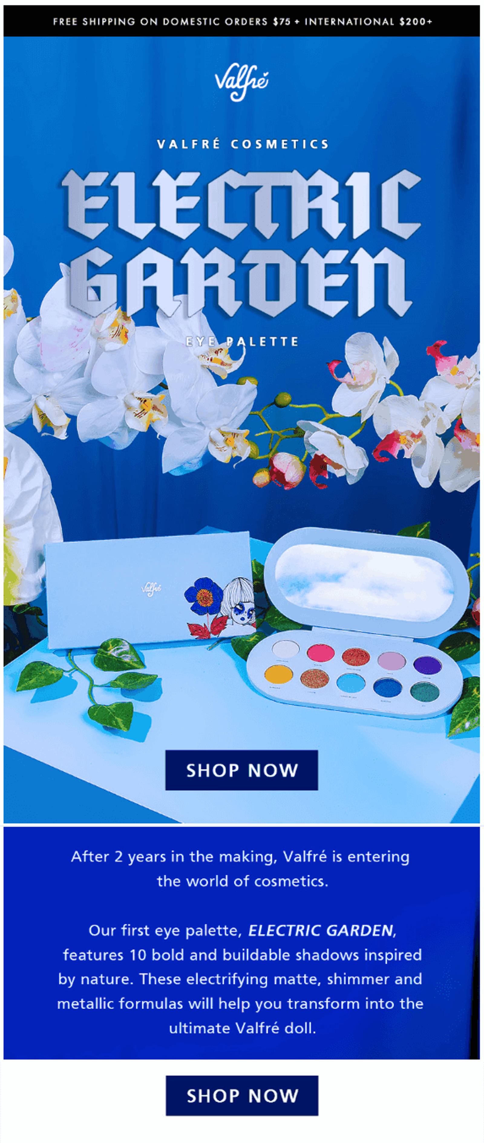
Email with images:
2. Better (Stanley Donwood)
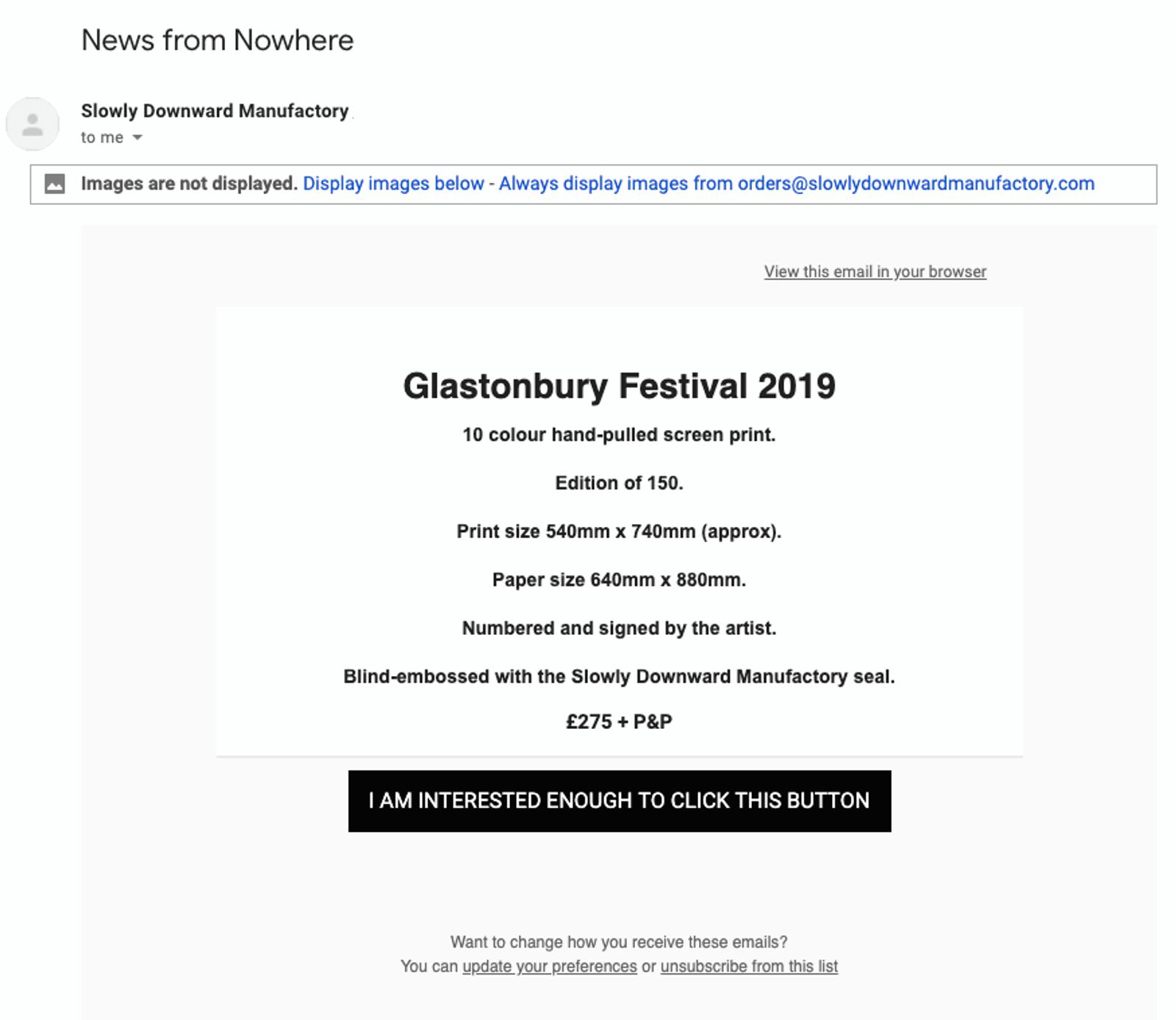
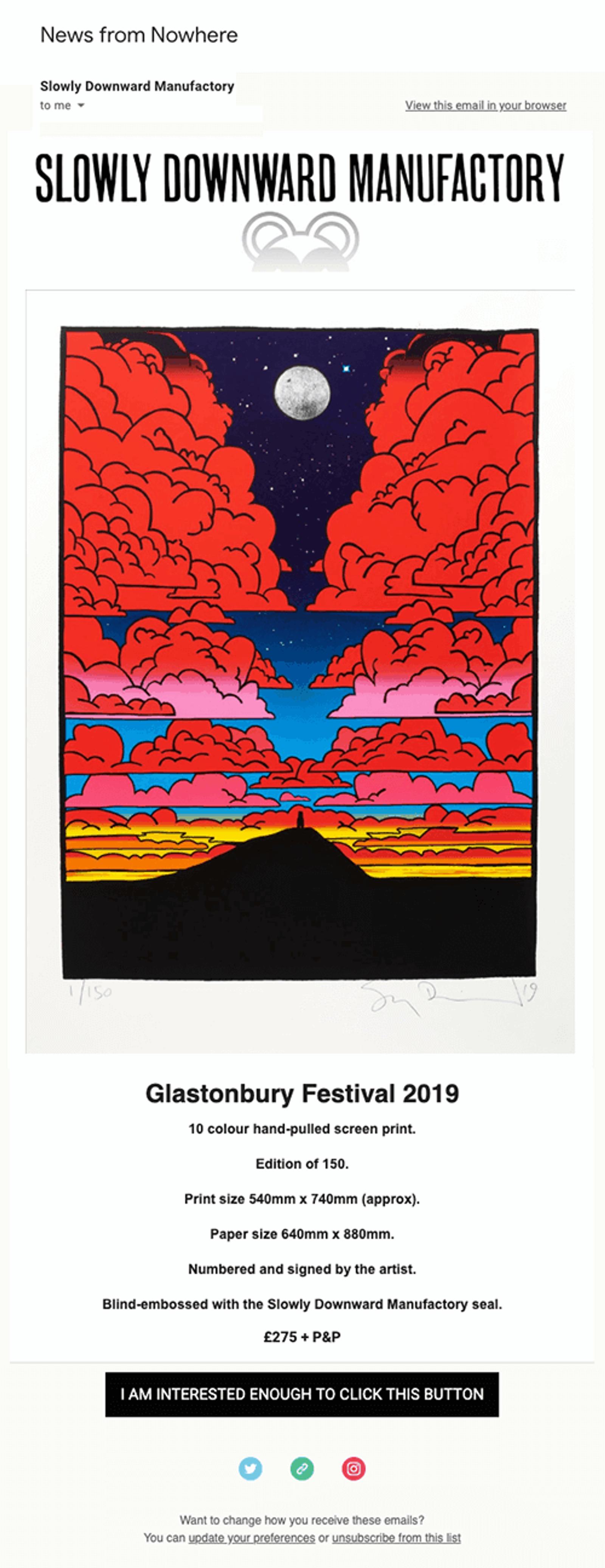
Without images: If your product is an image, it’s easy to shrug off how important bulletproof email buttons are. Artist Stanley Donwood doesn’t agree. You can’t see his art – but he makes it easy to decide yes, you are interested enough to click this button and visit the landing page.
Why this image-blocked email is good:
- Clear product descriptions. The detailed product description is text so information isn’t lost with email images turned off
- Bulletproof button. The bulletproof CTA has great microcopy, too
Email with images:
3. Best (Quip)
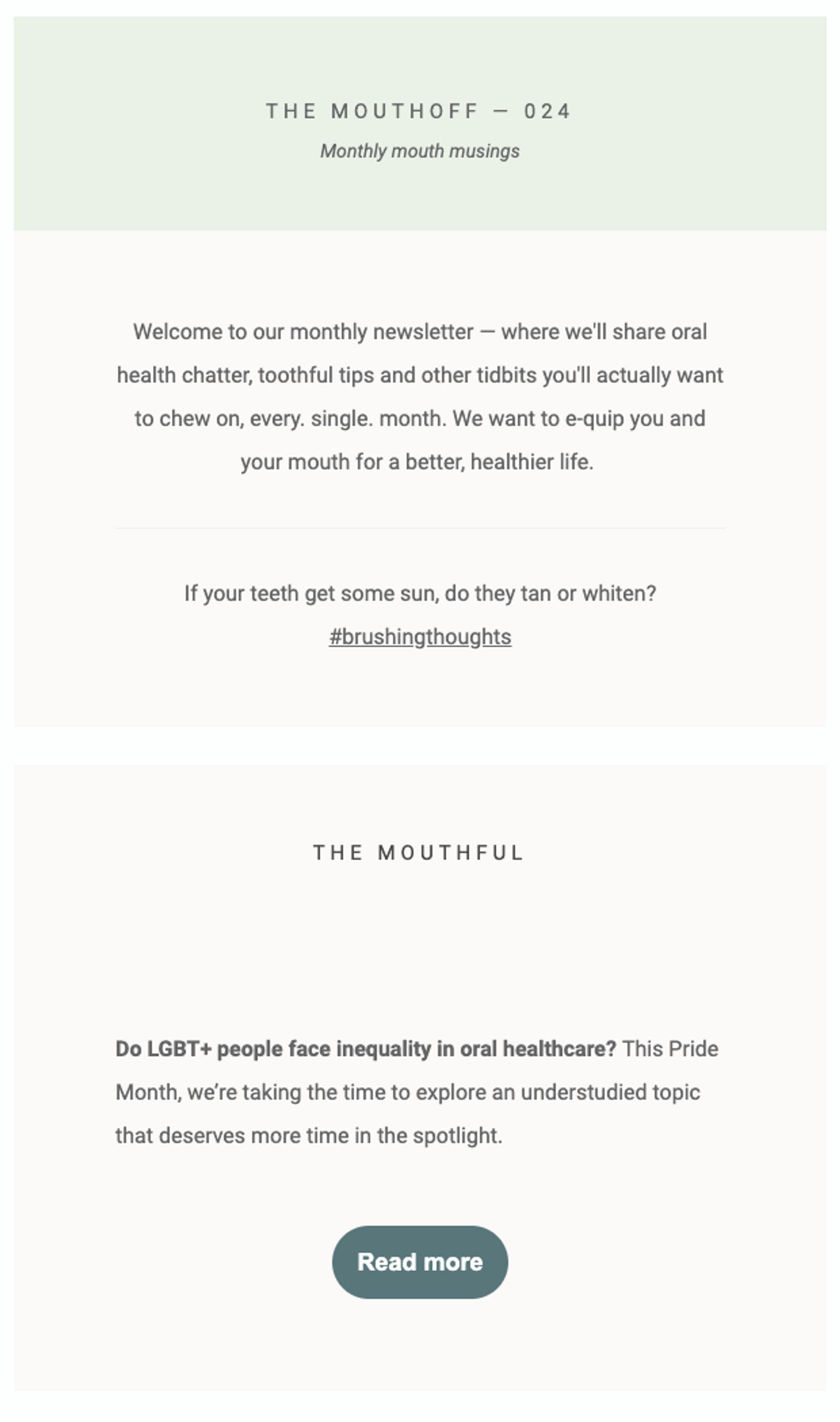
Without images: Quip has crafted a perfect newsletter email example that shows a lack of images doesn’t equal a lack of cohesive design. It’s accessible to everyone and the bulletproof buttons pop…exactly as a CTA should.
Why this image-blocked email is great:
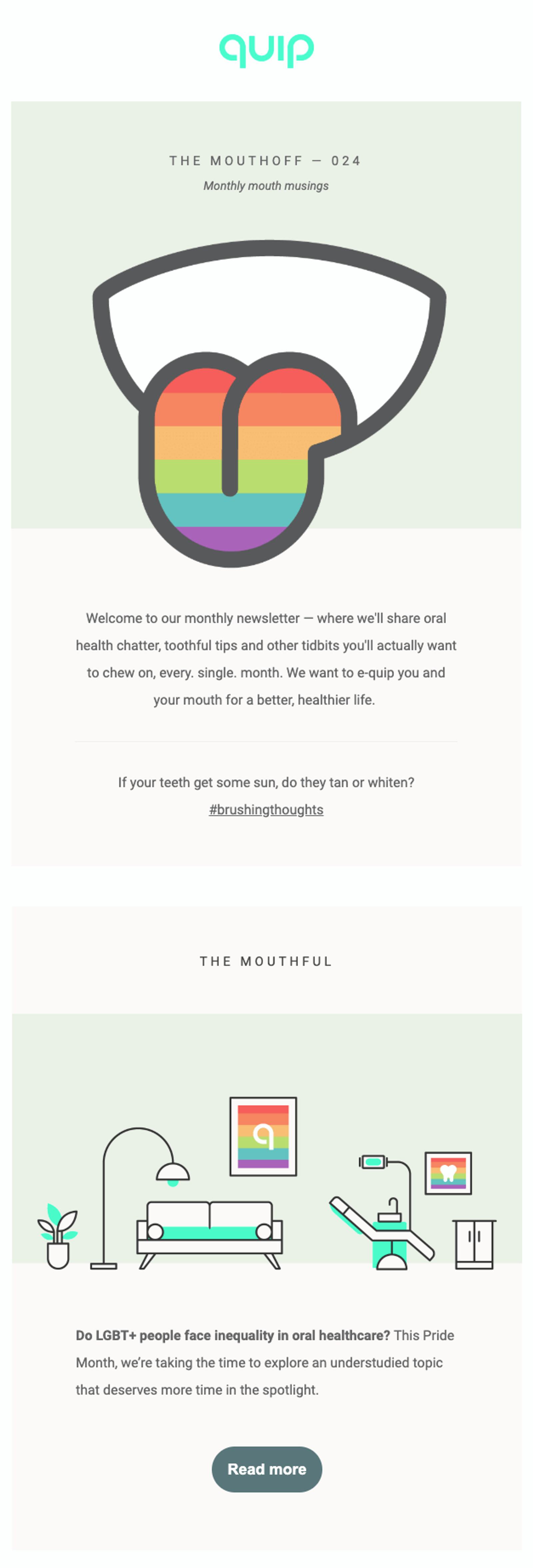
- Responsive design. This email features bulletproof buttons — and a responsive background, as well. You aren’t even aware there are missing images.
- Accessible copy. The copy is styled so it’s easy (and attractive) to read without images turned on. And a newsletter is a great way to engage your audience.
Email with images:
ActiveCampaign makes bulletproof email buttons automatically
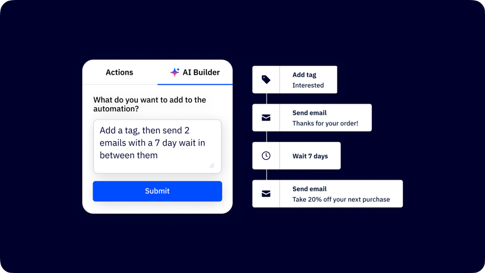
ActiveCampaign automatically makes bulletproof buttons for your email campaigns. Our design editor gives you options to create dynamic email CTAs that will show up in people’s inboxes exactly as you style them — every time.
Try it now, for free
Blocked images in email can be an embarrassment that loses you leads, subscribers, and sales…but there’s an easy fix.
Images should build engagement. They shouldn’t deliver important information. When you use image-free bulletproof email buttons with thoughtful design and copy choices, your entire list gets emails with the information you want them to get.

Emails have a job: to convert people with a CTA email button. Here’s an ActiveCampaign email that does that…even without graphics.

