Long live email marketing, for email is the king of marketing efforts.
Why?
- It’s cost-effective
- You can use it to reach people at every stage of the customer lifecycle
- It gives you the chance to showcase your brand in creative ways
- You get valuable data from customer behavior
- You can automate emails (and take a lot of the work out of marketing)
59% of people say that email marketing influences their purchases.
But bowing before email marketing and calling it king isn’t going to make it magically boost your customer engagement.
To have great email marketing, you need great email ideas.
And unfortunately, they don’t sell those in bulk at Costco (but God if they did…)
Where do you get all of these email ideas from, then?
You’ll need a lot of them. Increasing customer engagement isn’t a one-time job.
By the end of this post, you’ll have:
- 11 unforgettable email ideas (with killer examples) to inspire your most engaging campaigns ever
- 5 fast ways to think of even more ideas that are so simple you’ll wonder why you didn’t think of them before
Email-palooza starts now.
The 11 email ideas you’ve been waiting for are…
Here are 11 excellent examples of email ideas:
- Welcome emails
- Giveaway emails
- Newsletter emails
- New product launch emails
- Feedback request emails
- Can’t-miss sale emails
- Thank you emails
- Subscription anniversary emails
- Seasonal emails
- Cart abandonment emails
- Order confirmation emails
Try it now, for free
1. Effective welcome emails
The First Impressions Email Marketing Study conducted by Ciceron said that only 39% of brands send a welcome email.
39%. As a marketer, I’m wondering how in the world that number is so high – because if you’re not sending a welcome email, what are you sending as your first email?
The first email you send is how you make your first impression.
Knowing that, how can you NOT have a welcome email plan in place?
Whether you are one of the 39% or just looking to revamp your current welcome emails, I am including 3 examples of welcome emails because they are critically important.
Create a thorough welcome series (like True Citrus)
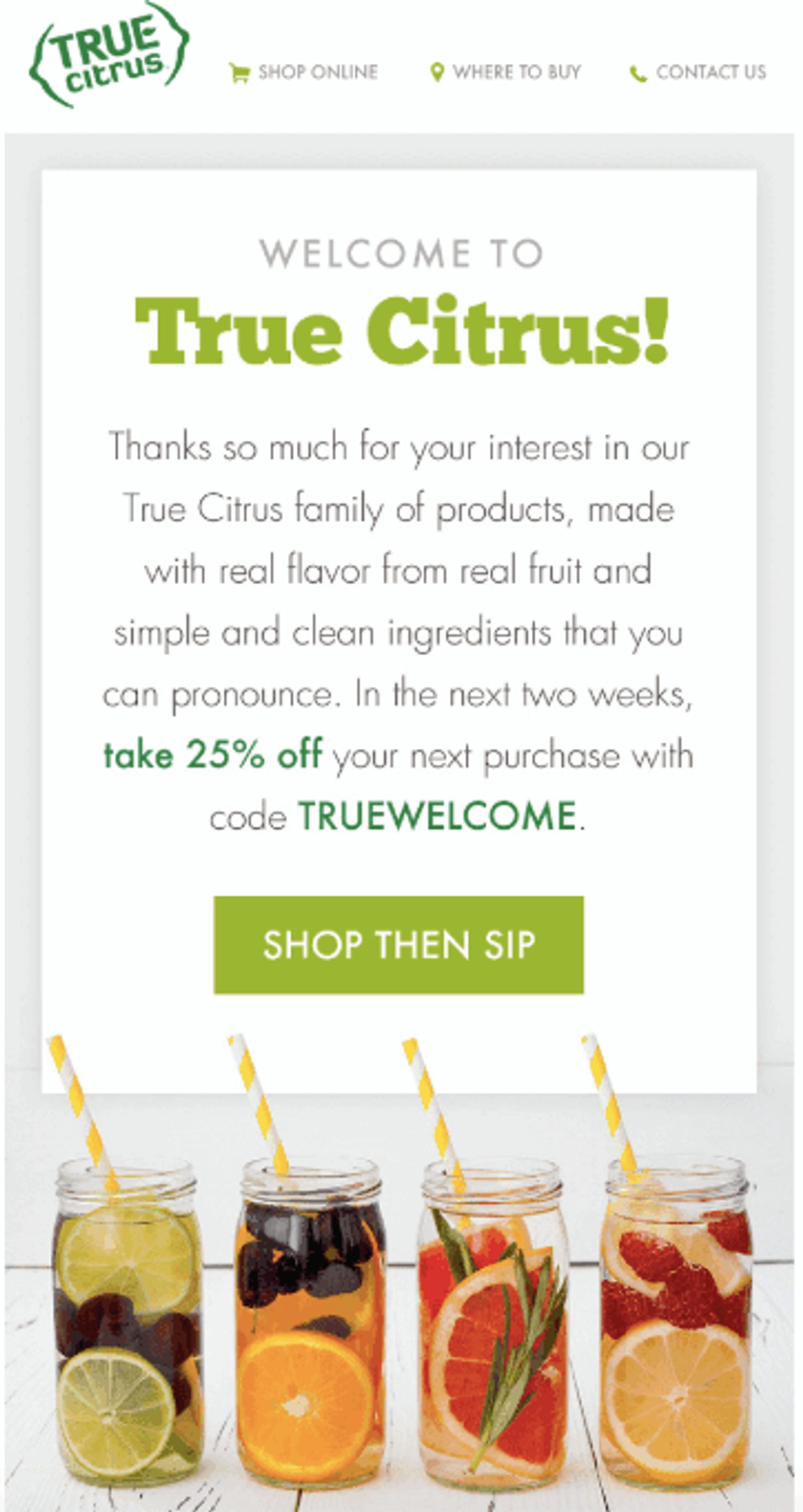
True Citrus, a company who creates crystallized citrus products for water, drinks, and recipes, sends out this welcome email.
What we like about it:
- The fact that this is only 1 of 4 welcome emails from True Citrus.
- The copy and call-to-action
A welcome email series is far more effective than a single welcome email. This True Citrus email is the first welcome email out of a series of 4.
Based on click/purchase behavior from this send, True Citrus segments their welcome series to send a message to those that used the coupon code or a separate message to those that have not made a purchase using that code.
The copy is simple and gives the new customer a discount to make their first experience even better.
The call-to-action is not only clever but makes it clear what to do next. Shop their product, then sip their product. And you can’t lose when you use alliteration.
Make your emails personal (like Copyhackers)
Joanna Wiebe of Copy Hackers is the original “conversion” copywriter. And she has the email writing chops to prove it.
What we like about it:
- They personalize it
- It takes advantage of high engagement opportunities
The value of a personal, emotional connection with your customers can’t be understated. Harvard Business Review takes a closer look at just how valuable emotional marketing makes a customer.
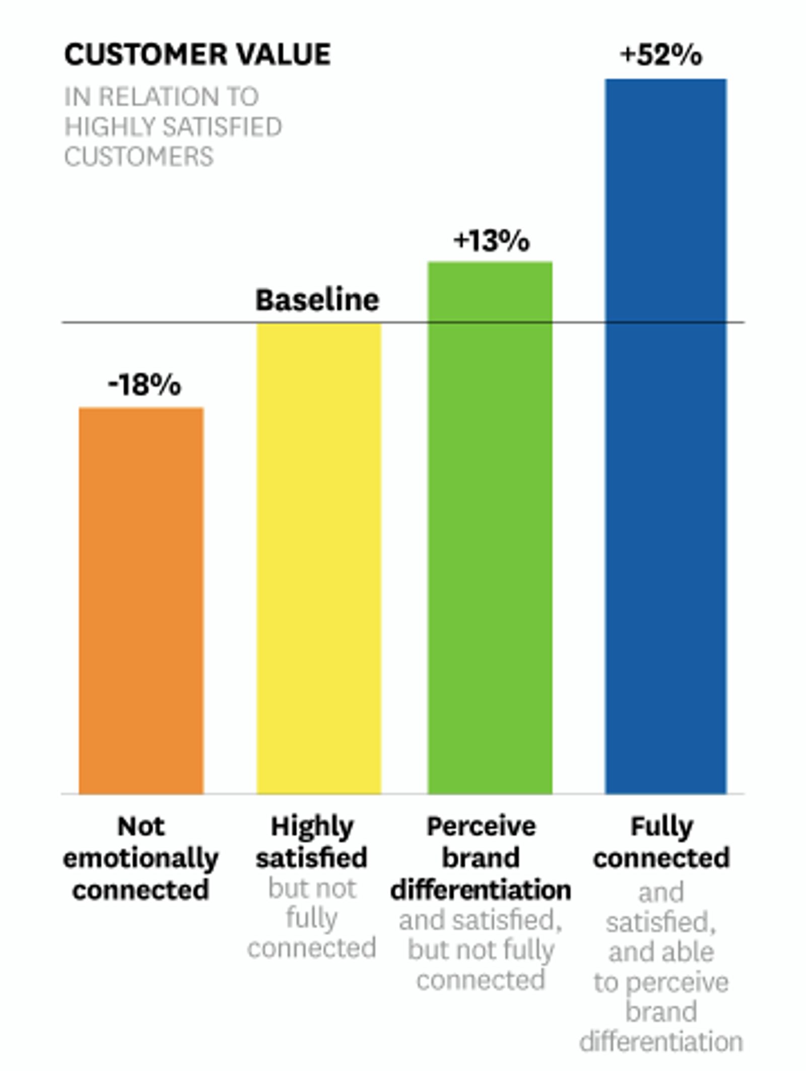
Fully connected customers are 52% more valuable, on average, than those who are just highly satisfied. (Source: Harvard Business Review)
Did you notice that Joanna uses a first name and not just a straight-up “welcome?” Personalization is key for B2C emails – it makes them feel less “one-of-the-many.”
Taking advantage of high engagement is something that not all welcome emails do – but this one does, and does it well. Take this opportunity to offer some extra relevant content (like Joanna does).
She likely does this by segmenting her audience based on interest and which links they click. Any information you can collect on your subscribers’ interests can be useful down the line.
2. Giveaway email examples
Who doesn’t love a giveaway?
When jewelry candle maker JewelScent hosted a giveaway the week before Valentine’s Day, they grew their email list by 3,431 new subscribers AND made $18,776.49 in 8 days.
Giveaways work. People like free stuff, and that will never change.
Lucky for you, you don’t have to host a giant event to promise a little free swag. An email can do it for you.
Here are two good examples of giveaway emails.
Target emotions while creating urgency (like Birchbox)
Screen Recording 2019-03-06 at 09.01 AM.mov(Source: Really Good Emails)
What we like about it:
- The headline copy is emotional and time-sensitive
- The CTA includes you
I’m not the only person who played with a cootie catcher like the GIF in this Birchbox email (right? right?).
Seeing it immediately sparked interest and emotions in me that made me more receptive to clicking on it (plus – free gift opportunity).
The “Let’s Play” CTA sounds fun! So, of course, you’re more likely to click on it. They’ve created a “game” and invited you to play with them.
Make irresistible promises (like The Knot)

I have to call out this subject line, because...yes.
Weddings are expensive and brides are stressed – do you think ANY bride is going to skip clicking on this?
And when they do, this is what they’ll find. A beautiful, free chance to win free money to bring their dream wedding to life.
Screen Recording 2019-02-23 at 09.49 PM.mov
What we like about it:
- The subject line draws you in
- Effective zig-zag design layout
I’m going to keep singing the praises of that subject line, because they really nailed it.
Consider the following 4 tips:
- Make it relevant
- Make it personal
- Make it curious
- Make it urgent
Your email subject line is what draws people in. It’s where you have the chance to grab attention and force people to click with the power of curiosity.
And who wouldn’t be curious about getting $3,000 for free?
Now about that zig-zag design layout…
A zig-zag or “angular” layout is both enticing to look at as well as functional to order lots of information and imagery, according to Canva graphic designer Mary Stribley.
The Knot combines call-to-action opportunities, beautiful images, and simple, clear copy to make reading this email easy and enjoyable.
3. Newsletter emails
Newsletters are an extremely common practice for brands (and a good one at that). But that doesn’t mean good newsletters are easy.
Ramit Sethi, author and owner of I Will Teach You To Be Rich, knows the value of a dollar (and how to teach others about it). He also happens to be skilled at copywriting and marketing. Every email he sends is content-rich and helpful.
His expertise might be finance, but Ramit Sethi can also take you through developing a great newsletter step-by-step.
How to write emails that get opened with Ramit Sethi
Now you can check out this example from Land O Lakes.
Sometimes emails aren’t about what you want from your customers (a purchase), but rather what you can give them (value).
A newsletter email like Land O Lakes does just that.
Give value beyond your product (like Land O Lakes)
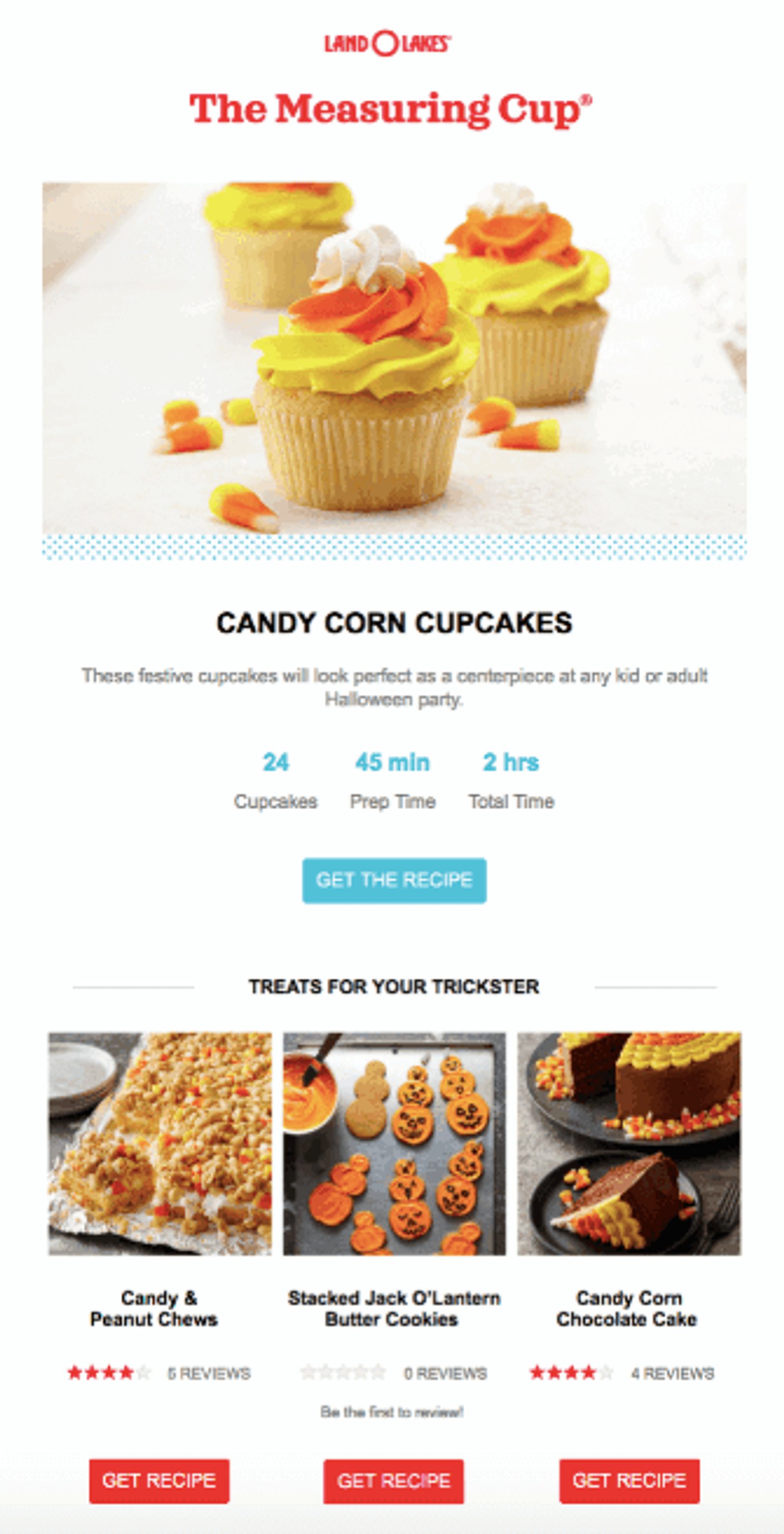
Land O Lakes has a newsletter called “The Measuring Cup” (cute, right?).
The email itself is just as cute.
What we like about it:
- Inviting images
- Immediately attainable value
Seasonally-relevant emails are all the rage during high-volume ecommerce times like Halloween, Christmas, and Black Friday. They give you a chance to get creative, which is what Land O Lakes did.
First, they focused on images (a picture is worth a thousand words).
People process visuals 600,000 times faster than text. You only have a few seconds to capture attention after someone opens your email, which means speed is important.
An image sets the mood and helps convey the ideas in the copy. Right away, a bright, high-quality image in the theme of the season catches the opener’s eye.
This newsletter gives double the customer value by showcasing:
- The non-obvious uses of the product (because few people will eat sticks of butter)
- Multiple recipes in the email (with a full snapshot view)
I wouldn’t mind seeing that cupcake (and its recipe) show up in my inbox.
4. Product launch announcement emails
You’ve got new products! Time to tell the world.
But who in the world will find this new product interesting and useful?
Maybe it’s targeted towards…
- Men
- Women
- Men and women
- Families
- Children
- Singles
- Millennials
- Carnivores
- Vegetarians
How do you decide?
Audience segmentation can help you with this, but sometimes your new product launch emails can serve multiple audiences.
No one likes to be left out, so when they added new items to their menu, Pret didn’t let that happen.
Be audience-inclusive (like Pret)
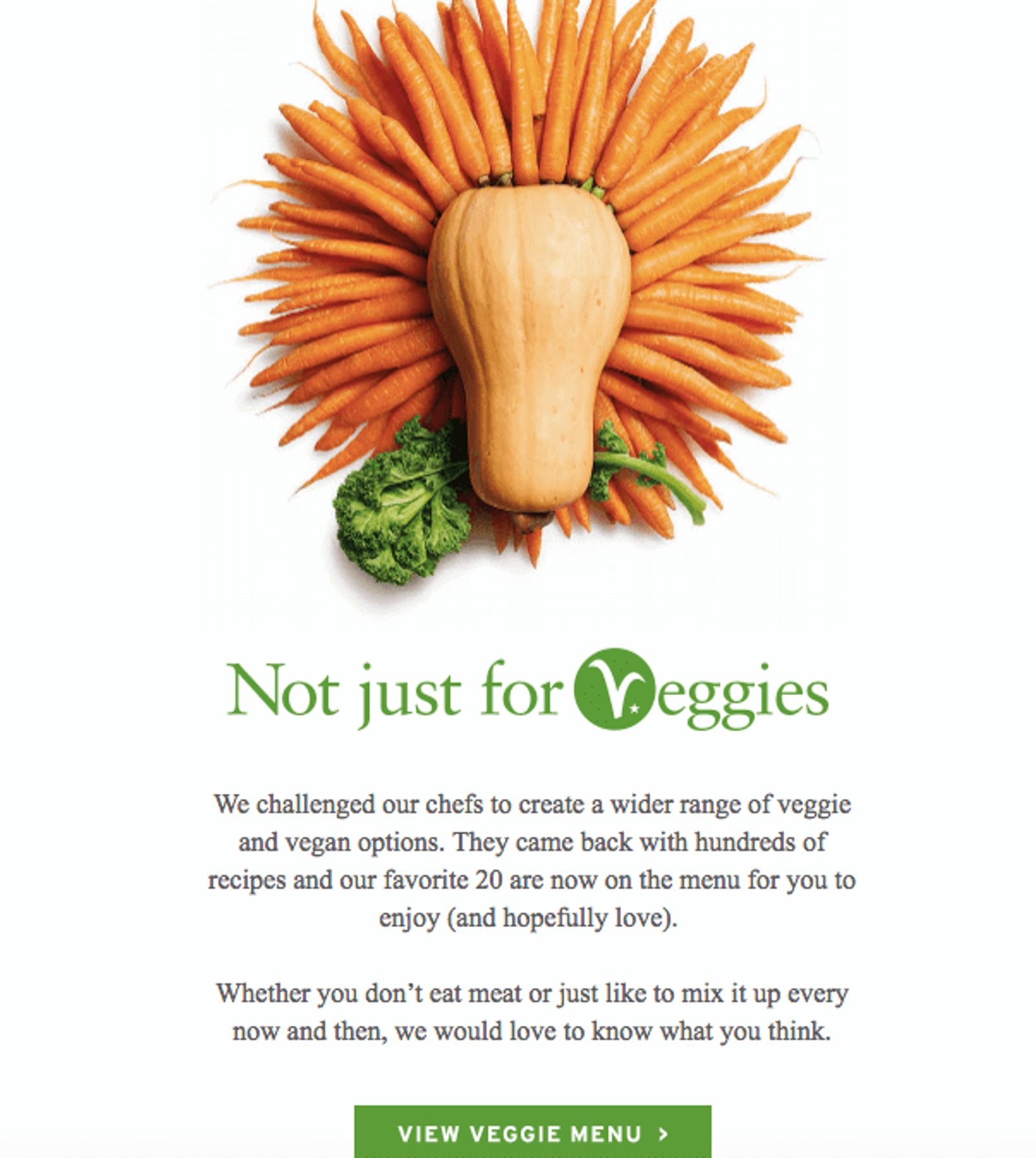
What we like about it:
- It’s audience-inclusive
- It teases information to prompt clicking through to the site
Being audience-inclusive lets you extend your reach while still being targeted.
In this case, Pret targeted their new product towards vegetarians.But they made a point to mention that it’s still a great product for people outside of the target.
There’s an advantage to only teasing content in an email rather than including absolutely everything in it. If you tease your content well-enough, it can increase the chance of a click-through to your site.
Pret used an enticing image and included just enough detail in their copy to make clicking a natural next step.
5. Customer feedback email
You never know until you ask.
That’s why you should simply ask for feedback via a survey. But here’s the thing.
A lot of people ignore surveys.
This can happen because:
- They don’t understand what you’re asking them
- It’s too much work to do
- They don’t want to give out personal information
- They don’t know you well enough to share their personal thoughts
Whatever the reason, you need a fan-freaking-tastic email to get people to give you that desperately-needed feedback.
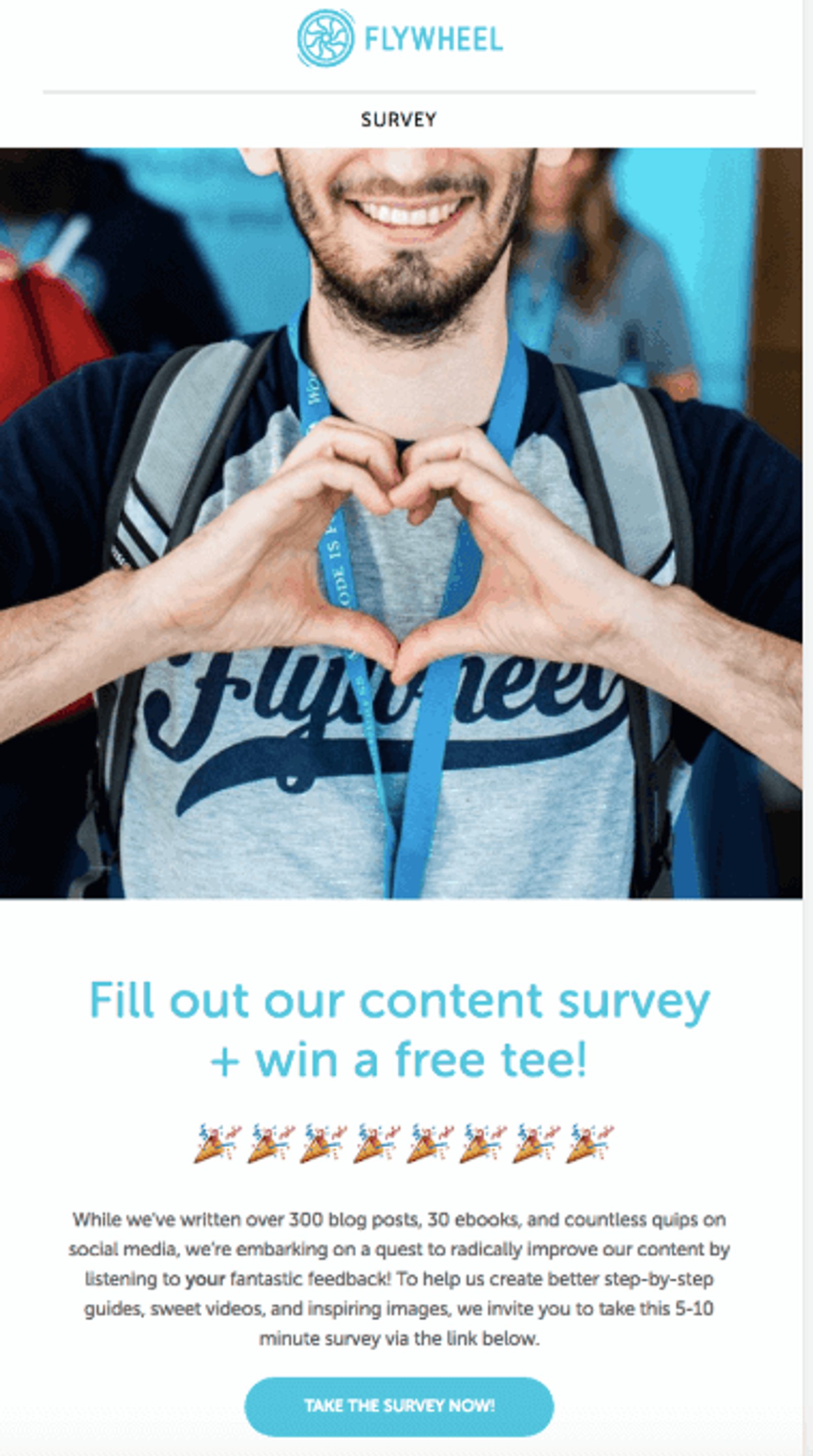
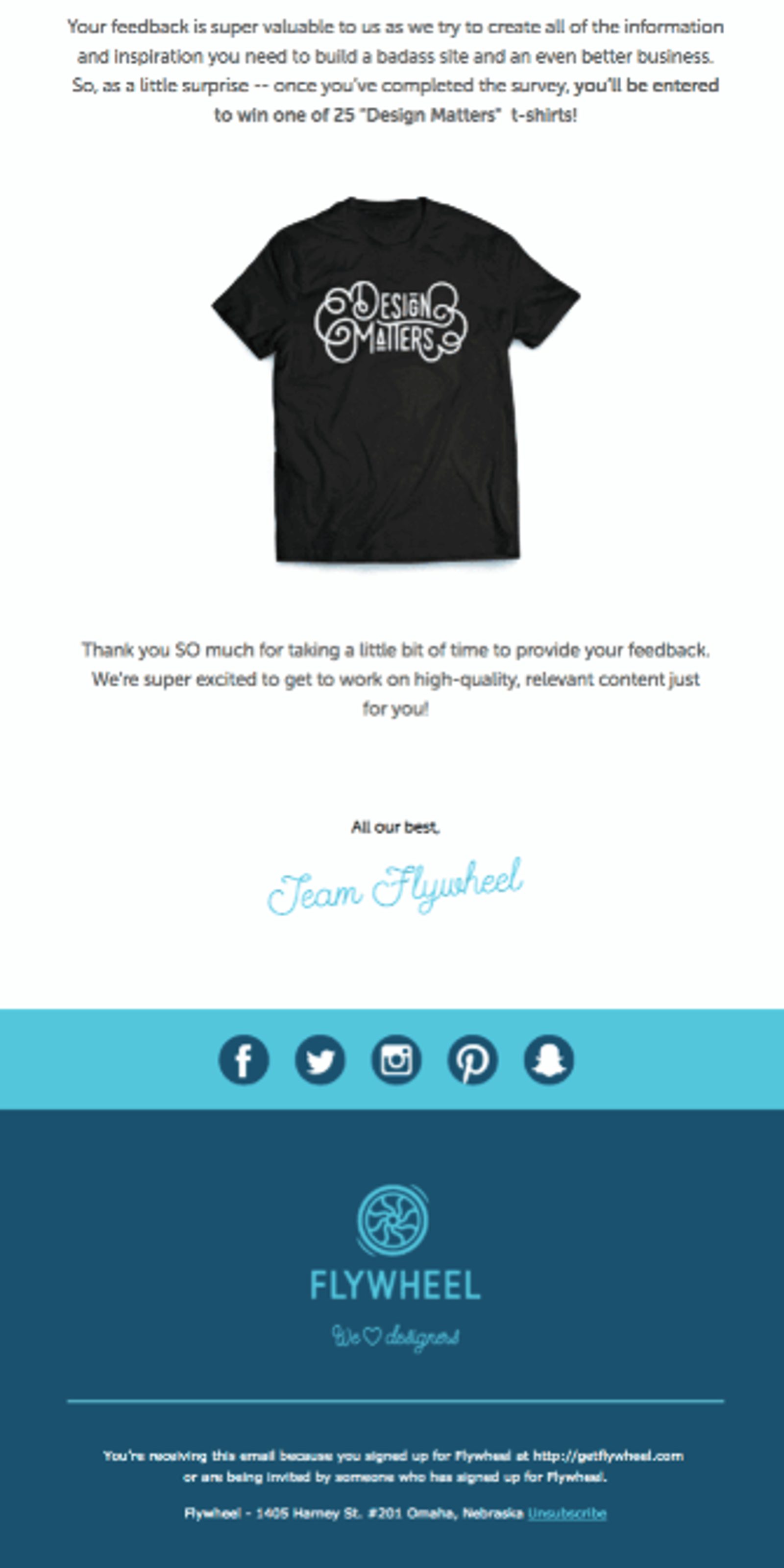
Here’s how Flywheel pulled it off.
What we like about it:
- The copy gives a time estimate for completing the survey
- It gives an incentive to complete the intended action (free t-shirt)
Have you ever seen web pages with a progress bar or blog posts that say things like “7-minute read?”
Time estimates are a small detail that can make or break a customers’ decision to read a blog, scroll a web page, or take a survey (like this one from Flywheel).
Readers want to know how much of their time you need, and showing that it's only a few minutes could get more people to fill out your survey.
You can also get more survey responses by offering a free gift, raffle, or another incentive.
6. Sale promotional emails
My inbox is always ripe with sale emails ready for me to click-through.
Let’s be real – some suck and make me literally say no to my screen (before I delete them).
Here are a couple of great ones.
Use a visual symbol of urgency (like Francesca’s)

Screen Recording 2019-03-04 at 10.12 AM.mov
What we like about it:
- The use of emojis in the subject line
- The angular layout
Subject lines are the main course of your email experience (the rest of your email means squat if no one opens it). When used properly, emojis in a subject line can have a strong effect.
How do ambulances get your attention? Sirens and flashing lights. Thank goodness sirens aren’t email friendly, but Francesca’s found a way to incorporate a visually stimulating emoji in the subject line to get attention faster.
And once again, the angular, zig-zag layout makes for an easy and pleasant email scroll.
Bring ecommerce to your email (like Nest)
What we like about it:
- Customers can shop right in the email, eliminating extra work
- The copy reflects the brand and its product in a clear and clever way
Imagine not having to leave your inbox to do your online shopping. You can shop in the email. You literally get everything you need from one email.
Each product is on light or dark background (with flipped CTA buttons) and the text is easy to read. But what makes this email great is that when you click on a CTA, it builds out a small cart within the email.
With the headline copy, you get more bang for your buck (so to speak). You learn there are financial savings, free add-ons, and it’s all told with a clever play on the brand’s purpose.
7. Thank-you emails
Everyone loves to be appreciated, and you know you are grateful for every customer that calls themselves your customer.
So sending a thank-you email is a smart and classy move.
Bombas was able to donate 3 million pairs of socks and they wouldn’t have been able to do it without their customers.
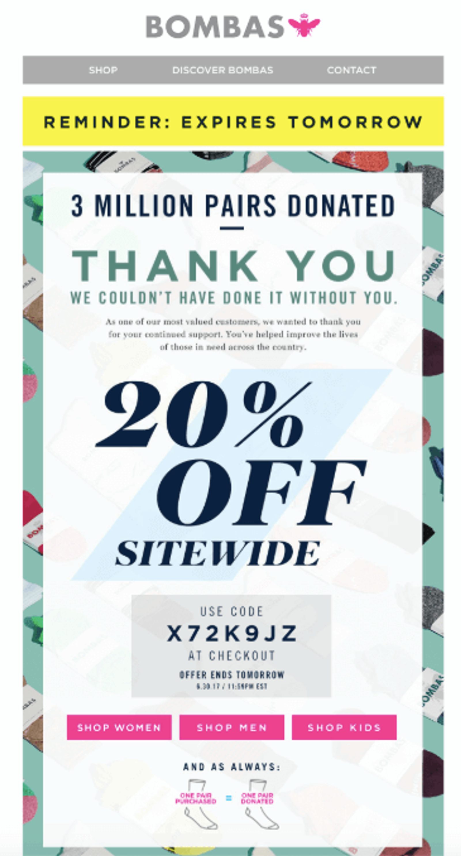
So Bombas told them so, with an extra little surprise.
What we like about it:
- One detail in the headline makes it highly impactful
- They give a discount to validate their appreciation (and make it easy to use it immediately)
Sometimes it only takes one detail to steal the show. 3 million is an attention-grabbing number. When someone says “3 million,” you immediately go “whoa.”
Putting 3 million in the headline copy (and about a charitable donation to boot) makes this headline thank-you all the better.
Nothing makes a customer happier than a discount. Giving a discount as a thank-you is even better – because you validate them for a specific reason.
This email skips the large monologuing thank-you and makes the code easy to use quickly.
8. Anniversary of subscription emails
Why does Facebook create friendship anniversary videos? Why do businesses celebrate anniversaries for their customers at all?
Fall Out Boy said it best: “thanks for the memories.”
The goals of a simple anniversary campaign are to:
- Strengthen the customer relationship
- Encourage more engagement with your brand
- Spur repeat purchases
Looking back on our experiences reminds us of the good times (and the things that created those good times). If a customer has positive memories with your brand, you should remind them (and celebrate them). Good times have been had and there are more good times to come!
Celebrate the customer relationship with presents (like PS4)
PS4 sends this email on their subscriber’s anniversary.
What we like about it:
- The compelling design equally incorporates brand and customer recognition
- It rewards the customer with a free gift incentive to keep subscribing
This anniversary email is about celebrating the customer’s relationship with the PS4 brand.
The copy focuses on the customer. The compelling design highlights the things that the customer loves about the brand. Images from popular games, cleverly compiled, are a simple symbol of the anniversary.
And, of course, the free gift. An email is a token of your customer’s subscription anniversary, but let's face it – a free gift is better. Something fun for them, and some more fun engagement for your brand. Win-win.
9. Seasonal emails
Seasonal emails can cover everything from holidays to weather. Between holidays like Christmas and Black Friday and seasons like Summer and Fall, you have a better chance to be creative, get noticed, and get conversions.
Target specific themes and times of year (like Sweetgreen)
Anyone who’s experienced a cold, snowy winter has had dreams of summer’s return so real they can practically taste an ice-cold glass of lemonade.

A good seasonal email like this one from Sweetgreen can reflect this kind of feeling.
What we like about it:
- Top and bottom CTA buttons that are easy to find
- Visually stimulating and clever CTA copy
This one is all about the CTA.
Multiple CTAs (like 4 or 5) tend to be distracting, which is why it’s better to stick to one. This Sweetgreen summer salads email uses one CTA at the top and bottom.
Why is this a good thing?
Oli Gardner of Unbounce lists the top and bottom of a page as good places to have a CTA.
The top is most common as the place where eyes are going to be drawn to first, but bottom placement follows the AIDA format by completing the “story” of your email and ending on an action.
Now the CTA copy...
Combined with the colorful, fresh images against a simple background, this CTA copy can practically make you taste those delicious-looking seasonal salads just by reading the button (imagine what it could make you feel by clicking on it...).
After reading that copy, I can now imagine summer tastes like watermelon, peaches, and goat cheese (BRB drooling), and I know that clicking that Sweetgreen button gets me closer to it.
10. Cart abandonment emails
No e-commerce business is ignorant of the cart abandonment email concept. Cart abandonment emails are necessary lifesavers not just for businesses but for customers who realize there’s “only one left in stock GET IT NOW!” and escape a near-miss.
Show them something unexpected (like Bonobos)
We have all been this chicken. This poor, distracted, confused, abandoned chicken.
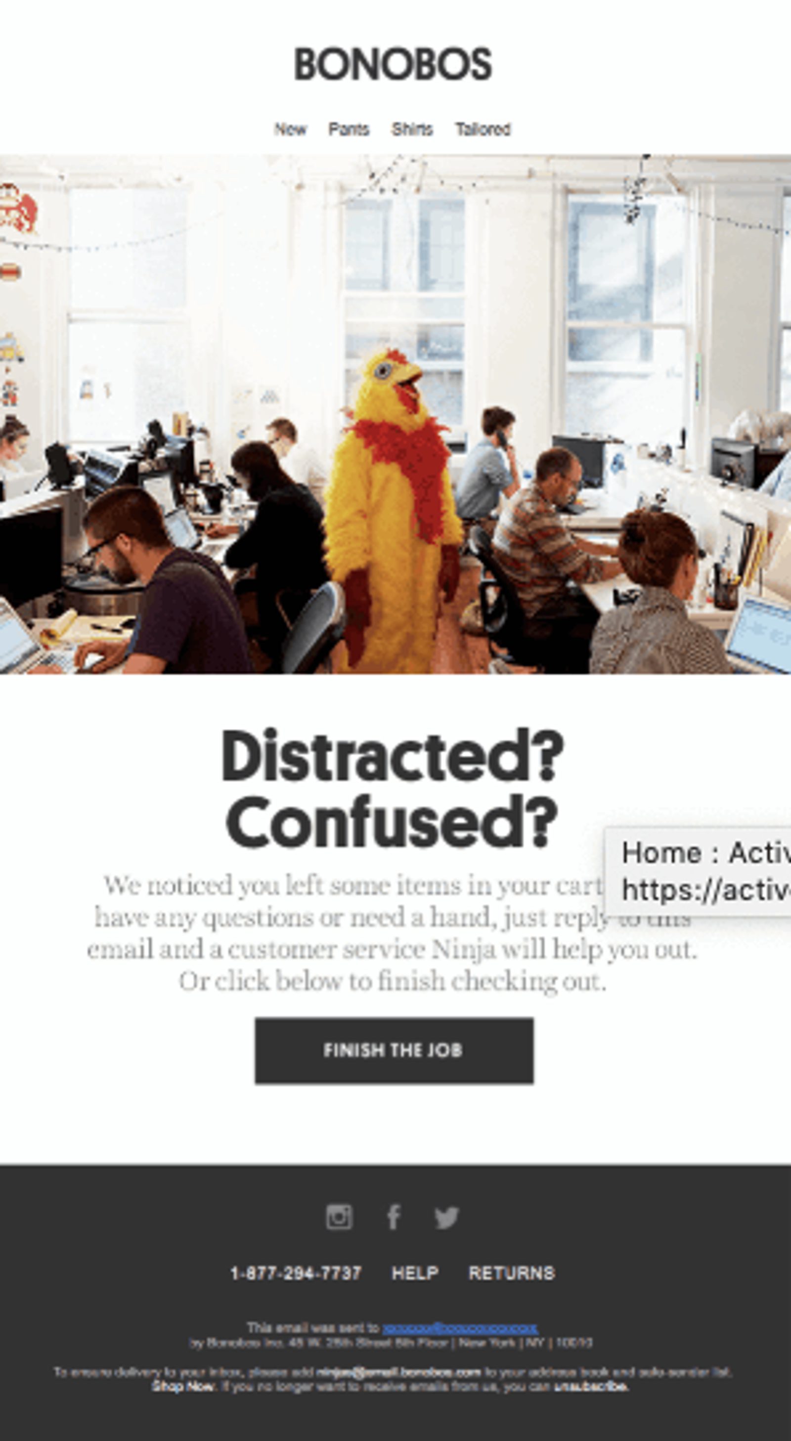
Bonobos knows that and capitalized on it to make one of the funniest cart abandonment emails I’ve ever seen.
What we like about it:
- The image grabs your attention
- Pointing out the problem with large headline copy
An attention-grabbing image grabs attention by showing something vibrant and colorful – or, in this case, something unexpected.
A bright, yellow chicken standing in the middle of an office (an uncommon place for chickens) is going to turn heads and ruffle some feathers (I had to say it).
Most cart abandonment emails will just flat-out say you forgot about your cart, or try to make it cute with a subtle “did you forget something?”
Bonobos decided to point out the problem behind the actual abandonment with a large, impactful headline.
11. Confirmation emails
Nobody likes to be kept in the dark, especially when they are waiting for a much-anticipated order.
That’s why confirmation emails are a godsend.
Give customers everything they need (like FitBit)
What we like about it:
- The relatable copy (it “totally made us smile”)
- It gives easy access to all the info you need
I don’t know about you, but when I get an email like this I respond with a little “yay!” (and a smile).
Mentioning a reaction or feeling can make your customers feel it too. If your email can make customers “totally smile” or react another way, they’ll feel good about interacting with you – and make a click-through to your site for even more interaction more likely.
Forget going all the way back into your online account to see what you ordered, how much it cost or when it’s supposed to arrive. A good confirmation email gives you a snapshot of everything you need to know.
How do you come up with more email ideas? Here are 5 fast ways
What do you do when you tap your creative maple tree and no email idea syrup flows out?
Step 1: Don’t panic.
Step 2: Remember that it’s not about just being the best, it’s about being your best for your customers.
Step 3: Read the next line of this blog.
Before you go bang your head against a wall trying to shake the ideas out like apples from a tree, try these 5 things to get your mental juices flowing:
- Look ahead. Every year there are ripe opportunities to capitalize on good weather, popular holidays and even quirky things like National Pizza Day. Consider what promotions you can do and brainstorm your email campaigns ahead of time.
- Pay attention. The best way to send your customers emails they’ll want to receive is to know your audience. Listen to what your customers are saying and doing use their problems, opinions, likes, and speech to tailor your future campaigns.
- Learn from others. Did you notice that all the examples above came from other brands? Other brand’s marketing campaigns can be useful creative resources.
- Review your past content. Old email ideas aren’t taboo, never to be used again. You can repurpose past content time and time again. Consider what content marketing ideas you can repurpose into email ideas
- Examine your own inbox. When in doubt, look inward...to your own inbox. You might be a marketer, but you are also a subscriber and customer to other brands. Get inspired!


