Want to build your email list more effectively and get more valuable leads for your business?
That’s a great strategy. Email marketing is one of the most powerful (and affordable) channels to reach potential customers. That’s why 87% of marketers use email to promote their product, software, or service.
But getting people to subscribe is becoming increasingly difficult. When every business asks for an email address, it’s hard to stand out2022
Luckily, one strategy that still works in 2022 is to use an email popup that markets your newsletter, gated content, or loyalty program.
In this article, we’ll break down exactly what to put in your email popup and highlight 15 best-in-class examples. You’ll learn how to boost your email subscribers without having to invest a lot more money in Facebook or Google ads.
What is an email popup and why do you need one?
An email popup is a signup form that slides or fades in over the main website content, asking for the visitor’s email address.
In its most basic form it’s a little floating box that includes a call-to-action, a catchy image or graphic, and the signup form.
It slides in with some type of animation and hovers over the main content of the site, with an option to hide it (in the form of an exit button).
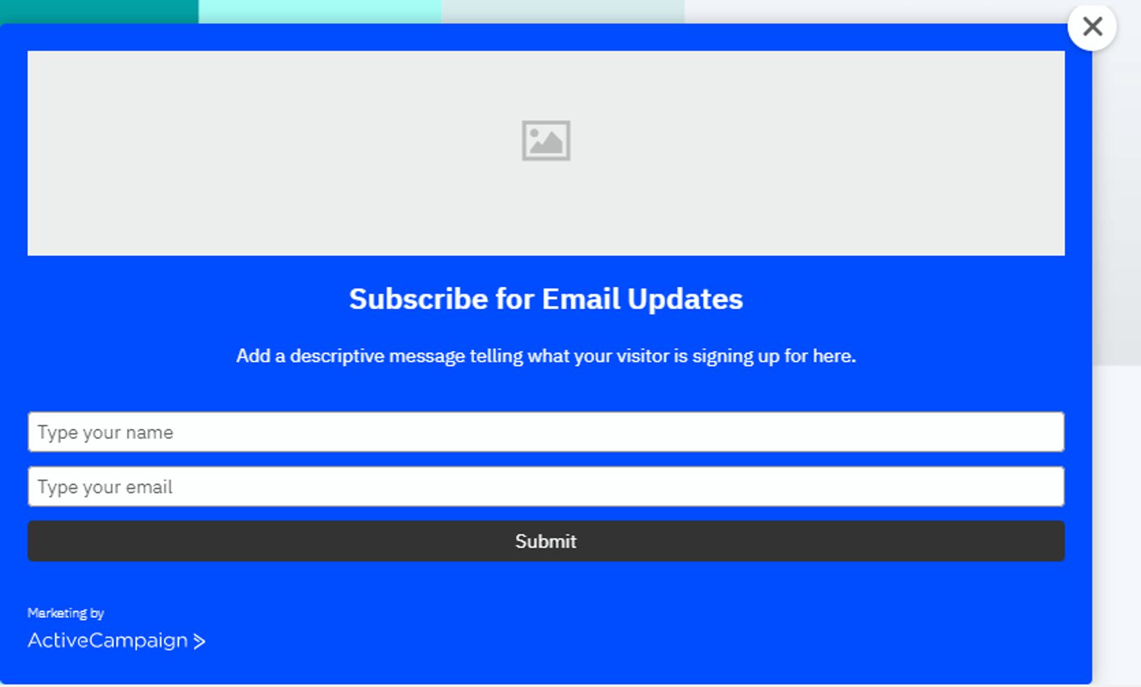
Here's a template...
It can even be a “lightbox popup,” a popup that appears over the existing content, while the main content is dimmed or hidden completely.
But why would you want to include an email popup on your website? Doesn’t it interfere with the user experience?
The answer is yes; it might interrupt the visitor for a split second, but it’s one of the best ways to leverage the power of email marketing for generating leads.
And in 2022, an email popup is a lot more than just a static form. It’s usually a part of a smart opt-in campaign with personalized lead magnets and copy. The content is based on the user’s previous interaction with your site or their Google search.
With a campaign like that, you can start collecting a lot more emails for your business. Which means you can reach potential customers and nurture them through the customer lifecycle.
Email marketing is more targeted than other channels, and you can segment audiences using AI-powered personalization tools.
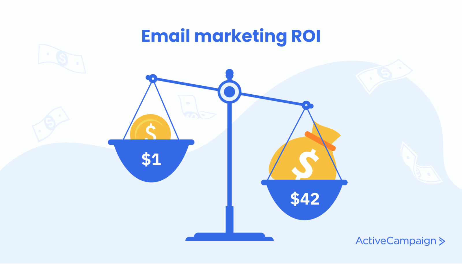
These are just a few reasons that email marketing has the best ROI of any channel — an average of $42 for every $1 invested.
Having the email addresses also gives you new opportunities to interact with your potential customers.
For example, you can send cart abandonment emails. These are email reminders you can send to customers who leave an ecommerce cart without purchasing.
These emails convert at a staggering 4.64% (of emails sent).
Do email popups work in 2022?
According to a Sumo study, on average, only 1.95% of site visitors sign up for a newsletter or other email list.
This number increases when you use a well-designed email popup, because they stand out and grab your visitor’s attention.
Using popup forms, some companies are able to boost their signup rate as high as 7.12%.
What should I write in my email popup?
You should treat the email popup as a miniature landing page and write short-form copy to convince your visitors that signing up for your newsletter is the best decision they’ll ever make.
Focus on these elements:
- An attention-grabbing headline that’s relevant to your audience.
- What’s in it for them — the benefits of signing up for your newsletter or loyalty program.
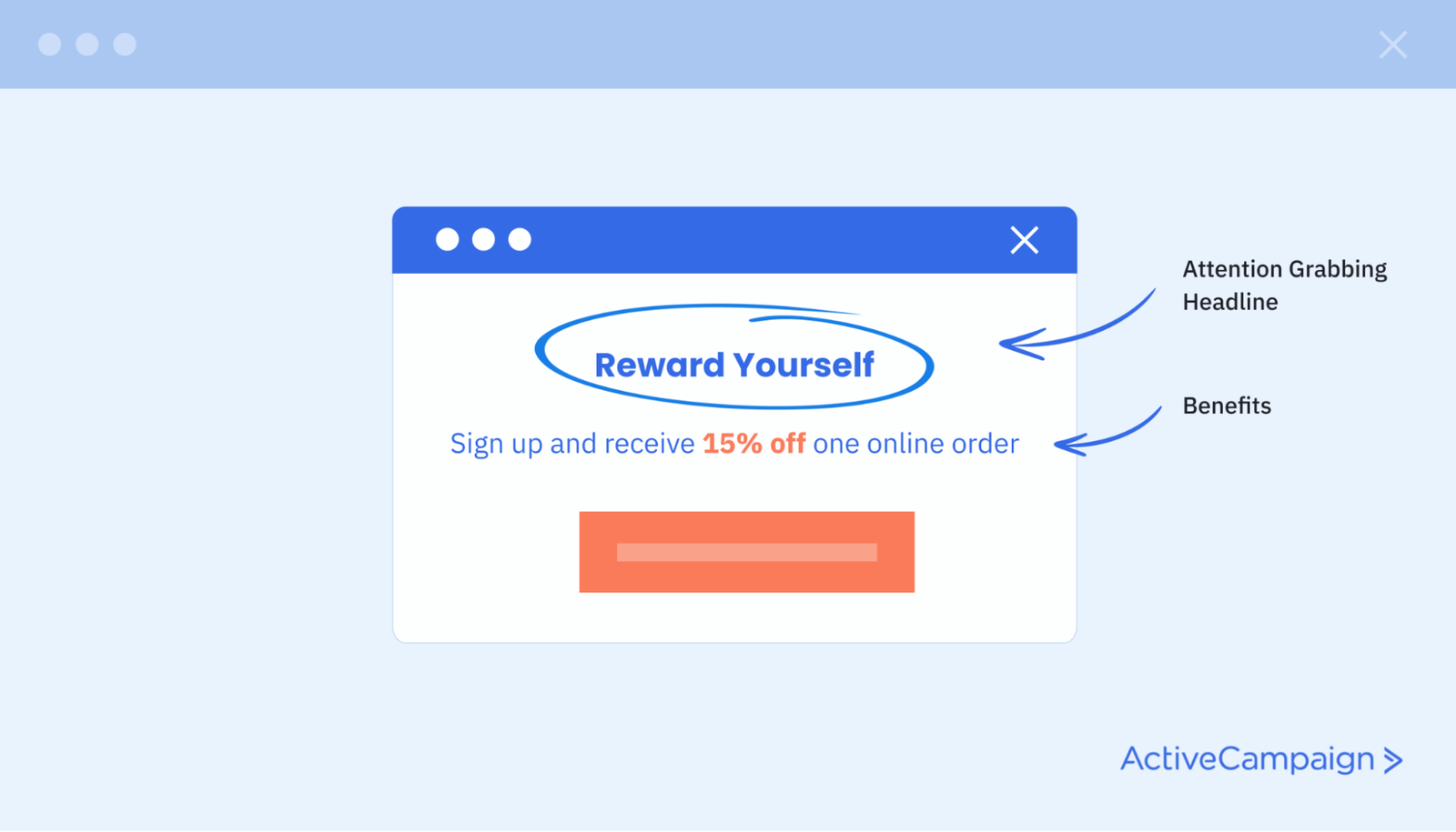
Here’s a basic popup example from cosmetics giant Estée Lauder:
The simple two-word headline “reward yourself” fits with Estée Lauder’s brand positioning. Their products are something you buy when you want to spoil yourself.
The additional copy on the form highlights the benefits of signing up with your email address — you get 15% off all future purchases on the site.
What copy works best on your form depends on your niche, audience, and your usual “voice.”
In the list below, we’ll show you 15 more examples of email popups and explain why they work. We’ve even separated the examples into B2C and B2B, so you can explore relevant examples.
10 effective B2C email popups (and why they work)
If you need some inspiration for creating your next consumer-focused email popup, here are 10 great examples for you.
Gaiam
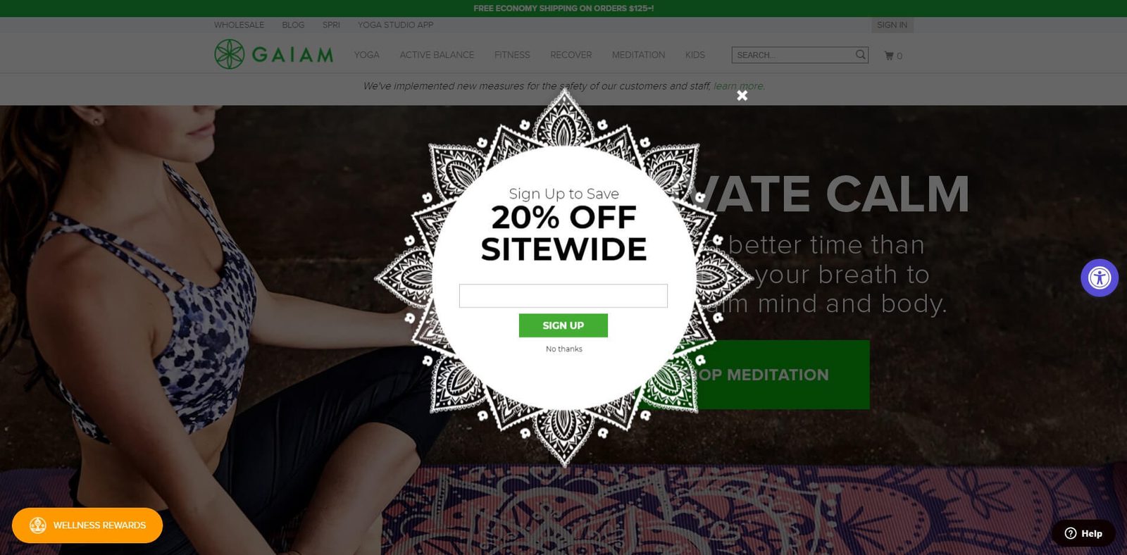
This email popup from yoga store Gaiam aligns perfectly with their brand.
The background image is a henna-inspired pattern, going along with the rest of the calming images on the site.
The headline states the benefits: save 20% on all purchases just by giving us your email address.
This kind of basic sale offer is also effective for an exit intent popup.
Magic Spoon
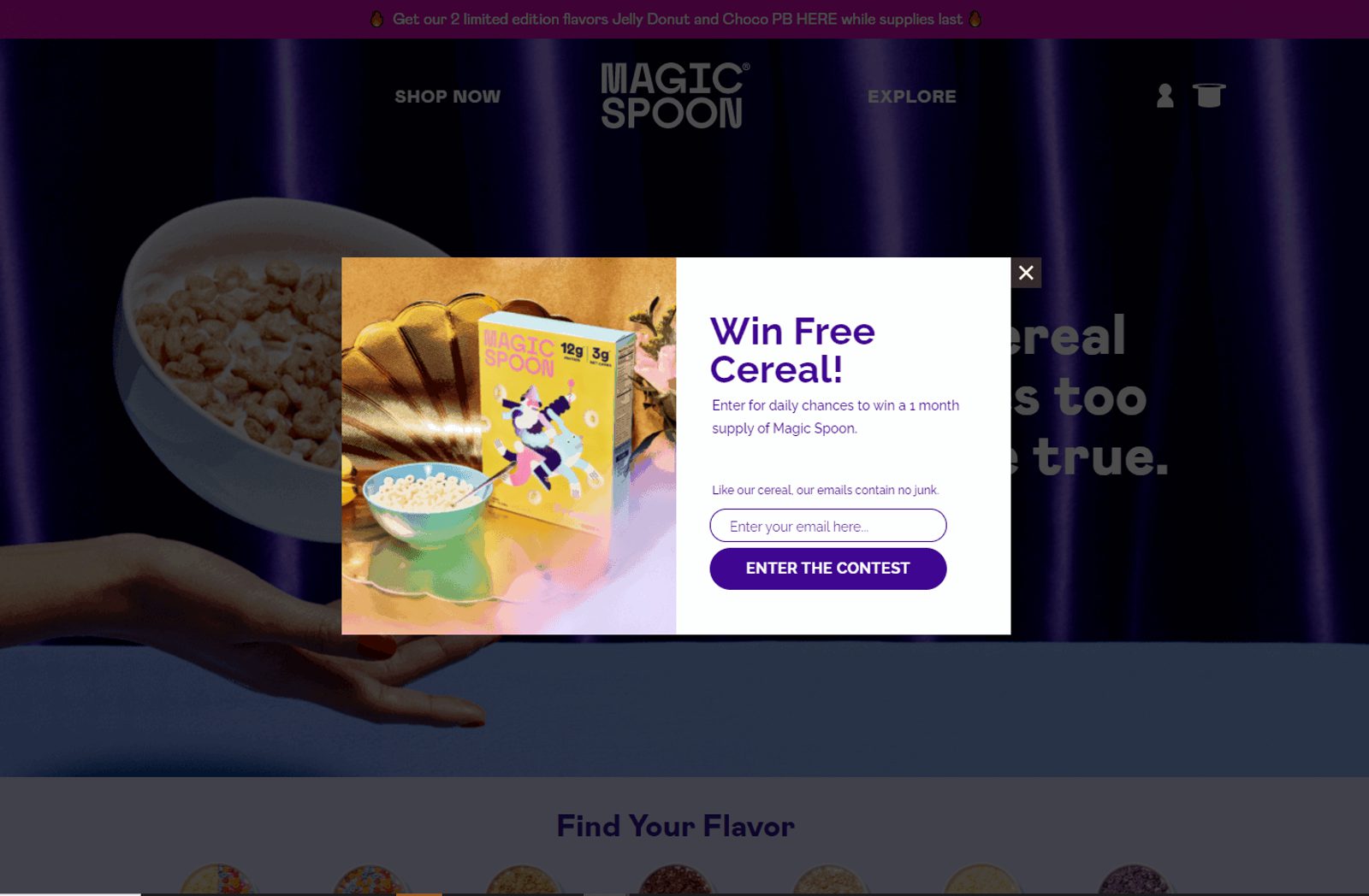
Protein cereal brand Magic Spoon has perfected the art of ecommerce email marketing. Their email popup instantly grabs the attention of the visitors, and instead of 10% off, it offers a daily chance at a free month’s supply of their cereal.
Helix Sleep
Helix sleep uses the email popup form as another avenue for seasonal marketing, driving home their Memorial Day sale.
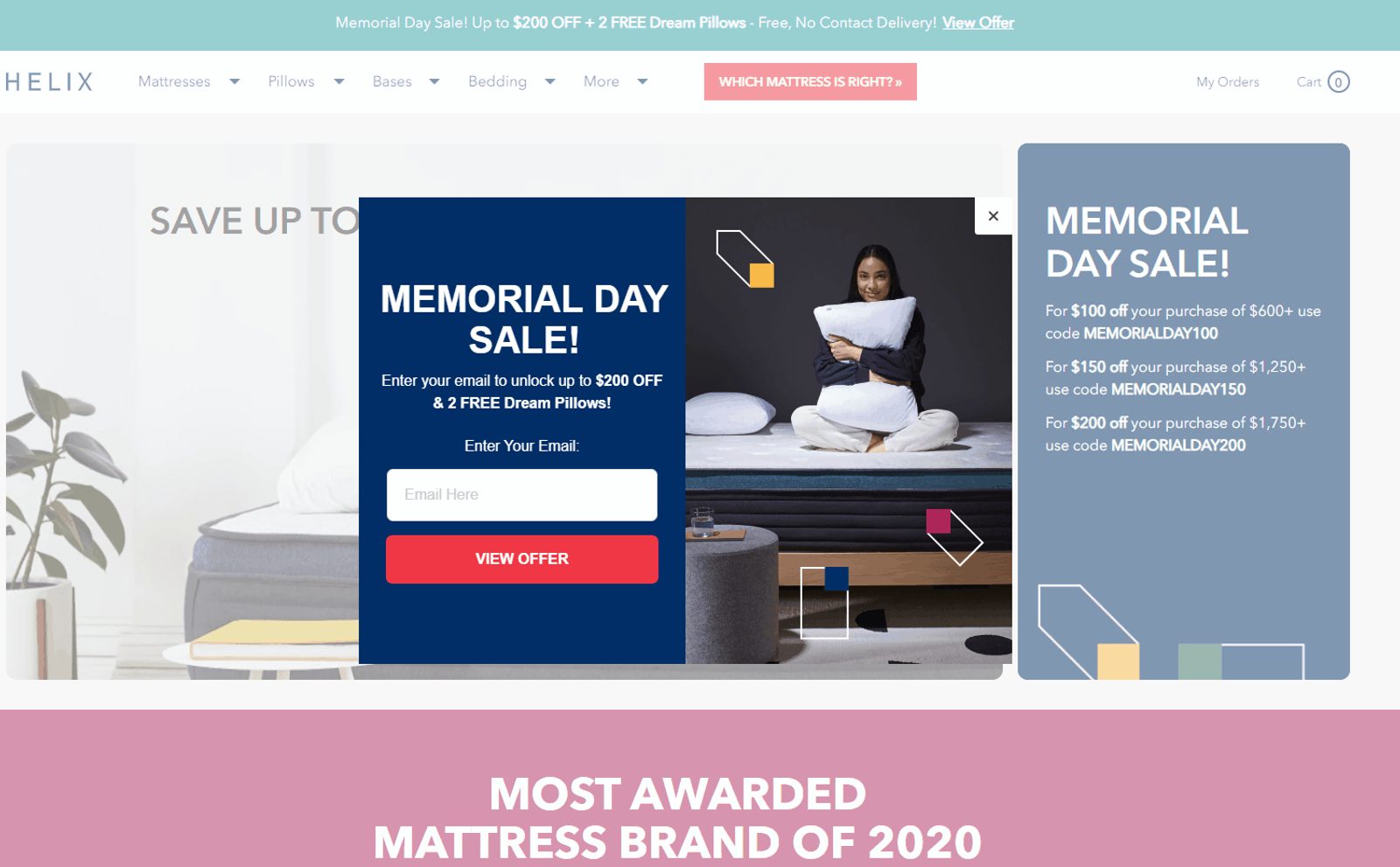
It’s straight to the point. and focuses on the benefits a visitor can receive by signing up.
Also, notice that the rest of the site fades away when the popup form comes up. This simple effect helps draw attention to your form.
Old Spice
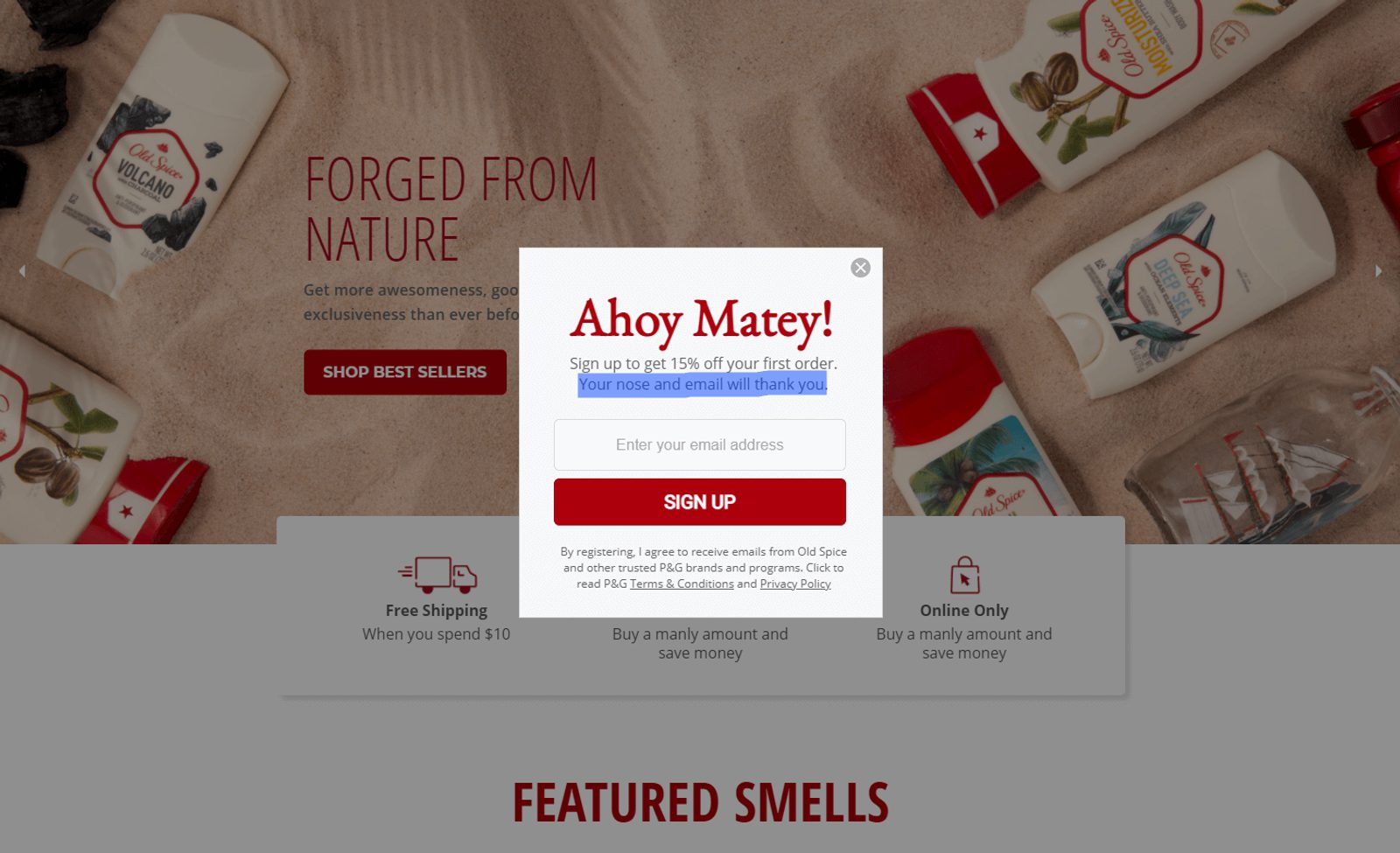
For anyone who remembers the whole “I’m on a horse” campaign, you’re probably not surprised that Old Spice uses humor well on their website, too.
Instead of “save 15% on your purchases” they go with the headline “Ahoy Matey!” They also mention that your nose will thank you later.
It’s a nice continuation of their brand voice on other platforms like their blog, YouTube channel, and Twitter.
If you usually use a lot of humor in your titles and content, there’s no need to suddenly shy away from that in your popup forms. Even the email popup should be on-brand.
Fjallraven
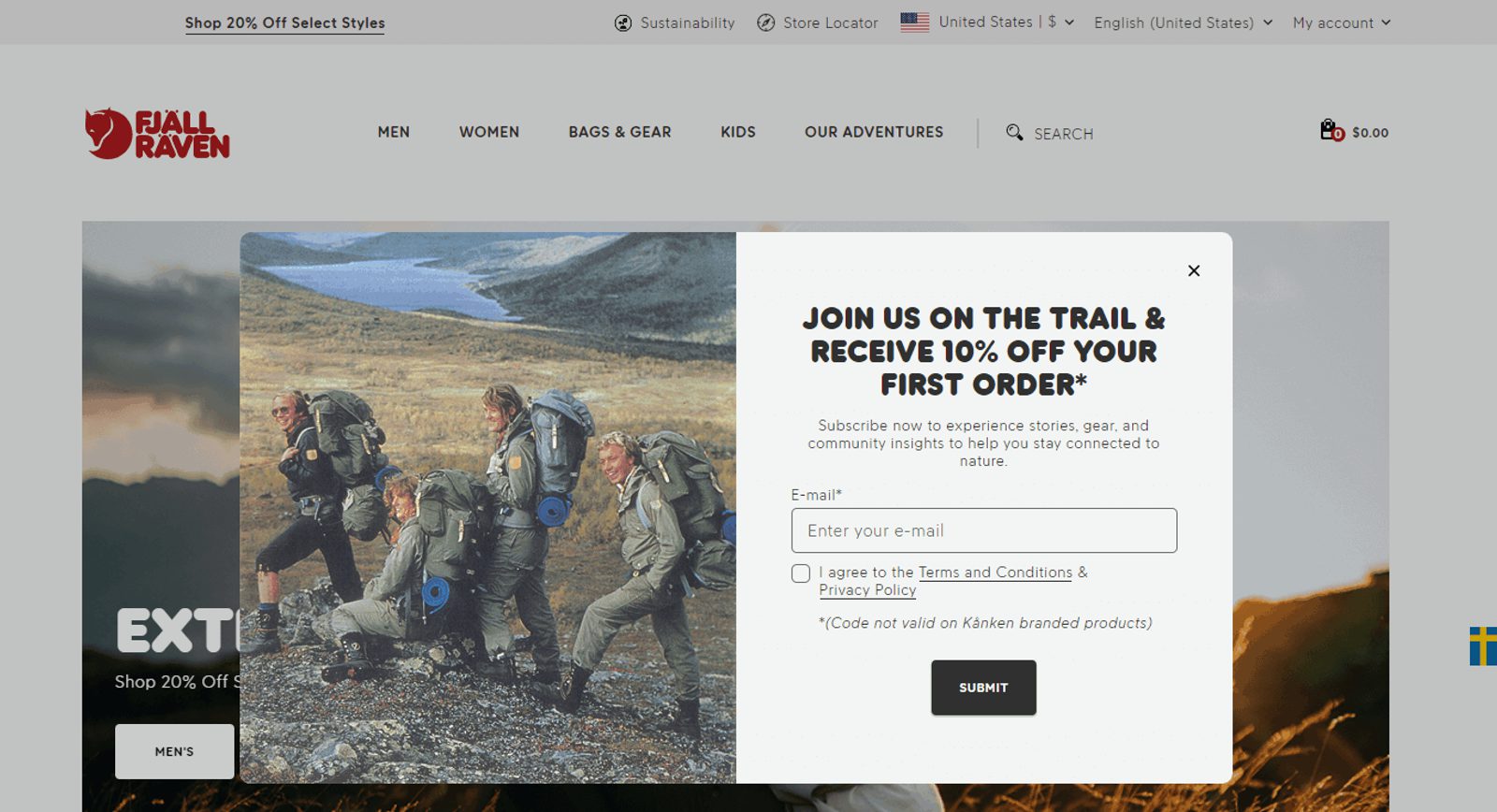
Swedish hiking and outdoor gear maker Fjallraven does a great job with their email popup. Not only does the headline highlight their brand message, but also the main benefit of signing up.
The image also shows their products in use in the ideal environment — hiking in a beautiful landscape.
Making Sense of Cents
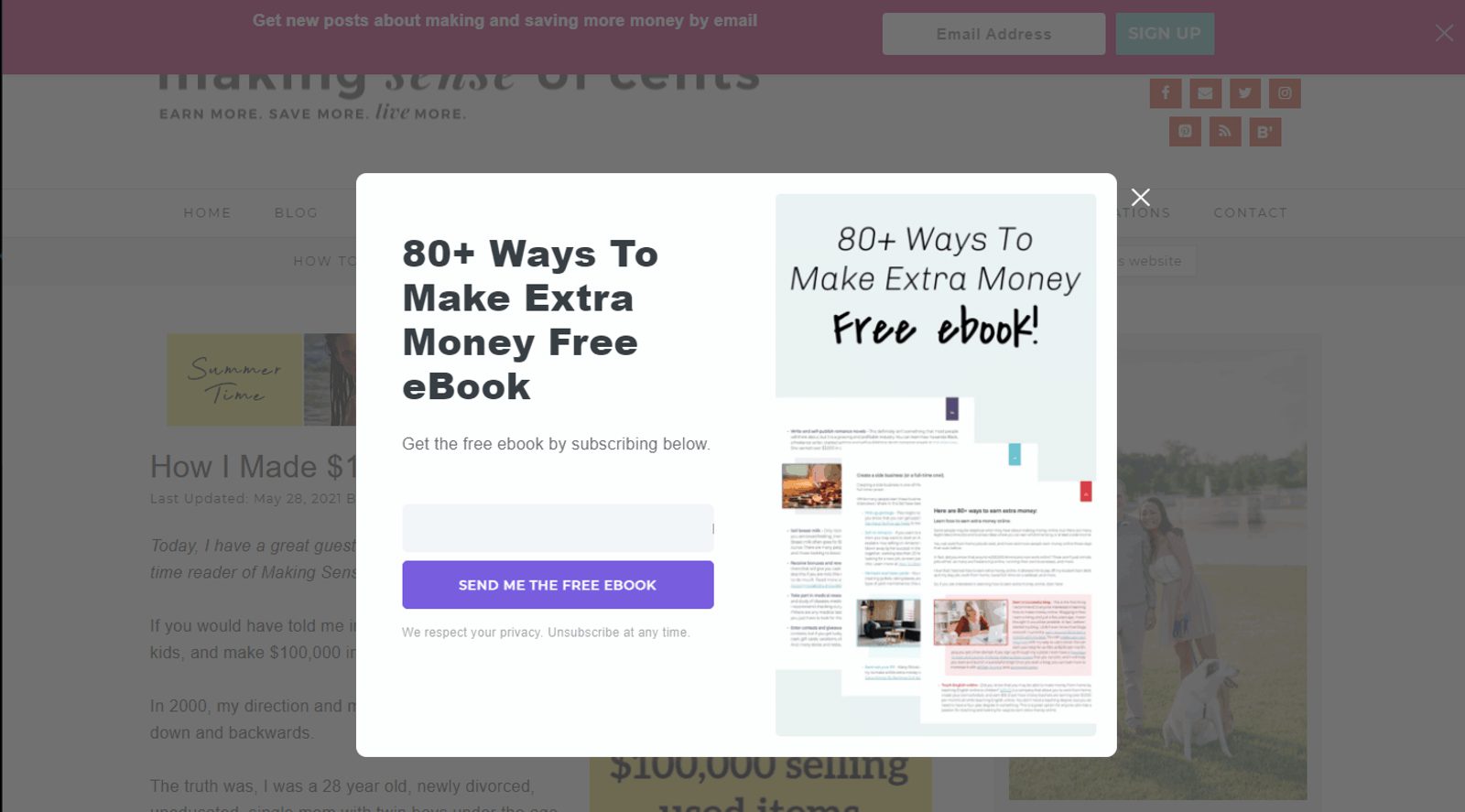
Making Sense of Cents is a popular personal finance blog. This email pop-up form is a great example of using a free resource, like an ebook, to convince visitors to sign up.
The title and graphics all tell the tale of the benefit. “Just sign up with your email to learn 80+ ways to make extra money.”
If you’re going to offer a free resource, it must align with your target audience. Since her blog readers care about personal finance, this ebook is the perfect match.
Kind
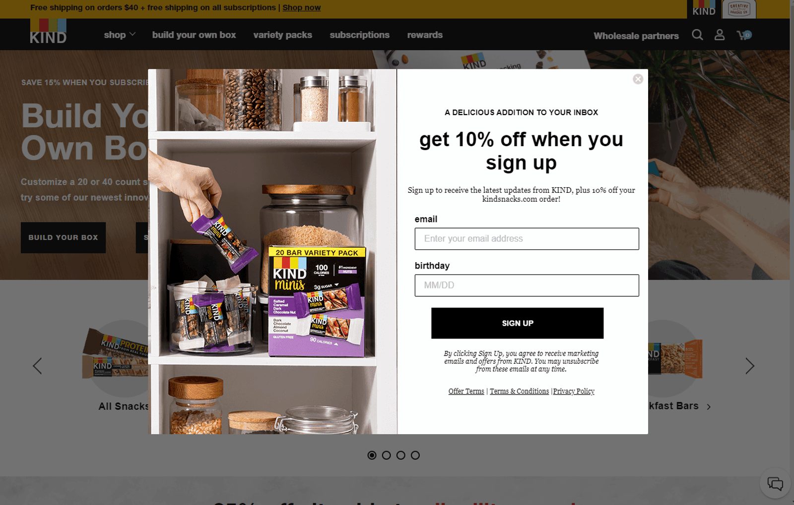
The Kind website is another good example of effective consumer marketing. The email popup claims to be a “delicious addition to your inbox.”
A little bit of humor can go a long way in buying you some consumer good will. Then the main headline highlights the benefit of saving money.
The eye-catching graphic helps the email popup stand out, featuring someone grabbing a bar, ready to eat it.
Robertson Training Systems
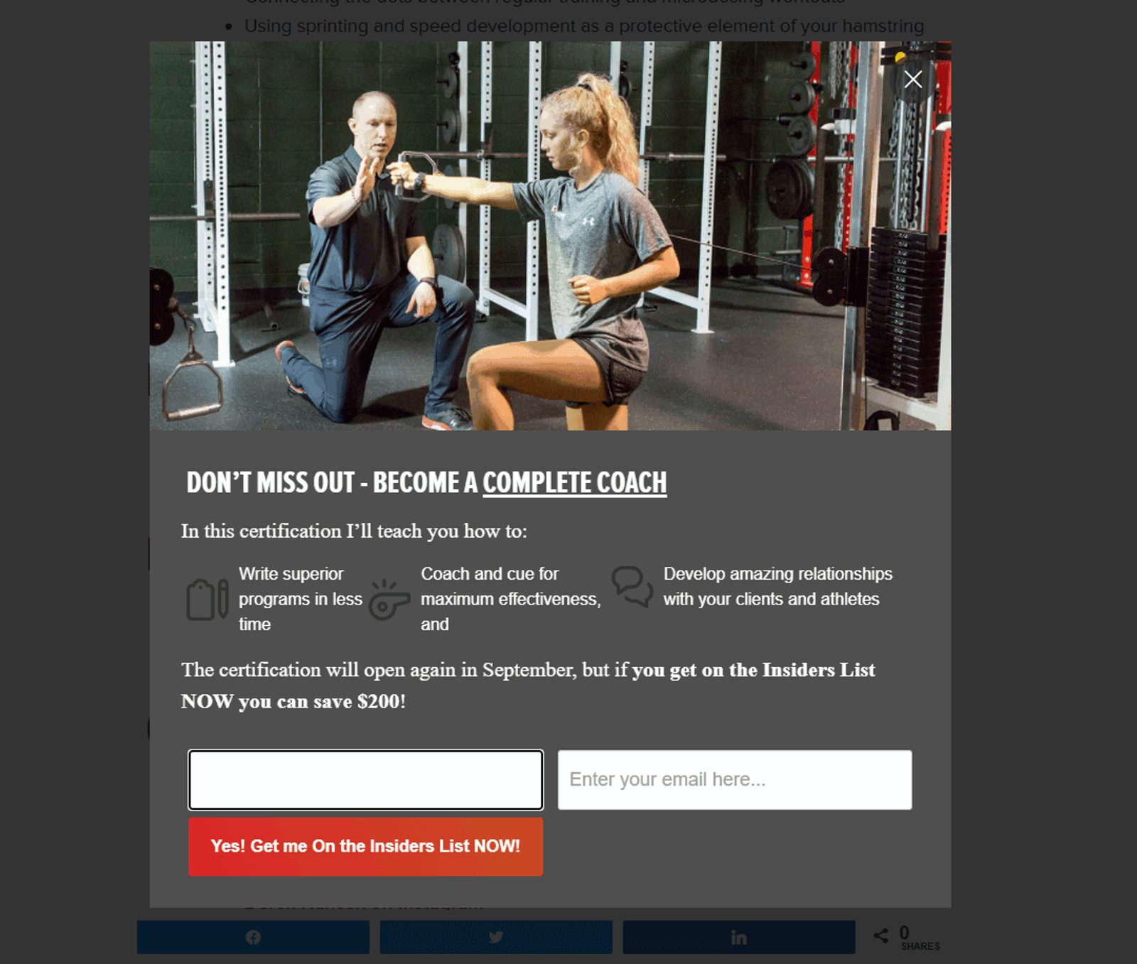
Robertson Training Systems is a unique training blog that focuses on information for trainers and coaches, not athletes or the average Joe.
The email popup highlights the three main benefits of joining the program and the benefit of signing up early (save $200).
It’s a good example of a full-screen lightbox popup that goes beyond just a headline and one line of copy.
Sir Kensington’s
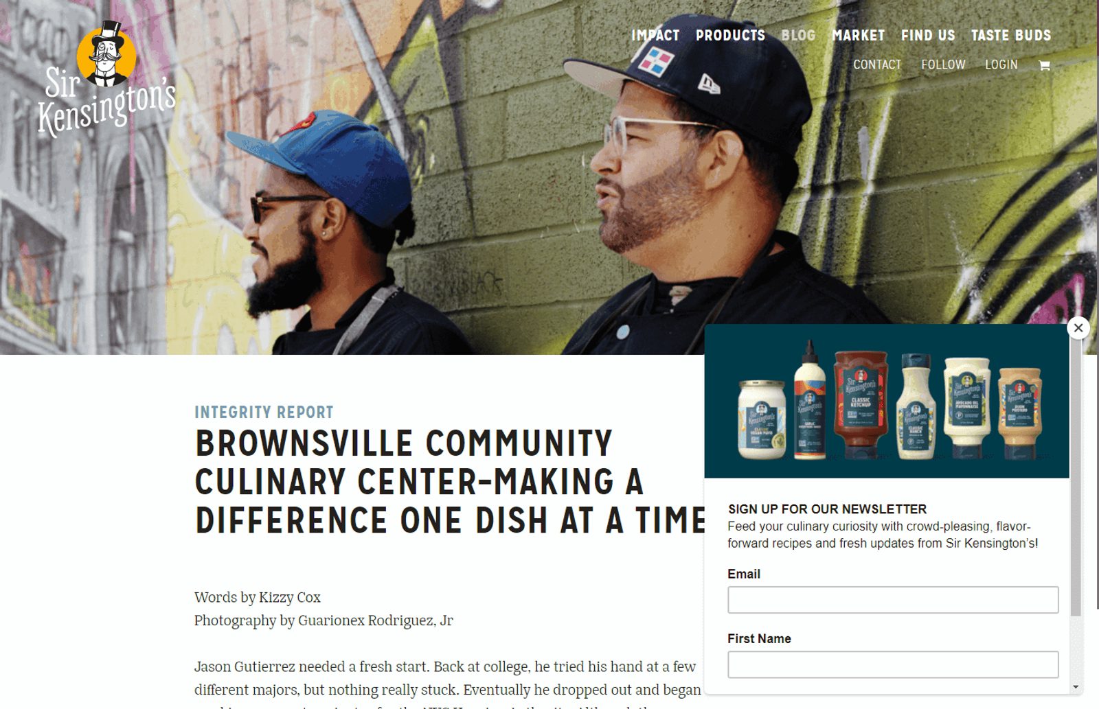
Premium condiment brand Sir Kensington’s are followers of the KISS (keep it simple, stupid) rule. It’s an unapologetic newsletter popup.
There are no gimmicks in the headline. The body copy opens with a nice creative touch with “feed your culinary curiosity.”
What really stands out is the eye-catching header image, with the color contrast from the main page dragging your eye to the email popup.
Besame
Besame is another cosmetics giant that knows how to speak to their consumers. Their email pop-up form is an example of something more discrete.
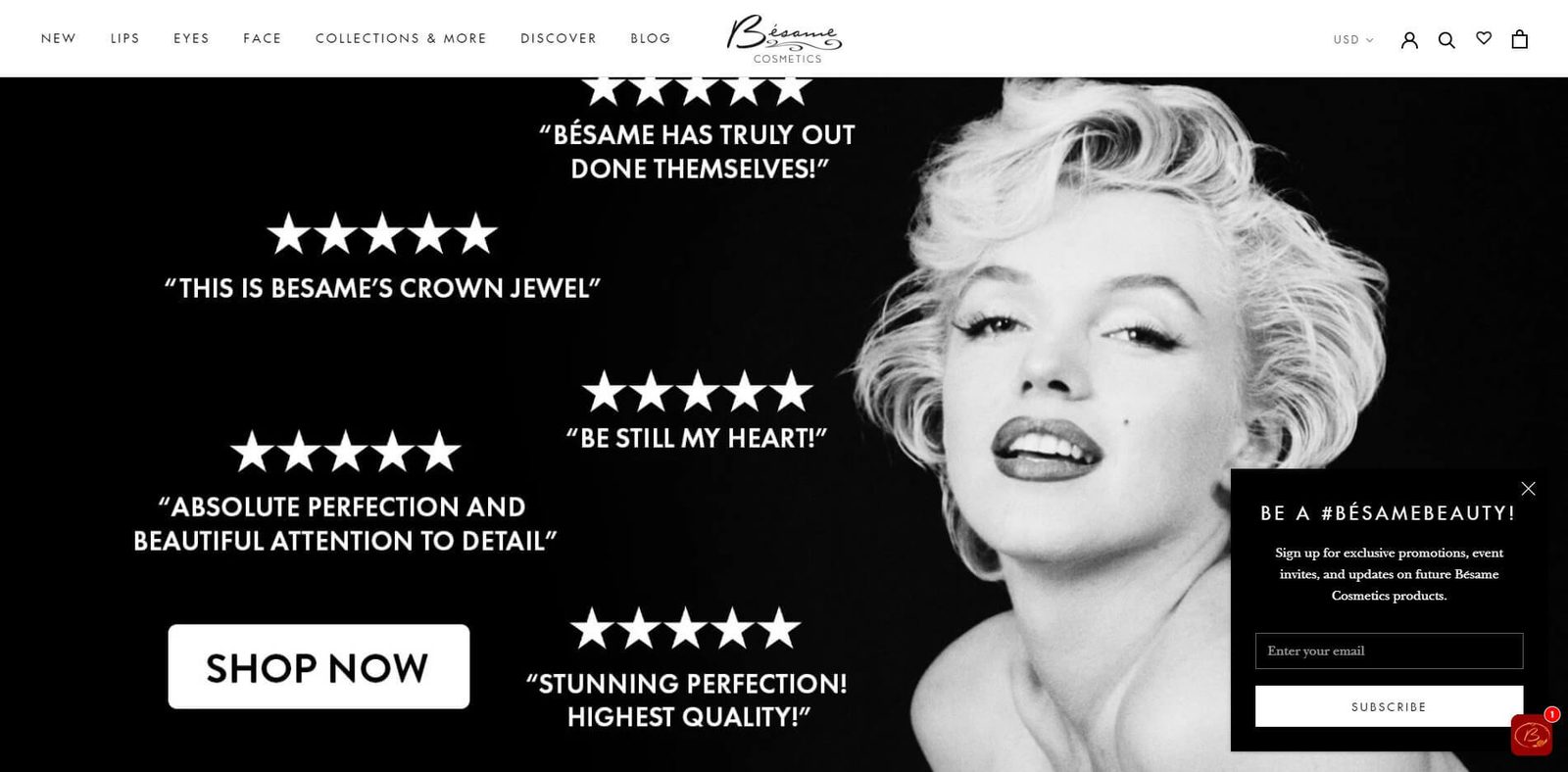
If you don’t want to interrupt the user experience of your store at all, you can keep the form size small.
The headline “Be A #BesameBeauty” highlights the idea that you’ll feel beautiful using their products.
It also promotes their preferred social media hashtag.
5 Effective B2B email popups (and why they work)
If your target audience aren’t average consumers, but instead professionals looking for ways to improve their company, simply offering a sale or coupon isn’t as effective.
Below, we cover 5 examples of email popups that work well for B2B audiences.
Conversion XL
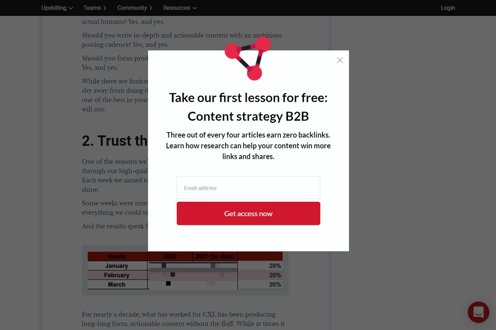
Conversion XL is a conversion rate optimization blog that caters to a professional marketing audience.
Instead of a flashy image, the email popup focuses on the headline, offering a free first lesson. It’s simple and to the point, highlighting the fact that it covers content strategy for a B2B audience, not just generic advice.
One thing it does differently is that it points out a common issue businesses face with content marketing.
The copy follows a “problem-solution” format, a common narrative in copywriting. Add this to your email popup copy to really grab your user’s attention — as pain points are more likely to get them engaging on an emotional level.
Contently
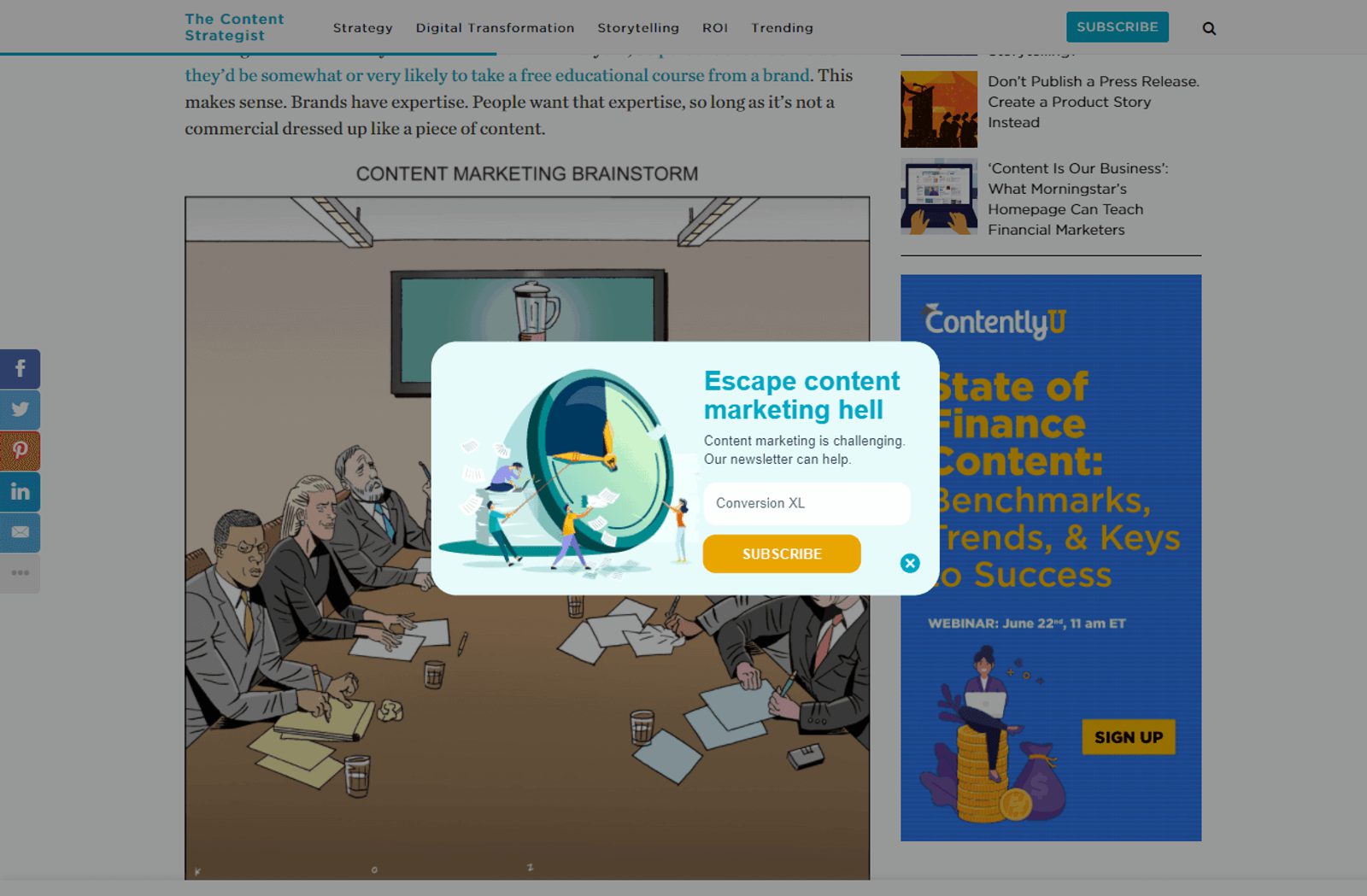
Contently’s blog on content marketing has a more colorful email popup than most corporate sites.
“Escape content marketing hell” is certainly a way to get an uninspired content marketing manager’s attention.
It’s an example that you don’t have to be boring just because you’re targeting a B2B audience. The image highlights the issues with content marketing, how it can be time-consuming and frustrating to get the right results.
ActiveCampaign
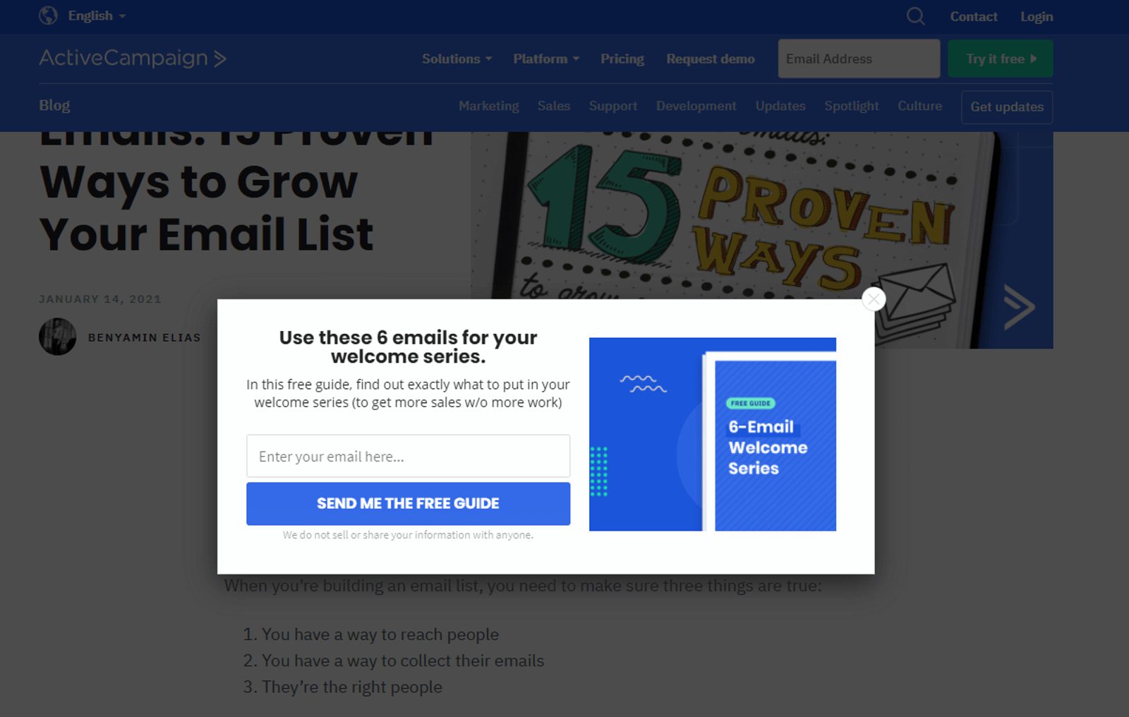
As an email marketing solution provider, we’re also firm believers in the email popup, and use it on our company blog.
This email form exemplifies a few key principles for getting B2B email subscribers:
- Offer something of real value — in this case, ready-to-use welcome email templates to land more sales.
- Keep it simple — state the benefit clearly in the headline, and don’t include excess content.
- Use graphics and color to grab the attention of the reader.
CoSchedule
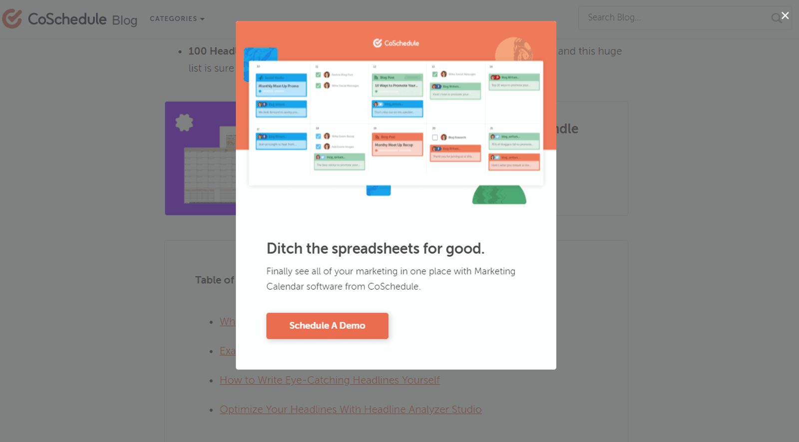
CoSchedule is a marketing planning platform that lets you create a better marketing calendar.
CoSchedule’s popup shows how you can pitch a product demo without being boring. Their headline focuses on the pain point of doing marketing planning in messy spreadsheets.
They don’t just go for the “free demo” approach.
Often, it’s better to focus on the real issues of your customers than just pitching your product.
Sage
Sage is an accounting, HR, and business system provider. They segment their email popup forms across the different topics on their company blog.
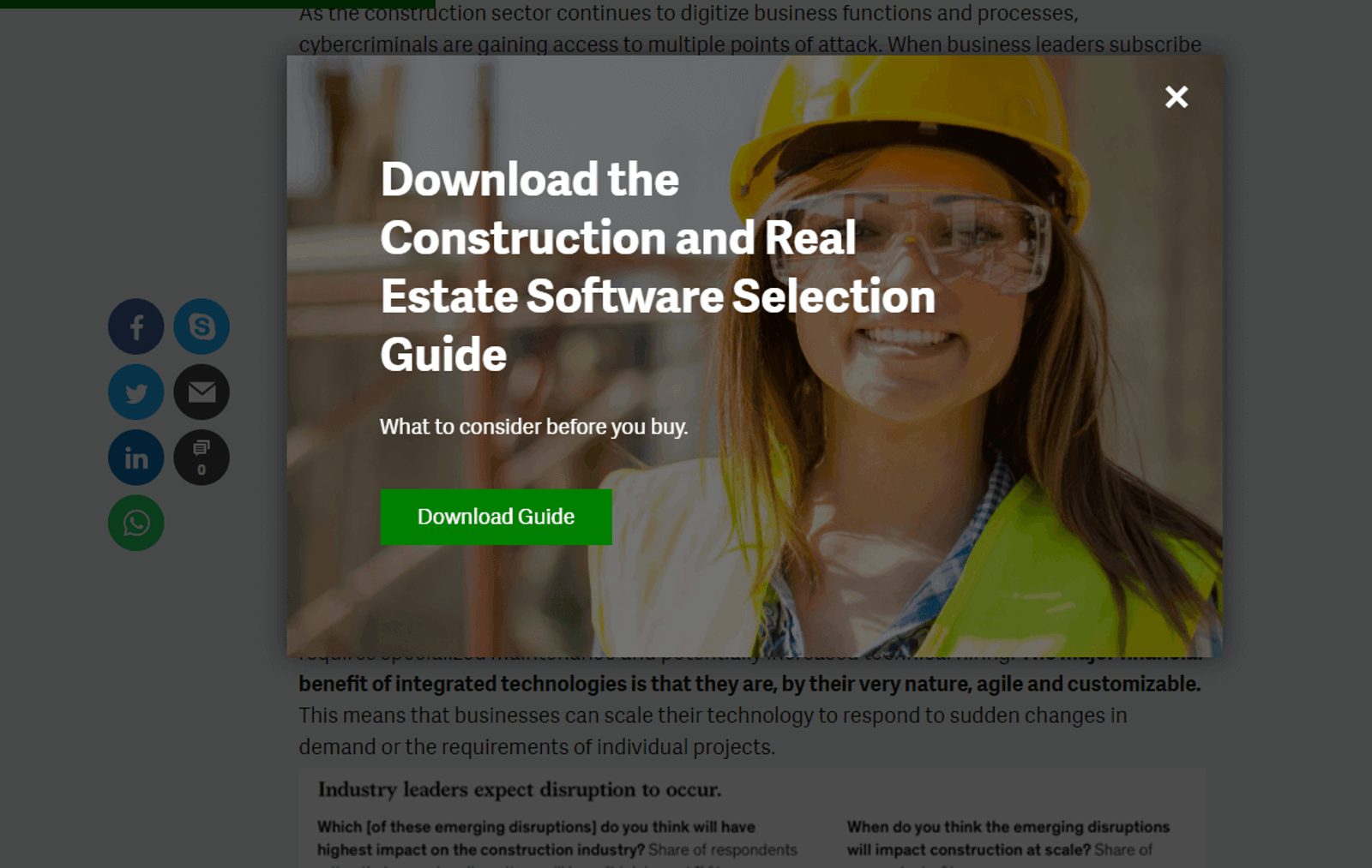
For example, this email popup is on content related to construction and real estate, so they directly target those readers with a dedicated buyer’s guide.
Remember that segmentation isn’t only for after the visitor signs up for your list. You’ll benefit from using segmented landing pages and signup forms as well.
That’s a lot easier to implement at scale if you use a marketing automation tool.
Ready to create your own email popup with ActiveCampaign?
Email popups can be a seamless part of your user experience, filled with inside jokes
that help your visitors relate more with your brand.
Are you ready to create your own email popup? With ActiveCampaign, you can use our form builder to easily create a form, and embed it with a code snippet.
Sign up for a free trial today and try it for yourself.

