Small businesses face some branding challenges that larger businesses don’t need to deal with.
How to build your brand on a small budget. Time. Having the in-house talent to put together stunning brand guidelines and logos.
Even though small businesses sometimes have marketing challenges related to a lack of resources, there are also a few key advantages you have when branding a small business.
First, big brands have dozens of decision-makers. If you do branding for big businesses, you can make it most of the way through the process only to get shot down at the very end. Having a lot of opinions in a room can also lead to branding ideas that are “polished” but not interesting.
Second, small brands have personalities. It’s hard for a large brand to have a personality—a multinational company has trouble sounding like a friend sitting across from you in a bar. It just doesn’t feel as believable.
With all of that in mind, how can small businesses create brands that stand out? Here are 14 of our favorite examples of small business branding.
Try it now, for free
1. Death Wish Coffee
Source: Death Wish Coffee
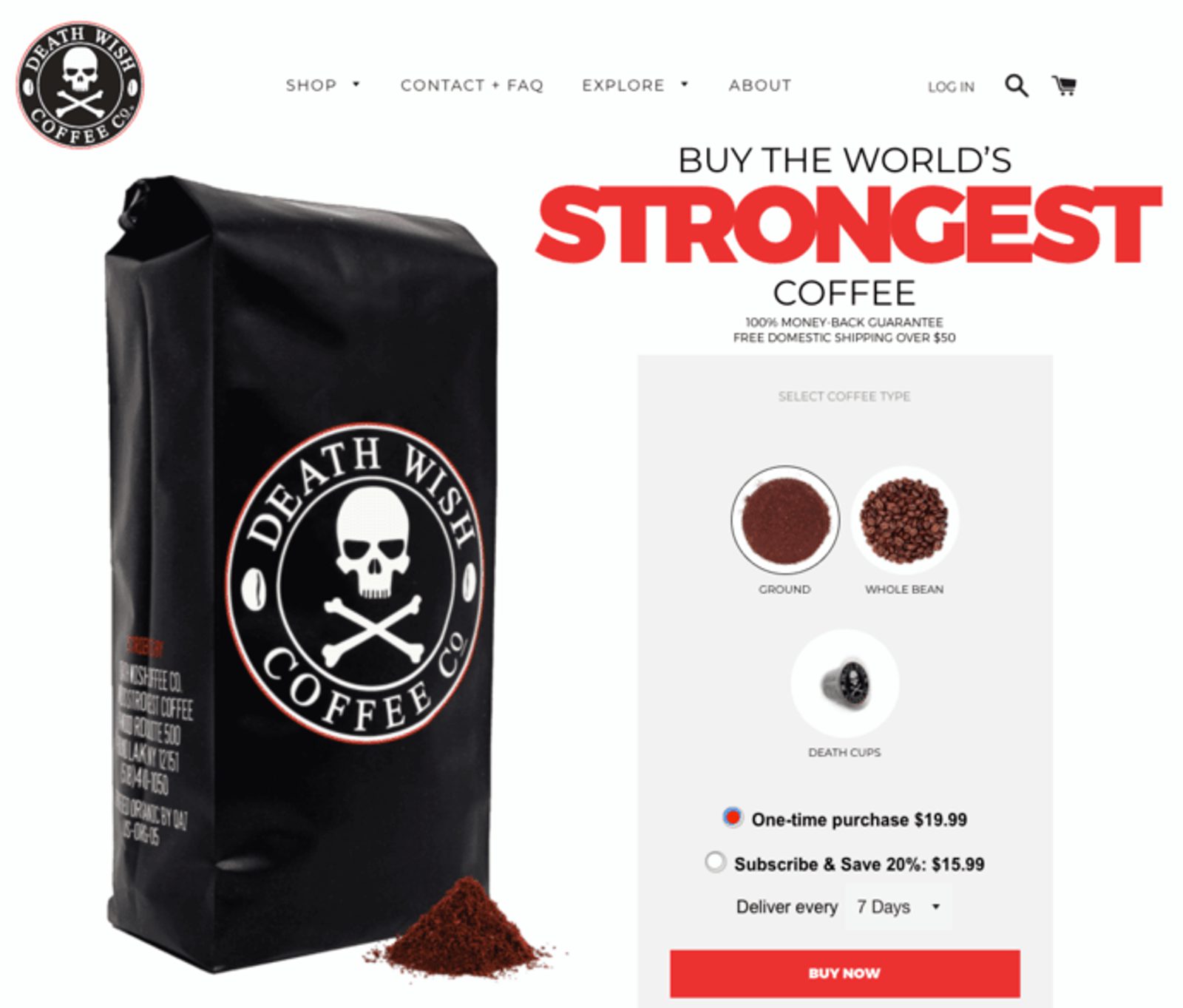
Head over to their website and you’ll see the Death Wish brand front and center.
Billed as “The World’s Strongest Coffee,” Death Wish plays up the “death” angle with its simple but evocative design.
Death Wish’s stellar branding and positioning come from deep audience research. By studying their customers, Death Wish realized that there was an entire segment of the coffee market that doesn’t especially care about taste—they just want to feel awake.
Death Wish’s success has made them a classic marketing example and even won them an ad in the Super Bowl.
Small business branding tips:
- Be bold. This isn't "gives you some energy" coffee. It's Death Wish. Choosing a bold, evocative name helped define the Death Wish brand positioning.
- Be known for something specific. How do you define your brand? If you heard about the "world's strongest coffee" and mostly drank coffee for the caffeine, wouldn't you choose Death Wish?
- Simple = memorable. One powerful message helps Death Wish stand out in people's heads.
2. Surly Brewing Company
Source: Surly Brewing Company
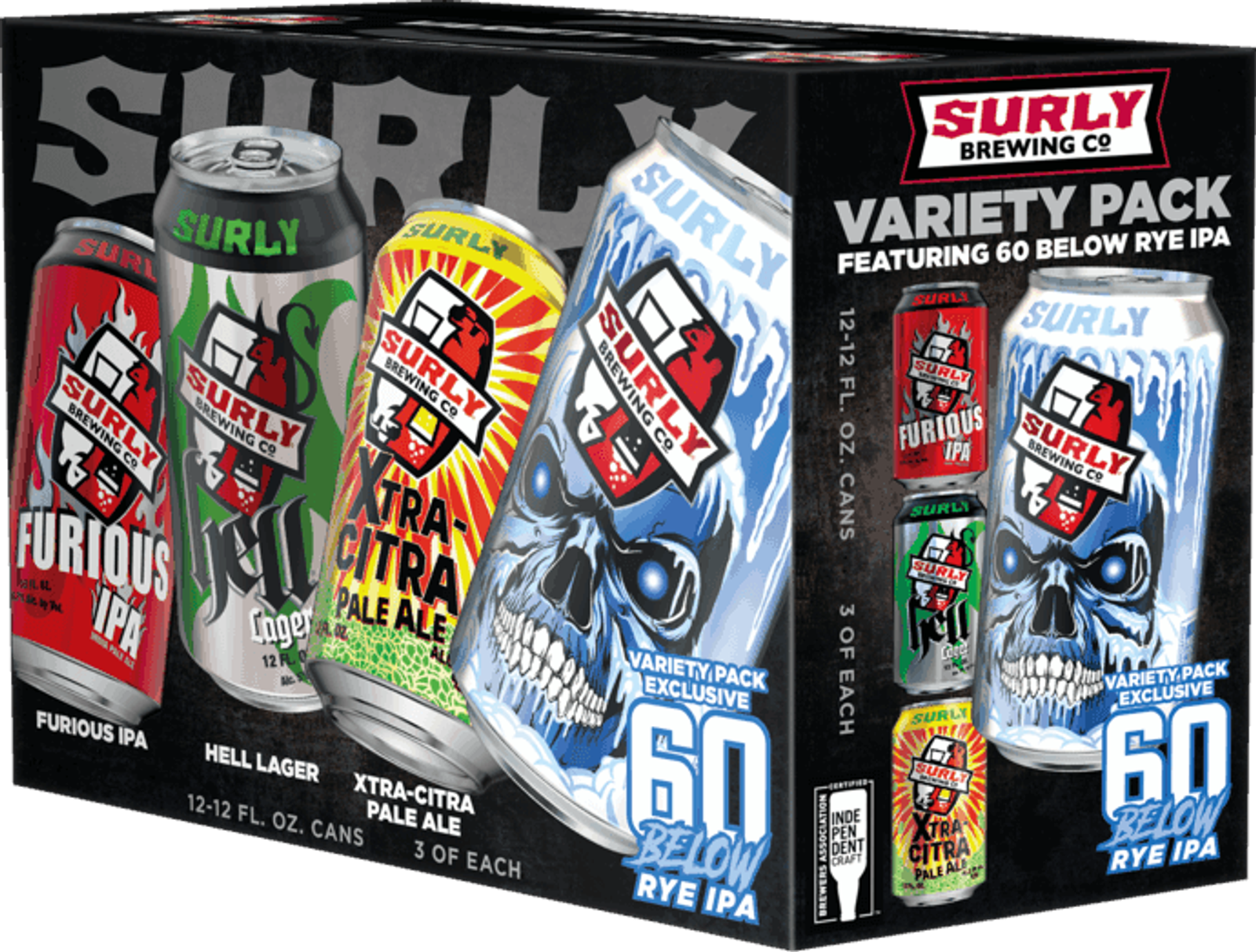
Known for 16oz beers that come in four backs, Surly Brewing Co. manages to stand out in an industry that prides itself on creativity.
The craft beer market is flooded with good beer and good beer names (read: puns), but Surly manages to stand out by looking different.
When you browse the shelves at a grocery store, Surly catches your eye. It comes in cans—big cans. It comes in four packs. Its artistic style is drastically different from the products it shares a shelf with.
That’s the genius of the Surly brand—it stands out.
Small business branding tips:
- Stand out visually. The Surly design is creative, bold, and colorful. It stands out by avoiding overused themes (LaCroix is another good example of this).
- Look for something different. Most craft beer comes in a bottle. By packaging its beer in cans Surly took the risk of being associated with lower-quality lagers in a crowded market—but the risk paid off.
3. Wieners Circle

Source: Flickr
Few small businesses are famous enough to have a fleshed-out Wikipedia article. The Wieners Circle is one of them.
A classic Chicago fixture, the Wieners Circle’s unique brand is only partially because of its yellow sign. It’s not uncommon to hear playful insults being tossed from employee to patron—and this is part of the appeal that lead to an appearance on This American Life and other media.
The Wieners Circle is an outstanding example of small business branding not because of stunning creativity, but because of how personality can elevate a small business to the status of a cultural staple.
Small business branding tips:
- Have a personality. I once watched a customer at the Wieners Circle ask to be insulted. A strong personality helps you stand out.
- Don't be afraid to take risks. The Wieners Circle sign often has political statements on it—and they can get a bit out there. But the risk of alienating a small segment of your core audience is outweighed by the loyalty built with others.
4. Imperfect Produce
Source: Indiegogo
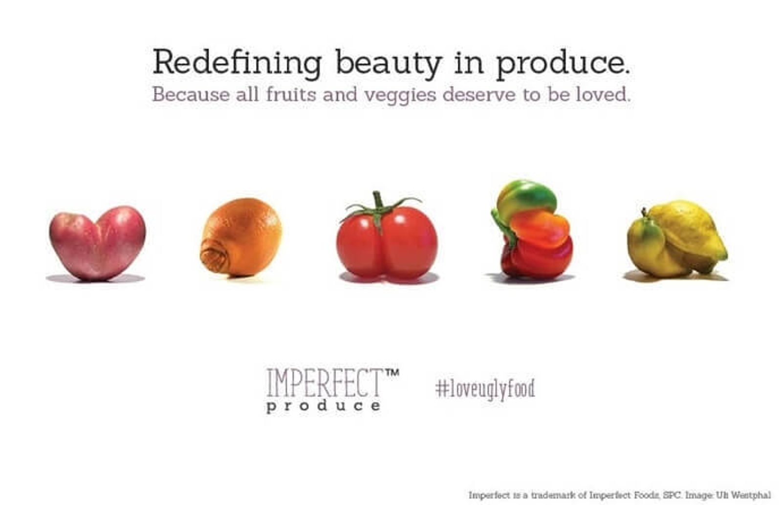
Imperfect Produce is a food startup that began after a successful Indiegogo campaign in 2015. The company takes food that’s too “ugly” for grocery stores and sells it at a discount or promotional pricing.
This is the description from their website’s about page: “Imperfect fights food waste by finding a home for ‘ugly’ produce. We source it directly from farms and deliver it to customers’ doors for 30-50% less than grocery store prices.”
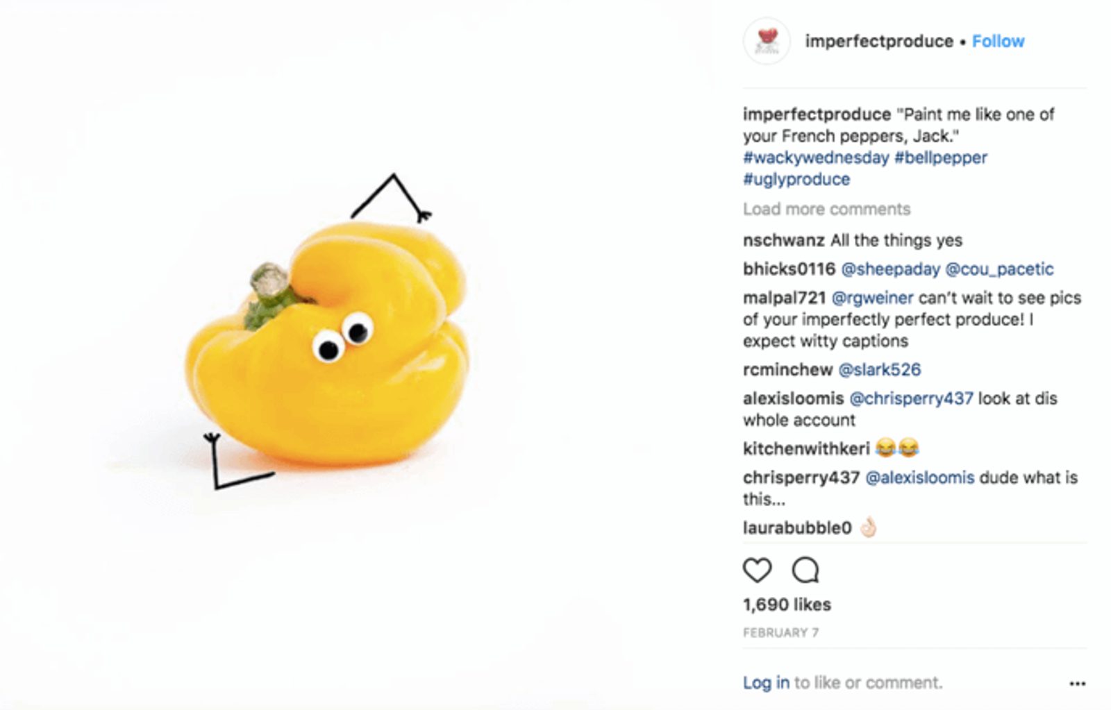
Imperfect Produce has had a great deal of success through social media marketing, using Instagram to spread its strong brand identity. That brand strategy is simple: stick googly eyes on misshapen vegetables.
It’s a simple concept, but how could you say no to that little guy?
Small business branding tips:
- Make a flaw into a benefit. Why is branding important? Imperfect Produce products are a little ugly. That might have made them harder to sell—so the company decided to turn misshapen vegetables into lovable, googly-eyed rogues.
- Connect to a broader message. Ultimately, Imperfect Produce fights food waste. That story is a powerful way to build brand loyalty and makes signing up for Imperfect Produce almost a no-brainer.
5. College Hunks Hauling Junk

Source: College Hunks Hauling Junk
With College Hunks Hauling Junk, what you see is what you get.
What’s great about the branding behind College Hunks Hauling Junk is that it’s incredibly simple. The name is descriptive. The logo supports the message of the name.
And, crucially, it sticks in your head.
When you’re driving past a truck, you probably don’t normally give it much thought. But if you drive past a truck with this orange and green logo emblazoned on its side, you remember it. Who will you call the next time you move?
Small business branding tips:
- Stick in people's heads. College Hunks Hauling Junk is easy to remember. Partially because it rhymes, partially because it's so easy to picture.
- Put your brand where people will see it. The trucks for CHHJ are brightly colored and have the logo on the side. Every pickup and junk haul is free advertising.
6. Platinum Skin Care

Source: Platinum Skin Care
Do you want skin care, or do you want platinum skin care?
Everything about the Platinum Skin Care name and creative communicates luxury. Elegance. From your first glance of the silver and black, you assume that this is a company with excellent products.
Small business branding tips:
- Go for emotional impact. What emotions does your brand associations evoke? Platinum evokes luxury because Platinum Skin Care is selling luxurious products.
7. Bony to Beastly
Source: Bony to Beastly
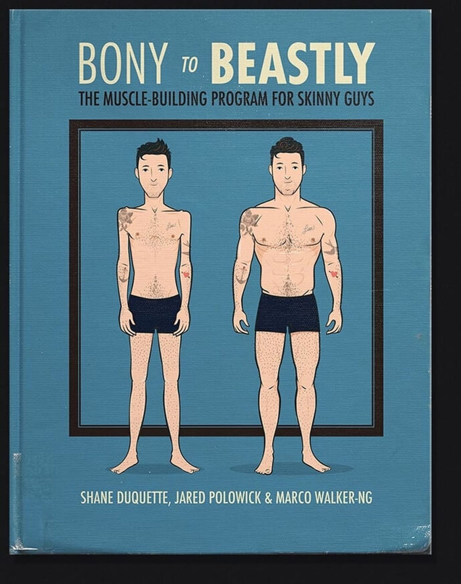
If you were a skinny guy looking to build muscle, where would you turn? One place you could go is Bony to Beastly, an online business that helps people build muscle.
What makes Bony to Beastly such a compelling example of small business branding is that it instantly communicates a key benefit. Before Bony to Beastly hit the scene, there weren’t that many resources out there on this subject.
The creative of Bony to Beastly is simple, but it communicates a compelling message quickly.
Small business branding tips:
- Visuals can tell stories. A picture of a skinny guy next to a buff guy tells the entire story of Bony to Beastly. The viewer understands it in seconds, showing the importance of branding.
- A simple message sticks. Bony to Beastly doesn't also help people lose weight. It isn't for hobbyists. It has one message that's easy to remember.
8. Vinome

Source: Vinome
If you’re not a wine enthusiast or are just looking for new wines to try, check out Vinome. The company analyzes your DNA, to figure out what flavors you’re genetically predisposed to love. Then it sends you wine based on your unique tastes.
Great marketing advice in your inbox
Now that you know the concept, take a look at that great logo design! The double helix, DNA corkscrew is brilliant—I was disappointed that they don’t sell an actual corkscrew in that style.
Small business branding tips:
- Industry affects brand. Wine is usually considered "high class." Vinome offers a new twist (pun intended) on wine, but it still reflects the "classiness" of the overall industry.
- Show what makes you different. DNA is in Vinome's DNA. So they also put it in their logo. Evolve your brand beyond what your direct competitors are doing.
9. MKBHD
Source: MKBHD
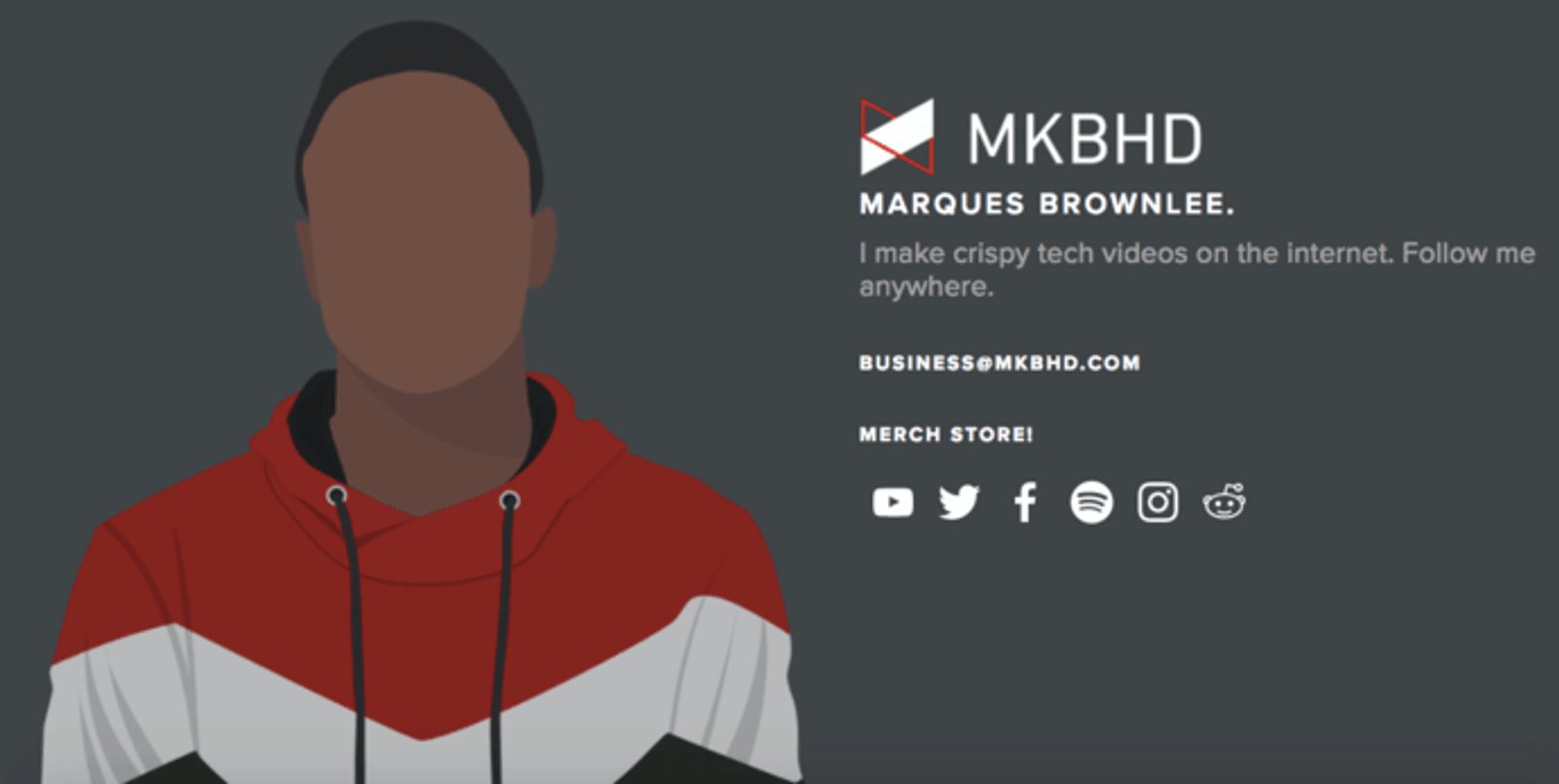
Marques Brownlee, better known by his YouTube name MKBHD, posts high-quality video tech reviews. Little known fact: he’s also a pretty good ultimate frisbee player.
Brownlee’s exact logo varies slightly across his social media platforms, but it always sticks to brand consistency with its red, black, and white theme. He’s widely regarded as one of the best tech reviewers and sometimes posts in-depth reviews on the same day as a product release.
His logo reinforces the casual, cool, cutting-edge nature of his tech content.
Small business branding tips:
- Go with your industry. Reds, blacks, and sharp lines can communicate the cutting edge. MKBHD reviews cutting-edge products, so he goes with those colors.
- Choose something slightly weird. MKBHD doesn't just make tech videos. He makes "crispy" tech videos. That adjective is just weird enough to make readers pause, without being so weird as to turn them away.
10. Lumosity


Source: Lumosity
Lumosity is a website that helps people train their brains by playing fun games. As it says on the about page of their website:
“At Lumos Labs, we believe in helping people keep their brains challenged. That's why we created a simple online tool to allow anyone to train core cognitive abilities.”
Their branding supports this mission statement. With clean, simple creativity, it communicates that “brain training” doesn’t need to be as strenuous as it sounds.
Small business branding tips:
- Design your brand to show what you do. Lumosity makes brains better. So their brand has a lot of brains.
- Make things sound fun or easy. "Brain training" could easily sound exhausting. But Lumosity makes it sound fun. If you offer something hard, look for ways to make it feel easy.
11. Finfolk Productions
Source: Finfolk Productions

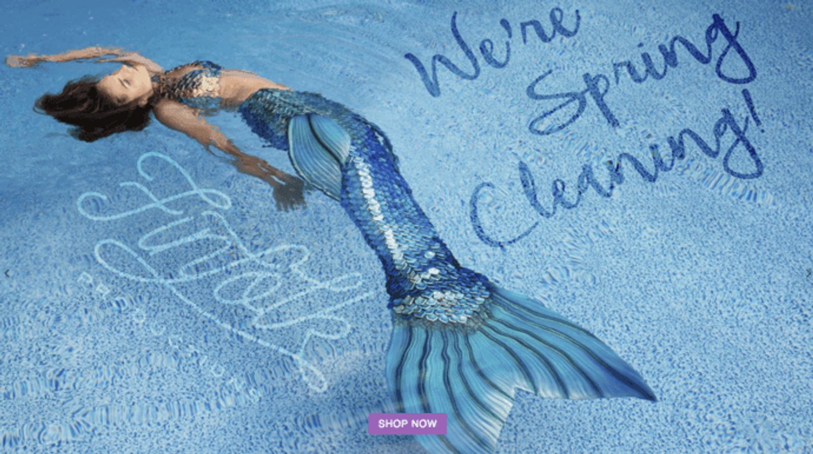
Have you ever wanted to be a mermaid? Finfolk Productions makes it happen.
A colorful brand with a vibrant Instagram presence, Finfolk Productions sells...mermaid tails.
It’s an unusual product, but the colorful art style and clever “pod squad” membership help you imagine what it would be like to live under the sea.
Small business branding tips:
- Color pops. Finfolk's products are colorful and so is their brand. Define your brand with colors that stand out and make people take notice.
- What you sell isn't always "useful" (even if it is). What's a mermaid tail good for? Maybe parties or events. But instead of focusing on that utility, Finfolk highlights the positive emotions of looking like a mermaid.
12. Tentsile

Source: Tentsile

When you can make your product look beautiful, showcase your product.
Tentsile is a company that produces a lightweight tent that’s suspended off the ground like a hammock. Its logo, above, shows a simple demonstration of how the product works (suspended between three trees).
The branding strategy on the Tentsile website and Instagram shows the product being used across a range of beautiful landscapes.
These incredible visuals make it easy to imagine yourself using the product. They sell an idea of the kind of person that goes to these places and builds the Tentsile brand through effective messaging.
Small business branding tips:
- Connect to a lifestyle. Looking at Tentsile's creative identity gives you a sense of what it feels like to live a particular lifestyle.
- Activate an emotion. High-def visuals and killer product shots evoke a sense of awe.
13. By the Way Bakery
Source: By The Way Bakery
“This is a special place, the kind you remember, but can never find.”
That’s the beginning of the copy on the By the Way Bakery website. The bakery bills itself as “an old-fashioned bakery where everything is made by hand, from scratch,” and sells gluten-free baked goods that are apparently indistinguishable from their gluten-filled counterparts.
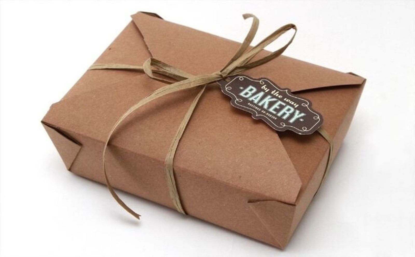
What I love about the By The Way Bakery branding, aside from the fact that it’s located in my hometown in New York, is that it’s simple. There are no bright colors. It doesn’t catch the eye. The takeaway boxes are mostly brown.
But that’s actually part of the Bakery’s charm. Its cohesive branding may be filled with brown, but it's a rich brown like aged wood—exactly what you would expect from an old-fashioned, homey bakery.
Small business branding tips:
- Make people feel things. If you can brand your small business to associate with a powerful emotion (in this case, nostalgia) you can get people to think of you when they feel that emotion.
- Color doesn't need to be bright to be effective. Brown should be boring, right? But for By The Way, it's exactly the color that matches their brand identity.
14. Prodjuice
Source: Prodjuice
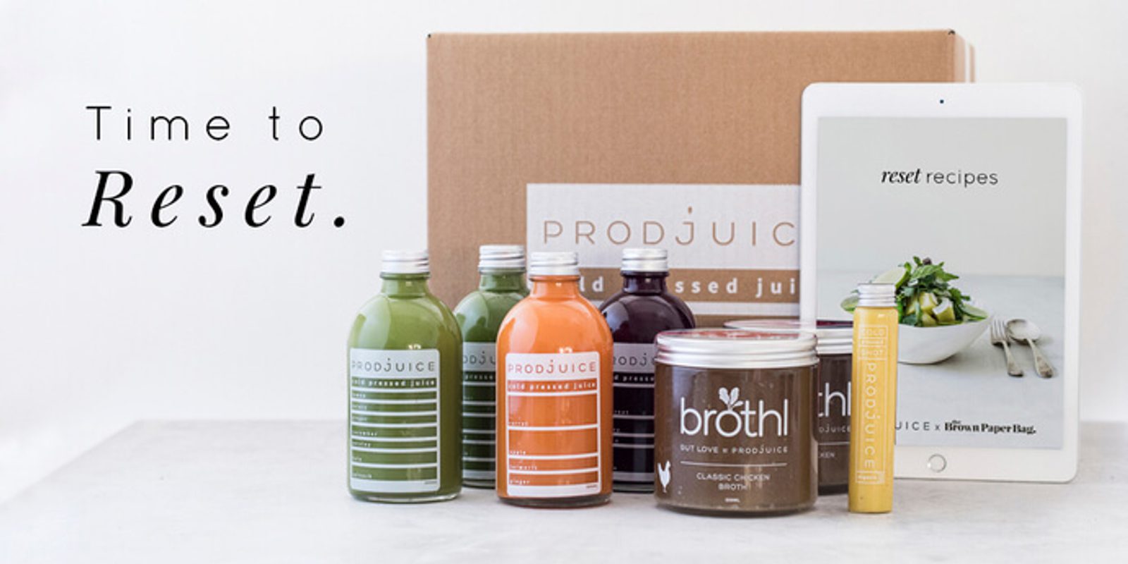
Prodjuice sells “extremely nutrient-dense juice that is not only incredibly good for you, but tastes amazing too.”
Prodjuice decided to go with a simple creative style, and with good reason—the colors of its juices are stunning all on their own.
Highlighting bright orange and red juices with the tagline “cold-pressed juice” paints the picture of health, simplicity, and calm.
Small business branding tips:
- Simplicity = quality. Simple and elegant is often associated with high quality and is a way to establish trust. Juice is a product that sounds "pure" and natural, so Prodjuice packaging looks simple and clean.
- Highlight your product. The color in Prodjuice creative comes from the product itself. If you have a stunning product, showing it can be a highly effective strategy in how to build a brand.


