Flyers aren’t just for garage sales, basement concerts, and lost dogs.
The numbers don’t lie:
- 79% of small-to-medium business owners (SMEs) use flyers and brochures as part of their marketing activities
- 85% of consumers said they are more likely to shop with a small business that has professionally printed materials, such as business cards, signs, and flyers
- Over $15 billion was spent on flyer printing in the US alone in 2017
Why should you use flyers to market your business or event?
1. They’re cost-effective. Designing and printing flyers can be cheaper than overhauling your website, paying for a billboard, or running social media ads.
2. Flyers are easier than ever to make and print. There are tons of tools and templates out there to help you design the perfect flyer for your business.
3. You can reach the audience you want. Depending on how and where you distribute a flyer, you can get in front of a targeted audience or a broader one. Think about where your audience spends their time (are there any coffee shops or small businesses that they frequent?) and then look into posting your flyer there.
Keep reading for:
- What should be on a flyer?
- 25 flyer examples, designs, and templates
- Free online flyer makers
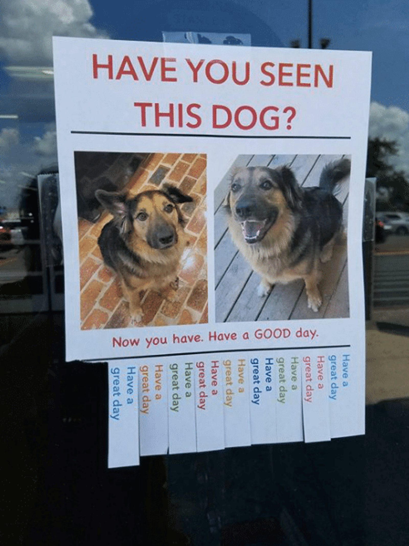
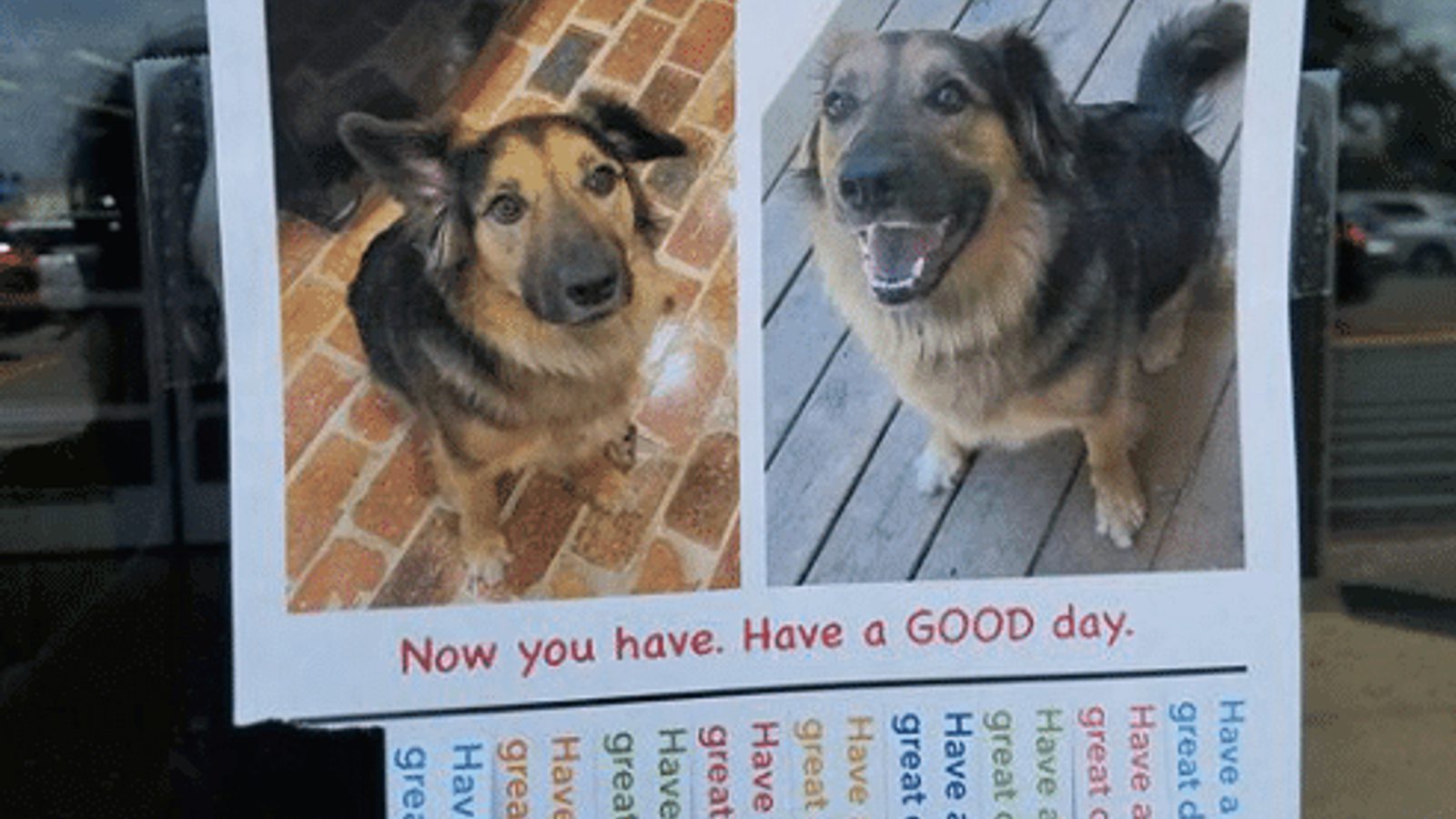
Have you seen this dog? Now you have!
What should be on your flyer?
No matter what event or business you’re marketing, your flyer should include:
- Your company name and logo: Who are you?
- Company contact info, including your website and social media handles. How can people reach you? Where can they find you online and off?
- Compelling headline to get people’s attention (and make them take a closer look). Your headline should be clear and interesting.
- Any special offers, coupon codes, discounts, or sale details.
- Attention-grabbing visuals. Your flyer design doesn’t have to be flashy — it can be minimalist or make use of negative space — as long as it attracts attention.
- Benefits or features of your product, service, or event. Why should someone come to your event or visit your store?
Try it now, for free
25 marketing flyer examples for design inspiration
Here are 25 flyer examples and some of the best flyer design templates, including:
- Business-to-business (B2B) flyer
- Culinary event flyer
- Film festival flyer
- Real estate flyer template
- Half-page open house flyer
- Medical flyer template
- Holiday shopping event flyer
- Vintage holiday-themed concert flyer
- Halloween party flyer
- Halloween events schedule flyer
- Informational copywriting service flyer
- Contemporary concert flyer
- Web design company flyer template
- Corporate branding flyer template
- Flyer example for cleaning service
- Creative yard sale flyer
- Valentine’s Day dinner flyer
- Minimalist flyer designs
- Monochromatic art show flyer
- Handwritten event flyer
- Modern food festival flyer
- Real estate infographic flyer
- Black Friday sale flyer
- Tropical summer sale flyer
- Double-sided flyer
1. Business-to-business (B2B) flyer
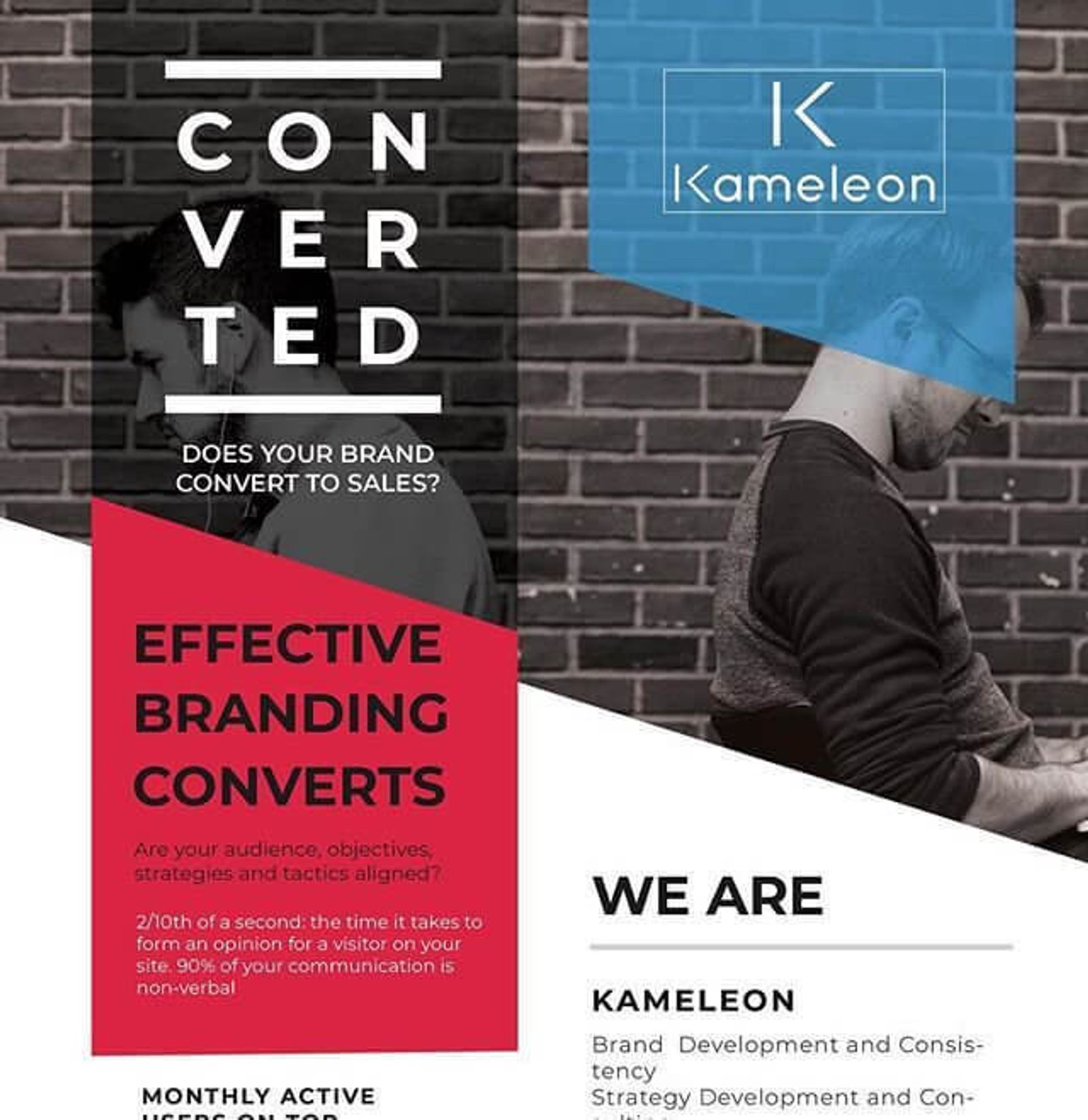
Preview of flyer design by Annie Anderson
What this corporate flyer does well:
- Visually interesting: Color-blocking, transparent overlays and bold fonts give this flyer a modern look
- Tells you the benefit upfront: “Convert” is a buzzword in B2B marketing. Kameleon promises to help you convert more customers by improving your branding.
- Name and logo are clear: You can tell whose flyer this is right away. Don’t make people hunt for your company name — they might just walk away.
2. Culinary event flyer
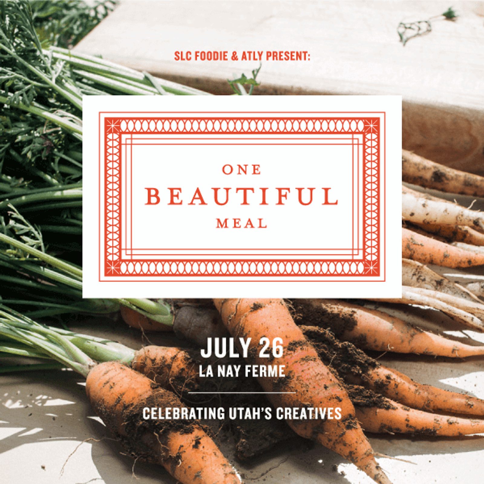
Flyer design by Valerie Jar
What this event flyer does well:
- Elegant design: Keeping text to a minimum and generously spaced design elements makes this flyer look sophisticated.
- Striking background: A creative use of photography and an edge-to-edge background photo make this flyer a true attention-grabber.
- Details are front-and-center: The date and location of the event are easy to spot.
3. Film festival flyer
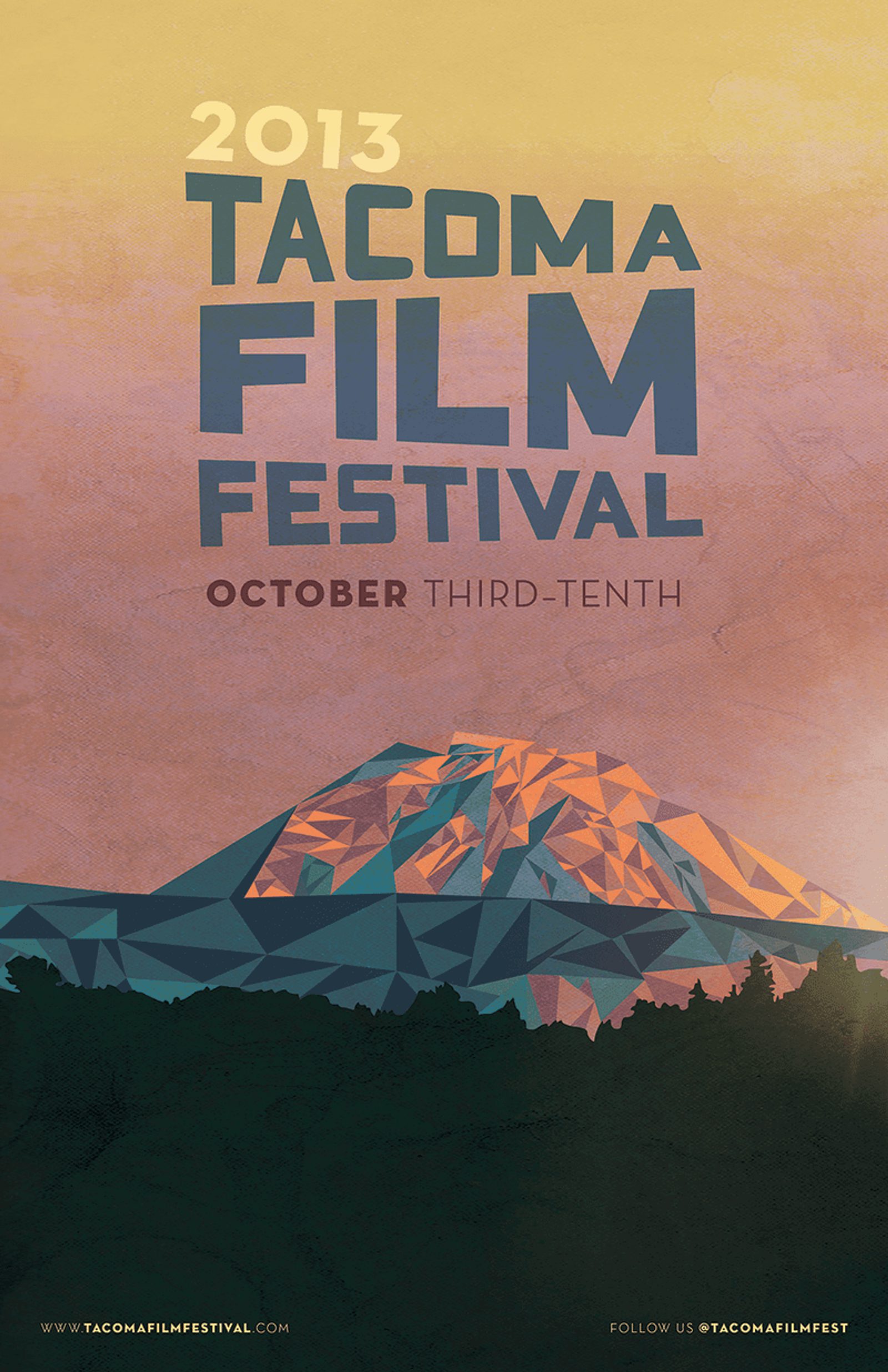
Flyer design by Justin Krout
What this festival flyer does well:
- Geometry is cool: Justin uses geometric shapes in the text and graphics to create a 3D effect that makes this flyer stand out.
- Eye-catching title: The slightly-tilted event title is nearly impossible not to read. When you craft a flyer headline, keep design in mind — you don’t need a bold claim or edgy headline to grab attention.
- Find them online: Including the festival website and social media handle makes it easy for people to learn more or contact the festival.
4. Real estate flyer template

Flyer template by Canva
What this real estate flyer template does well:
- Columns and lists: Canva’s template keeps a lot of important info well-organized with columns and bulleted lists. Formatting more text-heavy flyers this way makes the information easier to read and digest.
- Photography: In real estate listings, photography matters. You want to know what a house looks like before you buy it, right? This flyer template balances text details with 2 spaces for photos of the property.
5. Half-page open house flyer

Flyer design by Frank Burder
What this open house flyer does well:
- Gives an incentive: Saving $236 sounds good to me! An incentive (like saving money or a free gift) grabs people’s attention. You can also have your flyer function as a coupon by saying, “Show or mention this flyer for this deal.”
- Clear call-to-action: The flyer gives prospective renters an obvious next step: “Apply online today.” When you make it easy for people to act on their interests, they’ll be more likely to convert.
6. Medical flyer template
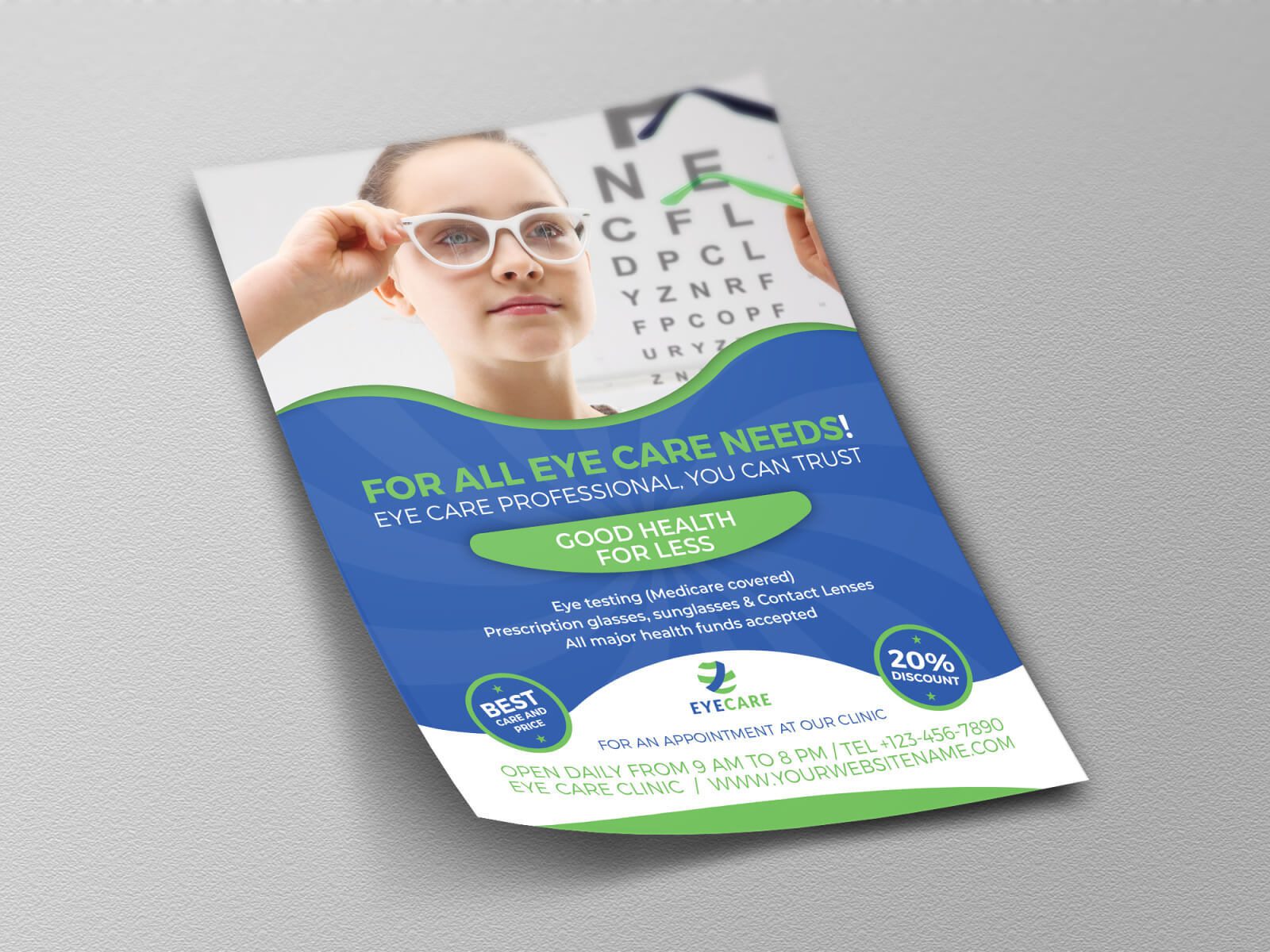
Flyer template by OW Pictures
What this medical flyer template does well:
- High-quality photography: A professional flyer should have professional photography. Keep images relevant to your business, as this eye clinic’s stock photo does.
- Simple design: A medical professional should be credible, not flashy. A simple and balanced design like this can help people take your business seriously.
- Business information: The flyer includes contact details and daily hours, which makes it easy for prospective patients to book an appointment.
7. Holiday shopping event flyer
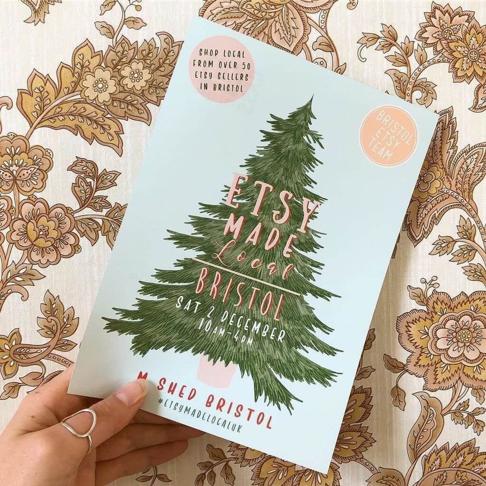
Flyer design by Little Paisley Designs
What this art market flyer does well:
- Beautiful illustration: A hand-drawn flyer fits the theme of a local art market perfectly.
- Branded hashtag: Including a hashtag for your event helps people find you online and share their own photos of your event.
8. Vintage holiday-themed concert flyer
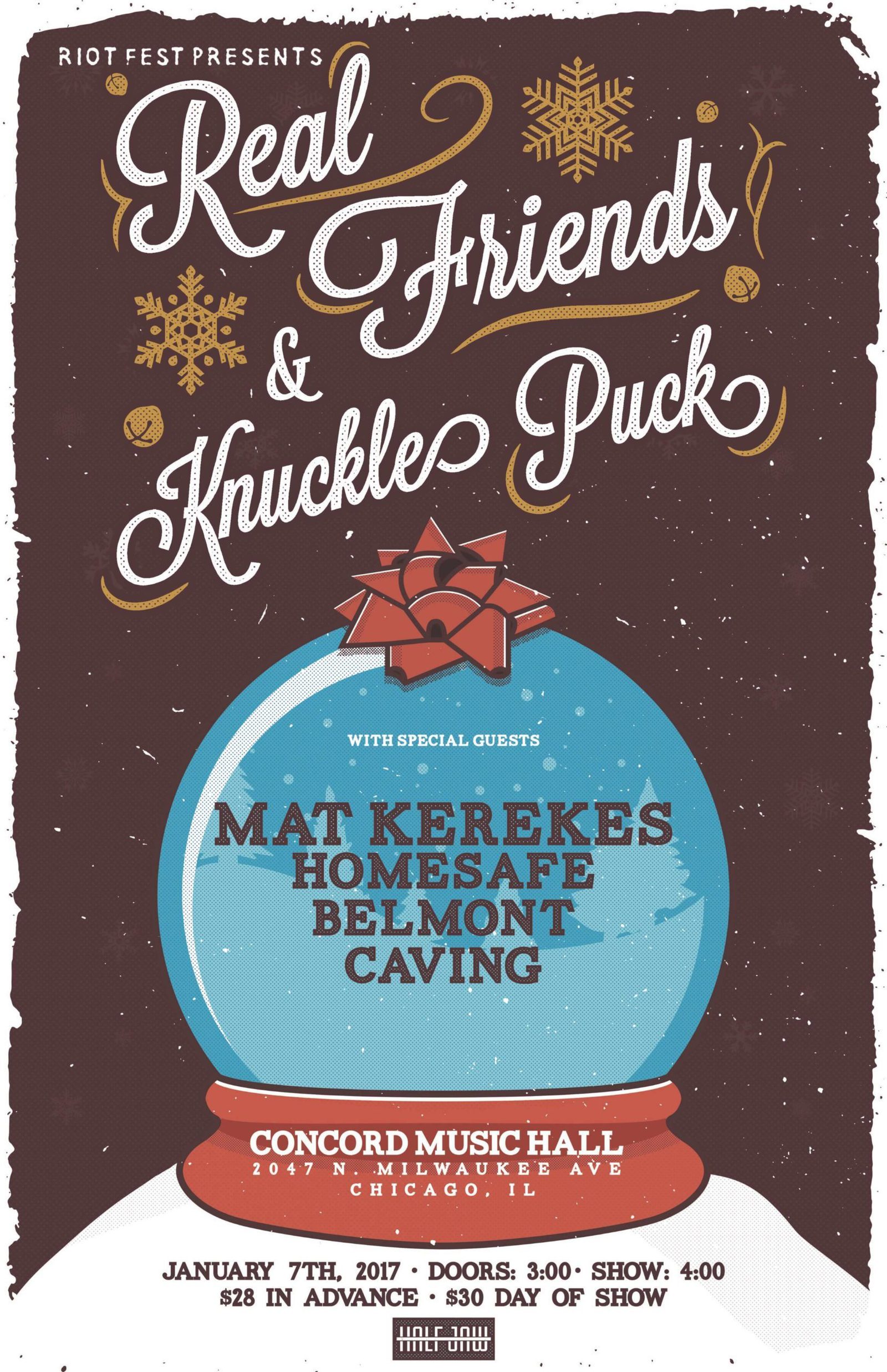
I had to give a shoutout to a local Chicago event! Designed by Carlos Cardenas of Half Jaw Designs
What this concert flyer does well:
- Vintage aesthetic: A worn-looking background, old-fashioned fonts, and faded colors give this flyer an interesting vintage feel – the perfect vibe when your event is holiday-themed.
- Mixed fonts: Using a few different fonts (but not too many) can help make your flyer more attention-grabbing — and keep people reading all the way through. It can also help differentiate between different types of information, like headliners vs. supporting acts.
9. Halloween party flyer
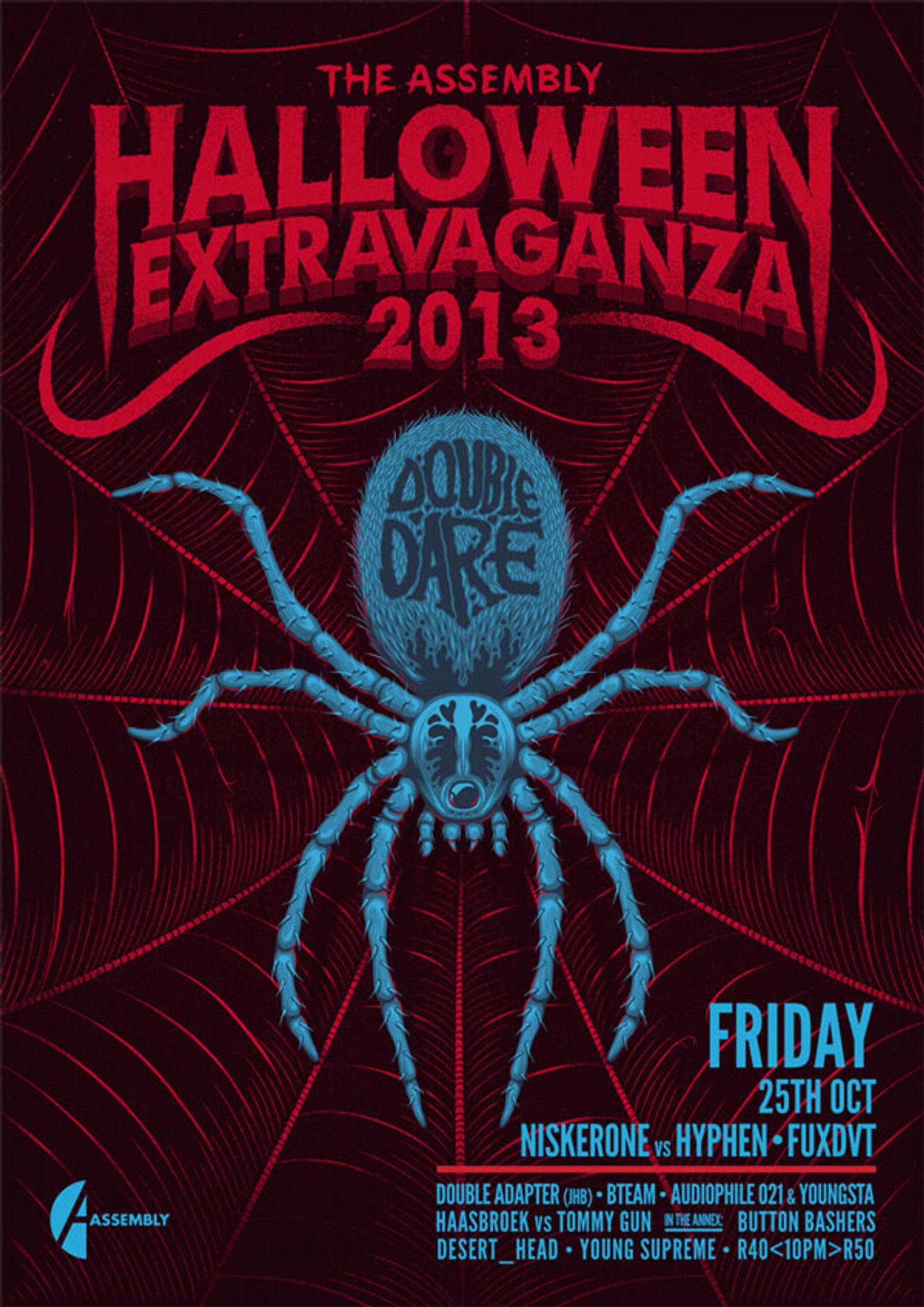
Flyer design by Ian Jepson
What this Halloween flyer does well:
- Clear theme: This flyer is really spooky (hello arachnophobia) — perfect for Halloween!
- Contrasting colors: Bold primary colors against a dark background make this flyer visually striking (and easy to read).
- Visual hierarchy: Create a visual hierarchy to draw people’s eyes to the most important information first. Here, that includes the name of the event, the date, and the headlining acts.
10. Halloween events schedule flyer
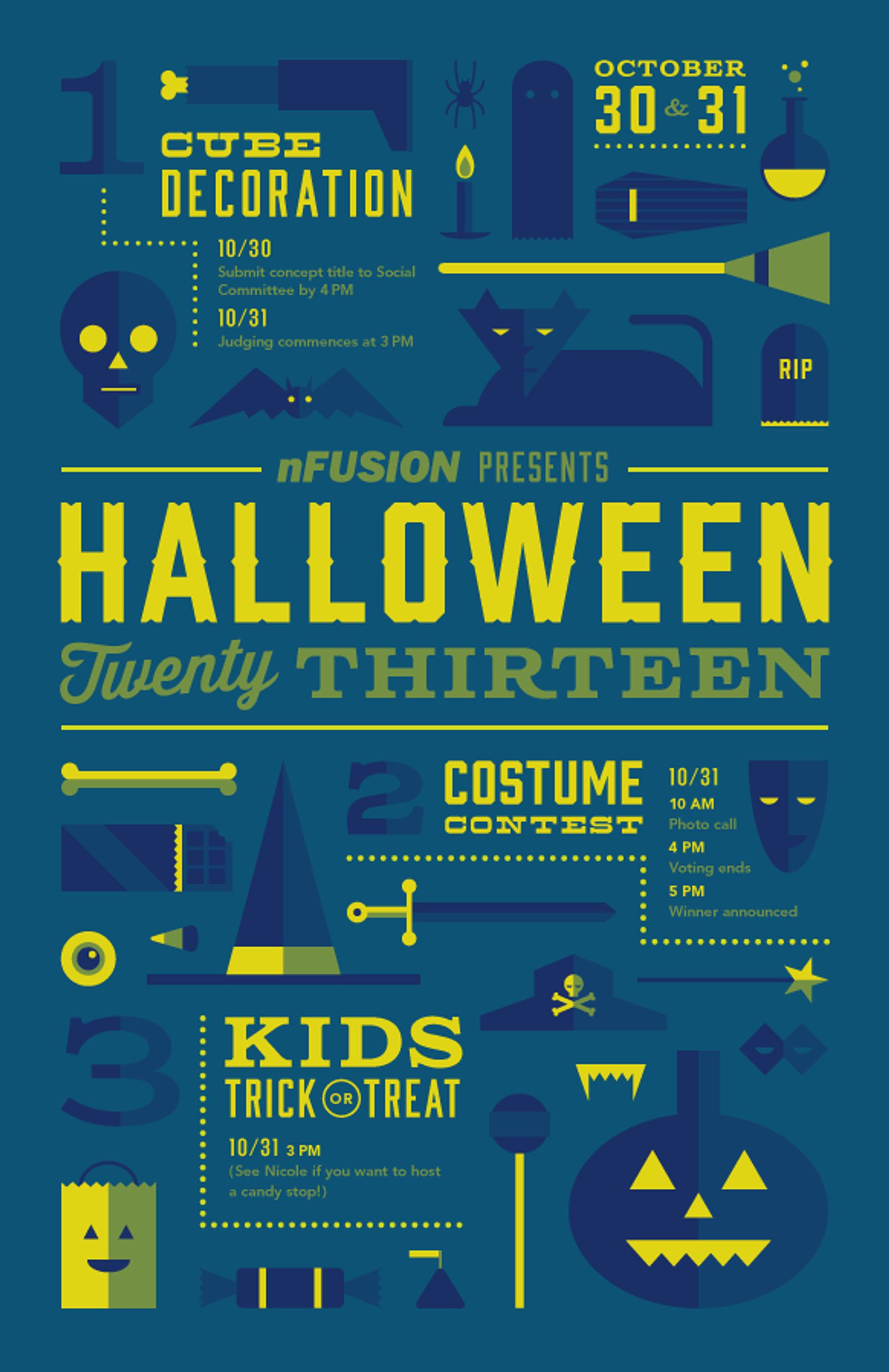
Flyer design by Jacob Etter
What this seasonal flyer does well:
- Easy to follow: Numbering the different office Halloween events 1-3 and spacing them apart makes it easy to keep track of what’s going on. If you have different event details on one poster, make sure you separate them clearly.
- Festive icons: This fun graphic design features Halloween-themed iconography in a consistent color scheme.
- Unexpected colors: This flyer avoids traditional Halloween colors, which will make it stand out from all the other flyers that use Halloween cliches (orange, black, green and purple).
11. Informational copywriting service flyer
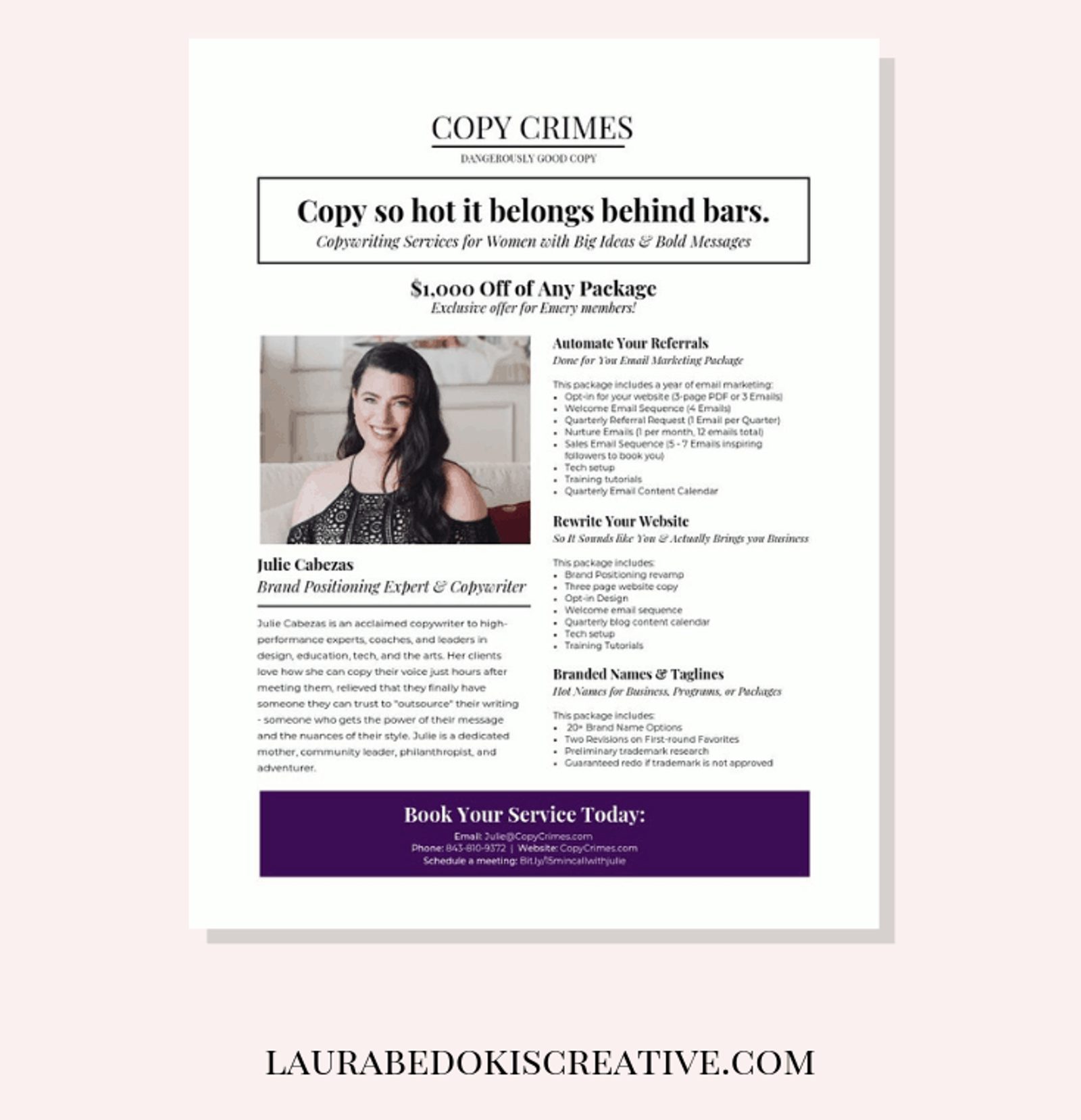
Flyer design by Laura Bedokis
What this informational flyer does well:
- Powerful headline: “Copy so hot it belongs behind bars” is…well…hot copy. It definitely grabbed my attention! Make sure your headline makes people want to keep reading.
- Full of information: This is one situation where minimal copy isn’t the right move. When your flyer is someone’s first introduction to your service — and the goal is for them to book, purchase, or sign up — provide as much information as they need to make a decision.
- Professional, simple layout: Julie provides a professional service to other businesswomen; it makes sense to use a no-frills layout.
12. Contemporary concert flyer
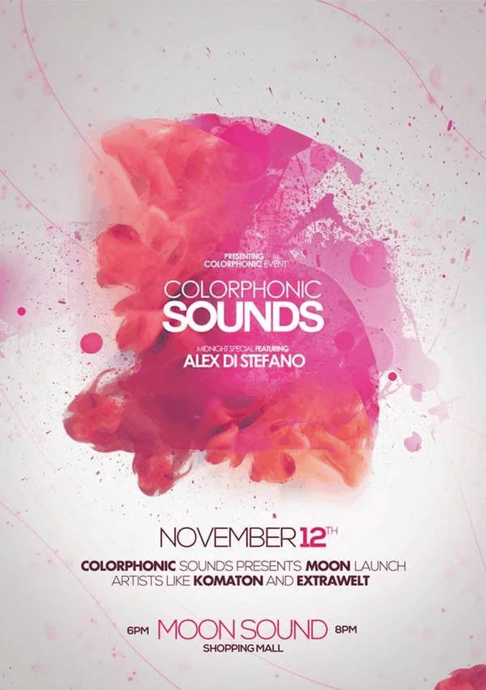
Flyer design by Dussak Design
What this creative flyer design does well:
- Bright colors: The watercolor splatter effect in this flyer is heightened by beautiful bright colors. An aesthetically-pleasing design makes people want to look at your flyer and read what you have to say.
- Minimal text: This flyer only gives you the information you need about their concert: Who’s playing, where it is, and when it begins. More info is unnecessary (and would clutter the design).
13. Web design company flyer template
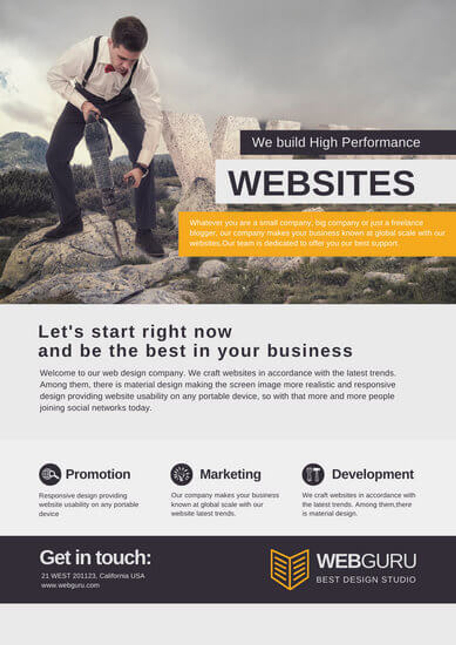
Flyer template by Canva
What this professional flyer template does well:
- Professional design: A flyer for a business that designs professional websites should reflect that same aesthetic. This simple, clean template with a muted color scheme fits the bill.
- Icons: Using icons for each service offered makes the flyer easier to skim (especially for readers on the go).
- Call-to-action: This flyer has a clear, low-friction call-to-action for potential clients who like what they see: “Get in touch.”
14. Corporate branding flyer template
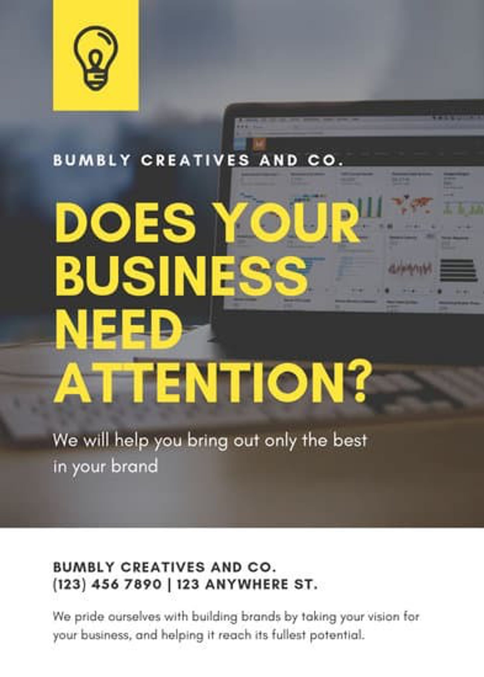
Flyer template by Canva
What this advertising flyer does well:
- Pop of color: The yellow headline and logo against a muted background photo make the flyer stand out.
- Powerful headline: More attention for your business = more sales. This headline piques curiosity with a solution to a universal business conundrum: How to get more eyes on your business.
15. Flyer example for cleaning service
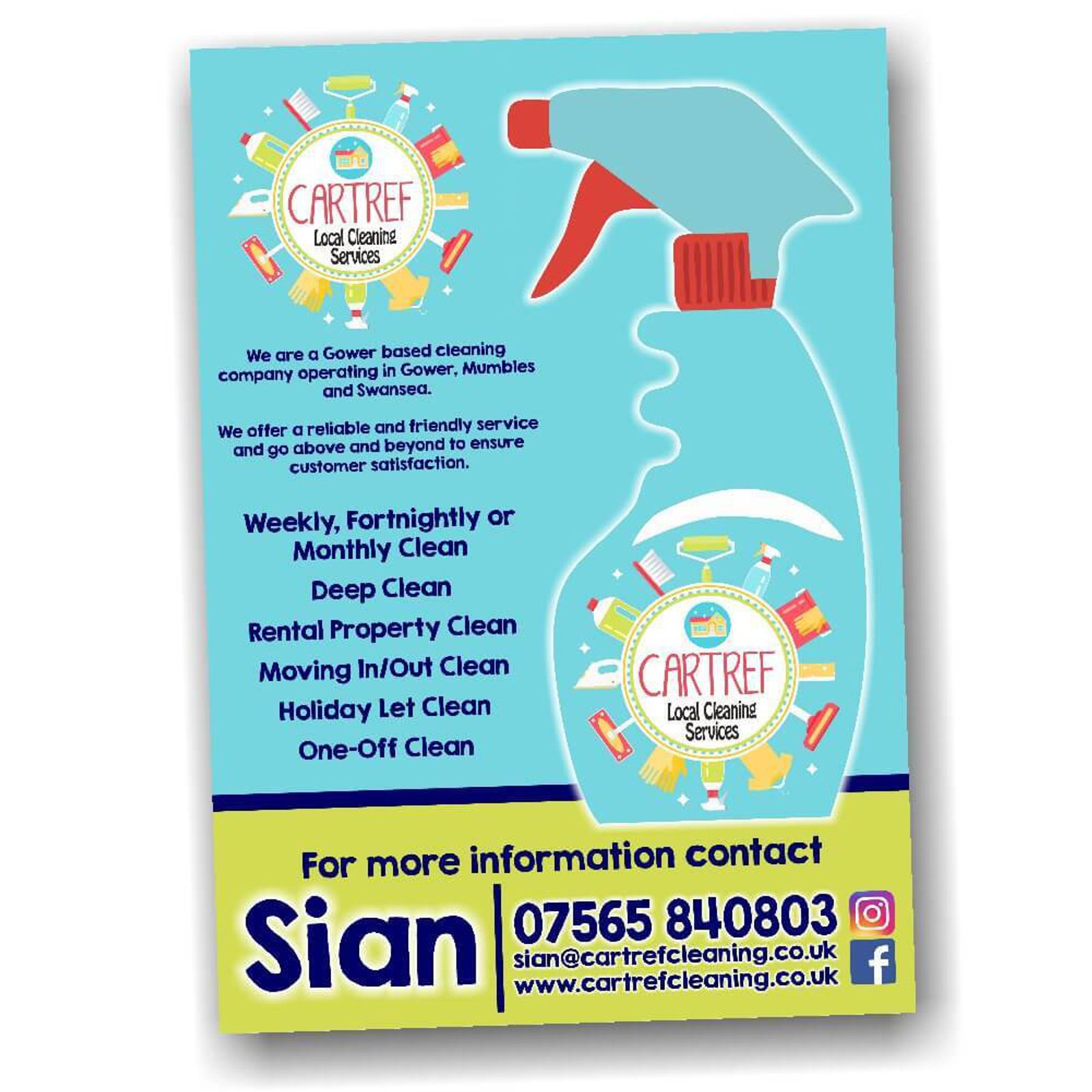
Flyer design by AW Graphics & Design
What this small business service flyer does well:
- Colorful and cute graphic design: The fun fonts and graphics on this flyer make it inviting and memorable.
- Multiple contact options: Giving potential clients several ways to reach you — including social media – makes it easy for them to get in touch.
- Clearly lists benefits and features: This informational flyer gives plenty of details on what services Cartref Local Cleaning Services offers. Make it easy for prospective clients to see how your service fits into their lives.
16. Creative yard sale flyer
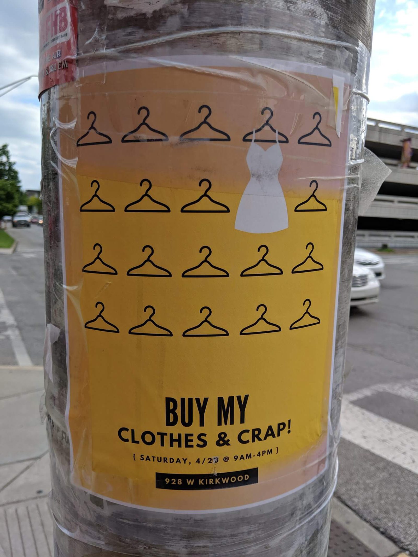
Source: @btownmoose on Twitter
What this simple flyer does well:
- Humor: I laughed out loud at the phrase “clothes and crap.” This flyer is casual and irreverent, which works great for a laid-back yard sale. If it works with your brand personality, humor can be a great way to make your flyer stand out.
- Repetition: People are drawn to patterns. The hanger pattern is visually pleasing and the single dress that breaks up the repetition is a fun surprise.
17. Valentine’s Day dinner flyer

Romance is in the air! (Source: Le Bistro Houston)
What this Valentine’s Day flyer does well:
- Full of details but visually balanced: There’s a ton of info on this flyer, but the use of columns, different fonts and colors, and headings makes it easier to read.
- Includes pricing: Including pricing makes it easier for people to make an informed decision by giving them all the info they need up-front. Plus, it cuts down on the number of phone calls the business will get with questions about pricing.
- Valentine’s Day theme: This is unmistakably a Valentine's Day flyer. If your event has a theme, put it front and center!
18. Minimalist flyer designs
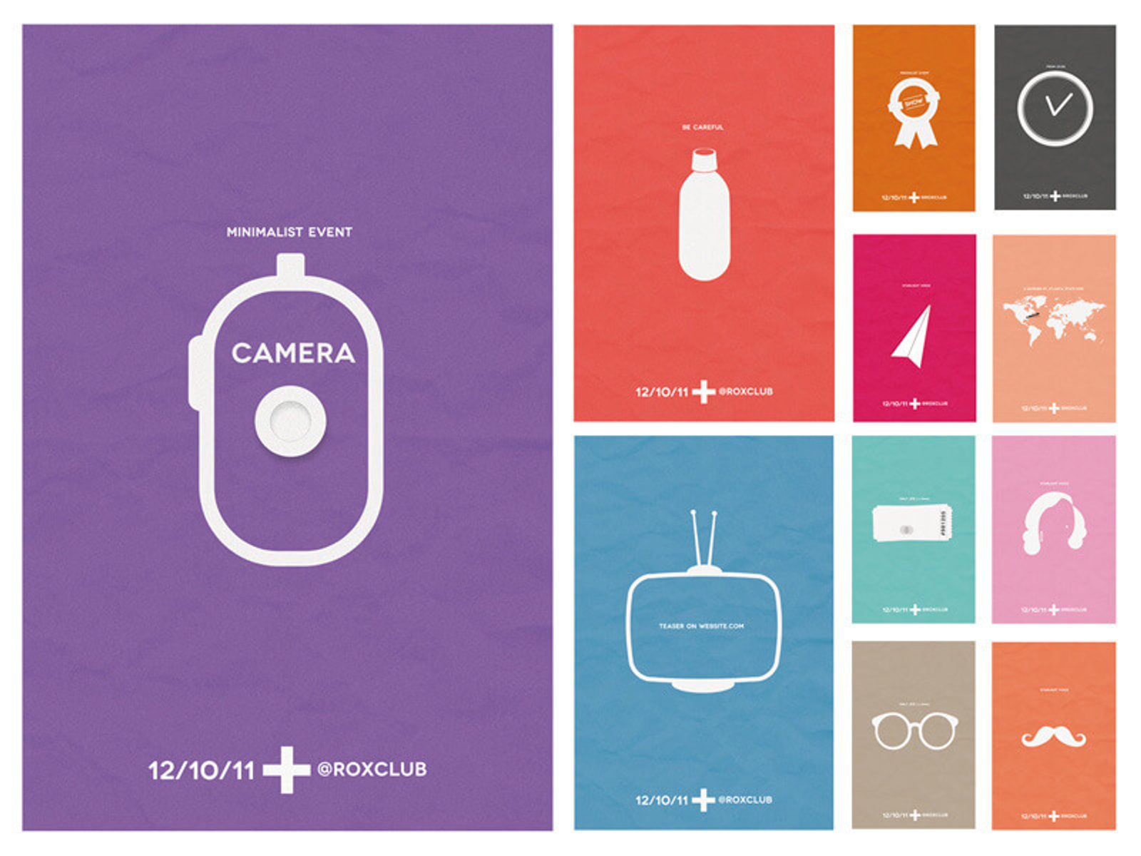
Flyer designs by Barthelemey Chalvet
What the minimalist designs in these flyers do well:
- Provokes curiosity: The lack of text generates interest and makes you want to look closer to find out what the flyer is all about.
- Visually satisfying: The well-organized geometric designs are aesthetically pleasing. Keep your flyer organized and neat to make it easy on the eye.
- Social handle: The bottom of each flyer includes the event host’s social handle — once people’s interest is piqued, they will want to know where to go for more info.
19. Monochromatic art show flyer
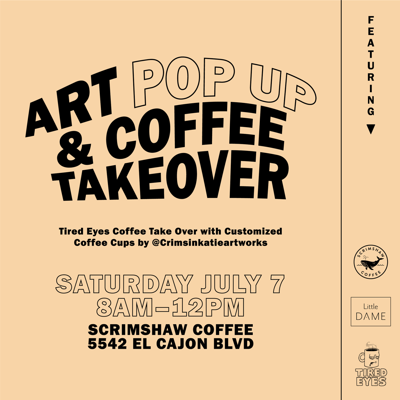
Flyer by Feels Design Studio
What this art show flyer does well:
- Creative spacing: This simple design makes ample use of negative space and fun fonts. Dynamic use of typography can make your flyer more interesting — no bold colors or bright graphics necessary.
- Monochromatic: The sepia-toned background and all-black text give this flyer a unique flair.
- Unexpected design: The super-skinny right column with vertical text and brand logos is unusual and visually interesting.
20. Handwritten event flyer
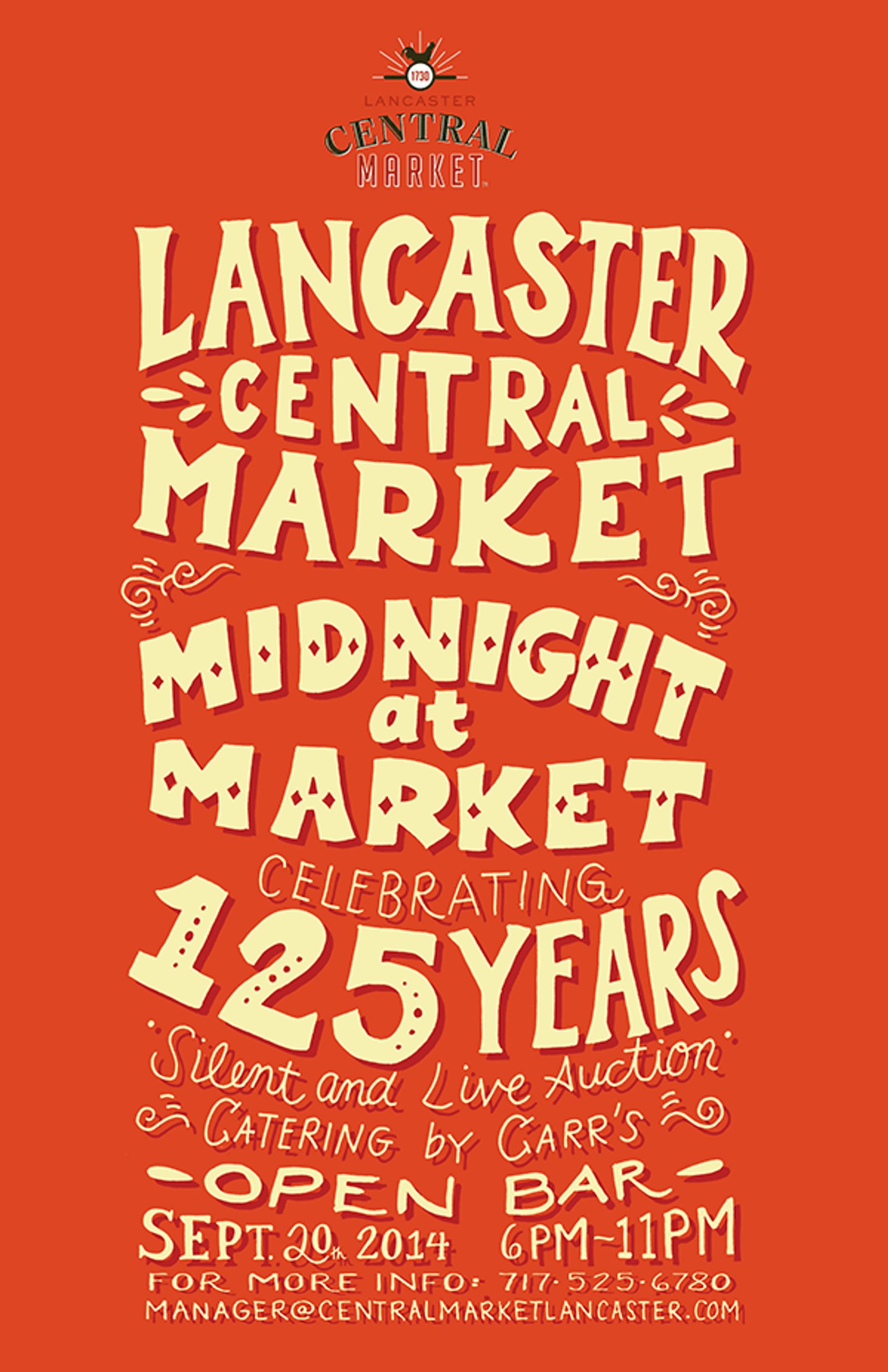
Flyer design by Samantha Mongelluzzo
What this event flyer does well:
- Hand-drawn trend: The design and typography on this poster are trendy. Don’t be afraid to try out new design trends on your flyers.
- Negative space: The negative space here works well to center the important information.
- Clear and detailed: This flyer has all the need-to-know information for the event, including perks like an open bar, catering, and an auction.
21. Modern food festival flyer
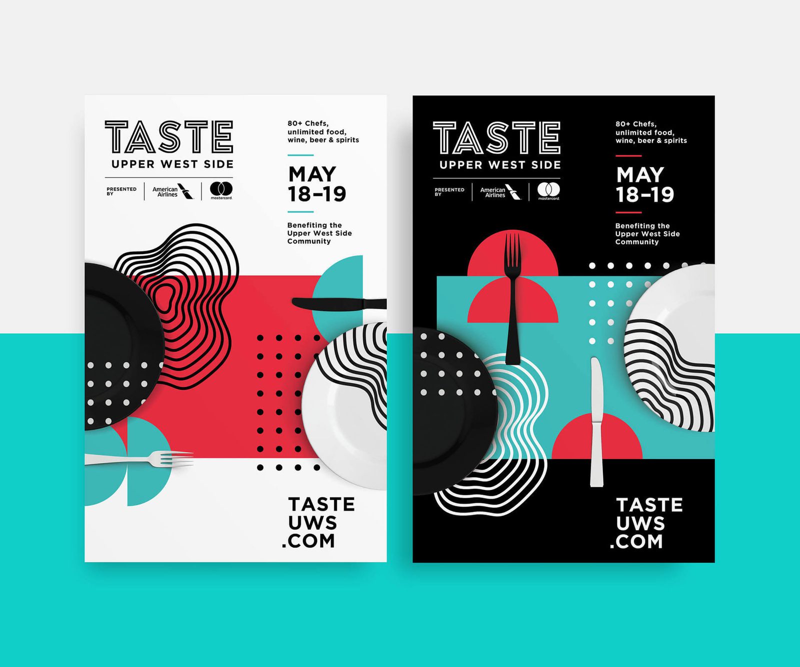
Flyer design by Shanti Sparrow
What this modern flyer does well:
- Balanced imagery and text: The complementary colors and modern, appealing design make this flyer easy on the eyes.
- Subtle culinary theme: Instead of hitting you over the head with food festival imagery, the subtle cutlery graphics play into the culinary theme in a refined way that matches the vibe of the event.
- Easy to find details: Don’t make it hard for people to attend your event. The title, date, and website of the event are all easy to find.
22. Real estate infographic flyer
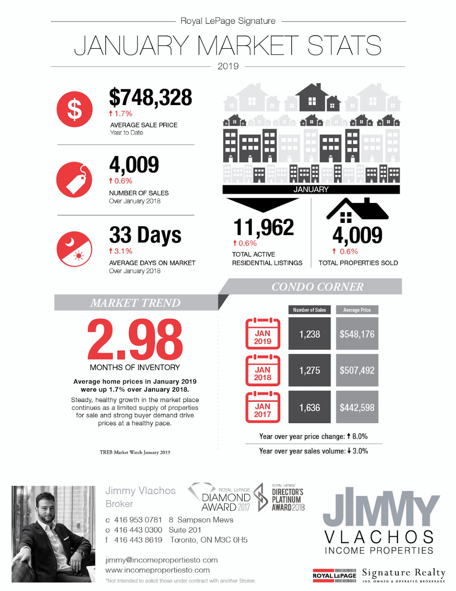
Source: Jimmy Vlachos Income Properties
What this infographic flyer does well:
- Data visualization: Use an infographic to share statistics relevant to your business so the data is easier to understand. If you’re in an industry — like the real estate market — that relies heavily on numbers and stats, using an infographic can help you make important, data-heavy information more intriguing.
- Contact info: Jimmy Vlachos gives plenty of options for people looking to contact him about selling or buying a property.
- Well-organized: There’s a lot of content on this flyer, but columns and headers keep it organized and easy to read.
23. Black Friday sale flyer
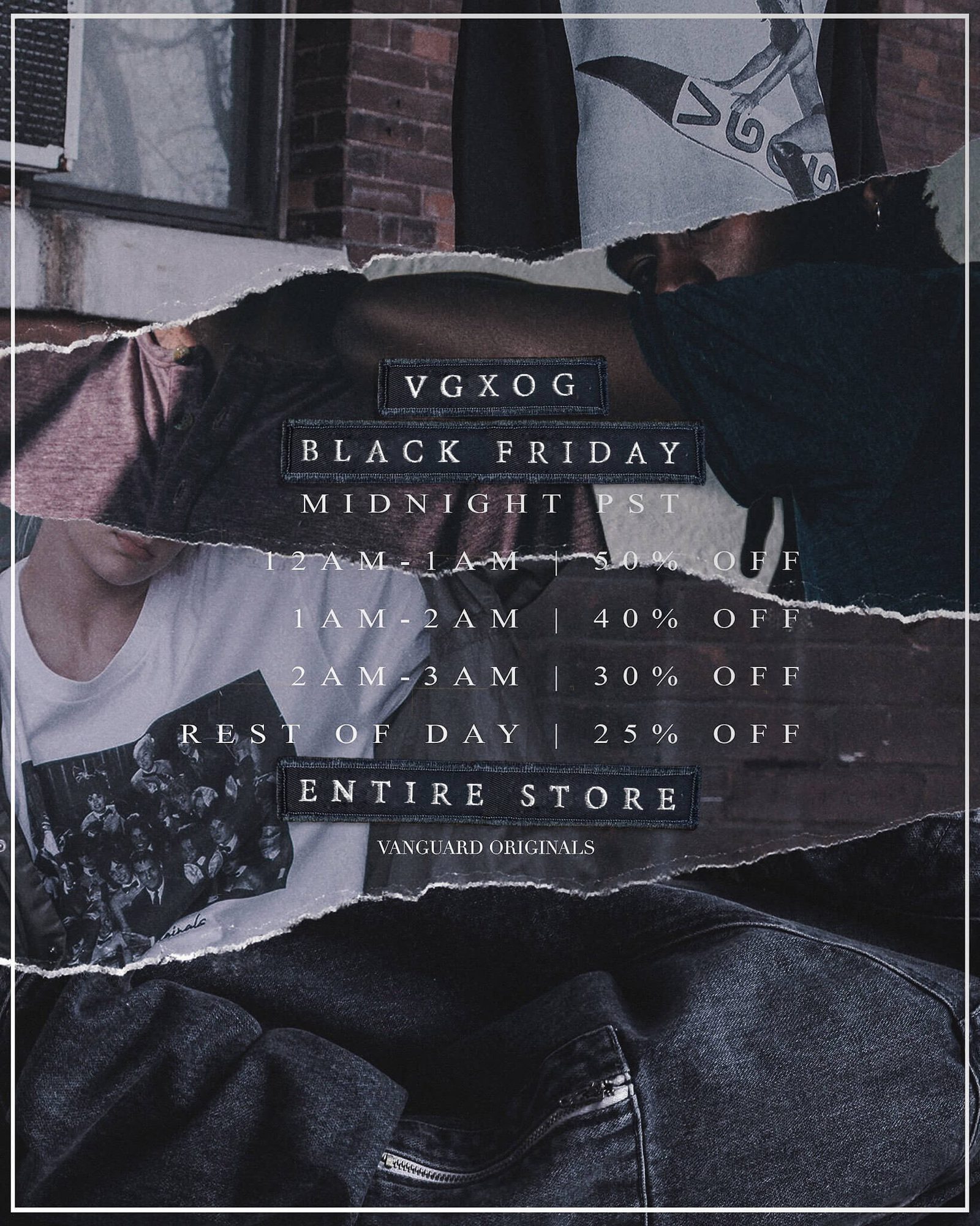
Source: Vanguard Originals
What this Black Friday sale flyer does well:
- Deals and discounts: The discounts and deals are clear, along with what time the sale starts and what will be on sale (the entire store!). If you use a flyer to advertise your Black Friday sale, make sure you include any promo codes, terms and conditions, and other relevant information.
- Brand aesthetic: This edgy, street fashion flyer fits in with the brand’s overall aesthetic.
24. Tropical summer sale flyer
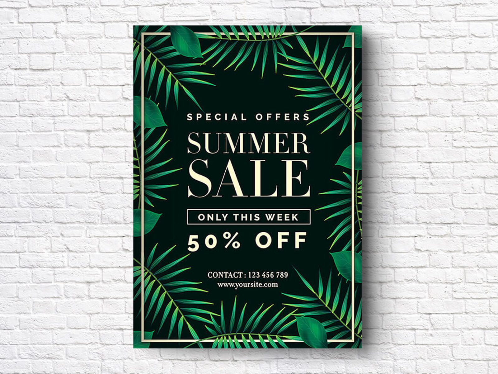
Flyer template by Peachline
What this creative template does well:
- Tropical theme: A fun theme makes your flyer stand out, and the palm leaves are the perfect vibe for a summer sale.
- Contact information: This flyer template includes a space for your phone number and website URL. Make it easy for potential customers to get in touch with multiple ways to contact you.
25. Double-sided flyer
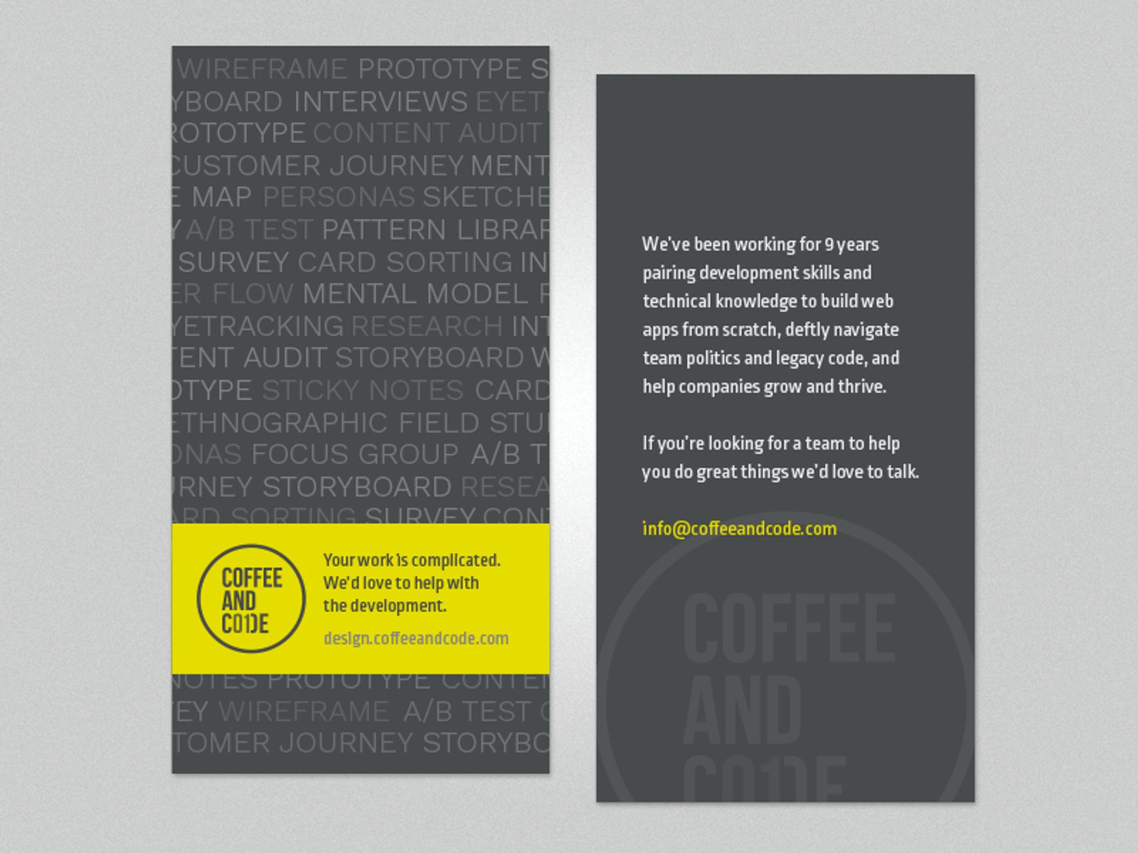
Flyer design by Eric Browning
What this two-sided flyer does well:
- Patterns and repetition: The typography on the front of the flyer creates a pattern and texture that’s visually appealing — and packed with relevant keywords.
- Pop of color: A stripe of bright lime green grabs your attention and highlights the most important information on the flyer: What the business does and how to contact them.
- Great copy: If you choose to print copy on both sides of the flyer, make sure it’s good copy. This copy is straightforward and conversational, not too pushy or sales-y.
Conclusion: Free online flyer makers and tools
Now that you have some flyer inspiration, here are some tools you can use to make an amazing flyer for your business or event.
1. Canva
Canva’s online design platform offers thousands of free templates for pretty much any graphic design project you can think of, including:
- Flyers and leaflets
- Social media posts
- Blog graphics
- Custom letterheads and resume templates
- And much, much more
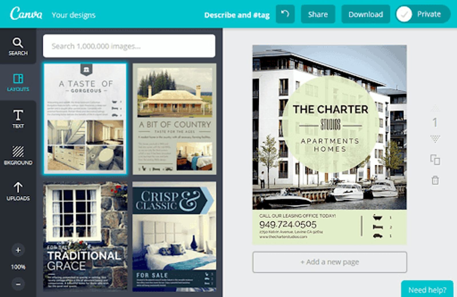
Canva’s online design platform has over 50,000 free, ready-to-use templates available for users. (Source)
Canva also offers Canva Print, a service that will print and ship your Canva designs to you on high-quality paper stock. Most flyers are A4 size, but you can fit your design to whatever size paper works best for you.
You can use your flyers digitally; posting on social media makes your flyers more shareable.
If you’re designing a digital flyer, you have even more freedom with sizing — just make sure it looks good on both desktop and mobile.
2. Adobe Creative Cloud
If you have the budget and skills, Adobe’s Creative Cloud product suite includes a ton of powerful tools for flyer design. The Creative Cloud includes:
- Photoshop
- InDesign
- Illustrator
- Lightroom
- Acrobat
- And many more products
There are thousands of beautiful flyer templates for Photoshop and InDesign across the web (though many come with a hefty price tag). Adobe’s software also tends to have a steep learning curve.
3. Piktochart flyers
Piktochart is best known for its infographic maker, but it also offers a free online flyer maker with a broad library of templates. The tool also offers:
- 1000s of royalty-free images
- Built-in color schemes
- Font libraries
You can save your flyer as a print-ready PDF or share directly to social media with one click.
4. PhotoADKing
PhotoADKing’s online flyer maker is a versatile and user-friendly tool for creating captivating flyers. With customizable templates, an extensive image library, and a user-friendly editor, it's a go-to choice for creating professional and eye-catching flyers.
It provides various types of flyer templates that include,
Real Estate Flyer
Education Flyer
Restaurant Flyer
Salon Flyer
Fitness Flyer
Cleaning Services Flyer
Medical Flyer
Hotel Flyer
And more…
You can download this flyer in PNG, JPG, or PDF format and share it on social media platforms.
Now get out there and make some awesome flyers!

