Do any of these statements sound familiar?
- “You need a landing page.”
- “You need more landing pages.”
- “You can do that with a landing page.”
You’ve probably heard statements similar to this, if not these exactly. After all, landing pages are powerful digital marketing tools that drive web traffic toward a specific action. Yet, many businesses are still hesitant to use them, despite high landing page conversion rate averages.
The truth is, landing pages can help your marketing campaign in many ways and can be used at nearly any stage of the sales funnel.
With a landing page, you can:
- Add subscribers to an email newsletter
- Promote your online course
- Sell a physical product
- Give out a discount code or coupon
- Boost attendance for a webinar
- Encourage a free trial
- Give away a consultation or demo
- And many more!
So while you may know what a landing page is, how do landing pages actually work?
What is a landing page?
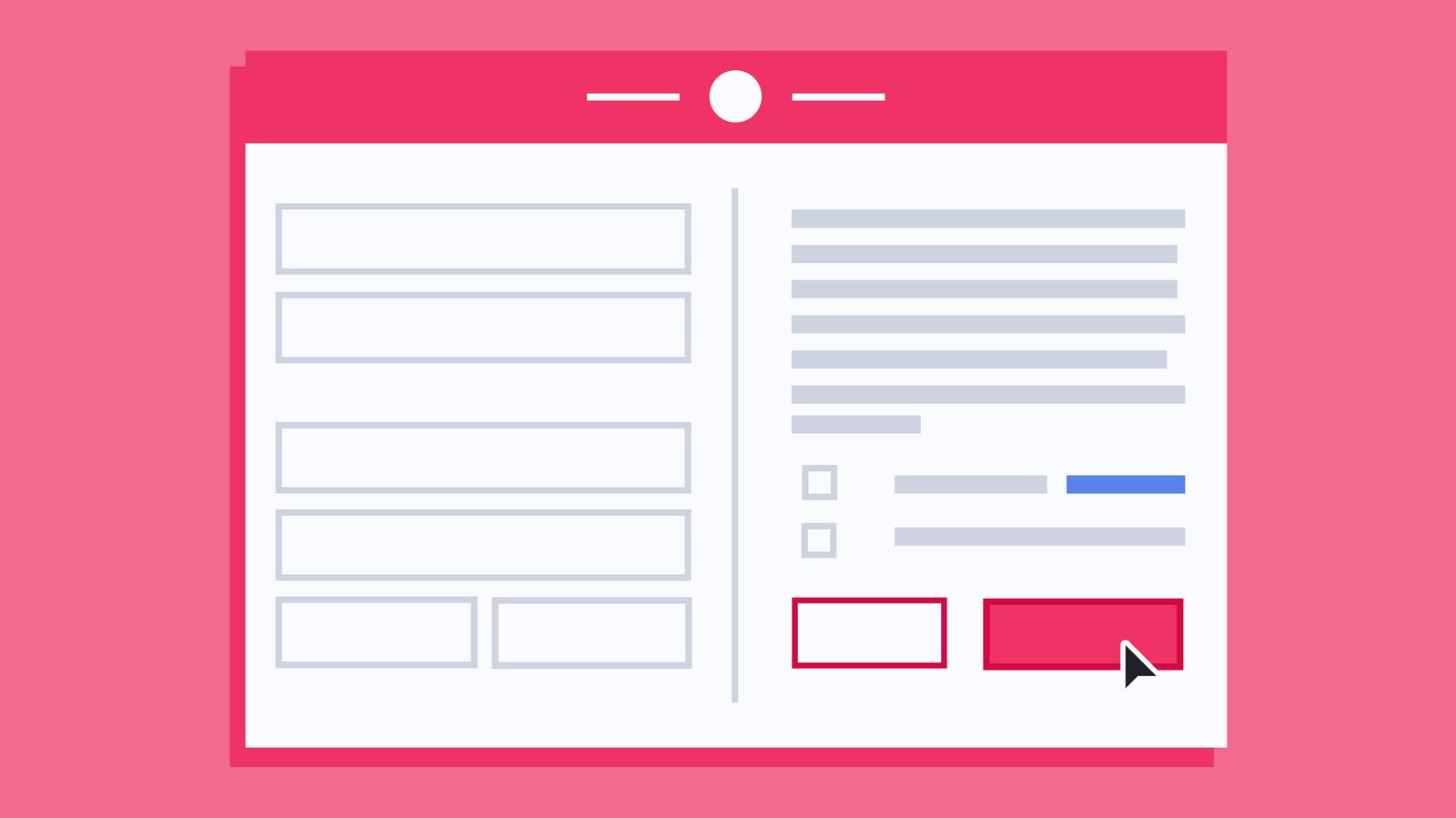
A landing page is a standalone web page created about a specific topic to gather contact information from a potential lead, such as their email address and name. The goal of any landing page is to convert visitors into leads or customers by funneling them towards a call-to-action (CTA).

Unlike a standard web page, a landing page usually has no website navigation—and directs people toward only one possible action (more on this later). By clearing out everything except the CTAs and supporting copy, landing pages reduce the chances of your reader getting distracted and leaving your page, known as “bouncing.”
How are landing pages created?
Landing pages are created using either a landing page builder like ActiveCampaign Pages or created directly on your website. If using a landing page builder, make sure it still feels like part of your company (keep your colors, font, and images on-brand) and either link to your website or embed a form to collect user data. If you do use a landing page builder, be sure to take advantage of any landing page templates they offer.
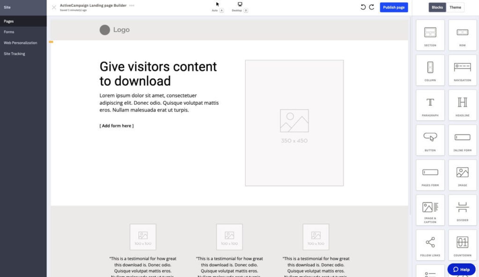
No matter where you create your landing page, always keep your target audience in mind, as well as the page’s overall goal.
What happens on a landing page?
Once you have a landing page, an ideal visitor will take these steps to become a lead or customer:
- A visitor lands on your landing page, usually from a marketing campaign such as social ads, search ads, or email marketing.
- The visitor follows the CTA and fills out a form.
- You receive the visitor’s contact information, and they receive your offer in return.

As soon as a site visitor clicks on your CTA or fills out your form, they should receive your offer right away, whether that’s directly on the page or through their email inbox.
Collect More Leads Faster
Why use landing pages?
A landing page is a great way to drive traffic from other parts of your marketing efforts, such as email marketing or social ads. Simply put, the conversion rate on a landing page is much higher than that of your homepage (or any other page).
Since landing pages focus on only one goal, visitors aren’t distracted by your other content, offers, or a blog post. This focus makes them more likely to part with their information in exchange for your lead magnet (AKA your offer) or buy your product or service.
It’s pretty common to wonder why you can’t just use your homepage as a landing page. A landing page should be simple, while your homepage should be more like a map, giving your visitors everything they need in one place. A homepage’s goal is to guide your many visitors to the multitude of content you have that best suits their needs.
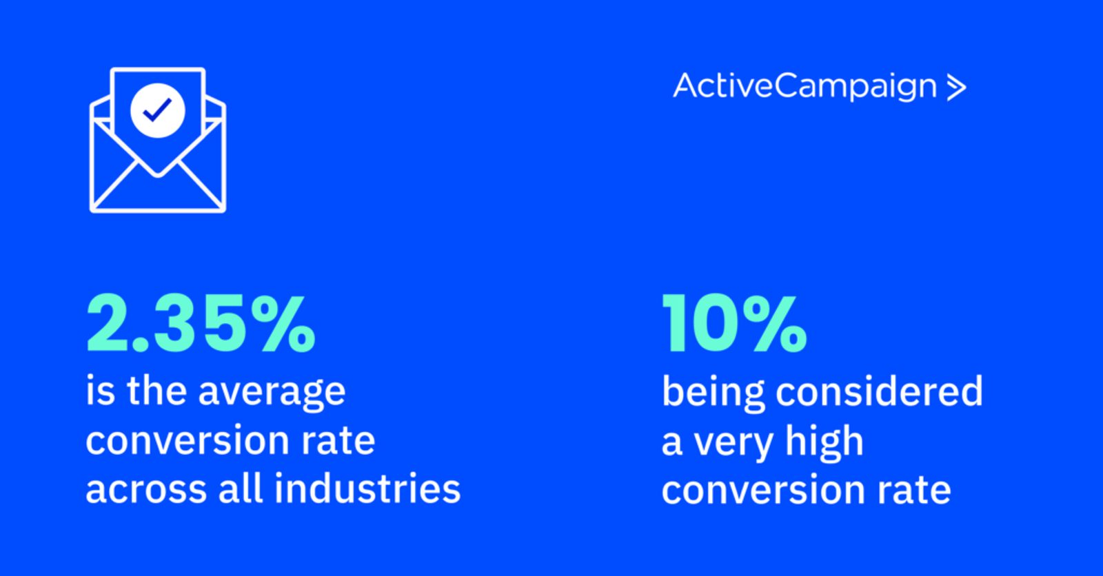
This means the singular focus of a landing page directly contradicts the purpose of your homepage. So, don’t be like 80% of businesses that are still using the “above the fold” area of their website (the part of the page that you can see as soon as the webpage loads) for static promotional content.
On top of that, your homepage is likely the top revenue-generating page across your entire site. Using the most prime real estate on your site for a single promotion is one of the bigger mistakes you can make in digital marketing.
How do landing pages work?
You can find plenty of landing page examples online. However, if you understand how landing pages work on a technical and functional level, you’re more likely to create a high-converting landing page and run a successful marketing campaign.
On a technical level, landing pages are a simple exchange of information. You have something that your visitors want (e.g., a discount, an ebook, etc.), and they have something you want (e.g., their information).
By removing the navigation and limiting your visitors’ options on the page, you make it more likely that they will read about what you have to offer—and ultimately convert.
On a functional level, landing pages are a little more complicated. The “Rule of One” is a copywriting framework that you can use to create a simple yet effective landing page. It states that your landing page should focus on.
One landing page per campaign
“The NSAMCWADLP principle: Never Start A Marketing Campaign Without A Dedicated Landing Page.” — Oli Gardner, Co-Founder at Unbounce
One dedicated landing page per campaign ensures you match your message with your target audience. This means your landing page headline, offer, and copy all match the marketing efforts you use to get visitors to your page. Message matching creates consistency and clarity.
If you use one landing page for multiple marketing campaigns, visitors to your page will:
- Be confused
- Leave without converting
- Waste the money you spent on pay-per-click (PPC) ad campaigns
Oli Gardner clicked on 300 paid ads, and 98% of them led to a landing page that didn’t match the ad’s message.
A mismatched message means wasted lead generation efforts.
On the other hand, this case study from Moz shows that matching the message increases conversion rates by up to 212.74%!
One offer per landing page
Successful landing pages use the attention ratio to their advantage. The attention ratio is the number of things a visitor can do on a landing page in relation to the number of things you want them to do.
An optimized attention ratio for a landing page is 1:1.
This means there’s one link (your CTA or offer) for the one goal (converting visitors into leads or customers).
Multiple offers don’t work to your advantage on a landing page. Visitors will hesitate and won’t make a decision. There’s even a term for it: decision paralysis.
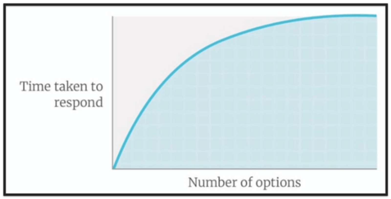
Anyone who has ever had to pick a place to eat dinner knows that decision paralysis can apply to many aspects of our lives, including when we browse the internet. Psychologist Barry Schwartz goes into detail about this in his TED talk, “The Paradox of Choice.”
This is why your landing page should have just one link: your offer or CTA button. Remember, this isn’t your homepage. Except for the “back” button, don’t give your visitors an easy way out!
This includes the navigation menu as well—in a case study by VWO, removing site navigation from the landing page increased conversions by 100%.
One primary benefit per offer
What do visitors get from converting? Why does it matter? Why should they give you their precious information?
Landing pages work best when visitors get just as much as they give, such as an ebook in exchange for their email address and name. What they get in the exchange is known as a lead magnet.
When you include the benefit that visitors get from your offer right on your landing page, they imagine themselves in the future with your offer. This makes them look at your brand in a positive way and are more likely to give you their information.
Landing pages work even better when the primary benefit is specific. A specific benefit helps your offer appear exclusive, and people want exclusive things.
Why only one benefit? Why not offer your visitors everything they might possibly need?
- Decision paralysis might kick in if you’re forcing them to choose between different options.
- Too many promises look like wishful thinking (and like you may be lying).
- It’s easier to match the message of one benefit to your offer and your off-site marketing—consistency is a key component of how landing pages work.
One key idea per primary benefit (1 solution to 1 problem)
What problem does your primary benefit solve? This is your key idea. Everything you include in the landing page copy should support this key idea.
“The main takeaway: If you want people to actually read the value propositions you’re composing, limit other elements on the web page. Elements that stay on the page should be extremely relevant to the value proposition’s message.” – ConversionXL
Any more than one key idea and your landing page visitors have to switch back and forth in their heads.
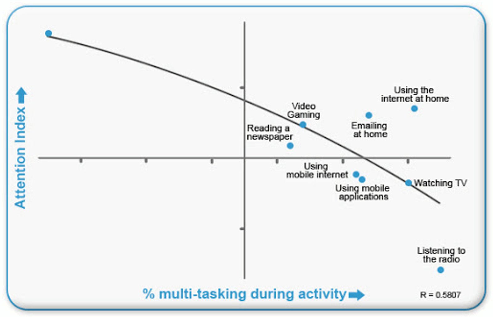
Harold Pasher’s research shows that humans are terrible at multitasking. Cognitive performance suffers when we switch between tasks and material is harder to understand.
“Human beings are a funny lot. Give them one idea and they nod their heads. Give them 5 and they simply scratch their heads. Or even worse, they forget you mentioned all those ideas in the first place.
Minimizing is the key to making a point stick. Though this is common sense, it may also be the most violated principle in marketing or any other business. Your point will be more quickly understood, and more easily remembered if you don’t clutter it up with other points.” – Ken Segall in Insanely Simple
Further research by Mark Carrier shows we’re more likely to abandon a task when it’s difficult to understand. Not only that, but more than one key idea could bring your visitor back to decision paralysis again, causing them to feel overwhelmed and leave without taking action.
One target audience per key idea
Who experiences the problem that your offer solves? Your landing page should be hyper-focused on just one key idea, so it should also focus on one target audience. Not only that, but it’s important to make sure your landing page makes them feel like you are talking just to them.
And let them know you’re talking to them by using “you.”
“You” is attention-grabbing and a proven persuasion technique. According to Brian Clark, founder of Copyblogger, it’s the most important word in copywriting. He writes,
“Every blog post should be purposefully aimed at the needs and wants of others. You only benefit when readers benefit first.”
People are interested in fulfilling their own needs. They’ll pay attention if you indicate that you’re interested in fulfilling their needs, too.
They’ll pay even more attention if you use the exact words they use. This technique is known as “Voice of Customer” (VoC), and companies that do it well generate a 10x increase in annual revenue year over year.
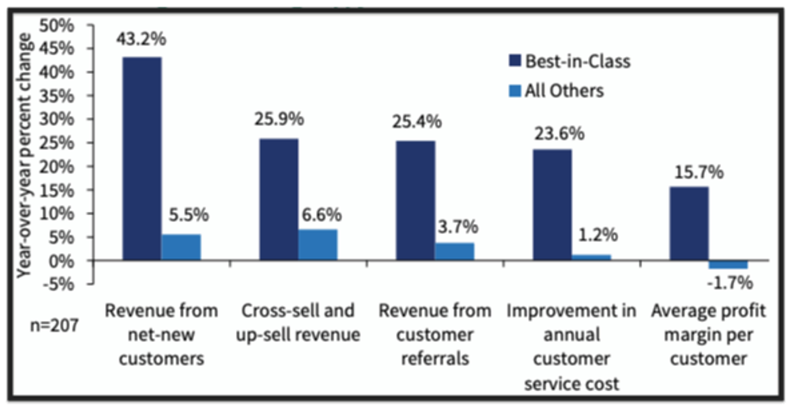
Copywriting expert Joel Klettke supported VoC in his presentation at Unbounce’s 2017 Call to Action Conference. He says to use your prospective customer's exact words to describe their problems. They don’t want “an affordable time tracking payroll software.” They want “the only time tracking tool that pays for itself.”
Harnessing the voice of your current customer gets you inside their heads and speaks to them in a language they understand.
“If your story describes their problem better than they can describe it themselves, they will automatically assume you have the best solution.” – Chris Orlob, Gong.io
You can find the language your prospective customers are using by:
- Mining reviews on Amazon
- Talking to them directly
- Searching social media sites
For more information on how to write a landing page, check out this guide!
How do you make your landing page successful?
Landing pages are a very powerful tool. Landing pages help you convert more potential customers into leads because they reduce conversion friction and give people fewer actions to take.
Your audience won’t convert on your landing page at a high level if the process is too complicated. Landing pages that remove website navigation, have a single CTA, include images and videos, and have excellent landing page copy can help you improve your conversion rates.
In short, an effective landing page is simple and is best for turning webpage visitors into leads.
How can you reduce friction on your landing page?

The perfect landing page doesn’t exist. Landing page friction makes it harder for your visitors to take action on your CTA.
“If your story describes their problem better than they can describe it themselves, they will automatically assume you have the best solution.” – Chris Orlob, Gong.io
- Create a single-column form. Single-column forms are completed 15.4 seconds faster than multi-column forms.
- Use negative space. Negative space supports scannability and visual hierarchy (visual communication of the landing page content order and importance).
- Ditch the dropdown. Questions on a form that use dropdown menu options slow users down, and people are more likely to leave your landing page without submitting your form. Opt for radio buttons instead.
- Fewer form fields. Ask only for what you need. A good rule of thumb is to ask yourself, “Will my visitor question why we need this information?” If it’s not relevant, don’t ask for it.
Keep landing page design elements in mind
When it comes to user experience (UX), it's important to keep the design elements on your landing page in mind. Landing page designs should always be "on brand" (i.e., have the same look and feel as your website, social media, etc.). You should also continuously A/B test each design element to get the highest conversion rate, especially for longer campaigns.
Here are a few things to keep in mind when designing your landing page:
- Color scheme: Your landing page should be easy to read and accessible for visitors. The best way to do this is to keep your background color and font colors simple with only a splash of color to direct visitors towards your CTA or capture form. You can play around with color, such as with your landing page headline, but save bright colors for your CTA.
- Call-to-action button: Your CTA button color should pop, and a visitor's eyes should be drawn to it when they land on your page. If your landing page is long, include multiple calls to action, but remember they should all link to the same place.
- Clean design: Perhaps most importantly, your landing page should have a clean design free of distractions. The fewer exists (i.e., links) the page has, the higher chance of conversion. You should also limit the amount of content (both written and visual) presented to a visitor and always make sure everything on the page is relevant to your goals.
- Don’t forget mobile users: There’s a good chance that over half your visitors will be on mobile, so make sure your UX is consistent across all devices!
How do I send traffic to a landing page?
The primary purpose of a landing page is to increase your traffic and conversion rate, but how do you actually bring in new traffic?
The most common ways to drive new landing page visitors to your landing page are split between paid and organic traffic:
- Social media: Whether you’re looking for newsletter signups or pushing a product, sharing your landing page link with a social media post, reel, or story is a great way to increase traffic.
- Email marketing campaigns: If your offer is for a free download (such as an ebook, white paper, or infographic) or if you’re selling a product or service, who better to market to than your existing audience?
- Paid advertising campaign: Arguably, the most effective way to drive traffic to a landing page is through paid advertising. You can get your offer in front of more eyes in a short amount of time. Using paid advertising is great if you’re looking for a boost to a new product or running a short campaign. However, it comes at a cost (literally!).
- Search engine optimization (SEO): SEO is the best way to drive traffic and increase conversions on your landing page for long-term campaigns. However, SEO takes time (3-6 months minimum). This is an excellent technique for getting new signups for your general email list or specific products that you always have in stock.
Use lead magnets to incentivize your visitors
A lead magnet is anything you offer on your landing page in exchange for a visitor's information. This exchange can take many shapes, but here are a few of the most common ones:
- You offer a discount code in exchange for a visitor’s email address with the understanding they will be added to your email list and receive advertising from you.
- You offer a how-to ebook download in exchange for a visitor’s email address, name, and any similar information that might be relevant to your marketing campaigns.
- You offer a free event in exchange for even more information, such as where they work, how big the company is, and whether or not they have the power to buy your product or service.
It’s important that this exchange always feels equal.
For example, asking for a visitor's address or credit card information in exchange for your newsletter is not balanced. This is heavily one-sided towards you, and most people will not be willing to part with that information for an email in their inbox once a week.
However, the same is true the other way around. Suppose you’re giving away something that took you extensive time to research, compile, and complete that offers a lot of proprietary information. In that case, you’ll want to ask for more information than just their name and email address.
Over to you
There are many types of landing pages, but they are all designed to convert visitors to the next step in your marketing funnel—whether that’s become a lead, a customer, or a repeat customer.
No matter what type of landing page you use, there are many different ways to convert your visitors into leads:
- Use a landing page to promote gated valuable content and lead magnets
- You can send traffic from Facebook Ads, Google Ads, and general PPC ads to landing pages to convert them better
- Landing pages can be a temporary one-page website, either to test ideas or get more time to build an entire website
Landing pages are incredibly versatile and one of the most essential pieces of marketing software that you’ll use for your business.
Incorporating ActiveCampaign’s automation into your landing pages will help manage all your marketing efforts, whether that’s collecting visitors' email addresses or sending out your lead magnet.
You can get started right now building landing pages and automating your marketing efforts with a free trial of ActiveCampaign to see what we can offer your business.

