How do you write a landing page that convinces people to buy from you?
A high-converting landing page can be a game-changer for your business. Once you have a landing page that you know gets you customers, it’s a lot easier to run Facebook ads, PPC ads, email campaigns, and other digital marketing campaigns (podcast ads?) that bring in new customers.
Of course, first you need to know how to write a high-converting landing page.
And that means answering some tricky conversion rate optimization questions, like:
- How do I design a landing page?
- What should I write on my landing page?
- Should a landing page have navigation?
- How many landing pages should I have?
- What should a landing page include?
- How do I drive traffic to my landing page?
- How do I track landing pages in Google Analytics (or your preferred analytics tool)?
- What’s a good landing page conversion rate?
- How can I increase my landing page conversion rate?
And so on.
This guide doesn’t answer all of those questions. It answers a lot of them – and where it doesn’t give you an answer right away, it usually links to a resource that will take care of things for you.
What this guide does do is show you how to write a landing page that converts visitors into customers (or leads, or subscribers).
It gives you a framework (the Rule of One) that takes the guesswork out of copywriting – and means you never have to start with a blank page.
And it shows you exactly why high-converting landing pages convert. So that you can make your own high-converting landing pages whenever you need them.
This guide will show you how to write a landing page that converts.
How to Write a Landing Page
- The Rule of One (aka, the most important landing page fundamental)
- What to put on a landing page (from copywriting to landing page design)
- 10+ studies about the psychology of action – and how they affect your conversion rate
- 13+ expert insights, from industry experts on conversion rate optimization
What is the Rule of One?

You can download this infographic here!
The Rule of One is a framework that helps you create powerful, high-converting copy. It states that your copywriting should:
- Target One Reader
- Present One Big Idea
- Make One Promise
- Offer One Offer
How does this teach you how to write a landing page?
Instead of scrambling to figure out what to put on a page (“What should my headline be? Where should I put my CTA? Which features should I highlight?”) the Rule of One helps you know exactly what to say.
Here’s how each piece of the Rule of One tells you what to write (from bottom to top of the page):
- One Offer: What are you offering your reader? What can you give them?
- One Promise: How does your offer change your reader for the better?
- One Big Idea: How do you hook someone? What makes them want to read this page?
- One Reader: Who are you talking to, and what do they care about?
When you work backwards from your “one offer,” each bit of your landing page design and copywriting falls into place.

“Outside of things like message matching, I never start a landing page without these four things in place:
- A clear understanding of the One Reader for the page
- The One Offer, made as irresistible as possible for the Reader (so it's not just like "get your download" or something ignorable like that)
- The One Promise, associated with the irresistible offer
- The One Big Idea, which is essentially a strong, prevailing thought that runs throughout the page and that is the core of your argument.
Focusing on just one of each of those elements - not multiple readers, not multiple offers, etc - is what makes the page as strong as possible.”
The Rule of One: One Offer
What will you offer people on your landing page?
If you want to know how to write a landing page that converts like crazy, everything starts with the offer.
Common landing page offers include:
- Ebooks
- Email subscriptions
- Free trials
- Free demos
- Physical products
- Online courses
- Discount codes
- Free quotes
- Consultations
Choose an offer that appeals to your One Reader and makes One Promise (more on those in the next sections).
Crucially – make exactly one offer on your landing page.

"The success of your landing page is 98% about the offer. Make it as good as possible. Make it about the user. Forget 10% off. Real value. Work on your offer more than anything. Then just put it on an undistracted landing page, and odds are it will work great.”
It’s tempting to put multiple offers on your landing page, but it will tank your conversion rate. (Try it and compare results in Google Analytics if you need proof).
Hick’s Law states that it takes people longer to make a decision if they have more options to choose from. And the longer it takes to make a decision, the more likely people are to give up.
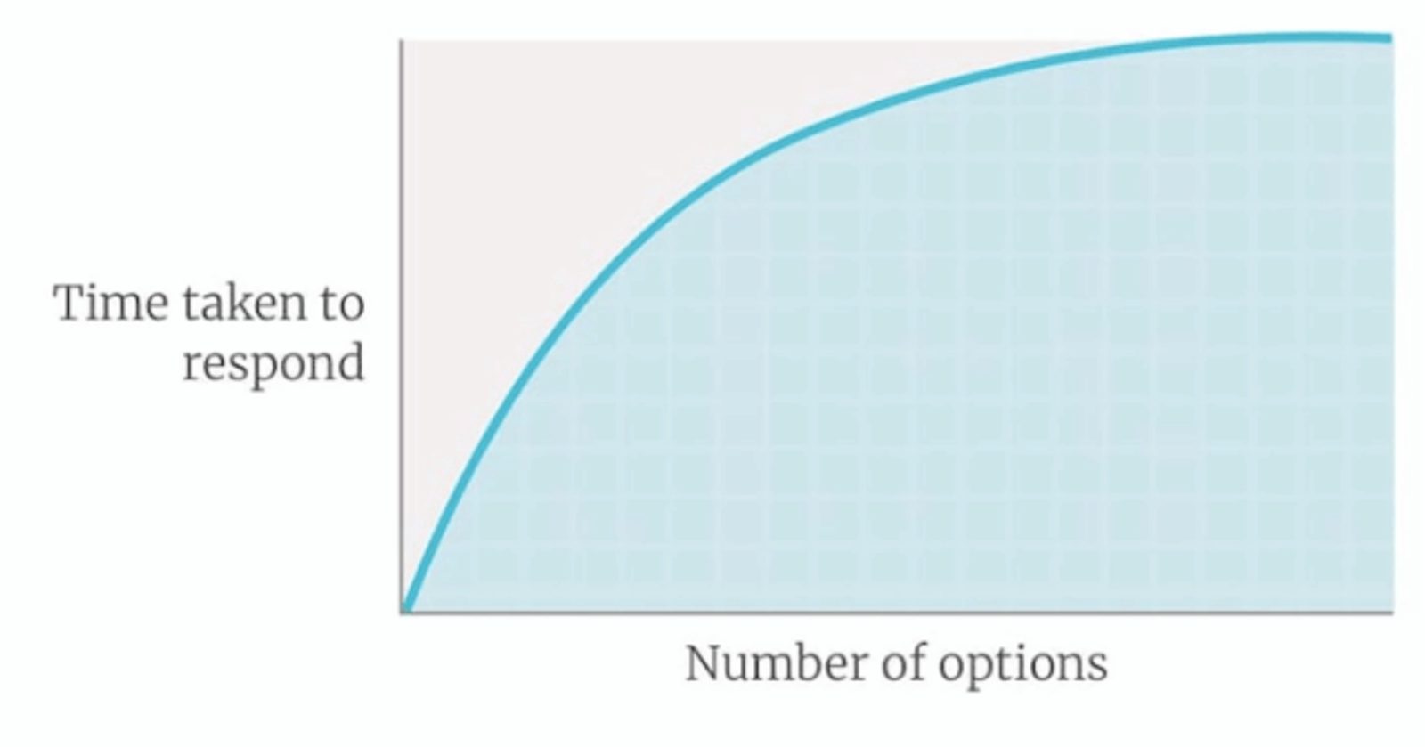
The more choices there are, the longer a decision takes – and the harder it is to actually make it. (Source)
Incredibly, adding more options can actually make people more likely to choose the worst available option.
Researchers Donald Redelmeier and Eldar Shafir gave doctors a 67-year old man’s medical history (chronic hip pain from osteoarthritis). After two drug regimens, the patient’s options (for the doctors to choose from) were:
- Attempt a new drug treatment
- Surgery for osteoarthritis
72% of family doctors recommended the conservative drug treatment before going through surgery.
Another group of doctors got the same medical history, with one small change. This group was offered an additional choice:
- Attempt treatment with new drug A
- Attempt treatment with new drug B
- Surgery for osteoarthritis
In this group 53% recommended surgery – even though either medication would have been a better choice!
Said the researchers: “Apparently, the uncertainty in deciding between two similar medications led some physicians to avoid this decision altogether and recommend not starting any new medication.”
Psychologist Barry Schwartz has built an academic career on this type of decision paralysis. In his book The Paradox of Choice, he reviews the psychology research on decision making – and shows why have more options can lead to worse decisions (for both doctors and your landing page.)
Barry Schwartz's Ted Talk on decision making has been viewed 3.5 million times on YouTube.
Your landing page should have exactly one offer – no more, no less.
You can sum up the advice of “One Offer” with the title of Steve Krug’s classic text on web design: “don’t make me think.”
Don’t Make Me Think is one of the earliest and best-regarded texts on web usability. (Source)
If your landing page has more than one offer, readers will get distracted — and are less likely to convert.
People won’t choose – they’ll just leave.
Expert Insight: Aaron Orendorff, Founder at iconiContent

“Landing pages live or die by a single ingredient: singularity. That might sound ‘meta’ but it’s really just about knowing the one thing you want each landing page to accomplish. In fact, we can break that down a bit further by
- The one thing you want your landing page to achieve internally (business objective),
- The one thing you want your audience to feel externally (emotional objective), and
- The one thing you want your audience to do (action objective).
These three have to be combined — and they have to be built on top of one another with the business objective as the foundation. After that, I like to move clients through the content of a landing page by ushering them along a hell-unto-heaven path focus on the audience.
This is very similar to the traditional PAS (problem, agitation, solution) formula old school copywriters have been using for decades … but it infused that formula with new, visceral life — emotional gravity. Only after you know what the hell the landing page is going to save a visitor from can you then ensure the action you want them to take — the solution — will be a legitimate heaven.
Great copywriting and content is about salvation, not sales.”
Whirlpool lifts clickthrough rate 42% by switching to 1 offer
What happens when you switch from multiple offers to one offer (and one landing page call-to-action)?
In 2013 (as reported by Marketing Sherpa), Whirlpool launched an email marketing campaign with 4 calls-to-actions related to their new Ice Kitchen Collection.
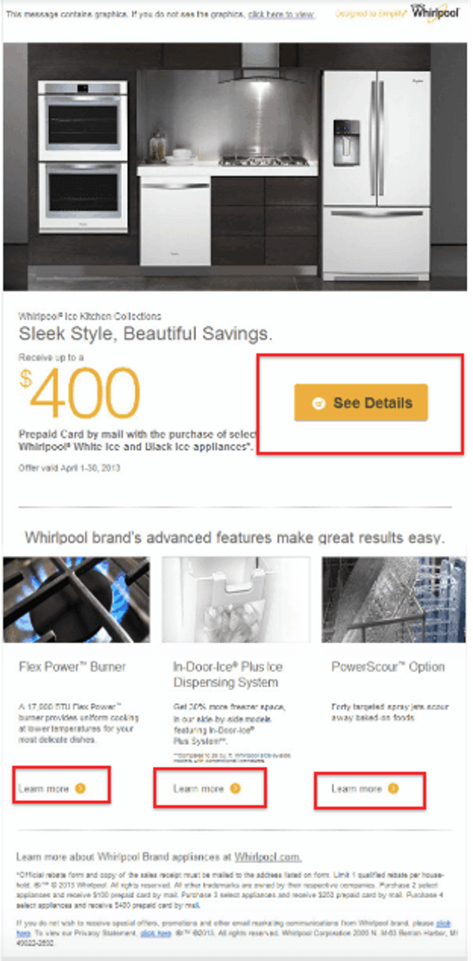
This Whirlpool email makes 4 offers at once. How do you decide what’s important?
The 4 different CTAs in the Whirlpool email sent people to 4 different places.
The "See Details" CTA button directed consumers to the rebate download landing page. The other three CTA buttons pushed to landing pages detailing Ice Kitchen Collection appliances' special features.
To focus the email on the primary goal — get people to the rebate landing page — Whirlpool updated the email to include only one CTA.
Their email clickthrough rate increased by 42%.
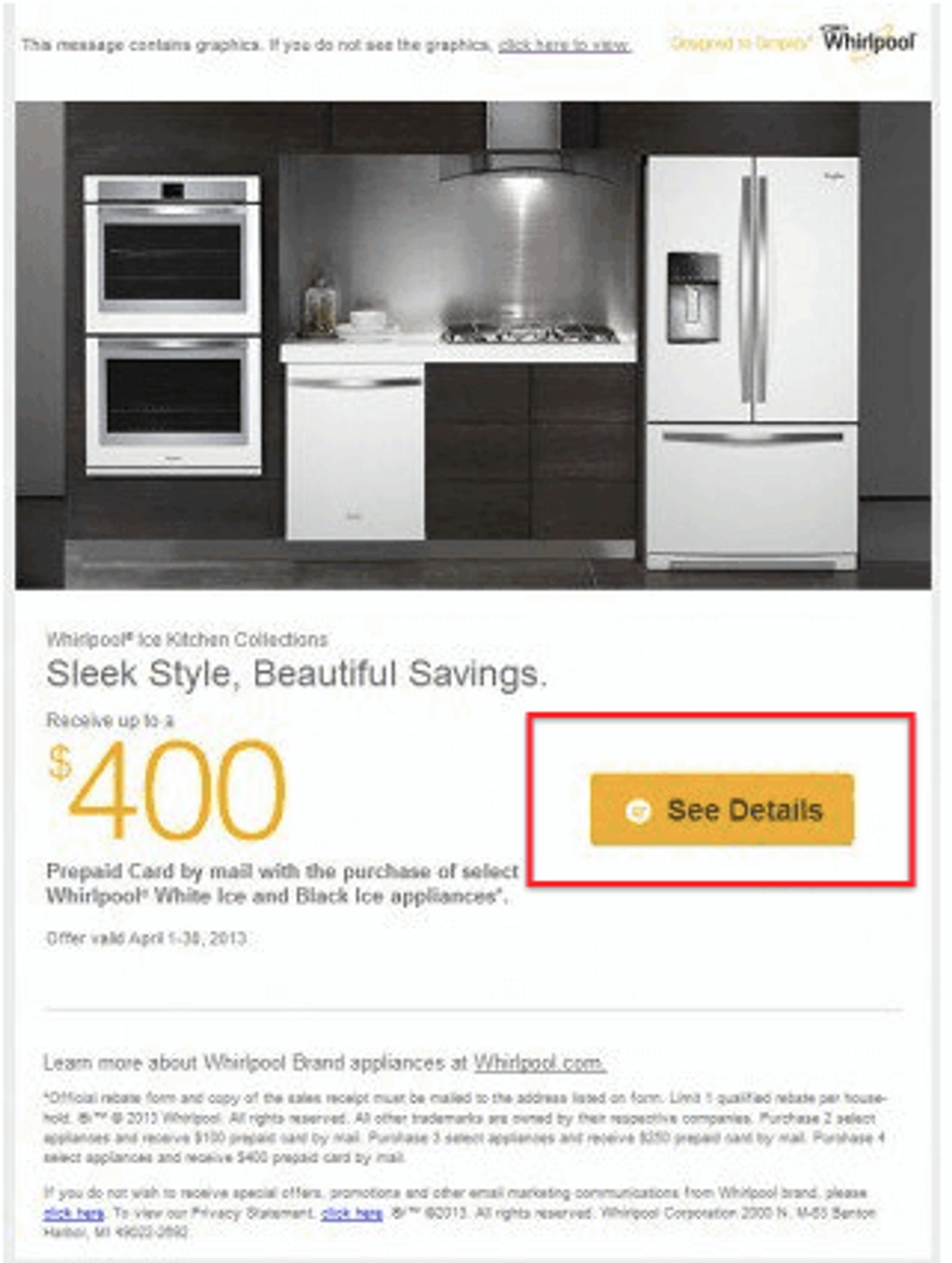
The final version of the email with just 1 CTA boosted clicks by 42%

“I think you should first "Work Backwards" when making a landing page. This means thinking: "What's the goal of this page?" If the goal is to get them to click "ADD TO CART" then you should have some very prominent ADD TO CART buttons on the top/bottom of the page.
I also am a big fan of first writing out the sales page, THEN adding on fun stuff like cool design. Just remember that your message is what sells, not the fancy templates or design!”
The Rule of One: One Promise
What will happen to people if they accept your One Offer?
The promise of your landing page is your value proposition. It shows people how their lives will change for the better if they buy what you’re selling.
Making your One Promise is what helps people understand why they should accept your offer. Usually that means:
- Showing how your offer will benefit them
- Showing them how your offer removes a burning pain point
You can think of a great promise as the difference between “what this is” and “what you get.”
BusinesSuites is an office space provider out of Austin, Texas. Although website conversions were their biggest sales driver, their landing page conversion rates were low.
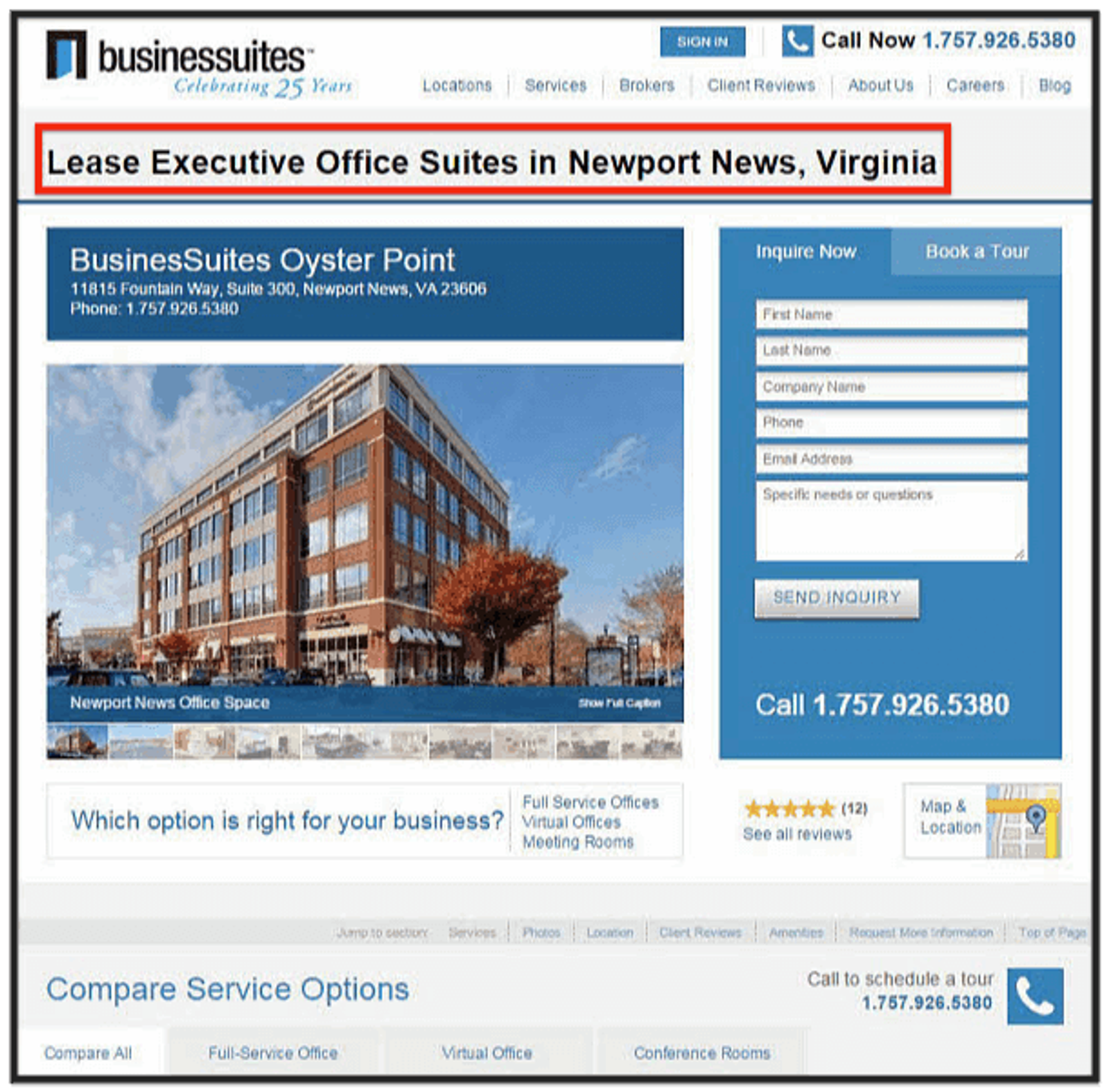
Where’s the value? What kind of space is it? What do we get? This page leaves questions unanswered. (Source)
The promise on this page isn’t a promise at all — it’s a chore! There are no results, no differentiators, no reasons to convert.
BusinesSuites revamped the landing page with an emphasis on their value proposition.
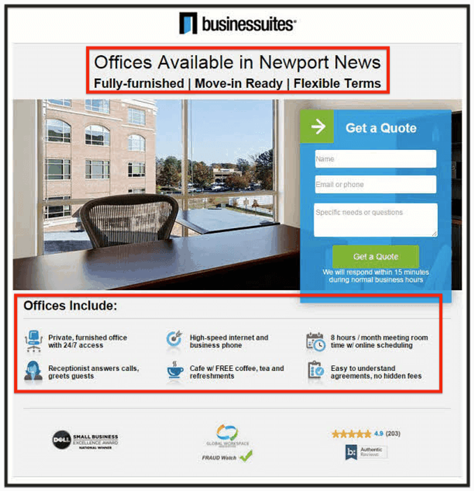
Now that’s more like it. The promise is “an office I can move into right away.” All of my questions are answered! (Source)
Once the language changed from “what it is” to “what you’ll get”, conversions increased by 88%! BusinessSuites also saw a 45% decrease in cost-per-action (CPA).
Although this page lists a lot of features (9), it promises a professional office that’s ready to move into right away.
BusinesSuites got more leads for less money by focusing on what the customer gets, and not on what the company does.
The more specific and easily understandable your promise, the more likely you are to get conversions.
RXBAR burst into the protein bar market by including an incredible promise on their product packaging – their ingredients list.
- 3 Egg Whites
- 6 Almonds
- 4 Cashews
- 2 Dates
- No B.S.
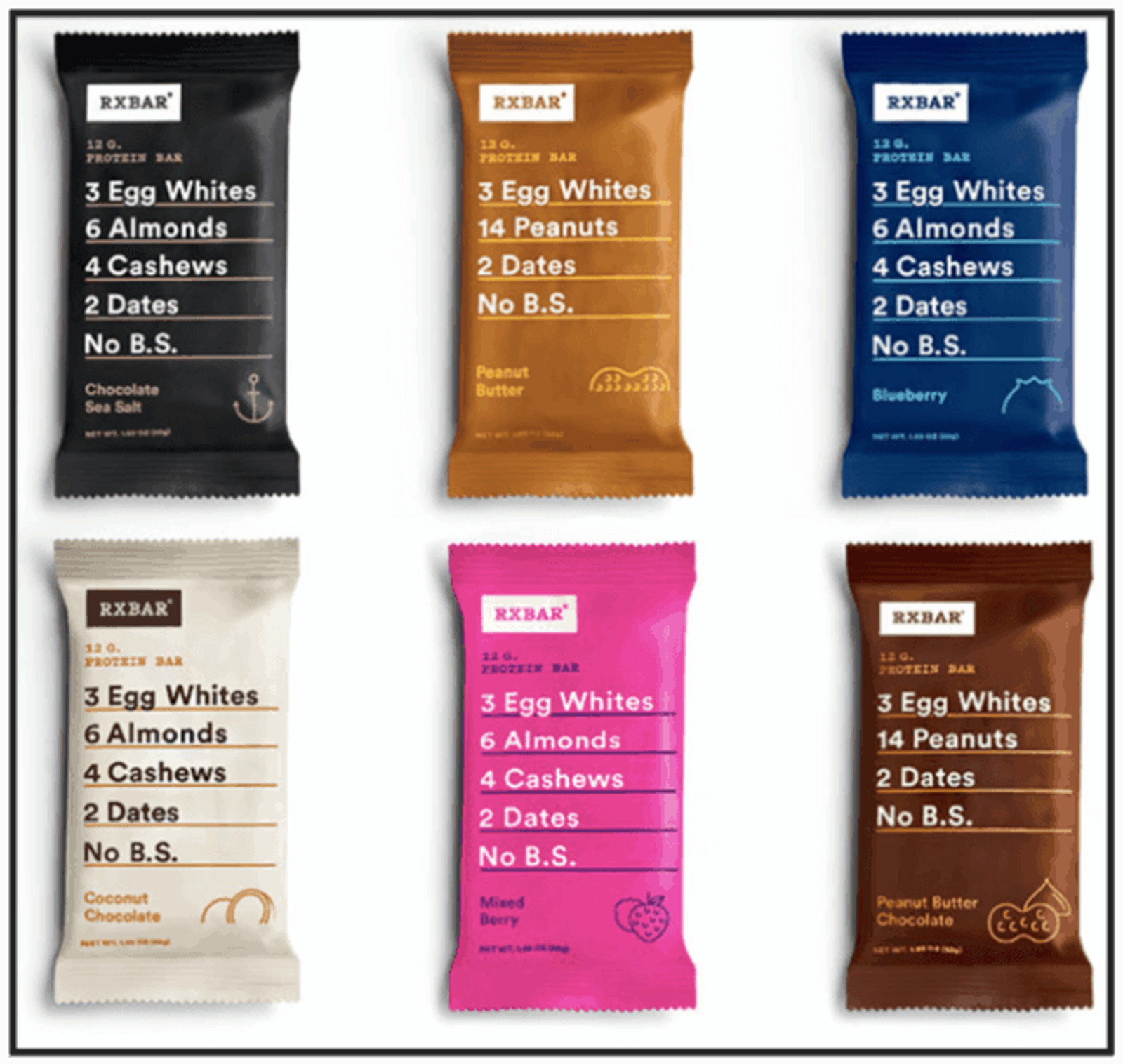
Even though this is sort of a list of features, it makes a clear promise – this is a protein bar without all the unhealthy stuff (Source).
Most protein bars are filled with sugar or have a long list of hard-to-pronounce ingredients. By making the promise of a simple bar with healthy ingredients, RXBAR is able to get people to accept their offer (i.e. “buy protein bars”).
Every marketing campaign should have its own landing page (Unbounce co-founder Oli Gardner calls this the NSAMCWADLP principle). One reason for this – your One Promise should be the same in your ads and the landing page those ads point to.

“Stay focused on the two jobs of a landing page:
- Keep the promise made in the ad, email, social post, or web link. If you don't know the promise that brings the traffic, you're not building a landing page.
- Make it clear that you're asking the visitor to make a choice. Anything not designed make the visitor more comfortable and confident probably doesn't belong on the page.
Follow these rules and you'll make better decisions about your landing pages.”
The Rule of One: One Big Idea
“It takes a big idea to attract the attention of consumers and get them to buy your product. Unless your advertising contains a big idea, it will pass like a ship in the night. I doubt if more than one campaign in a hundred contains a big idea.” – David Ogilvy
High-converting landing pages tell a cohesive story.
A Big Idea is what connects all of the pieces of your landing page. If someone asks “what is this landing page about,” the answer is your One Big Idea.
For an unusual example of what it takes to create one cohesive message, listen to South Park creators Matt Stone and Trey Parker.
The Big Idea of this video: A story that’s connected by “and then” is boring. The scenes in a great story are connected by “but” or “therefore,” which creates a unified story arc.
Your landing page doesn’t need to start with “once upon a time.” But every piece of your landing page needs to connect back to one idea – an overarching theme – in the same way that good stories have overarching themes.
A bad landing page has a lot of “and then.” Bad landing pages tend to list features, but it isn’t clear why the reader should care about those features.
A bad landing page lists features like:
- 4 doors
- Steering wheel
- Bluetooth sync
- Front and side airbags
- Automatic parking
- Seatwarmers
- 360 degree camera system
- State-of-the-art brakes
- Auto dimming mirrors
- WiFi hotspot
- Multi-zone climate system
Some of those features are nice, but some are obvious (everyone knows that cars have steering wheels).
A good landing page connects notable features into a single theme instead of listing every possible car part. “Make your commute the most luxurious part of your day.”
If you list disconnected features, people have to keep track of every feature in their head.
Unfortunately, people don’t have unlimited memories. In fact, as psychologist George Miller discovered in the 1950s, humans can only hold about 5–9 items in memory at once.
Unless they use chunking.
Psychologist Adriaan de Groot found that people who organize small groups of information into buckets (or “chunks”) were able to remember more information at once.
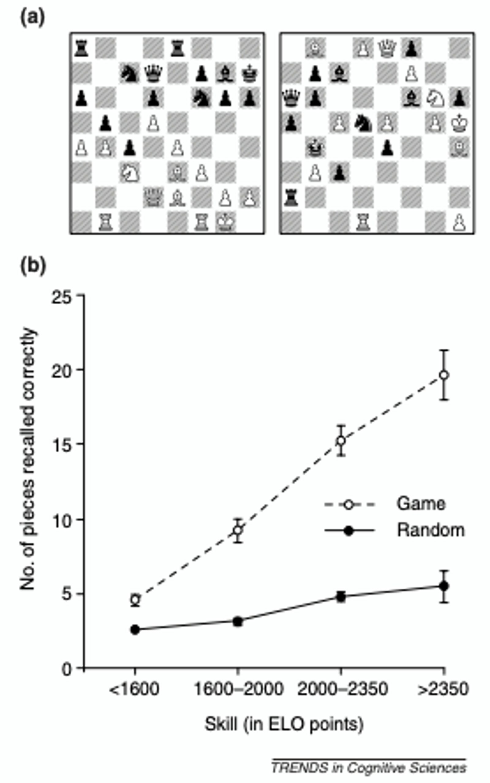
Early research on chunking studied chess players. Skilled chess players were able to remember more pieces on the board because they grouped 4-6 pieces into chunks based on their importance to the strategy. Notably, skilled chess players weren’t any better at memorizing random positions because the chunks weren’t meaningful. (Source)
When you think of a car, you don’t need to remember that it has 4 doors, a steering wheel, seats, radio, wheels, tires, brakes, gas, engines, and windshield wipers. You just remember that it’s a car.
Your One Big Idea does the same thing for your landing page. It makes sure that people chunk all the important information – which makes it easier to understand (and makes your offer more enticing).
In Insanely Simple, Ken Segall tells a story of how Lee Clow, the head of ad agency Chiat Day, had to argue with Steve Jobs about the importance of One Big Idea.
“Here, Steve, catch,” said Lee as he tossed a single ball of paper across the table. Steve caught it, no problem, and tossed it back.
“That’s a good ad,” said Lee.
“Now catch this,” he said, as he threw all five paper balls in Steve’s direction. Steve didn’t catch a single one, and they bounced onto the table and floor.
“That’s a bad ad.”
...Steve didn’t exactly break down and pledge never to question us again. However, he did appreciate the point. Lee’s demonstration lightened the tone of the conversation and turned the tide for us. When we left the room, we had the go-ahead for a much simpler ad than the one Steve had in his head at the start.”

“Your landing page should focus on solving one problem, by making one promise, to one person. Landing pages that convert the highest establish resonance with their visitors by increasing incentives to act now (on a call to action) while reducing friction. Therefore, a landing page needs to be fundamentally clear *and* compelling.”
The Rule of One: One Reader
“Imagine the one person you’re helping with this piece of writing. And then write directly to that person (using you as opposed to people or they). Connect your reader to the issue you’re writing about (again, why does it matter to him or her?), perhaps by relaying a scenario or telling a story. Put your reader (or someone just like him or her) into your story right up front — because you want the reader to recognize and relate to an issue.” – Ann Handley in Everybody Writes
Ann goes on to say,
“Someone who lands on a landing page is leaning forward — in other words, she has had her interest piqued. So speak to landing page visitors directly (lots of you and your) and use active verbs to match your tone to theirs.”
Your reader is waiting to hear from you. Right when they land on your page, they’re ready to be persuaded.
Your challenge now is to hold their attention. You can hold their attention by:
- Directly addressing their pain points
- Using the exact words that they use to describe their problems
This is why it’s crucial to write for One Reader. Different buyer personas have different pain points. Even if they do have the same pain points, different types of people use different language.
Research on consumer behavior shows that attention and comprehension change based on personal relevance. The researchers called this “felt involvement” – people need to feel involved in what your landing page promises.
In his landmark book Pre-Suasion, persuasion researcher Robert Cialdini argued that personal relevance is one of the key factors that affects what people choose to pay attention to.

Attention comes after motivation. You can motivate people to pay attention to your offer by activating personal relevance. (Source)
How can you write for your One Reader? How can you activate the personal relevance that gets them to pay attention to what you offer?
At the 2017 Unbounce Call to Action conference, copywriter Joel Klettke showed the crowd how to use “voice of customer” copy. Using your audience’s exact words makes them feel like your message is for them and them alone.
Can you tell the difference?
- “Sales made simple” vs. “You hate guesswork and busywork — so we made sales less work”
- “Affordable email marketing software” vs. “The only email tool that pays for itself”
- “Break through native reporting limitations” vs. “Get the reports your CRM can’t give you — without the headache it does”
Voice of customer copy uses the exact words that your customer uses to describe their own problems. In his research, Joel found that people didn’t talk about “native reporting limitations” – they wanted the reports they couldn’t get from their CRM.
When he put that copy on a page, of course people bought! He was promising to solve their exact, personally relevant problem!
You can learn how to find the exact words to use in your copy in these three guides:

“There are five fundamentals I start with before I write a single word for any landing page:
1. What are the audience's pain points?
In other words, what is driving them into the page? What are the motivators: the frustrations, challenges, and problems they're trying to solve? Similarly...
2. What are the audience's desired outcomes?
When a lead envisions that bright new future or better outcome, what does it look like? How do they describe it?
And more importantly, WHY do they want that: what will it make possible for them? Picking away the superficial to get at the underlying desire helps you write to that desire.
3. What might cause them to hesitate?
What doubts or concerns might prevent a qualified lead from taking action? What questions do I need to answer to make sure I answer in the copy to make sure they're comfortable moving ahead?
4. What do they prioritize?
Not all pain points, desired outcomes, or anxieties are equal: some are deciding factors, others are nice to have. Of the above, what is MOST critical for me to address in the copy where I'm confident EVERY lead will see it?
And finally,
5. What is the leads' awareness level?
How much do they come in knowing? How convinced or clueless are they now? This will define how I structure the page, make my arguments, and communicate with my audience.
The less aware they are, the harder I have to work to bridge the gap. That usually means more copy.”
How to write a landing page (what to put on a high-converting landing page)
The Rule of One covers the most important landing page fundamentals. If you understand your One Offer, One Promise, One Big Idea, and One Reader, you’ll know what message you need to put on your landing page.
But how do you send that message? How do you design a landing page? What makes an effective landing page structure?
A high-converting landing page works because of how it uses these pieces:
- Headline
- Features and benefits
- Social proof
- Visuals
- Colors
- Call-to-action
Personalization also plays a role in sending an effective message, but let's stick to these core concepts.
1. Headline

Consider the source. Social ad? PPC? Email? Wherever they came from, whatever they clicked, it was a link with words. The little bit of text in that link is all important because...
The landing page MUST use the same words as the ad or email that lured them in. If landing page optimization was a country song, it'd be called "Dance with the one that brung ya."
If that chain of language is broken, expect a high bounce rate.
The headline is the first thing people see when they get to your landing page. A high-converting landing page headline states the offer as clearly and succinctly as possible, and it answers the question,
"What will I get from visiting this page?"
The headline needs to:
- Message match – include the same language as the ad or email campaign that brought the One Reader to your page
- Hook your reader – above all else, your headline needs to get someone to keep reading
Fundamentally, good headlines do one job: get them to keep reading.
If you’re feeling ambitious, you can also use your headline to:
- Introduce your one big idea
- Promise a specific benefit
But a headline doesn’t need to include a value proposition to be successful – just targeting a customer’s pain point in their own language is often enough. For example:
“If you think you need rehab, you do.”
Copywriter Joanna Wiebe came up with this headline for Beachway — a rehab and addiction therapy center — by pulling it from an Amazon book review of a book on addiction.
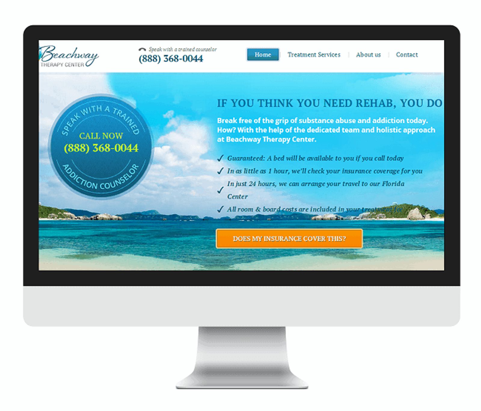
This headline generated a 400% increase in button clicks for Beachway. (Source)
One way to write attention-grabbing headlines is to use the psychology of attention and curiosity. In 1994, Carnegie-Mellon professor George Loewenstien published the paper The Psychology of Curiosity.
In it, he describes the 5 ways you can create curiosity:
- Ask a question
- Start a story, but don’t finish it
- Be unexpected
- Imply you have information they don’t
- Imply they used to have information, but they forgot it
The most effective copywriting headlines of all time use 1-3 of these methods. For example:
- They Laughed When I Sat Down At The Piano — But When I Started To Play! (Method 2)
- Have You Ever Wondered What You Would Look Like With A "Million Dollar Smile"? (Method 1)
- What’s under the bonnet of a Rolls Royce? (Method 1 + Method 2 + Method 3)
Your headline can also serve as the first step of a classic copywriting formula, like AIDA or PAS.
- AIDA (Attention, Interest, Desire, Action)
- PAS (Problem, Agitation, Solution)
You can read more about how to use these copywriting formulas in this guide, but here’s a copywriting example, courtesy of Copywrite Matters, of Problem-Agitation-Solution landing page copy (for a hypothetical mattress company).
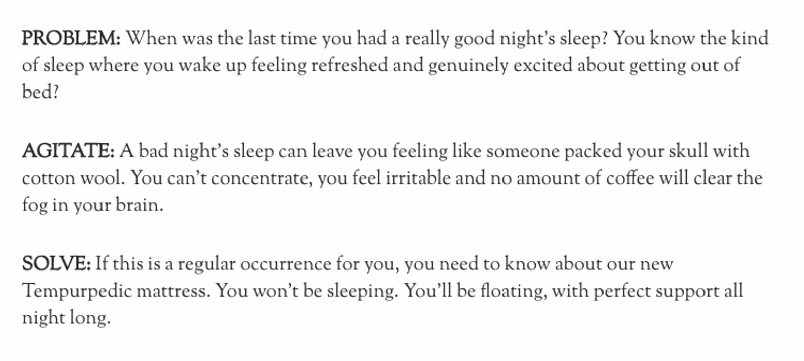
Hooking people with a pain point + customer language + a question (Method 1 of curiosity), then following up with Agitation and Solution. (Source)
A clear, compelling headline that matches a pain point and promises a benefit is the first step to writing a landing page that converts.
“When you write a headline, get attention by picking out an important customer benefit and presenting it in a clear, bold, dramatic fashion. Avoid headlines and concepts that are cute, clever, and titillating but irrelevant. They may generate some hoopla, but they do not sell.” – Robert Bly, writing in The Copywriter’s Handbook
2. Features and benefits
According to research from the Nielsen Norman Group, people only stay on a web page for 10-20 seconds. That’s all the time your copy has to tell them why they should stay and convert.
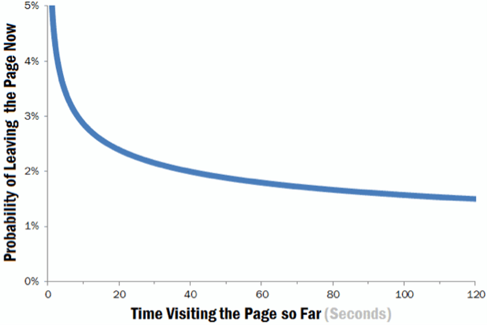
10 seconds to sell a benefit is nothing — make the most of it with your copy. (Source)
Should you focus on features or benefits?
Conventional marketing wisdom is that focusing on selling benefits is more effective than selling features. In fact, this post has had several examples of “features vs. benefits” already (e.g. “a luxury commute” vs “4 doors and a seatwarmer”).
Whether you sell based on features or benefits is based on two factors:
- The One Reader’s stage of awareness
- Whether your product is hedonic or utilitarian
The concept of stages of awareness was created by legendary copywriting Eugene Schwartz (in his book Breakthrough Advertising). Modern conversion copywriters use stages of awareness to map out the flow of their copy.
Here are the 5 stages of awareness:
- Unaware. People who don’t know they have a problem.
- Pain Aware. People who know they have a problem, but don’t know how to solve it.
- Solution Aware. People who know that there are solutions to their problem, but don’t know about your solution.
- Product Aware. People who know you have a product, but don’t know much about it.
- Most Aware. People who know a lot about your product and what you offer.
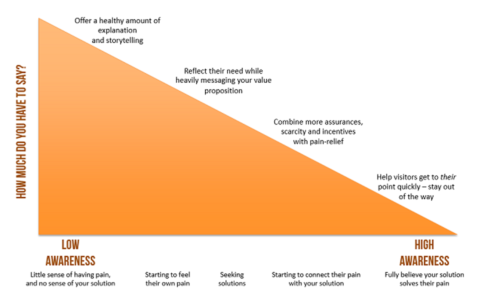
The more aware your reader, the less convincing you have to do. (Source)
Someone who is Most Aware knows a lot about your product – they already understand the benefits, and are more likely to make a decision based on a few key features (or the price).
A Pain Aware prospect doesn’t even know there are problems out there – you’ll need to start by highlighting their pain points (e.g. “If you think you need rehab, you do”), and then move to benefits, and then features.

“One of the most fundamental things you must do before creating any landing page is identify your prospect's stage of awareness.
These 5 stages are key to identifying the exact message you should be using on your page, what your call to action will be and what content is required on the page to increase conversions. For example, if my prospect is solution aware, it is important to remind him of the pain he's experiencing, how it affects his life, most importantly, what solutions he's already tried and why they're not working. Only then will I introduce the solution that will work for him, my own solution.
However, if my prospect is product aware, it means she knows me, she understands the problem she's facing, she's been comparing solutions, so all that's missing from me is the value proposition (why our solution is the answer), pricing, features and an offer. The entire process (e.g writing copy, choosing visuals, colors and social proof) comes into place and becomes easier when you know where your prospect is on that scale.”
Aside from stages of awareness, the type of product you sell can also affect your landing page copywriting.
Is your One Offer hedonic or utilitarian? Do people buy from you because you offer them enjoyment, or because you’re offering them something practical that they need?
A visitor can perceive your landing page as either hedonic or utilitarian. In other words, your landing page offer is either for their enjoyment or for functionality. This distinction depends on your product and your audience.
One paper defines utilitarian consumption as the need for the basic requirements of life.
Another paper defines hedonic consumption as buying a product that makes the voice in your head say ‘treat yourself.’ This type of consumer interaction creates feelings of happiness and satisfaction.
Basically...
- Utilitarian perception is about rational, practical needs, answering questions, and objection handling
- Hedonic perception is about emotional connection — imagining yourself in an enjoyable context
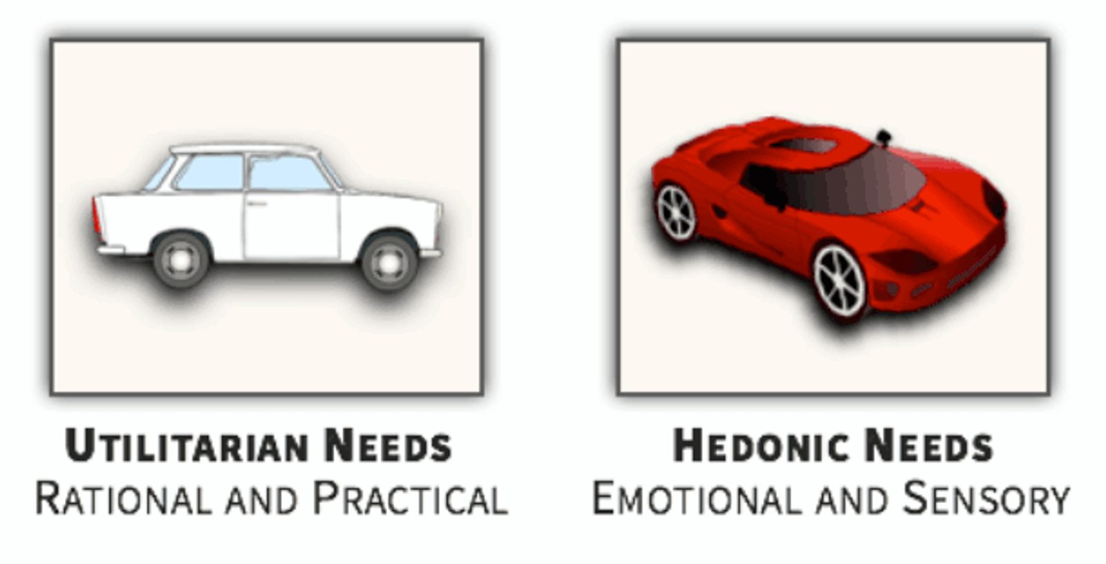
A product that one person perceives as utilitarian can be perceived as hedonic by someone else. That’s why the world has both sports cars and Volvos. (Source)
A study from ConversionXL shows how hedonic and utilitarian copy can affect price perceptions of a product. In this case, a blender.
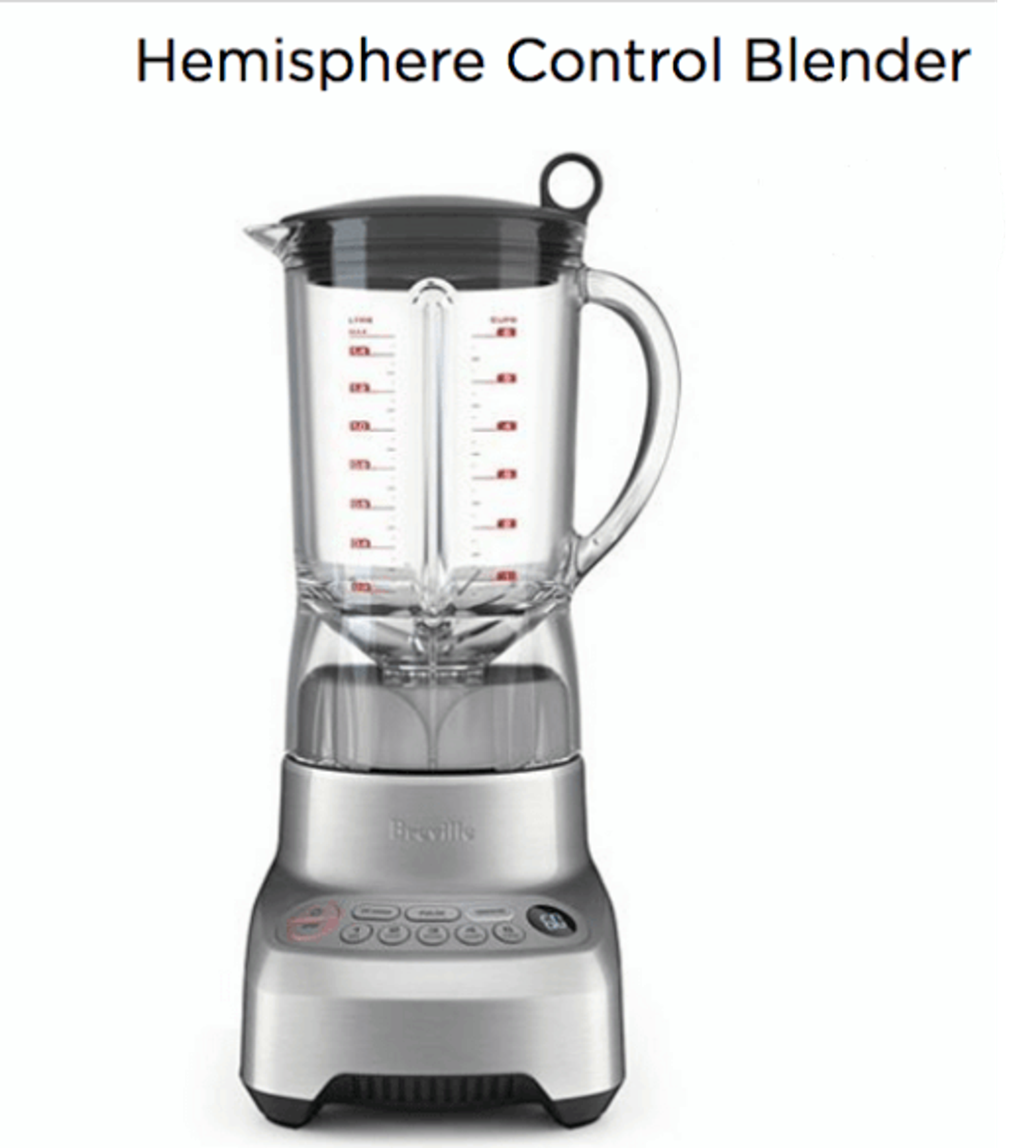
The research question: Do people spend more on the blender after reading copy that focuses on enjoyment or practicality? (Source)
These were the two copy variants A/B tested in the study.
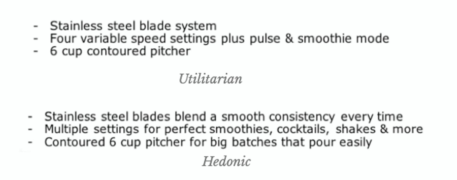
Luxury to some is not luxury to others. Is it more important to get information about steel blades quickly, or to highlight that the blades can make smoothies?
In this study, participants’ perception of the blender’s value was significantly more when accompanied by the hedonic product description.
Still, if you sell utilitarian products, it may make more sense to highlight important features (depending, again, on stages of awareness).
3. Social proof
Social proof is one of the most effective elements you can include on a high-converting landing page.
Social proof includes:
- Testimonials
- Case studies
- Quotes from online reviews or existing customers
A case study from VWO showed that using targeted customer testimonials significantly increased conversions for Buildium, a property management software company.
The type of social proof you use matters. When Buildium used generic customer quotes about “saving time,” conversion rates were poor.
To boost free-trial signups on the page, Buildium changed their social proof copy to highlight testimonials about the scalability of their product. Each new testimonial even shows the customer’s unit count – which further proved a specific benefit of the product.
By using testimonial copy to address a specific benefit, Buildium increased the conversion rate by 22%.
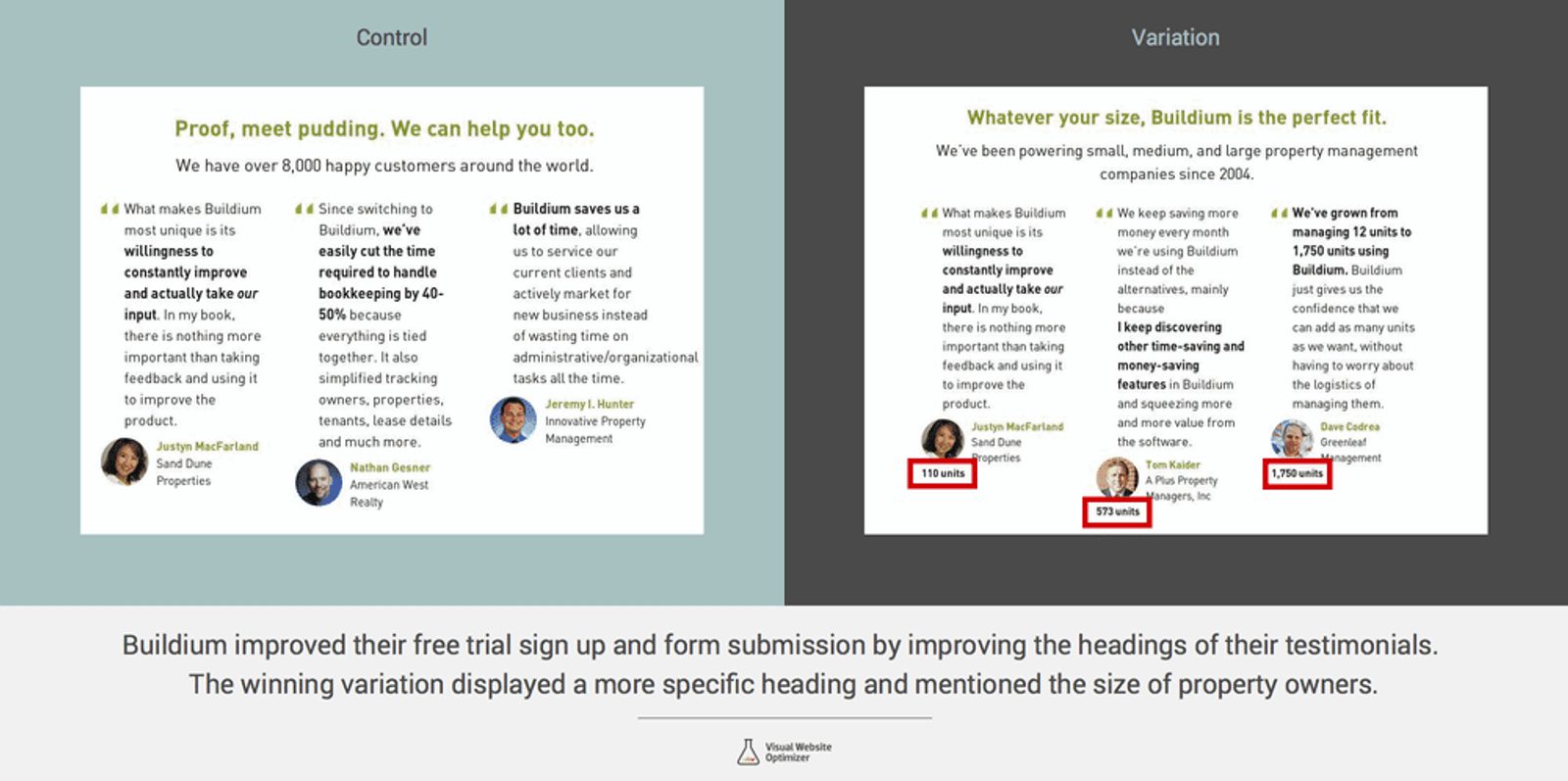
The updated presentation of social proof on this page increased their conversion rate by 22%. (Source)
People want to know exactly how your business helped someone else, which means your copy should include specifics whenever possible. Great social proof includes:
- Data: Numbers prove that people get real results
- Pain points: Highlighting problems you’ve already solved shows readers that your offer can solve their problems
4. Visuals
The human brain processes images 60,000 times faster than text.
That’s why visual elements are a powerful way to get your message across.
Visuals can be:
- Explanatory screenshots
- Demo videos
- Customer testimonial videos
- Infographics
- Product images
- Images of your offer (like an ebook cover)
The right landing page visual helps persuade visitors to act on your CTA. A visual can tell a story, show how to effectively use a product, or build an emotional connection with visitors. A visual, such as a customer's testimonial video, can tell a story, show how to effectively use a product, or build an emotional connection with visitors.
This Uber landing page uses an image to clearly show what to expect from using their service: A person waiting to give you a ride.
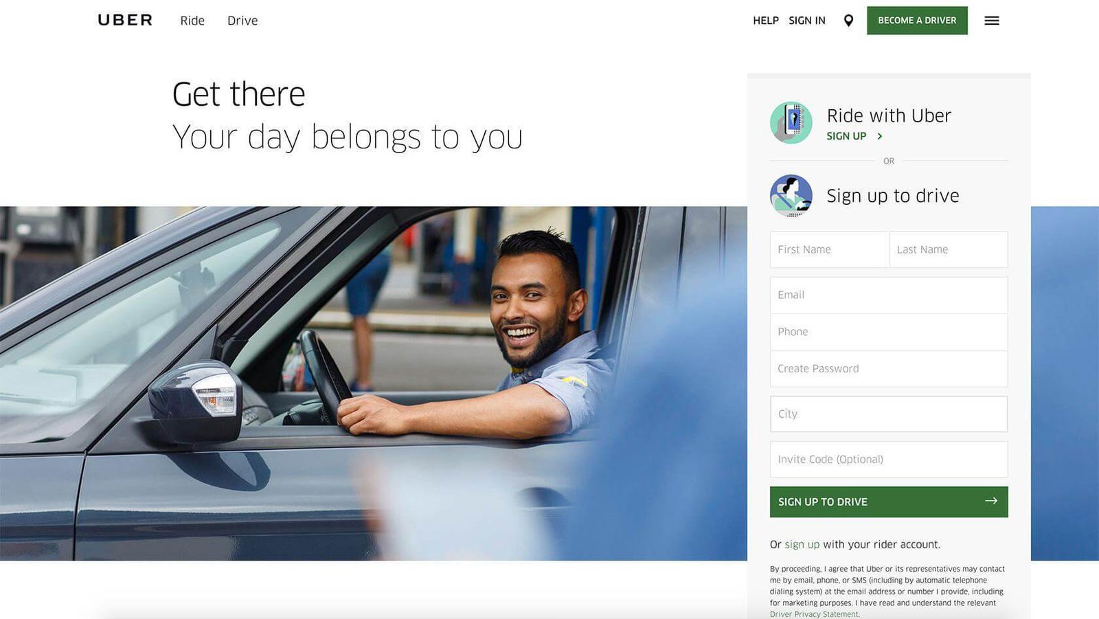
The landing page design makes it easy for the visitor to picture themselves using the product. Uber is famous for its A/B testing culture and growth teams – so it’s likely this page converts well. (Source)
This image shows a real experience a landing page visitor could have: Walking up to an Uber they called for a ride. In turn, this person is more likely to sign up and “Ride with Uber.”
5. Colors
In a study called Impact of Color in Marketing, researchers found that, for some products, up to 90% of snap judgments people make can be based on color alone. Color, like great copy, creates an emotional response in the viewer.
Although you may have heard that the future of the marketing call-to-action is the “big orange button”, is it the truth? When you choose colors for your landing page, the actual colors don’t matter that much.
Yes, you should stay consistent with your brand colors. And yes, using the entire rainbow will probably hurt someone’s eyes. But what matters most is that the color of your CTA stands out against the rest of the landing page.
In this example, from Marketing Donut, it would be easy to debate red vs. green buttons. But is that the real takeaway from this A/B test?
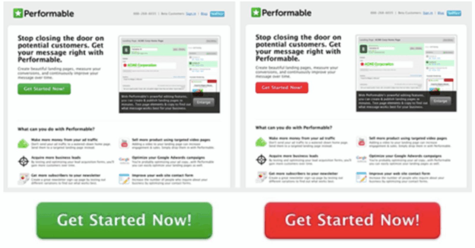
Red does stand out here, but did conversions increase because the button is red – or because it was a more noticeable contrast alongside the green company logo?
Marketing Donut A/B tested the effects of a red CTA button vs. a green one and saw that the red button outperformed green by 21%.
Is this because of the color choice? Probably not. In this case, color contrast is probably more important.
In the control of the A/B test, the company logo is the same green as the CTA button – the red CTA button in the test variant stands out against the green logo.
If you want to get deep into the weeds of color psychology, you can use this guide from Talia Wolf of GetUplift.
6. CTA

“One of the mistakes I see a lot on landing pages is that the company isn’t being clear in what they want their potential customers to do. Do you want people to book a demo? Do you want them to sign up for a 14 day free trial? Do you want them to contact you by email? Choose one.
Even when we visit a site and want a product, having to choose takes up seconds that sometimes we don’t have and this tension can be overwhelming. If your landing page is speaking to the end-user and you’ve done the customer research to prove that, choose the one call to action that speaks to their needs. If you don’t know what that is, test! Just, don’t make your visitors overthink.”
Your call-to-action is the last thing standing between your visitor and your product.
A great landing page CTA can get you more customers. A bad landing page CTA will leave people scratching their heads in confusion (and leaving your page).
It’s the reason your landing page exists, which makes it one of the most important elements of a high-converting landing page.
Here are the 3 key components of a great landing page CTA:
- Visual prominence. Your CTA needs to be easy to find. Otherwise no one will find it!
- Clear CTA copy. Make it clear what will happen after they click the button.
- Low friction. Make it sound easy to accept your offer. If it sounds like work, people won’t want to do it.
This landing page example from Good Egg does a nice job of showing a visually prominent CTA with a clear offer.
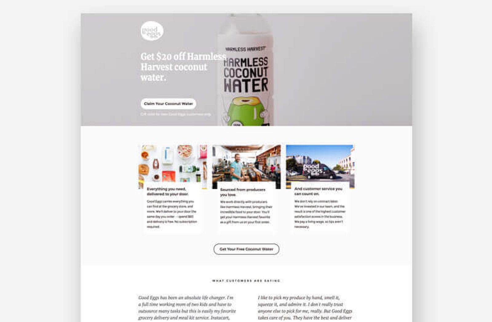
The CTA is easy to find and has one explicit offer. (Source)
When you write your landing page call-to-action and CTA button copy, avoid high friction words (lists courtesy of Joanna Wiebe), like:
- Buy
- Sign Up
- Submit
- Give
- Invest
- Donate/Sponsor/Support
- Complete
Also, be careful with medium friction words. These are better, and have uses, but may still be risky:
- Join
- Share
- Switch
- Find
- Start
- Visit
- Learn
In general, you should make it as easy as possible for someone to pay you. That means having a prominent, clear CTA button that sounds easy to use.
Conclusion: Writing a high-converting landing page

“An event for which I wrote ads made $18.66 for each $1 spent while their previous campaign made $0.40 for every $1 spent.
No changes were made to the landing page. The new ads just gave the user a pre-taste of what to expect at the conference. Ad copy is not only about selling the click."
Your landing pages will convert more visitors if you apply the ideas in this guide.
- Create a separate landing page for each campaign, so that each person gets exactly the message that appeals to them
- Follow the Rule of One, so that you know exactly who you’re talking to and what you should say
- Include the important parts of a high-converting landing page, so that it’s as easy to buy from you as possible.
Once you have an initial landing page, A/B testing and conversion rate optimization can help you take your results to the next level.
“Two of the biggest barriers I hear about are lack of traffic and lack of time. I look at it this way. If your business depends on your online marketing efforts scaling up, then it's never too early to start training your organization to adopt a testing mindset because if you don't have enough traffic right now, you will have enough soon.
You have to plan for success. If you wait too long to introduce a testing mindset, you'll have a much harder time shifting your culture. To avoid the "not enough time" barrier I recommend starting with something easy to execute. Headlines or primary copy are good examples, and perhaps consider testing something that makes you feel a little uncomfortable.
Just remember that testing is about learning, and the wider the range of things you try the more you and your organization will learn. (By the way, our brand new Smart Traffic feature helps marketers overcome both of these barriers and get higher conversion rates!)”
A/B testing is the ultimate weapon of inbound marketers everywhere. Companies whose conversion rates have improved year-over-year execute 50% more tests on average.
Before you run an A/B test, of course, you need to have a sense of how to measure a landing page. Popular landing page metrics include:
- Conversion rate
- Average order value
- Total revenue generated
- Pageviews
- Scroll depth
- Goal completions
- Bounce rate
For an approach to landing page A/B testing and landing page measurement, here’s marketing expert Dana DiTomaso:

“First, define for yourself what the ultimate goal is for this landing page. For example, are they filling out a form or buying something? Now, list out all the possible ways that someone could engage with that landing page, such as scrolling, dwell time, watching a video, reading content, and so on. These are your engagement metrics.
Set up measurement for these engagement metrics and then you can determine what types of engagement are more likely to lead to the conversion. This will help you make your page more effective and make it easier for you to make new landing pages in the future!”

