“A/B testing.” “Persona.” “ROI.”There’s so much marketing jargon out there that it’s sometimes hard to figure out what matters and what’s a waste of time.When you hear the word “microcopy,” your first instinct might be to roll your eyes at yet another mystery marketing term.But before you hit the back button, consider this:Any time you sign up for a new account, make a purchase, subscribe to a list, or interact with a company online in anyway, you like to know what you’re getting yourself into.You want it literally spelled out.That’s what microcopy is for. And, if you do it well, you could get more people to sign up for what you’re offering.Microcopy spells out tiny reassurances so that customers feel comfortable taking next steps towards a final action, like:
- Signing up for an account
- Completing a purchase
- Subscribing to a newsletter
If I had to sum up microcopy: “small words make a big impact.”They do, and they can make a significant impact on your conversion rates.But, first things first:What the heck is microcopy, and why should you care?
Try it now, for free
What is microcopy?
- Addressing concerns
- Clarifying next steps
- Convincing customers to take action.
- Provide transparency (No one wants to deal with Charlie Brown’s teacher).
- Reassure customers and remove potential user concerns
- Prompt a call-to-action and increase conversions
How’s this for microcopy?
How microcopy reduces friction

Microcopy probably would have helped about 100 ft ago.
If something sounds hard, fewer people are going to do it. Microcopy can help you make a CTA sound easy.Which button sounds easier to you?- Complete your registration
- Learn more
- Get your free webinar
- Data security and loss
- Getting spammed by you or other companies.
- Making irreversible changes (like during account set-up)
- Encountering dreaded error messages, like 404 notices

Avoid causing this face. Not everyone is fond of surprises.
Now, consider the call-to-action button example that we mentioned just a minute ago, “Sign Up Now.”Here are some popular examples of how microcopy reassures customers and prevents any surprises that would cause friction later:“No credit card required.”
This line of microcopy is simple, straight, and to the point. Imagine this copy below the “Sign Up Now” button.“Sign Up Now” is pretty ambiguous, and it doesn't really tell you what comes with that sign up later. This microcopy’s subtext says “no commitment,” takes away that uncertainty, and prompts a customer to keep clicking through the process.“Never shared, never spammed.”
Remember before, when we listed data security as one of the customer concerns? Microcopy like this is how that concern is addressed.If the example button were on a form that a customer was filling out with required, personal information, microcopy that explicitly ensures privacy and not allowing any spam will go a long way in that future customer relationship.BUT WAIT! Small disclaimer –While it’s a nice gesture to reassure customers about something they wouldn’t want to happen, be careful when using the concept of spam in microcopy. They might not have even thought about the possibility of being spammed, so don’t inspire them to.Using other language to describe it or making sure it makes the most sense in context could be helpful.
Mailbox full.
“You can always change it later.”
When a customer is signing up for a new account, it’s comforting to know that they don’t have to make all of their decisions right away. Want to change an address or the name in an account? Great. This microcopy that makes it clear they can.“Free 14-day trial. No credit card. No nonsense.”
No strings attached, no hassle, no financial commitments, no headaches.This microcopy assuages multiple concerns in just one line.Microcopy like this makes clicking a CTA button that says “Sign Up Now” a whole lot easier.“Add to Chrome (it’s free).”
Who doesn’t jump at the opportunity for free stuff? Nothing says “let's move forward” to a customer you want to finish an action than literally saying that call-to-action won’t cost them a thing.This says they get something that will benefit them, and that there’s no work to get it. Win-win for everyone involved.How to create great microcopy
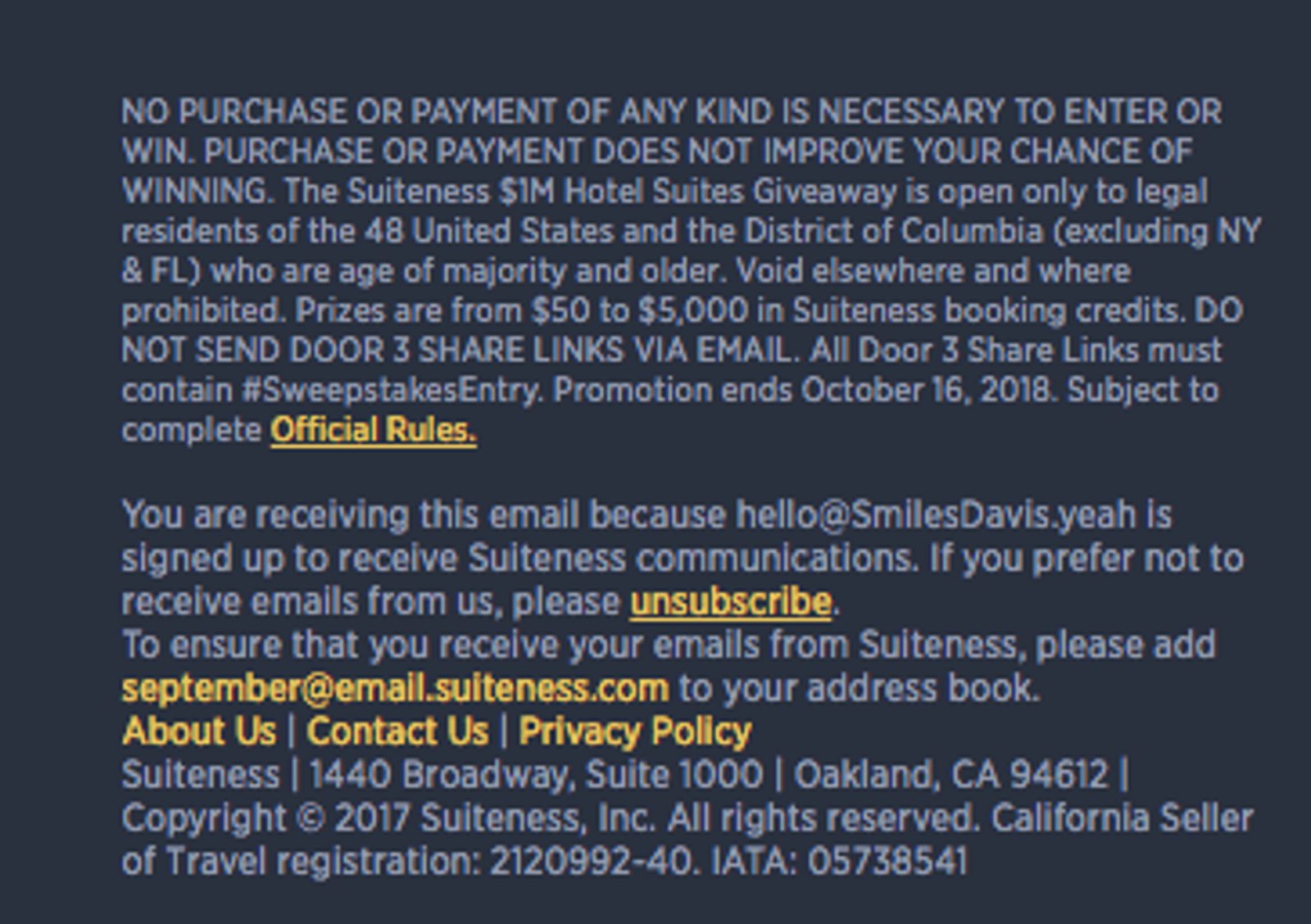
Yeah. Nobody has the time for that.
People reading your content are likely to be content scanners who only want a short and simple line that tells them everything they need to know at that moment.Did you know that:- Most people scroll through 50-60% of online content.
- A 2008 Nielsen report (that’s still relevant today) showed that, on average, users read less than 20% of a website’s content, which wasn’t surprising news because…
- Another 1997 Nielsen study found that short, scannable writing improved usability by a whopping 124%.
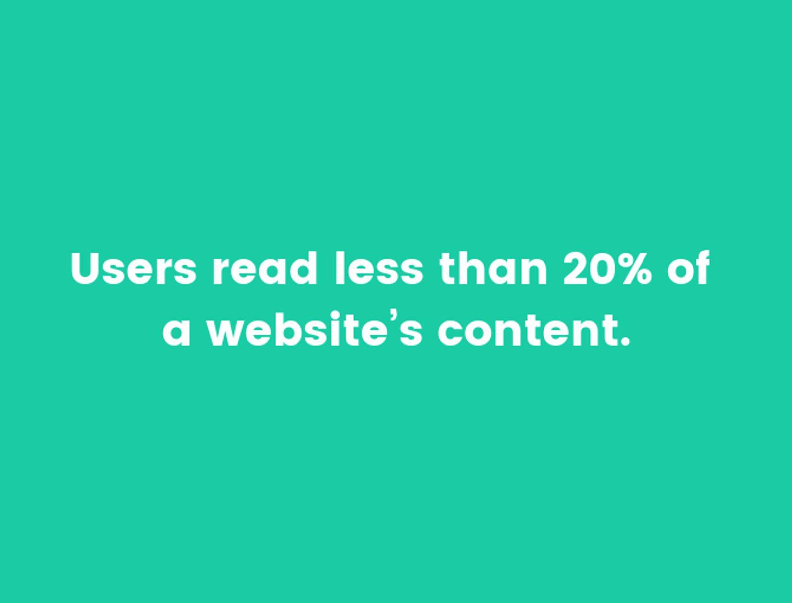
Only 20% of an entire website's content? Better make it count.
So, why is this important to know for designing microcopy?Scanners are literally scanning copy for the main points, or for something specific in the interface that brought them there in the first place. Scanners are more looking for the gist that gets simply and straight to the point.That’s microcopy.Microcopy lets you get that fine print in front of people’s eyes without always going on forever. It can give your leads and conversions a boost, but only when done right. To get it right, there are 4 rules to keep in mind when you’re creating microcopy.The 4 rules of creating microcopy
1. Be concise
“Keep it short and sweet.” It’s a common expression for a reason, and it definitely applies to microcopy. In a content scanners world, you don’t want to be overly wordy or use high-brow language.If you can be creative while being clear, great! But the most important thing is to get your message across with the first read using micro words.2. Give context
Microcopy shouldn’t be a novel, but that doesn’t mean it can’t be a few lines if necessary. Context is an important and helpful component to help leads become customers, so don’t feel constrained by trying to keep microcopy short every time.No customer will blindly give their information. They want to know what they are getting themselves into and what you’ll do with their information, so strive for transparency and make sure they have all necessary information at each step of the CTA process.3. Inspire action
Creative copy is cool, but not if it turns out ambiguous or boring.If your microcopy isn’t compelling, it won’t inspire action. Customers are there for a reason, whether it’s to make a purchase or continue learning about your company’s products, so spell out your call-to-action right in your copy.4. Be your authentic self
Microcopy isn’t an excuse to say just anything to make customers complete an action. The copy you present has to be relevant to your company brand and the intended CTA or it has no business being there at all.Customers want to engage with brands that make them feel heard and allow them to build trust. Create copy that does this, like InVision did.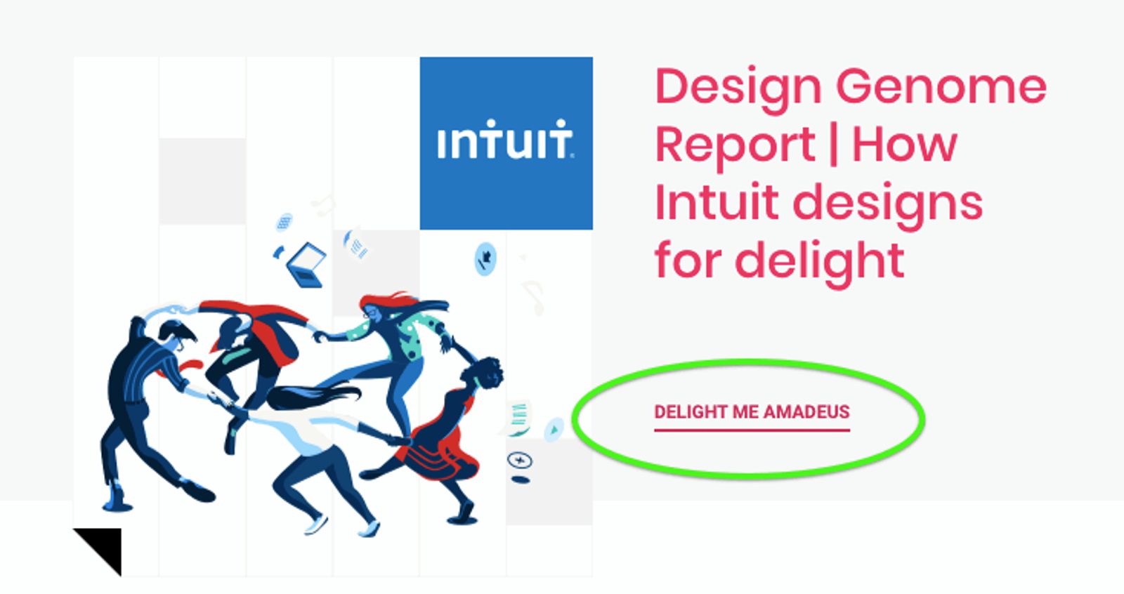
Delightful, don’t you think?
Good UX microcopy doesn’t just benefit you
Good UX microcopy + leads = customers and high conversion rates.
Pretty straightforward.
What you WON’T look like thinking about microcopy.
But, how does it benefit your leads?Like the chorus of a song, we’ll sing it again.Their concerns are addressed. They complete a call-to-action. They reap the rewards of that action.AKA, their UX, or user experience, is a good one and they go from leads to customers.Once they become a customer, your product or your service is the value that is enhancing their life. Sometimes, good microcopy is all you need to give them that final nudge towards the finish line.Microcopy gives them that value by playing 3 different roles.Much like squirrels gathering nuts, customers like to gather as much information as possible. Microcopy provides them the “nuts” that they need to get from one step to the next, finally resulting in that action you want them to complete.So, what are the 3 roles microcopy plays to accomplish those actions?- Guide
- Promoter
- Comforter
Writing microcopy is easier with examples
Where: Forms
In all likelihood, you have some lead forms for your site. It might be a form to download an e-book or to subscribe to a blog. Or it might be for a free trial, like this one: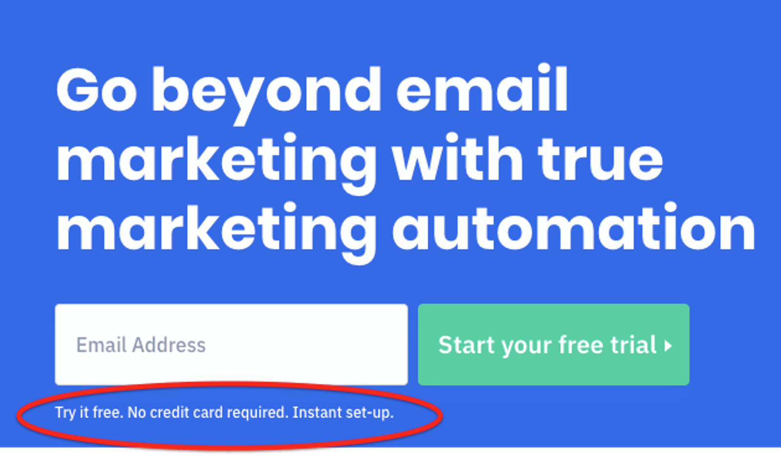
That looks like pretty compelling microcopy...time to sign up!
What does this accomplish?- There’s clear added-value from following through on the action. (The chance to try out free automation on TOP of email marketing? That’s the dream).
- The tone of the messaging is encouraging to customers, building trust. (Because no one would click through a CTA without some kind of foundation).
- It reinforces and encourages the customer to follow through (Free and short-term commitment. Sold.)
Where: CTA buttons
Joanna Wiebe of COPYHACKERS once wrote some wise words about buttons:“Buttons are like closed doors — people don’t know what’s behind them, and they need certainty to decide to click them. They need to be sure that they understand what will happen after they click.”Wise words, Joanna Wiebe.Buttons and microcopy do exactly that when written well. Look at this button example with microcopy incorporated into the CTA: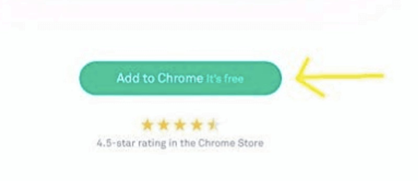
Still waiting for the day when “It’s Free” doesn’t work on a person...
What does this accomplish?- There’s total transparency with what’s about to happen beyond the button. (It’s going to get added to Chrome. Boom, done.)
- The language provides a clear, simple action for the customer to follow in a few tiny words. (“Add to Chrome.” There are very few ways to do this wrong).
- It encourages the customer to follow through and creates a sense of urgency. (Again, when has “It’s Free” not worked on a person?)
What: Explain new features
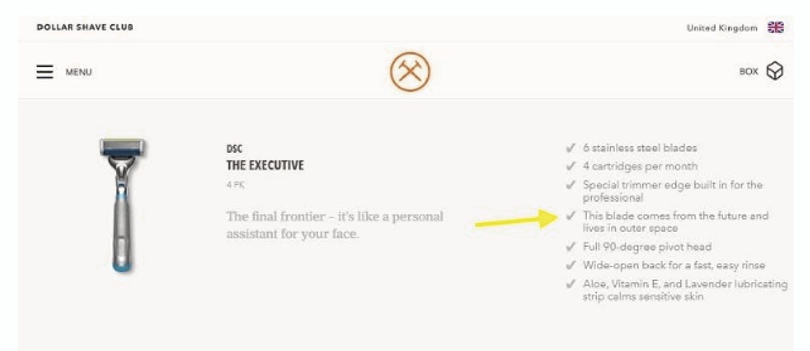
Wow, that's quite the razor.
Not only does this Dollar Shave Club give helpful product feature information in their microcopy, but they also humanize it with a little humor.What: Instruct on next steps for account registration
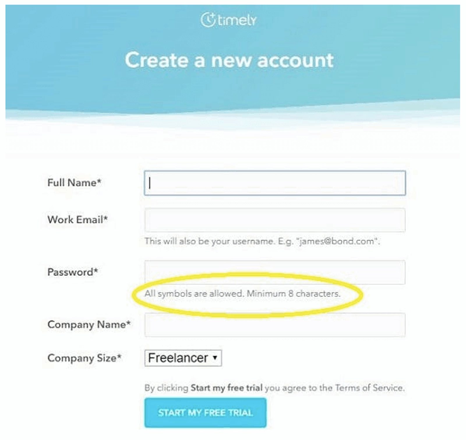
All of the symbols. Such freedom...
Pets, birthdays, last names. They’ve all been done before. With this helpful password instruction microcopy, nothing is off limits in the form fields. You can use your imagination and create the most secure, hard-to-guess password in history. Thank you, microcopy.What: Instruct on necessary fields during a purchase
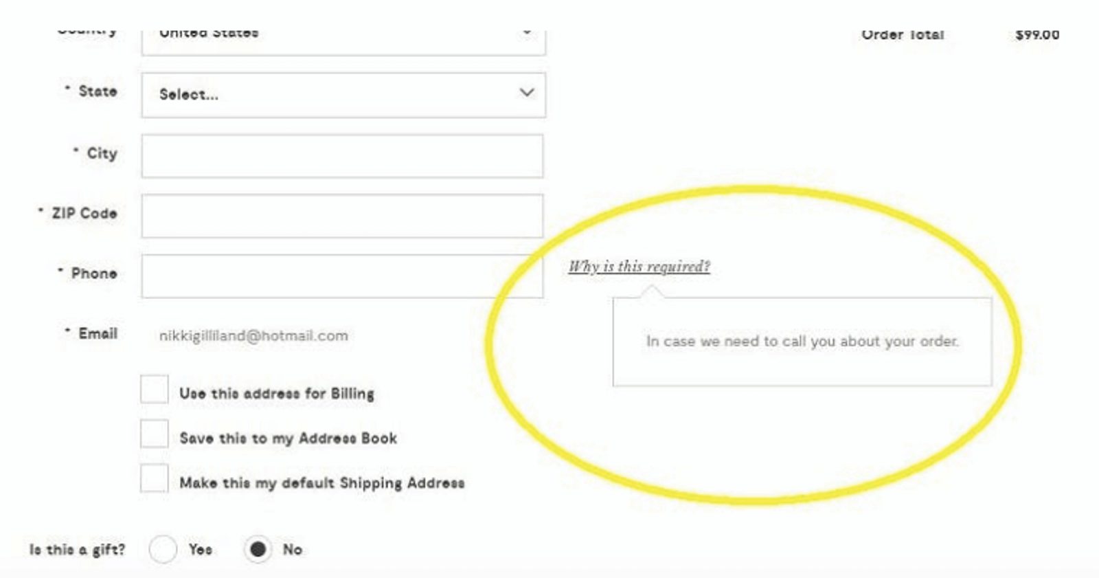
You don’t give your number to just anyone, and they won’t either.
Forget that little nagging worry in the back of your mind as you fill out the fields of a purchase form. This microcopy from Modcloth removes potential user concerns by saying that the requested info will only be used for that purpose alone.What: Search bar suggestions
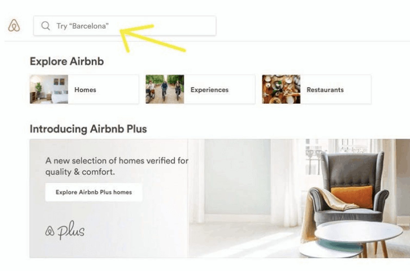
Hola, great search bar microcopy!
Have you ever gone to sites just to browse, not even knowing what you’re looking for, but you’re just doing it for fun? Personally, I’ve done this on Airbnb when I get the travel itch.That’s why it’s so nice to have micro words like theirs in the search bar (oohh, Barcelona…well I’m certainly clicking through now).Microcopy is famous for having the “small words make a big impact” reputation. We may hear it a lot, but it couldn’t be truer. Sometimes, less is more. Simple microcopy could mean the difference between a casual, occasional visiting lead and a permanent customer.


