What is an email newsletter?
An email newsletter is a regularly scheduled email (or broadcast email) sent to email list subscribers.
The content of an email newsletter can include:
- Tips
- News
- Stories
- Articles
- Educational content
Your email newsletter can be anything that you send to your list of email subscribers to keep them engaged and informed. Usually, you use an email newsletter to stay in front of people who are good candidates to become your customers.
Even if you have an idea of what you want to send – do you know what your emails should look like?
Do you want a minimalist design? Mostly text? Short text or long text? Featuring images, videos or gifs? Will you have one call to action or several? Multiple things to share, or just the one? Branding or no branding?
The list of questions goes on. You can narrow them down by answering these:
- What will you use the newsletter for?
- Who is getting the newsletter?
Are there examples? Templates?! Do you need some ideas?
You’re in the right place. Below you’ll find 10 popular types of newsletters and 2 examples for each.
In addition to the examples, you’ll find a newsletter template from the ActiveCampaign template library for each email type. Access to these templates is available on any ActiveCampaign plan!
Try it now, for free
10 types of emails, 20 examples, and 10 newsletter templates for newsletter design inspiration!
Your newsletter type and target audience determine the newsletter’s:
- Design
- Copy
- Format
- Call-to-action (CTA)
- Images
- Metrics for success
Let’s look at 10 common newsletter uses and see how today’s businesses are designing them.
What can you use an email newsletter for?:
- Keep your audience informed
- Get people to a landing page
- Drive people to a store or location
- Encourage people to buy
- Boost awareness for your events
- Promote your webinar
- Notify audience of an offer
- Create customer loyalty
- Establish your business as a thought leader
- Build excitement or create urgency
1. Keep your audience informed
Newsletters create awareness and spread information. The information is intended to build a relationship with your email list.
The info in the newsletter might push your prospects to do something – like driving event attendance or encouraging a purchase – but a lot of newsletters are designed just to spread information.
An informative design has a main section and a few subsections. Each section has brief copy that summarizes the section and (usually) a link or CTA for more information.
Take a look at Xfinity’s October newsletter:
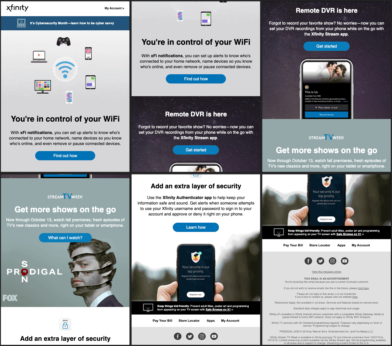
This newsletter brings attention to lesser known features and new programming
This newsletter is a great example of using visual hierarchy (the arrangement of visuals to imply importance).
The sections are concise so that you can always see the next section while looking at the current one. This creates flow from one section to another while including brief descriptions of the topics and links to more information.
A key aspect of the informative newsletter is diversity of topics. Xfinity’s newsletter covers:
- WiFi control
- Remote DVR
- Security
- New television programs
Xfinity takes full advantage of images, and even includes a GIF at the top to grab your attention (If you’re curious about using GIFs in emails, click here!).
It’s up to you to strike a balance between images and text. You might have more to say in text and only include 1 or 2 images. You could also rely on images to inform, like Dave Matthews Band’s newsletter below:
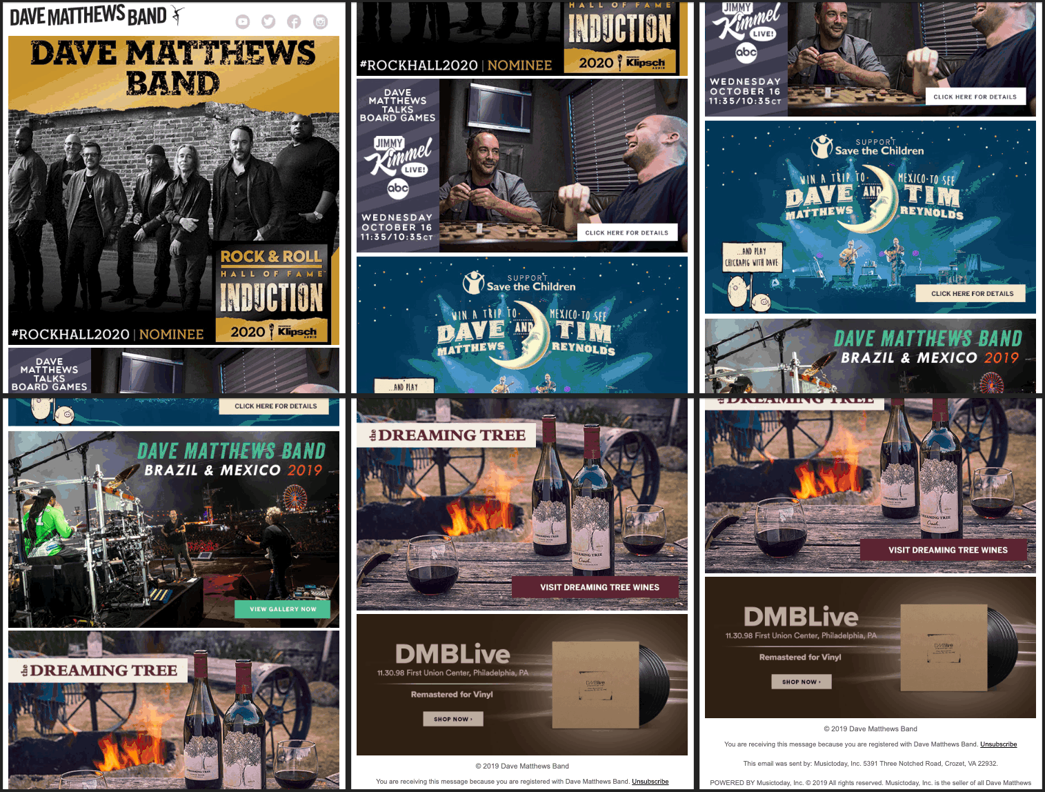
DMB lets the images do the talking in their newsletter
This newsletter uses no copy outside of what’s included in the images. Like Xfinity, each section is totally different and flows into the next.
Every photo includes a CTA button to:
- Vote for DMB
- Watch Dave play boardgames with Jimmy Kimmel (please no Monopoly)
- Learn about a benefit concert
- View tour photos from Brazil and Mexico
- Purchase wine (you have my attention)
- Shop for vinyl
The band has a lot going on, and uses the newsletter to let everyone know!
These newsletter designs are optimized for mobile and desktop: everyone will be able to view them, on any device. This is a critical detail as approximately 50–60% of email opens occur on mobile devices and if current trends hold, this will only increase!
If you’re looking to design an informative newsletter, ActiveCampaign can help. Below is our “Newsletter Welcome” template:
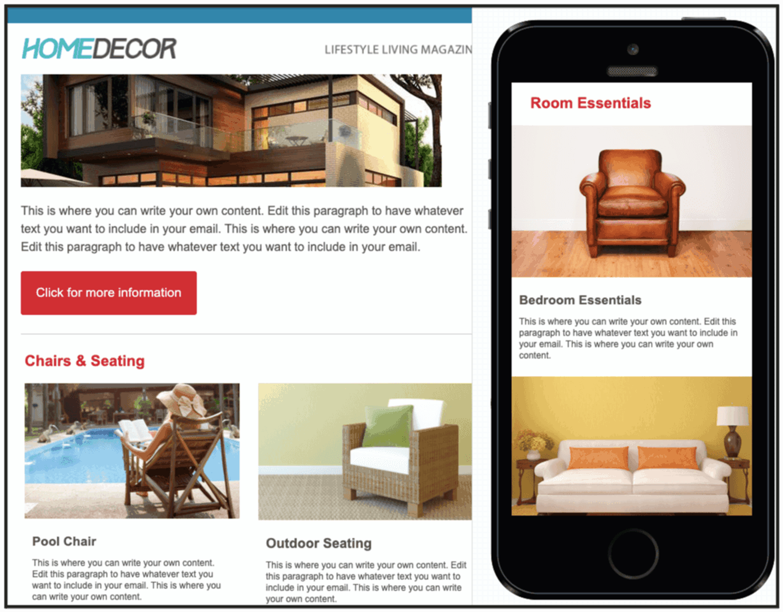
ActiveCampaign templates are easily edited with a drag and drop builder
The left side shows you what your email would look like in a browser or desktop, while the right side shows your email’s mobile display so you can optimize for both! All ActiveCampaign templates display both desktop and mobile previews.
This informative newsletter template uses:
- Visual hierarchy
- Main section
- Subsections
- Images
- Text
It’s a great framework to keep your audience up to date with everything they need to know about your business.
2. Get people to a landing page
You might want your subscribers to take an action that’s only possible outside of the email.
This might be:
- Filling out a form for independent research
- Watching a video (embedding video in email is a hot button issue)
- Learning about a program or product
- Verifying an email address or piece of information
In these cases, it’s best to send a newsletter designed for landing page conversions. Here’s an email I received recently from Capterra:
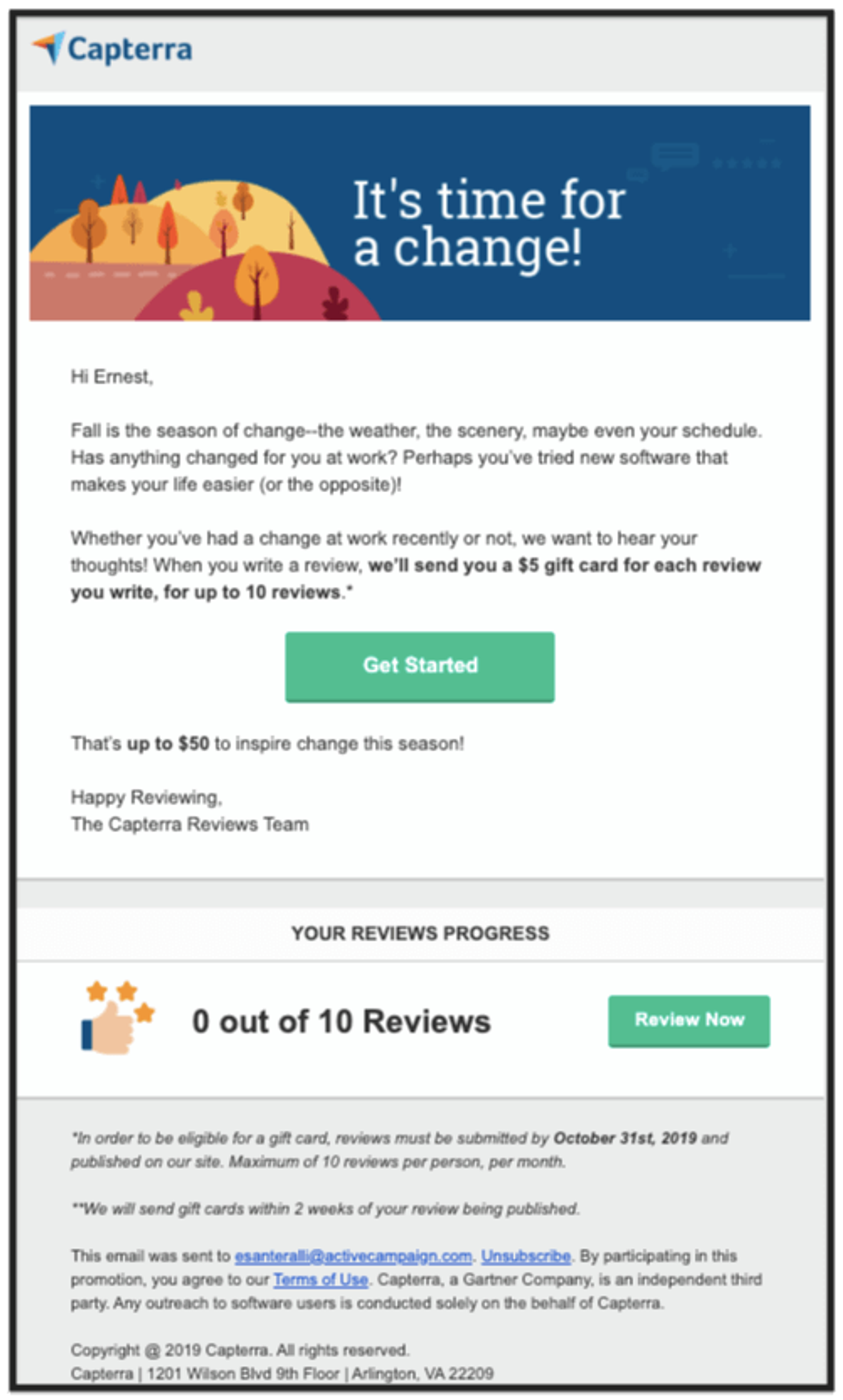
Capterra wants reviews but has no idea what I can contribute – the best way to find out is to visit their landing page!
The landing-page-centric newsletter doesn’t need a complicated design to be effective. Capterra’s email is straightforward with a clear CTA and a clear benefit. I mean, who doesn’t want $50 for their opinions?
Readers can’t complete the reviews from the email, so Capterra has to create an incentive to click through (for more on email click through rates [CTR] click here!).
To ensure that the benefit doesn’t go unnoticed, the design and body of the email is short and concise. The important text is bolded, and CTAs pop with their bright green color.
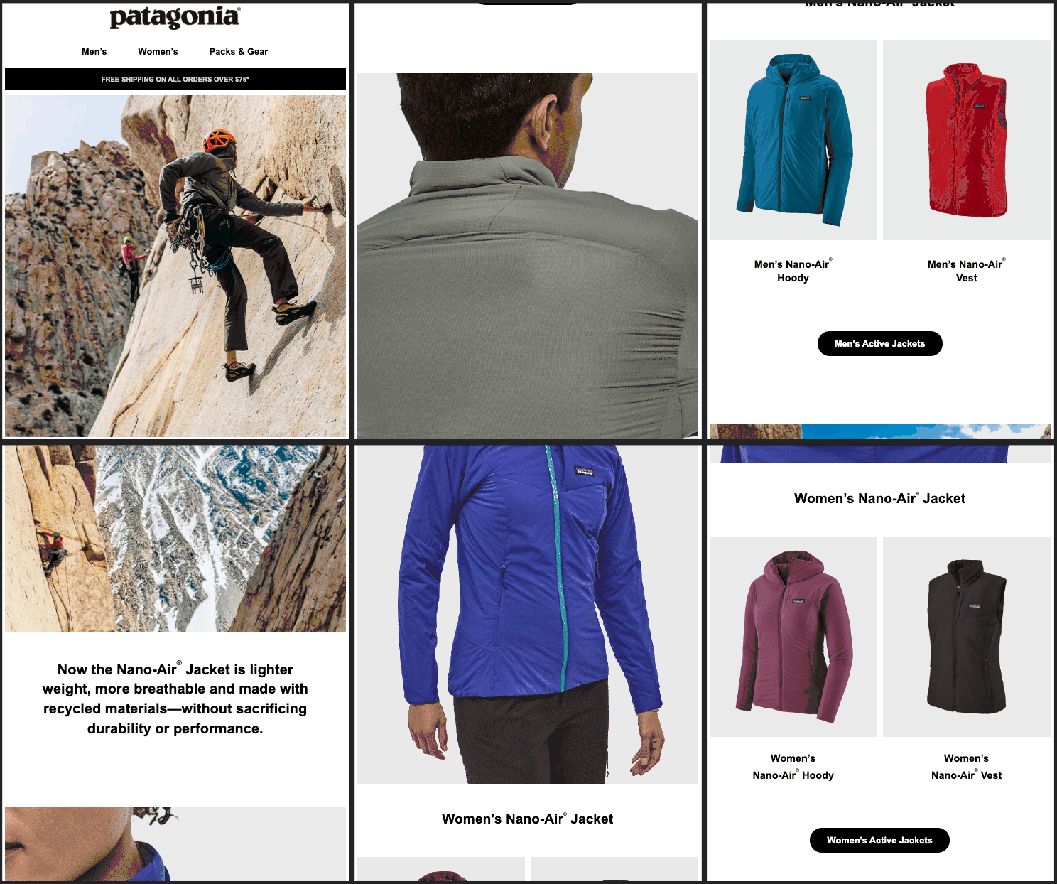
Patagonia relies on multiple images to lure clicks from their readers
Patagonia’s email may be longer, but both Capterra and Patagonia are straightforward in their intent. Unlike informative newsletters, there’s only 1 topic in landing page newsletters.
Two brief sentences of copy are all that’s needed – Patagonia lets the action and product photos do the rest of the talking.
ActiveCampaign’s “Announcement” template follows this straightforward design theme:
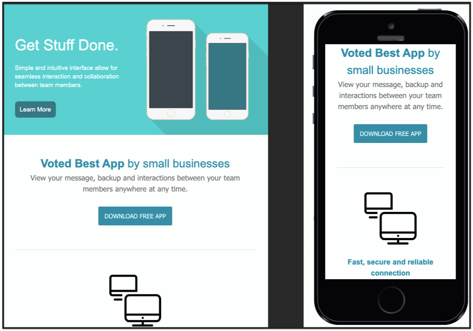
Strong email header, brief copy, and a clear CTA – next stop, landing page!
The email header indicates the benefit and provides the reason why a subscriber should click through. The middle section is an opportunity to give social proof followed by the CTA that takes them to the landing page promised land.
You don’t need to include too much, but what you do include needs to be compelling and clear.
3. Drive people to a store or location
Newsletters keep your audience engaged and an engaged audience takes action. That action doesn’t have to be online – it could be getting people through the door!
Newsletters that drive people to a store or location are great for:
- Restaurants and bars
- Grand openings
- Real estate open houses
- Parades
- Fundraisers
- Philanthropy
- Meet-and-greets
Here’s an example from the Chicago Liverpool FC Supporter’s Club:
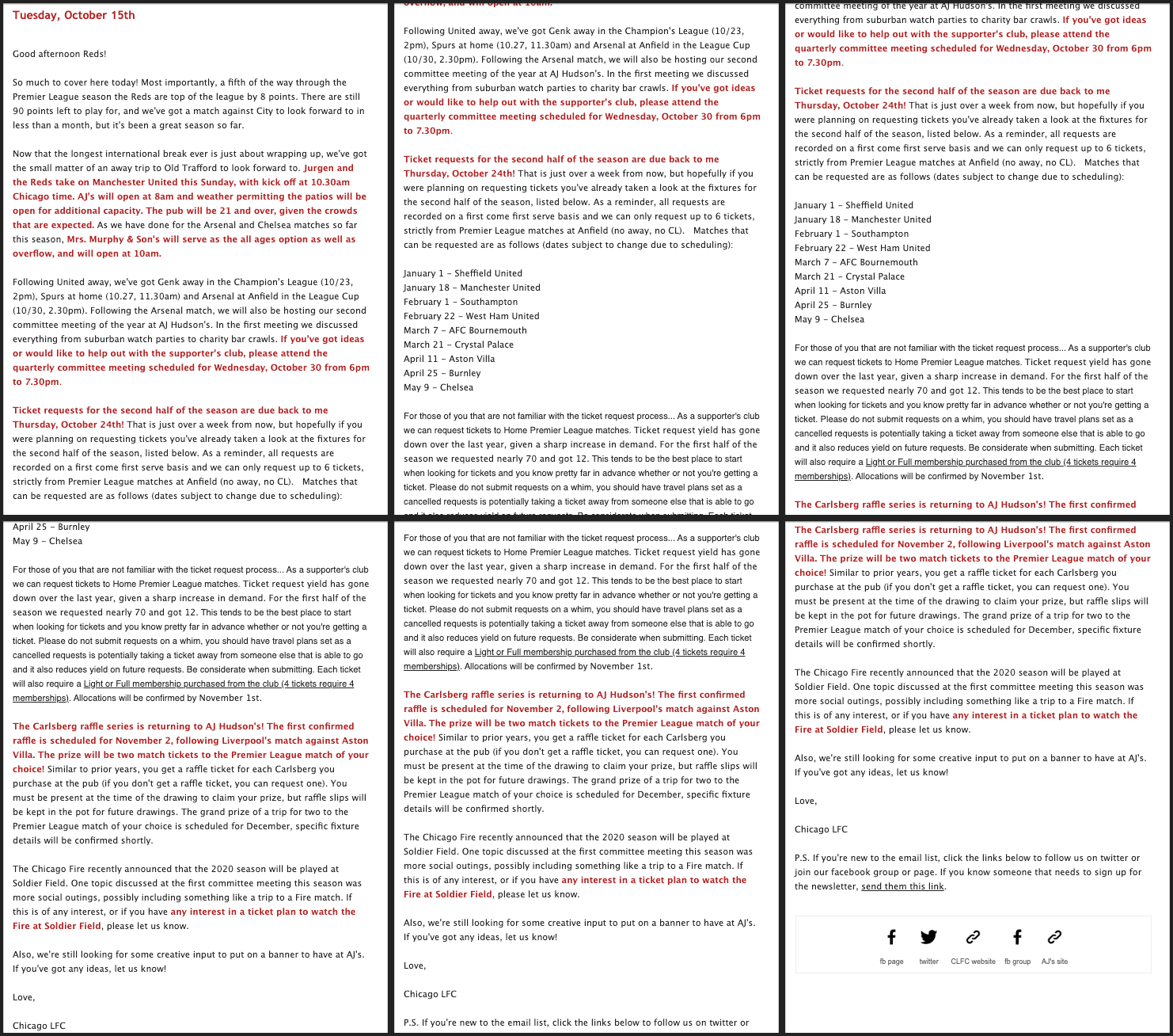
Text heavy newsletters work if you know your audience is engaged
If you have an email list full of passionate individuals, a text-heavy newsletter can be effective. The Chicago LFC Supporters are a group of people who have no problem showing up to a pub at 6:30 am on a Saturday to watch the Reds at Anfield, and including an image or two won’t change that.
This newsletter embodies the “know your audience” principle. They can get away with heavy text because they know the audience won’t mind.
The newsletter gives details on:
- The season so far
- Upcoming matches
- Upcoming events
- Locations of events
- Deadlines
- Buying tickets
You might be saying to yourself, “Wow, this is a long newsletter, how long should my newsletter be?”
Well, it depends.
There’s no clear cut rule for newsletter length or design, as long as it’s consistent with what your audience expects from you.
What if your audience isn’t a mob of people in red singing “You’ll Never Walk Alone”?
Take a look at this newsletter email from SmileDirectClub.
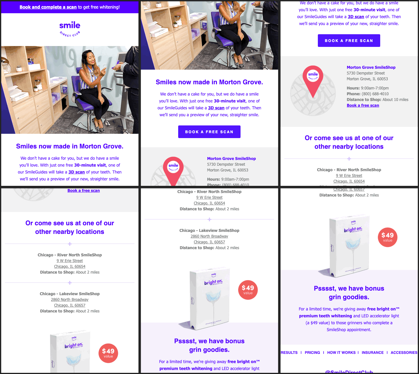
“We’re in a new location! Book a free scan here today!”
This newsletter from SmileDirectClub:
- Informs the localized audience of a new location
Like Chicago LFC Supporters, SmileDirectClub knows their newsletter audience. So it’s no surprise that the pubs are packed and SmileDirect is opening new locations.
If you want to get people to a location, ActiveCampaign’s “Cafe” template is a great framework to work from.
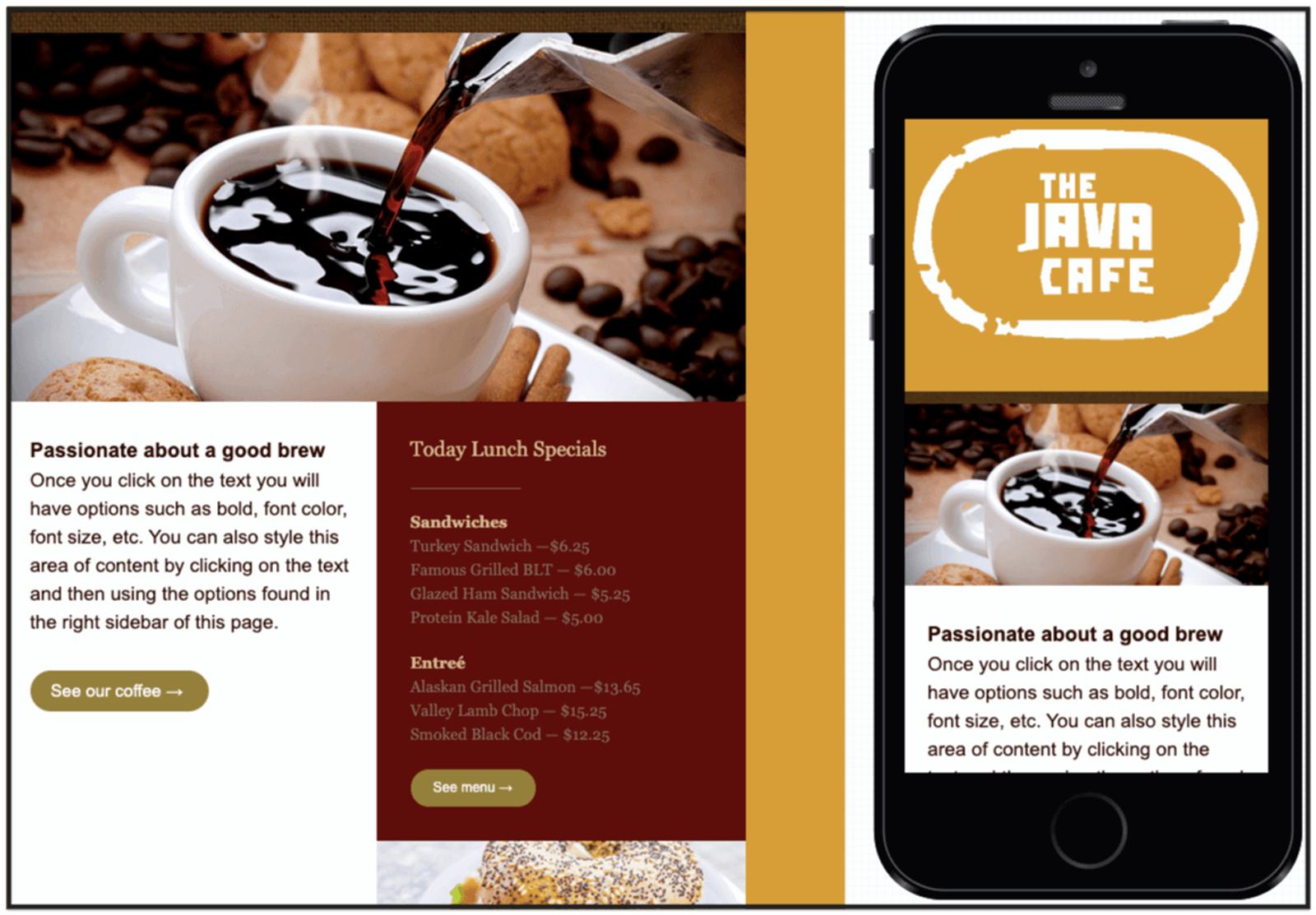
Photos, copy, and today’s specials – complete with CTAs to see more? I’m on my way!
This in-app template makes it easy to update with your own images, copy, and deals. Include a discount or lunch special as an extra incentive.
4. Encourage people to buy
Encouraging your subscribers to buy via email is a massive opportunity for your business. Email is 40x more effective at acquiring customers than Facebook and Twitter combined.
Sometimes your subscribers need an extra push to convert them into customers. A newsletter is a great way to get them over the finish line — if you use it to show them why they should buy!
Take a look at this email from HatStoreWorld designed to optimize conversions:
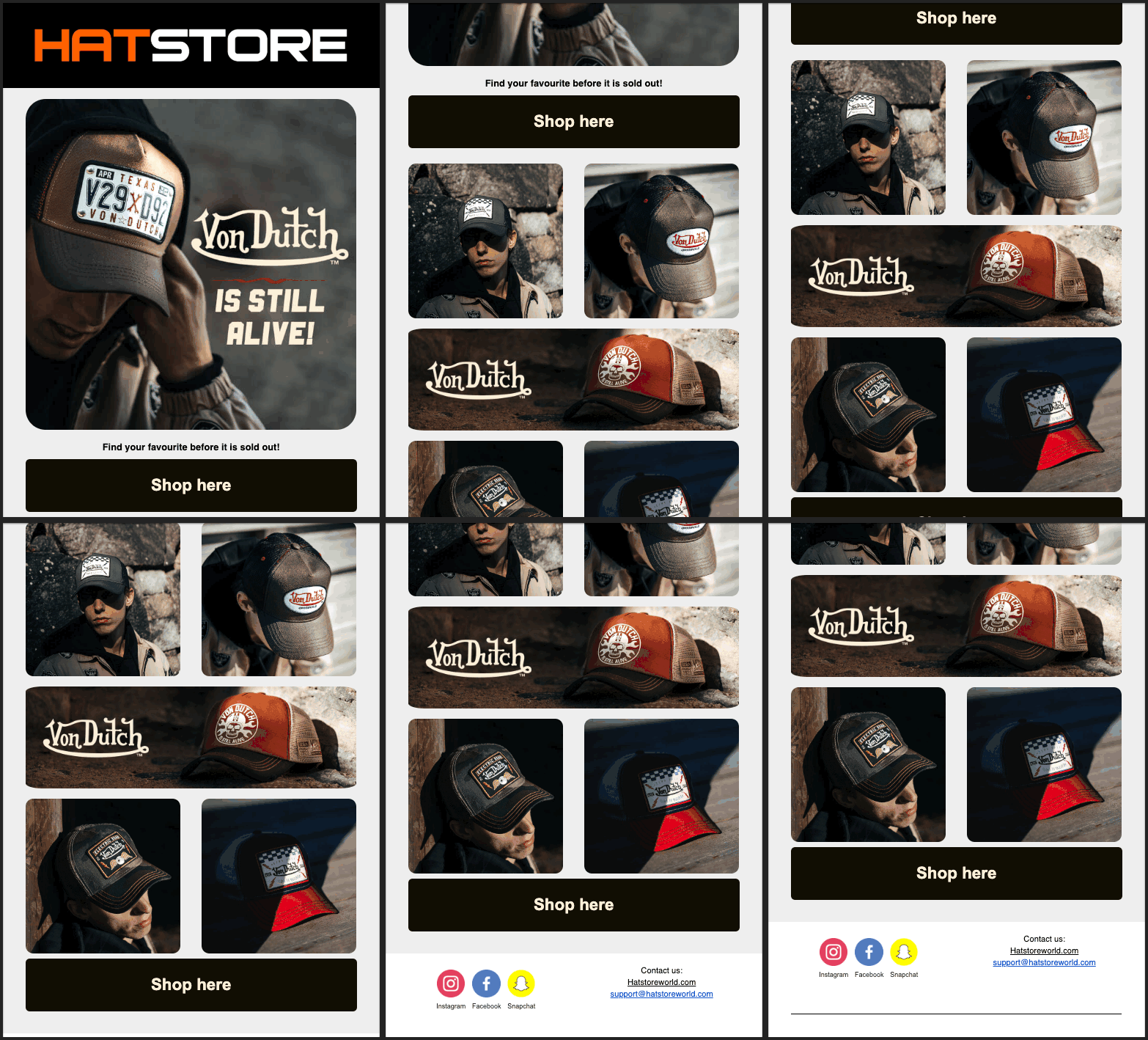
Image heavy, product centric, no offer or sale – just shop here!
This newsletter design lets the brand do the talking. There are two CTAs that sandwich 5 different hat designs.
A single sentence of copy adds just the right amount of urgency:
“Find your favourite before it is sold out!”
This newsletter is designed to do 1 thing: sell Von Dutch hats.
HatStoreWorld knows this brand is popular. They know the audience is more likely to see a hat they like if they show multiple designs, so they included 6 of them.
Clear newsletter purpose + defined target audience = effective newsletter design.
But what if you’re selling multiple different products?
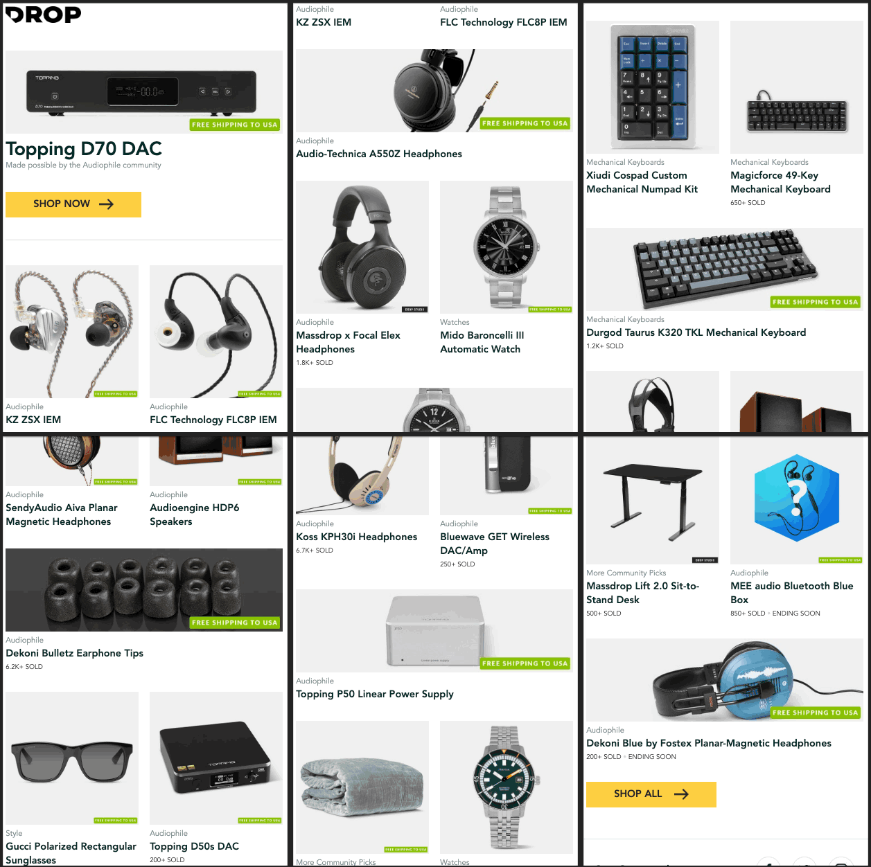
From sunglasses to subwoofers – DROP has you covered
Images are important in buy-centric newsletters. 93% of consumers consider visual appearance to be the biggest factor in a purchasing decision. Show the audience what you have to offer and encourage a conversion, and make sure your images are high quality.
Etsy, the popular ecommerce site for handmade and vintage items, found that the quality of images influences 90% of their shoppers to make a purchase.
If you’re looking to design a newsletter that encourages your audience to buy, take a look at the “Shopping” ActiveCampaign template.
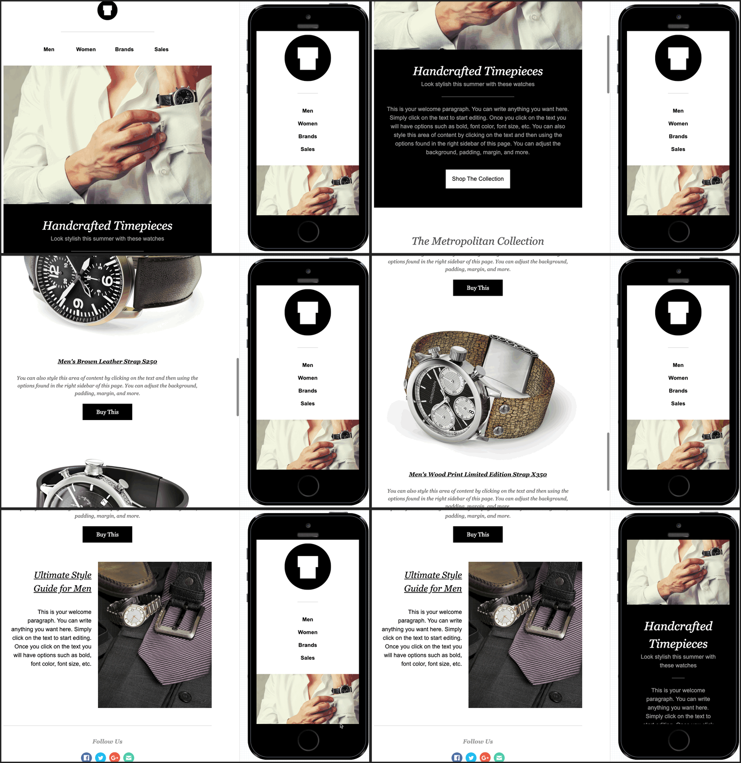
Design a product focused newsletter using the ActiveCampaign framework!
Like HatStoreWorld and DROP, the ActiveCampaign shopping template zeros in on images of the products you want to sell. A brief description of the collections or products can work to your benefit, but are optional.
5. Boost awareness for your events
Use your email newsletter to keep your audience in the loop for upcoming events. An invitation is a powerful personalization tool that strengthens the relationships you have with your email list, so long as the event is relevant to the individual.
Live Nation sends a personalized event newsletter that uses segmentation to recommend concerts specific to the subscriber.
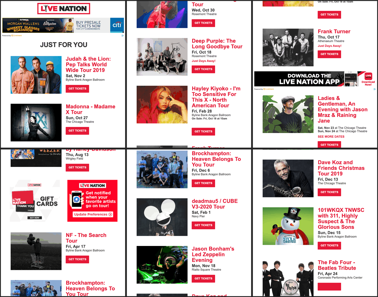
Live Nation includes the most important details about each concert with a specific “Get Tickets” CTA
Images of artists add visual appeal and flavor to the email. The design is consistent throughout and uses negative space to differentiate each upcoming event.
Chicago is a big music city, so there’s no shortage of events to stay up to date on. But you don’t have to have a bunch of things on the calendar to send out an event-based newsletter. Your event doesn’t even have to be a physical event!
Take a look at this event email from Lyft.
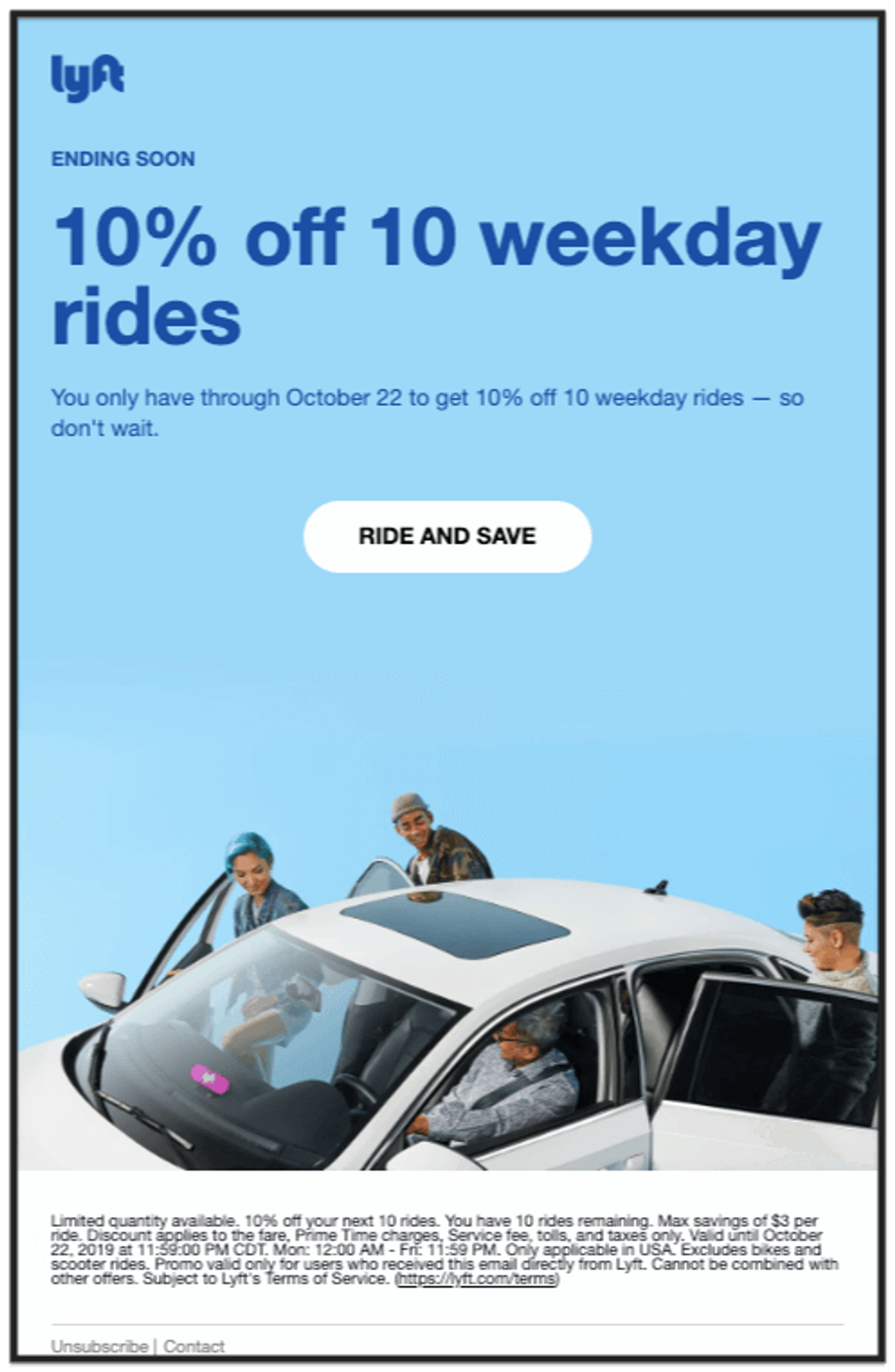
Although not something you can attend, it’s still an “event” you should be aware of.
Unlike LiveNation, Lyft’s email is about a single event (and you don’t even need tickets). The visual hierarchy naturally directs your eyes to everything you need to know, in the order you need to know it. Lyft creates urgency with a well placed, “ENDING SOON”.
An event-based newsletter checks a few boxes:
- Clear message about event
- Clear CTA for tickets or registration
- Sent to a relevant target audience
If you’re looking to send an event-based newsletter, look no further than ActiveCampaign’s “Tickets” template:
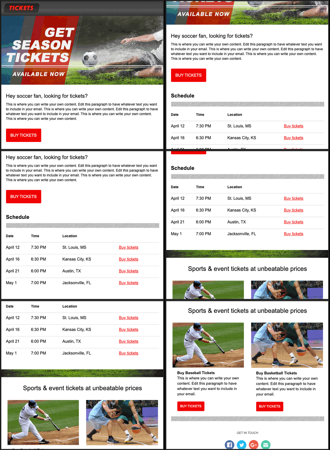
Include information about your event, and specific CTAs for tickets or registration.
This ActiveCampaign template presents the opportunity to include:
- Short descriptions about upcoming events
- Relevant photos for added context
- Unique CTA links for each event or type of ticket available
6. Promote your webinar
The webinar promotional newsletter is a variation of the event-based newsletter, and is used for the same thing– to increase awareness and attendance.
Webinar newsletters rely on text more than on images. They convey the webinar’s benefits in the subject line and preheader text, or the “email preview text” after the subject line in your email inbox.
Search Engine Journal sent this newsletter to promote their webinar on infographics:

Just the important details, no images – the infographics are in the webinar!
SEJ wants to increase webinar attendance. Their newsletter gets right to the point in the first line by asking if you’re able to attend.
The question is followed by:
- Short, direct description of the webinar
- A bulleted list (like this one) for visual clarity and webinar benefits
- A single CTA link to register
Another example is this webinar newsletter from WordStream.

WordStream includes additional links for more information about the topic.
Like SEJ, this newsletter uses:
- Short and direct copy
- Informative sentences
- Negative space for visual clarity
- Links for registration or additional context
ActiveCampaign’s “Webinar” template provides a similar framework to promote your webinars:
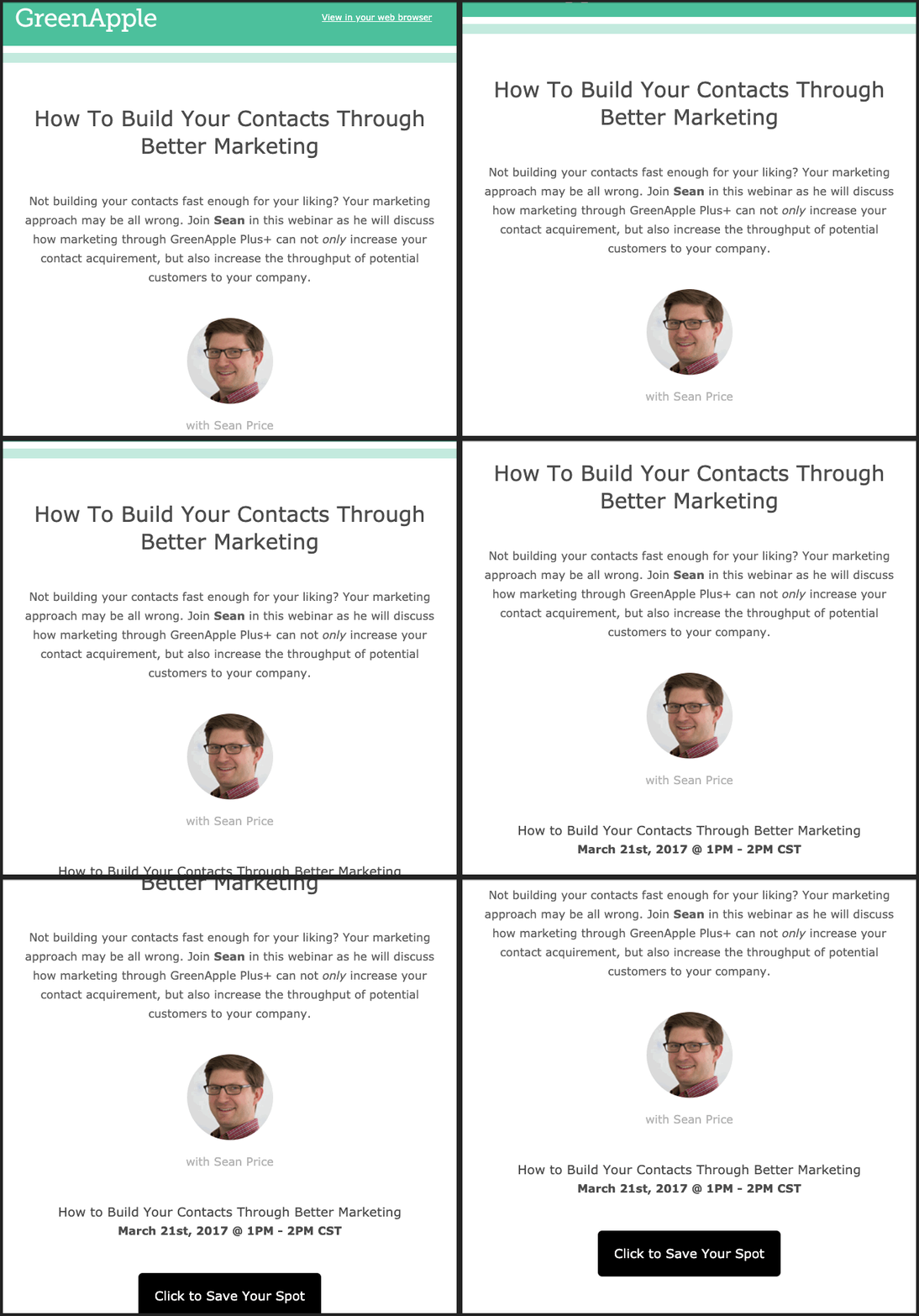
Title → description → webinar host → CTA
A webinar newsletter doesn’t need anything extravagant to be effective. You want to encourage attendance by teasing the benefits of the webinar. The formula is simple:
- Webinar title (subject)
- Description (importance of subject, benefits of webinar)
- Host (credibility on the subject)
- CTA (opportunity)
Your webinar is important and the information is valuable– show your audience what they could learn, or what they’ll miss out on if they don’t attend!
7. Notify people of an offer
SALE! For a limited time only! Exclusive offer! Don’t miss out on this!
Offers are exciting and newsletters are the perfect way to let everyone know. When it comes to newsletter design, special offer newsletters use excitement to their advantage. They create urgency and rely on visuals.
Reebok demonstrates this design style in their recent 40% sale:
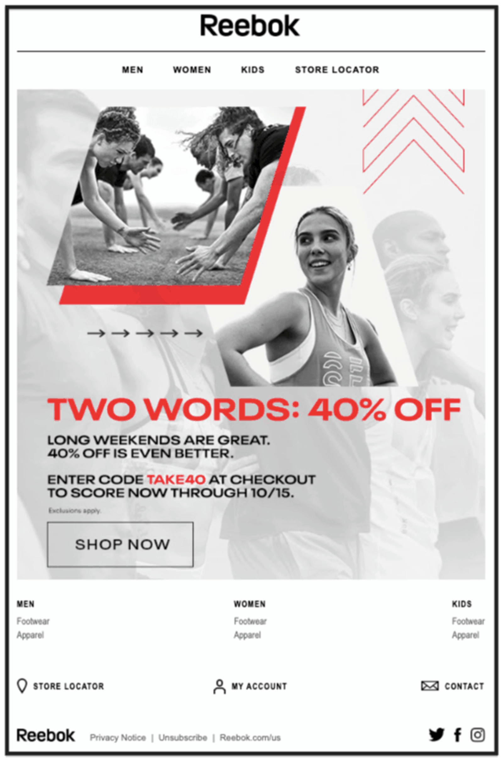
Clear offer, clear deadline. Don’t miss out.
Reebok uses competitive images to highlight their brand and to create a sense of urgency Reebok is a well known athletic apparel brand, and doesn’t need to include many images of products because their audience already knows who they are.
The use of red in an otherwise black and white email directs your eyes to the important stuff: 40% off! Visual hierarchy brings your eyes to the CTA to redeem the offer. Don’t wait, shop now!
Udemy takes a different approach to the offer newsletter:
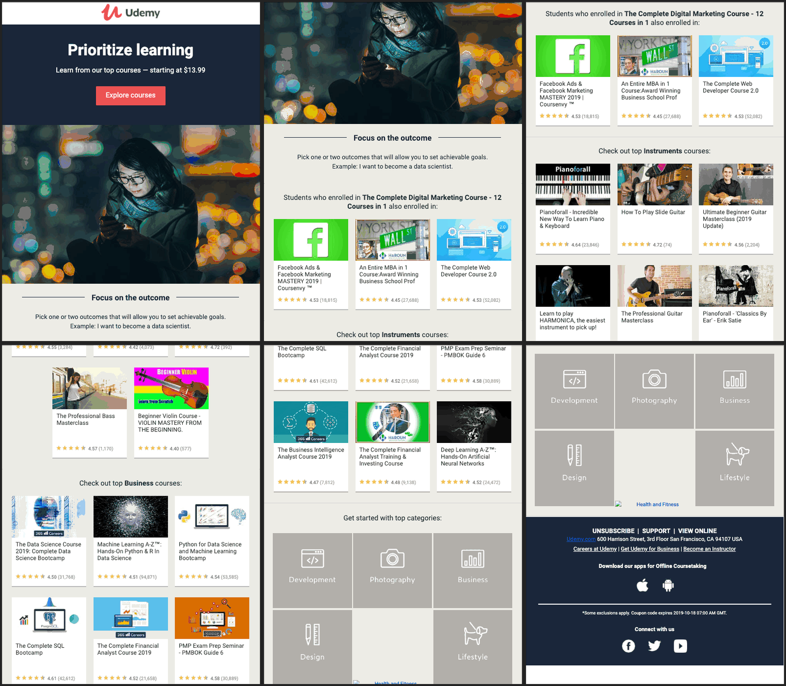
Udemy showcases the broad spectrum of courses on sale with images
Udemy offers high quality online courses. Unlike Reebok, Udemy’s audience probably doesn’t know of every course that’s available.
To overcome this obstacle, Udemy includes 20+ examples courses that span a huge spectrum of material, plus a menu at the bottom with 6 additional course categories.
Studies show only 19% of newsletter emails are fully read, and 35% of readers skim only a small portion of emails. Udemy’s thumbnail images are organized for visual clarity and they provide more context and an opportunity to hook your attention if you’re scrolling or scanning.
The offer-centric newsletter design shows the audience 2 things they care about:
- What is the offer?
- How is the offer relevant and important?
Reebok and Udemy use different styles, but are effective in showing the audience the offer and why it matters. For more exclusive offer email newsletter designs, check out these Cyber Monday email examples!
ActiveCampaign’s template library includes a “Discount” framework to let your audience know of an offer:
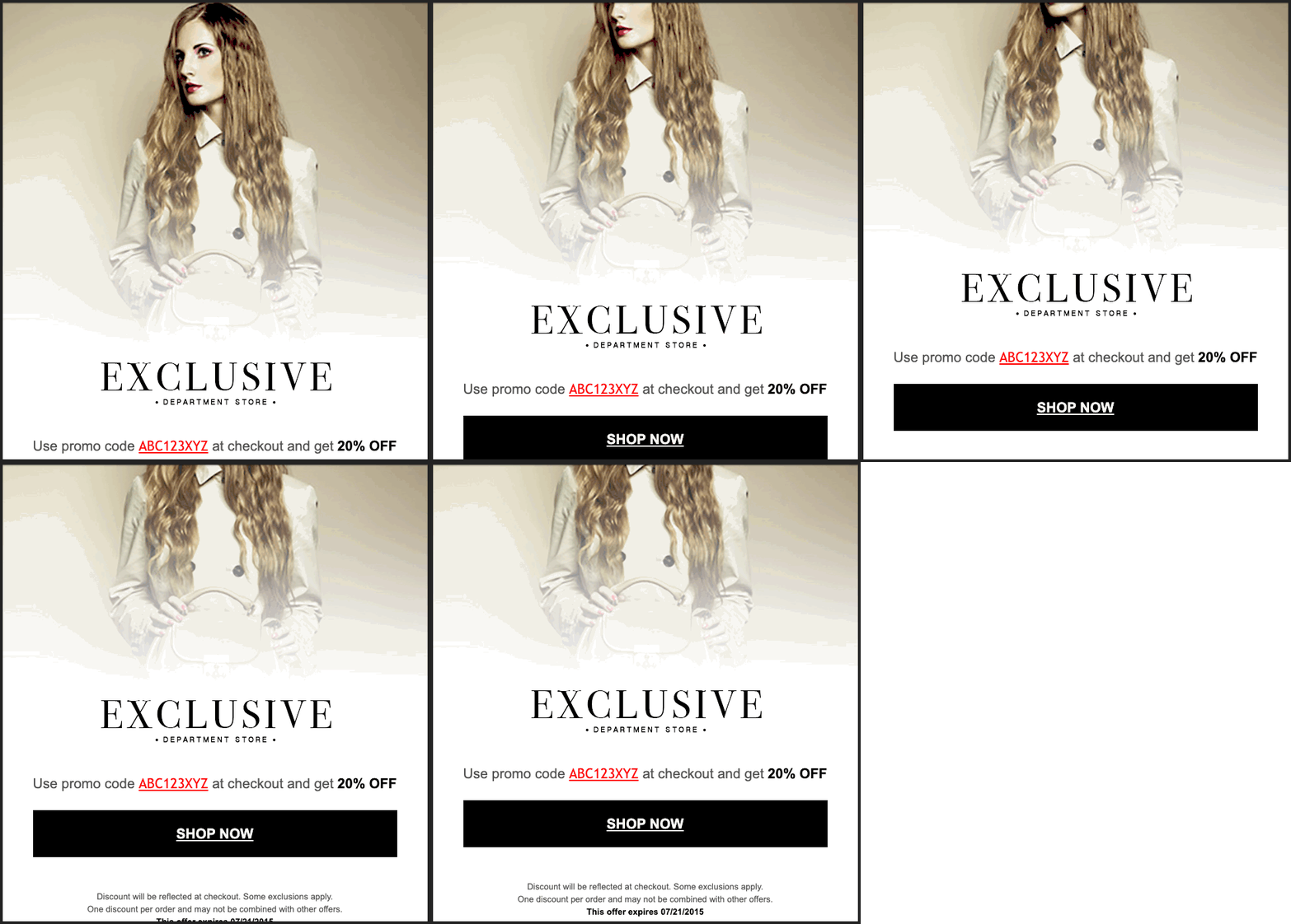
This newsletter design template is perfect for spreading the word about your offer.
This offer template uses visual hierarchy and a straightforward design to tell the audience what the offer is and how to take advantage of it. The image is an opportunity to connect with the audience and draw them in.
8. Create customer loyalty
You’ve got a list of email subscribers that you want to convert into customers. But not just one-time customers – loyal customers. Repeat buyers. The benefits of customer loyalty are huge.
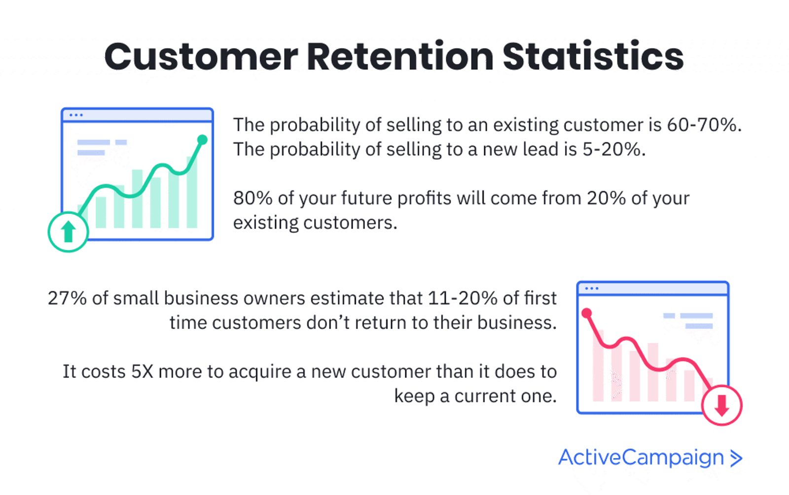
How can you increase the probability of selling to an existing customer?
But how do you get loyalty?
Your email newsletter is a great place to start. Send out a customer survey or an invite to a loyalty program.
Divvy (Chicago's bike share program) sent this email:

You want my opinion and feedback? Sure!
When you ask your customers for feedback, it’s like asking them for advice. When you ask someone for advice, they view you as more competent and in a more positive light. Your audience is flattered and views you as smarter.
Divvy uses simple copy to make their case. They make the audience feel like they have a say in the future of the business. This makes the audience feel invested and important.
When your audience has a positive outlook on your business, they begin to trust you. Brand trust is a key consideration that consumers use to decide who to buy from. In fact, 81% of consumers say they must be able to trust a brand.
Another way to improve customer retention via email newsletter is through loyalty programs.
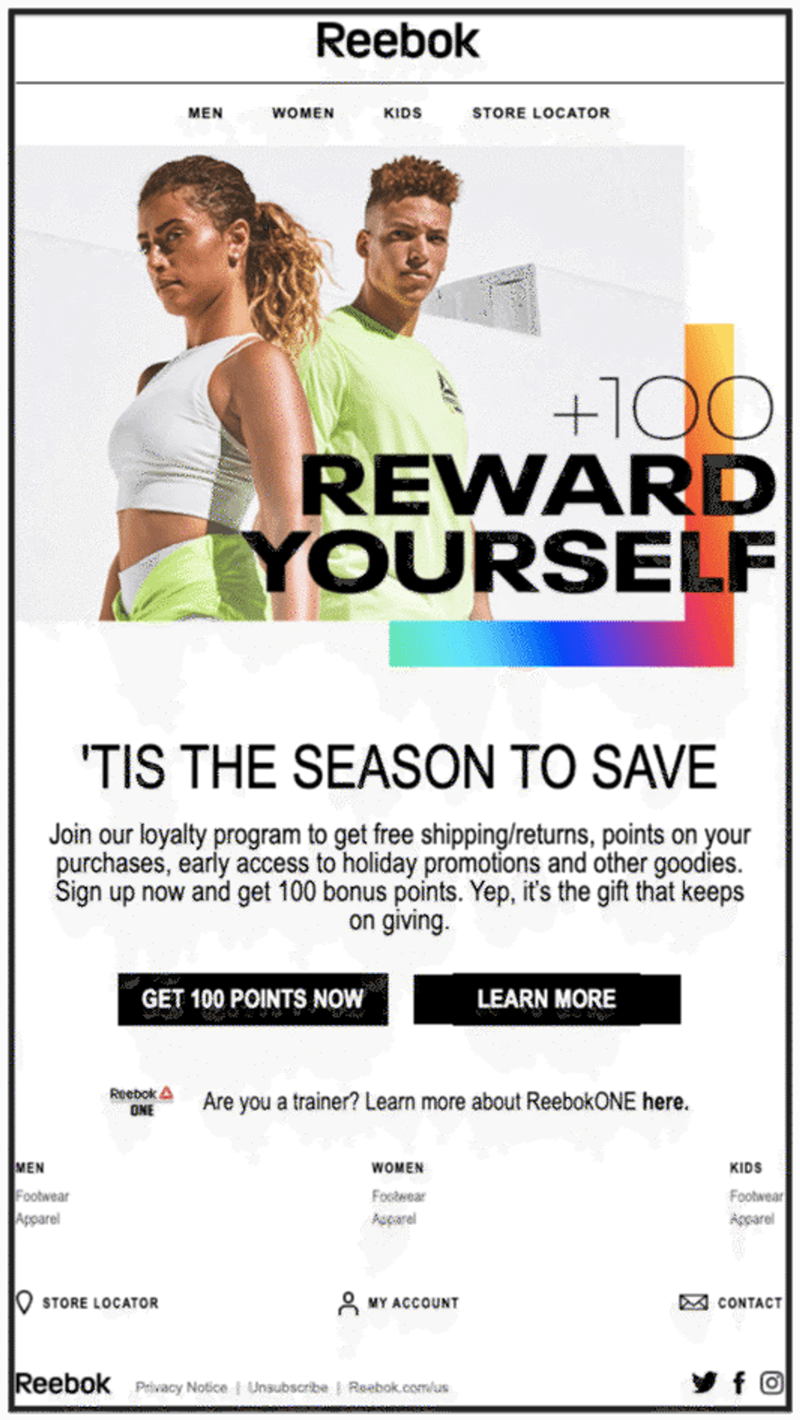
Reebok encourages customer loyalty with an incentive to join their rewards program.
Reebok includes a strong image in their customer loyalty invite and a 100 point incentive (whatever that means). The email mentions the potential to save money as well as a self-care benefit in “Reward Yourself”.
2 clear CTAs give you the choice between an immediate reward, or learning a little more first. Reebok designed this newsletter to do one thing: increase sign-ups for the loyalty and rewards program.
Studies show that 76% of North American consumers are more likely to choose a retailer with a loyalty program. Not only that, but loyalty program members spend 12-18% more annually than regular customers.
If you’re looking for a newsletter to improve customer loyalty, ActiveCampaign’s “Review” template is a great design to start.

Customer feedback and reviews are powerful tools to improve customer loyalty
The newsletter design is simple with a clear purpose and call to action. Reviews help to cement your business in the mind of your customers, as well as provide social proof to potential customers.
9. Establish your business as a thought leader
Why is it important to be a thought leader in your industry?
Thought leadership means potential customers think of you as:
- Trustworthy
- Authoritative
Your email newsletters can help your business build credibility by being a source of valuable information on a certain topic.
That’s how The Daily Carnage uses their newsletter:
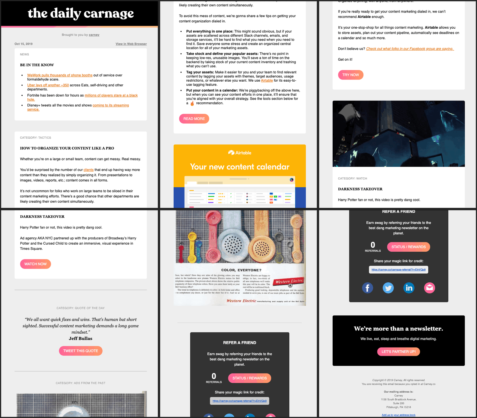
A newsletter that includes multiple links on a topic shows the audience you’re credible
The digest newsletter shows the audience you’ve taken the time to sift through information and present only the best stuff to them. Putting the best content into a single email saves them time, and establishes you as an authority.
The Daily Carnage newsletter design includes several sections, laid out in a traditional newspaper format:
- Top news
- Featured category – content organization
- Software tool recommendation
- Interesting video
- Quote of the day
- Vintage advertisement
They’ve been through the internet and curated a newsletter of valuable content for your viewing pleasure. Each section includes links to more info or a CTA related to the content.
New Breed Marketing puts together a similar digest newsletter:
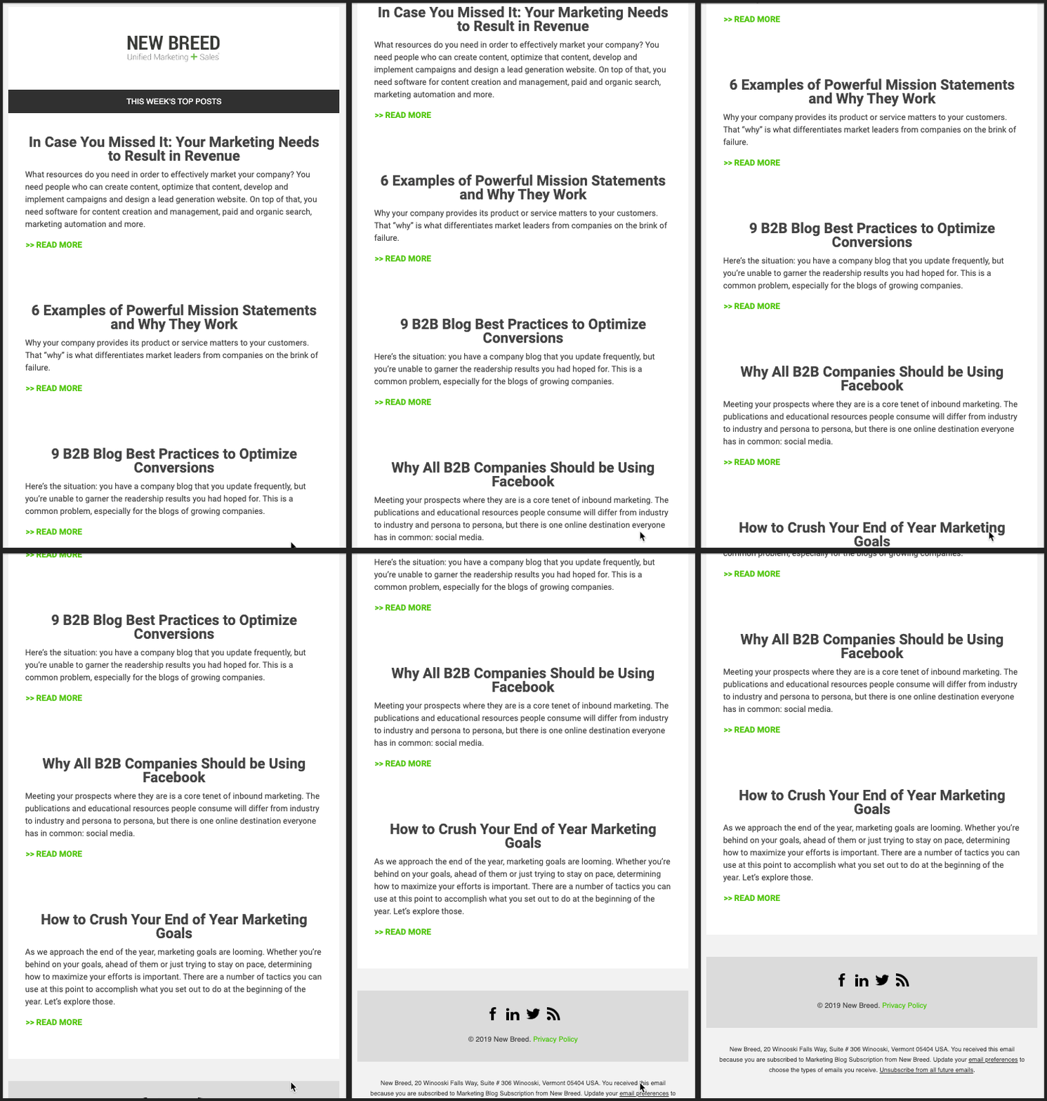
Strong headlines, short copy, and a link to learn more about the subject.
New Breed’s design is simple and uses negative space to direct the path your eyes take.
Each article relates to the overall marketing topic. The green CTA stands out, yet stays consistent with the brand.
You can curate high quality content for your email subscribers with ActiveCampaign’s “Digest” newsletter template:
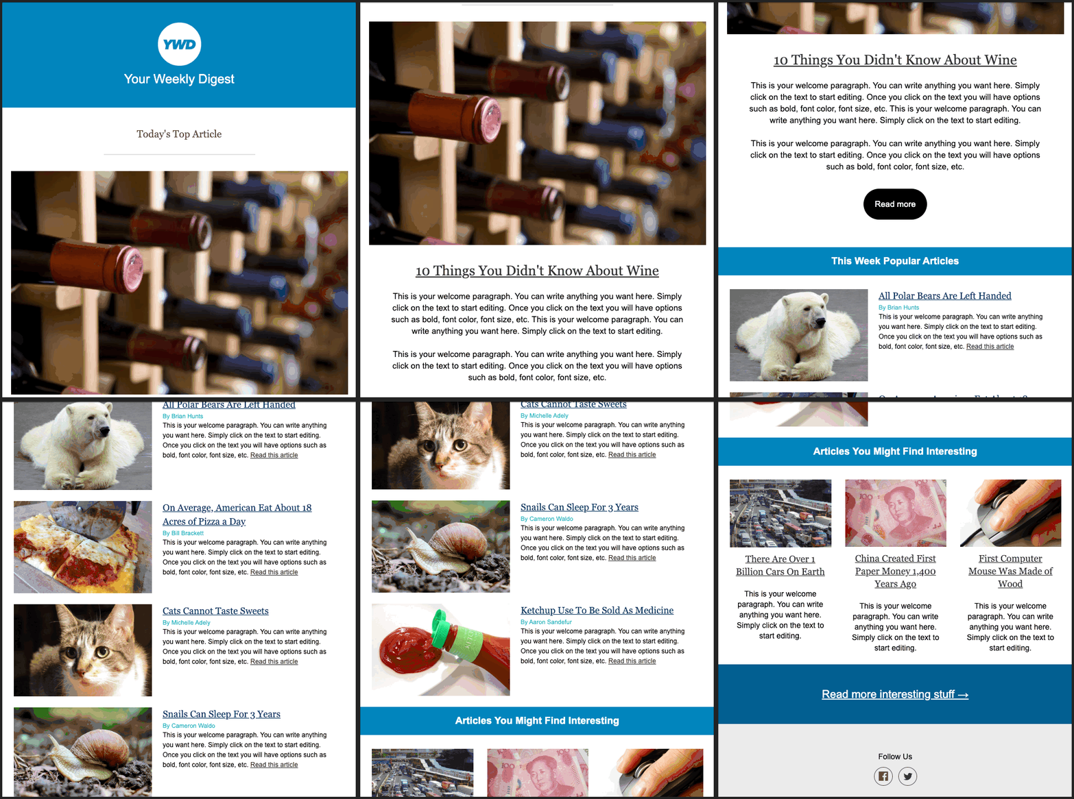
Send your audience an engaging digest newsletter with this ActiveCampaign design!
Like The Daily Carnage, ActiveCampaign’s template has a “featured” section followed by subsections. This lets you curate the content further by directing more attention to a given article, image, or post.
You can link to additional information, use thumbnail images, and provide a brief description of each article.
10. Build excitement or create urgency
Your newsletter can can create urgency and excitement with:
- Limited offers
- Contests
- Grand openings
- New products
Here’s an example from Writer's Digest:
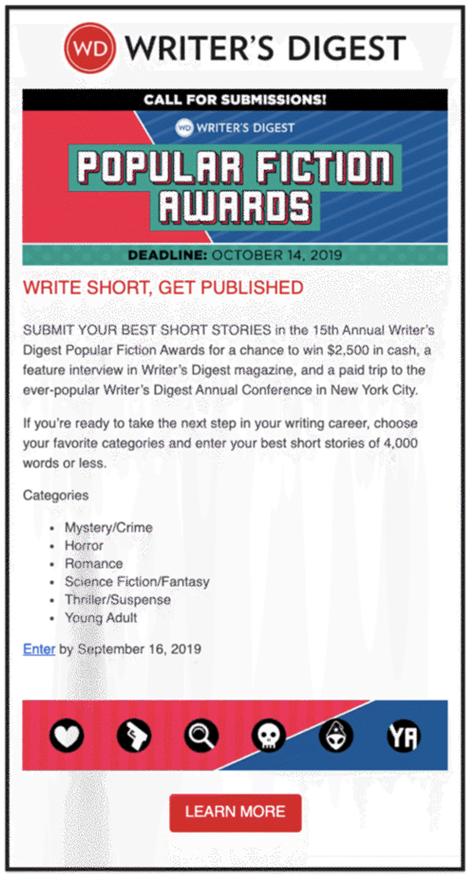
Awards, getting published, cash prizes, trip to NYC – are you excited yet?!
You don’t need an elaborate newsletter design to build excitement. Writer’s Digest draws your attention to their contest with a bright banner that tells you what’s at stake. The deadlines and concise CTAs add a sense of urgency.
Leading with “Popular Fiction Awards” and following with “Write Short, Get Published” tells the readers why they should be excited.
Limited time sales or offers use urgency as a way to engage the audience. Polo used urgency in this recent email:
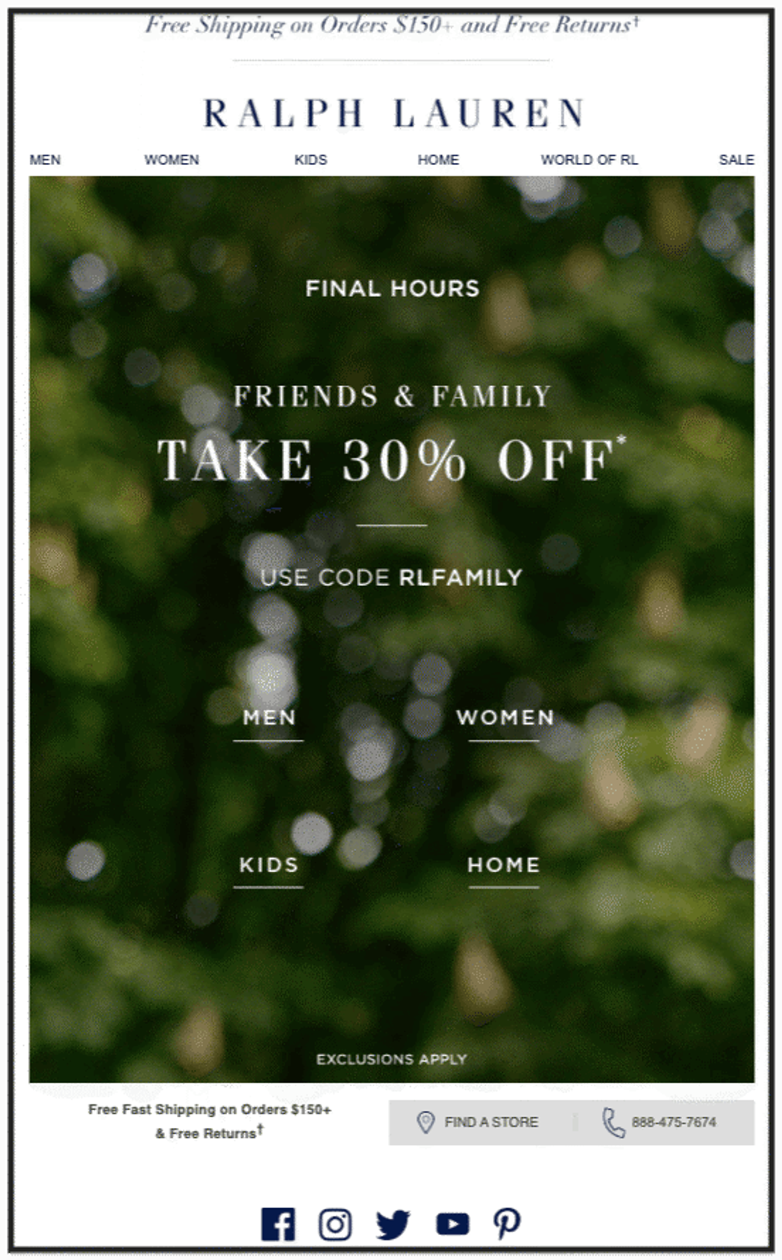
Polo discounts don’t come around very often, better jump on this before it’s gone.
If your business doesn’t offer discounts often, an offer email served with a side of urgency is sure to give you a bump in your email engagement metrics.
In newsletters designed for excitement and urgency, it’s best practice is to lead with why. Writer’s Digest and Polo both begin their emails with a hook.
In this case, “Final Hours” tells you all you need to know. The offer won’t be around forever, so you’d better make a decision now.
ActiveCampaign’s “Contest” template is perfect for crafting an exciting newsletter that will inspire your audience to take action.
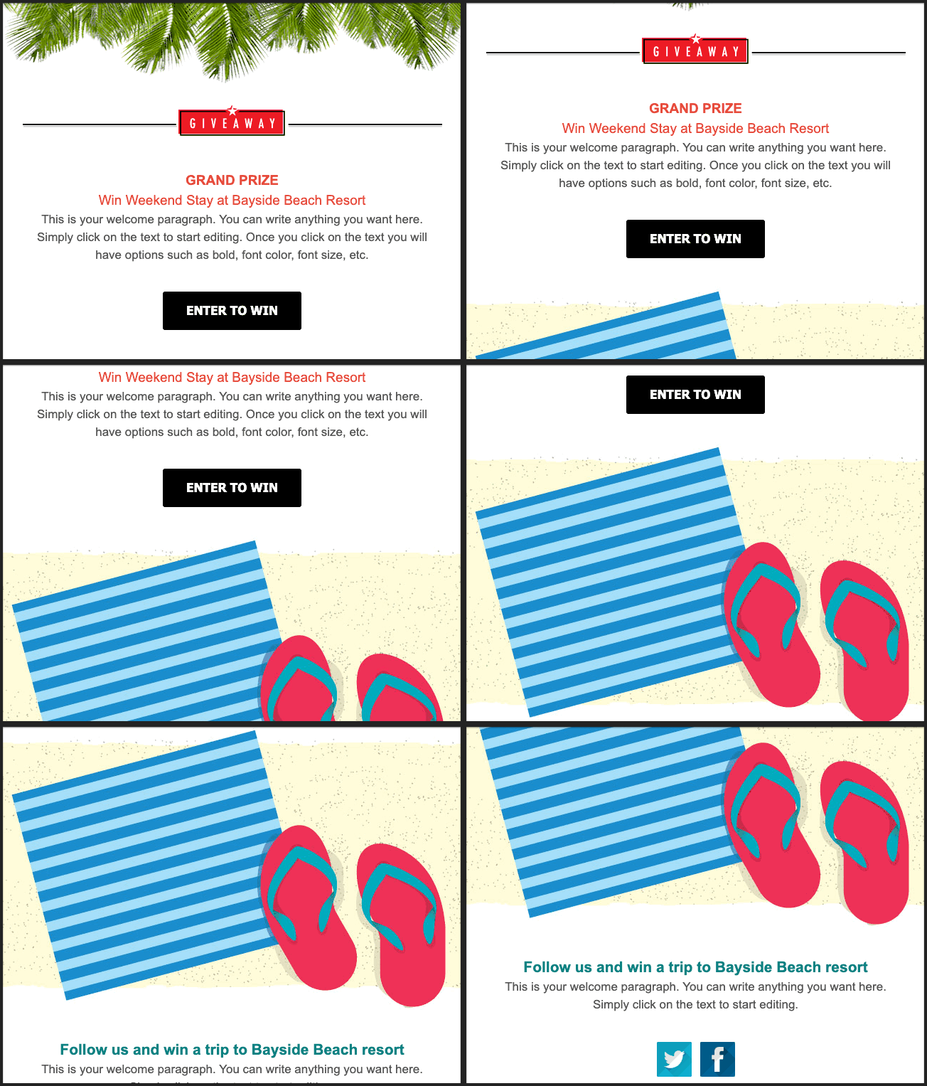
This template wastes no time telling your audience why they should be excited
Just like Writer’s Digest and Polo, this newsletter template is designed to build excitement from the first word. This email has good news to share, and can’t contain itself!
Be careful not to overuse words like:
- Giveaway
- Grand prize
- Win
- Free
These might trip a spam filter, and it’s important to be mindful when including them in your emails. ActiveCampaign has a spam check tool that ‘grades’ your email campaigns and flags any potential issues.
Conclusion: Newsletter design is determined by newsletter type and target audience
There are infinite ways to connect and engage with your audience through an email newsletter. Your newsletter can be anything you want it to be, so long as you keep 2 things in mind:
- The newsletter’s purpose
- Your target audience
If you understand those, it doesn’t matter:
- How long or short your newsletter is
- How many images you include
- How many CTAs you include
What does matter is if you can answer these questions:
- Does your newsletter design match with what you want it to do?
- Does your newsletter design resonate with your target audience?
If the answer is “Yes” then it’s time to hit “Send”.

