In the dynamic world of digital communication, email newsletters stand out as a vibrant tapestry that weaves together brand stories, essential updates, and promotional emails into a cohesive narrative. Crafting an engaging newsletter is both an art and a science, requiring a keen eye for color schemes, strategic image placement, and an understanding of responsive design that resonates across major email clients. Whether you're curating content for company newsletters or creating well-designed newsletter templates, the best practices of newsletter design are your blueprint for success.
This guide will delve into the world of email marketing platforms and their UI design tools, offering insights into creating newsletters that captivate your audience and drive your unique goals. From the layout intricacies to selecting from a wide variety of design elements, every pixel in your newsletter contributes to a dialogue with your subscribers. Let's unravel the elements that elevate a simple message into an immersive experience for your readers.
This article is part of our Perfect Email series. Click here for a complete guide on how to write an email, templates for different types, and formatting tips to boost your engagement.
Why is newsletter design so important?
In 2021, approximately 320 billion emails were sent each day worldwide, and this figure is steadily growing. There are more than 4 billion email users. We can assume that an average email user receives around 80 emails per day.
Businesses face unprecedented competition as they fight for consumers’ attention.
It’s not enough to haphazardly compose a newsletter and call it quits—you need to ensure that your campaigns cut through the noise and are more valuable, clever, and captivating than your competitors. The only way to achieve that is through high-quality design and copywriting.
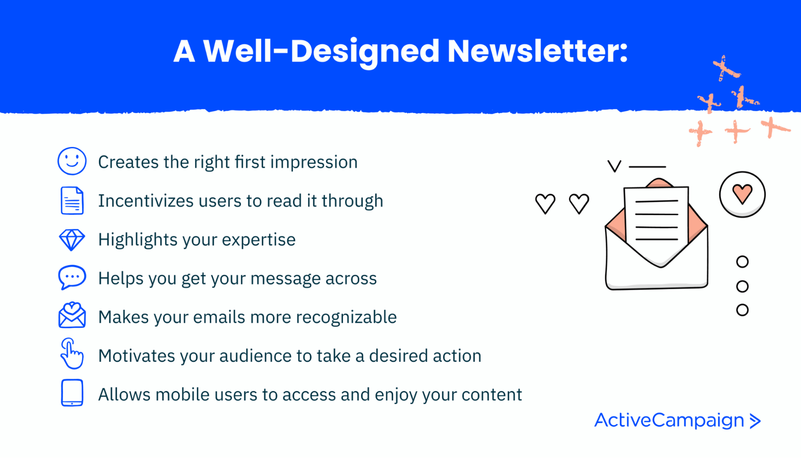
An effective newsletter design helps you tick multiple boxes, including:
- Immediately impresses your customers and sets the tone for future communications.
- Makes your content more appealing and inviting to improve your engagement metrics.
- It showcases your expertise through smart and tasteful design choices.
- Uses visual accents like arrows, icons, and supplementary colors to highlight your key points.
- Expresses your brand personality and amplifies your brand voice using witty copy and stunning visuals.
- Motivates your audience to take the desired action by highlighting your CTAs.
- Makes your newsletter more accessible for busy users always on the go.
11 components of an effective newsletter design
You need to know the key elements and roles to design an outstanding newsletter. The anatomy of a newsletter is a blueprint that allows you to create attractive and catchy emails every time. It applies to any commercial, entertaining, or informative newsletters.
Once you learn the key components, you can play around with them and make more confident design decisions.
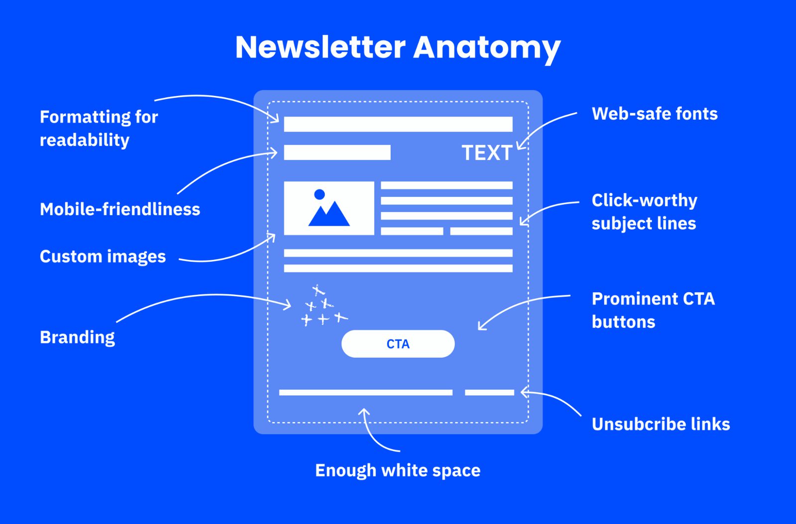
Let’s see what they are and how they affect the overall email user experience:
- Bite-sized formatting.Small chunks of text make it easier for the recipient to process the whole email without stumbling or spending too much time.
- Mobile-friendliness. If your email looks good on a mobile device, your audience can even read it on their commute.
- Branding. Including your logo, signature, or company name is a must if you want your newsletter to be instantly associated with your brand.
- Informative subject lines. They communicate the value of your content and ensure that your newsletter won’t get lost in your subscriber’s inbox.
- Custom images. By using unique photos or illustrations, you stand out from the crowd of businesses that rely on the same cheap stock images.
- Recognizable color palette. You can use your brand colors or stick to monochrome—the main point is to give your email series a cohesive look.
- Headlines. Grab attention the moment your recipient opens your newsletter.
- White space. Declutter your email layout and let it breathe to improve its legibility further.
- Web-safe fonts. Strike a balance between accessibility and aesthetics by choosing fonts that most operating systems use.
- Prominent CTA buttons. Use visual cues to subtly push your subscribers toward the action you want them to take.
- Unsubscribe links. Show your audience that you care about them and want to accommodate their needs and interests.
There are many optional elements that you can include in your newsletter design. For example, email footers can be reserved for social buttons, while images can be swapped for videos or GIFs. What matters most is the overall newsletter content structure and delivery, the bones that support your storytelling.
8 newsletter design best practices and how to use them
There are 250+ professionally-designed newsletter templates in the ActiveCampaign library. Let’s put some of them under the microscope to understand why they’re designed the way they are.
You’ll learn useful newsletter design tricks and techniques and find out how to make the most of any customizable email template.
1. Stay consistent from email to email
If you’re sending a series of emails, ensure they naturally complement each other and are easily recognizable as a sequence. Create some visual continuity by adding subtle repetitive elements to the templates.
For instance, if you’re promoting an event, stick to the same design choices throughout your campaign. It can be a dramatic dark background color, a niche illustration style, or an unusual typeface.
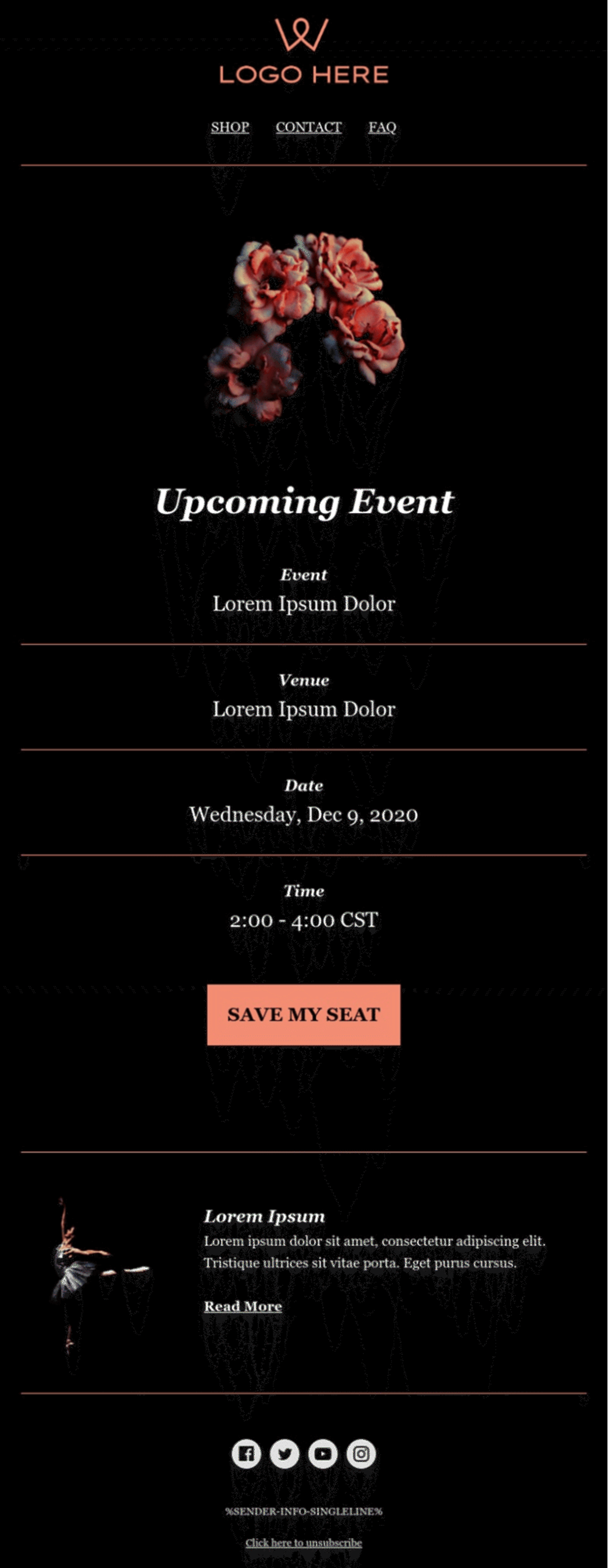
Let’s assume your goal is to grow your audience’s interest in a certain product or event. In that case, you don’t want to be too experimental—choose one aesthetic for your newsletter and hold on to it.
2. Use your screen real estate wisely
Your layout should be well balanced—not too busy, but not too empty, either. By leaving just enough white space around your paragraphs and images, you’ll inevitably draw attention to them.
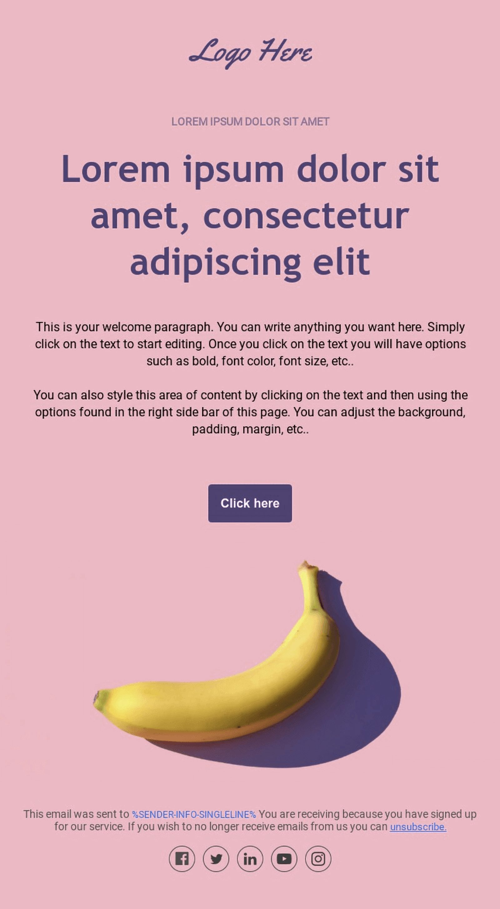
This example shows that even a minimalistic email can be bright and attractive if you moderately use complementary colors. Also, always place your headline, supporting text, and CTA button above the fold at the top of the email to ensure your subscribers won’t miss them.
3. Go for a single-column design
A single-column design always looks great on a mobile phone because it provides a smoother reading experience. A newsletter designed this way is skimmable by default.
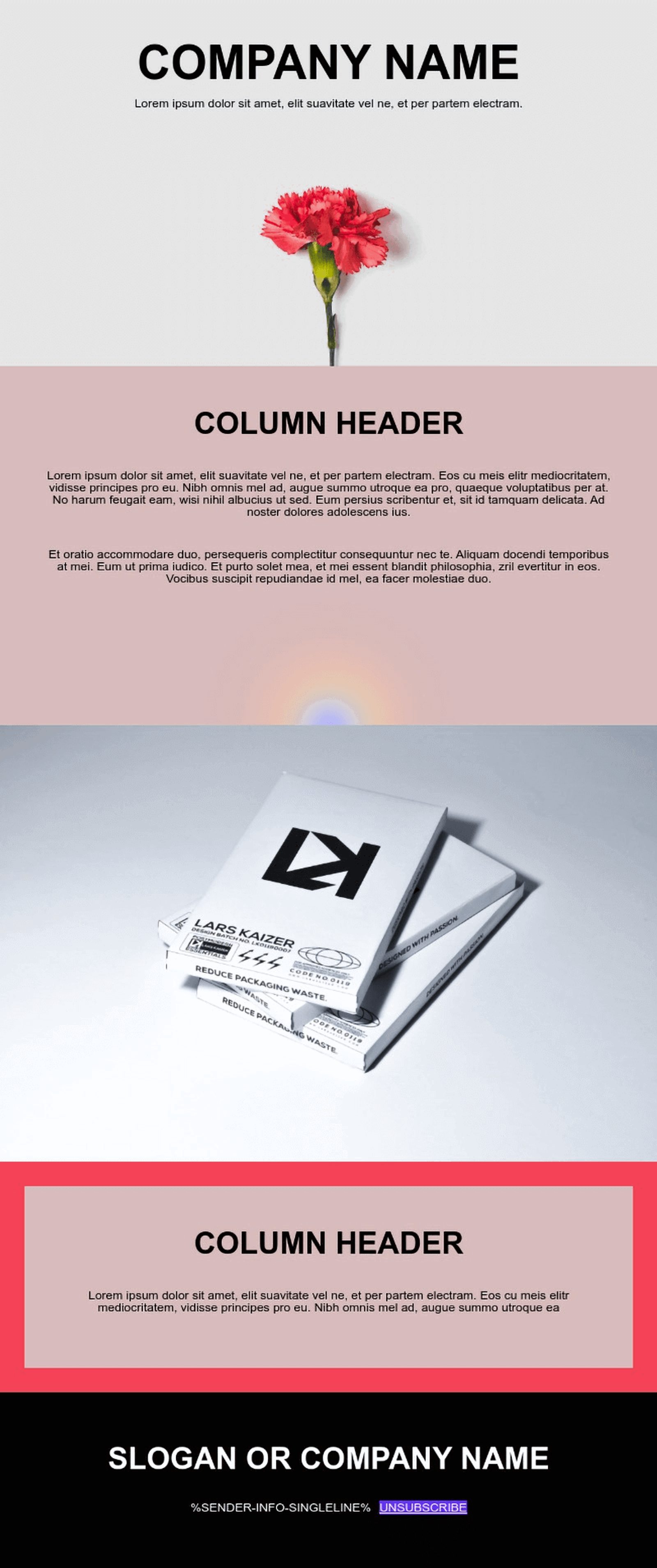
Even if your template is responsive and your audience mostly uses laptops, you should still consider a single-column design. It instantly makes the whole email more slender and inviting, which is especially important for text-heavy newsletters.
4. When out of ideas, stick to minimalist design
If you aren’t confident in your design decisions, use fewer colors, textures, fonts, and images. You can’t go wrong with minimalism since it’s trendy and requires little effort.

Minimalism is a perfect choice for tech companies, businesses, or experts who don’t want to appear or sound too informal. Typically, this approach uses a clean white background, basic illustrations, and one contrasting color.
5. Use dreamy images to convey the mood
The principle “show, don’t tell” comes to mind when discussing newsletter design. Use stunning images to enhance your message and capture the atmosphere of your brand, event, or special offer.

When using multiple photos, edit them using the same preset or filter. Otherwise, they’ll conflict with each other.
6. Don’t shy away from bold typography
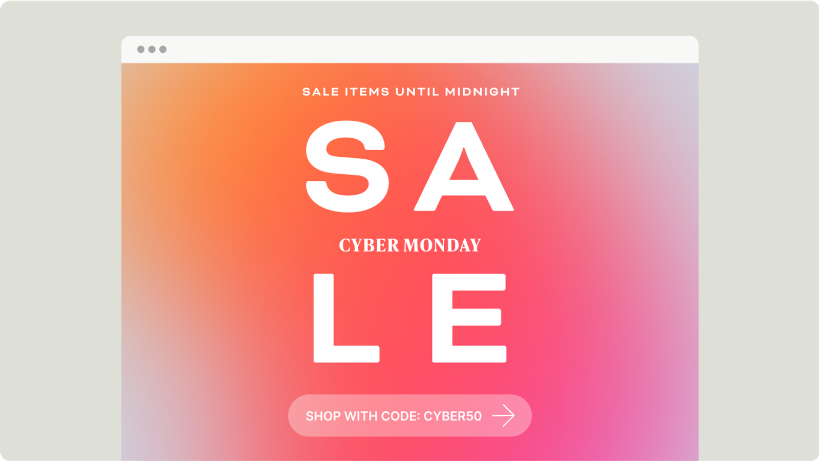
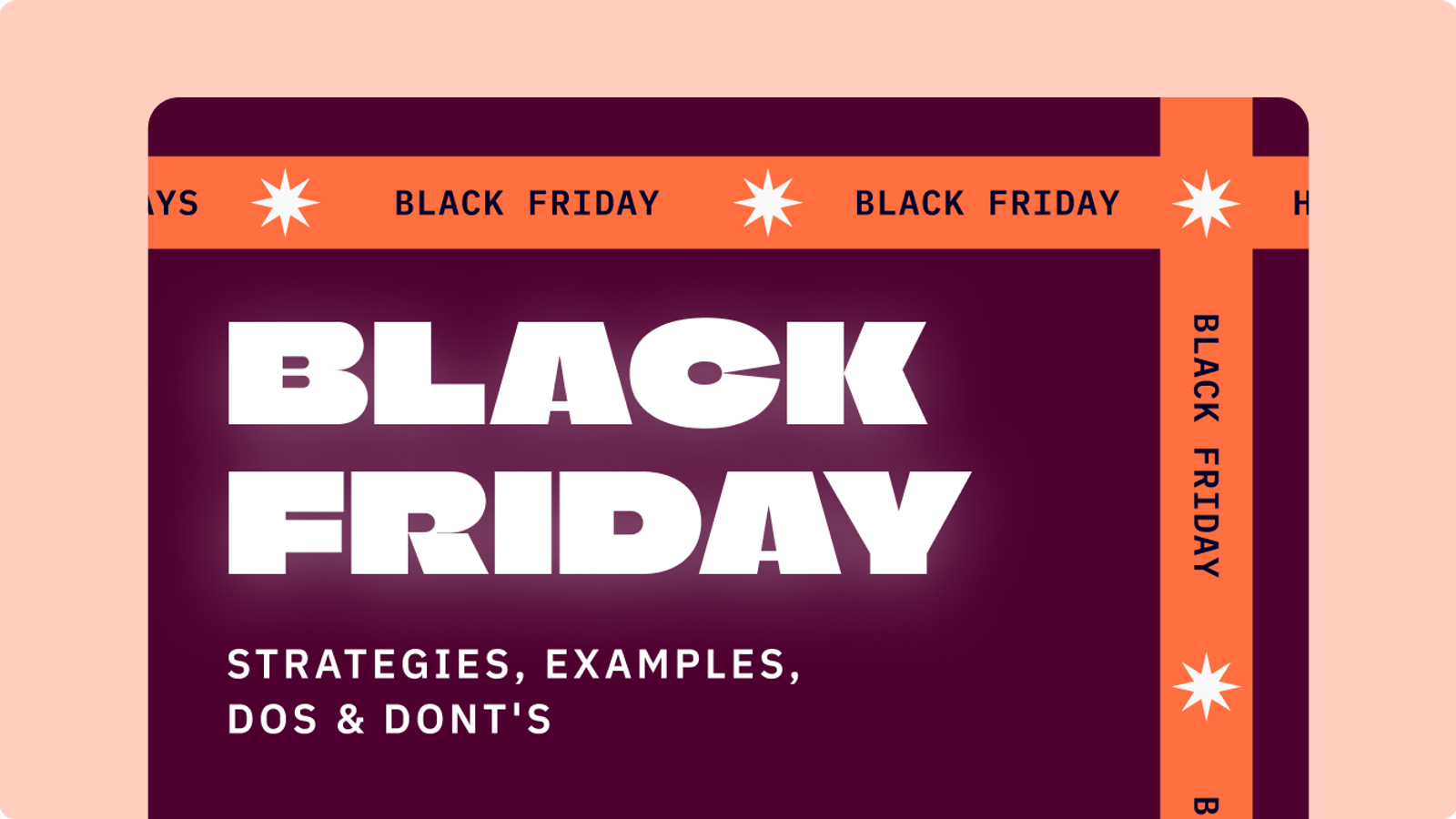
You don’t always need images to attract users’ attention—a powerful typeface can be a total eye-catcher, even on its own. Use it for your main headline or to accentuate certain points throughout your email.
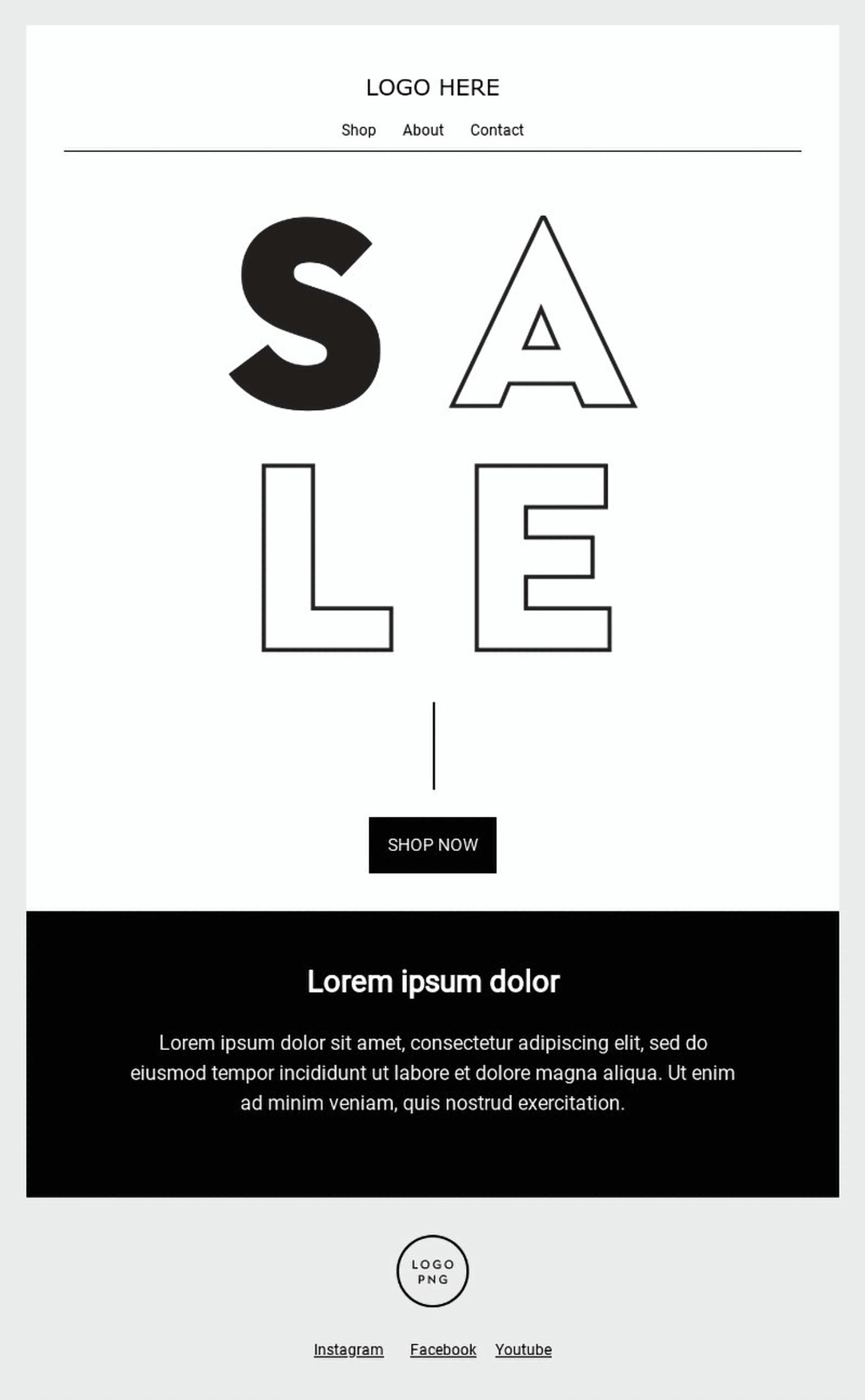
If you pick one bold, original font, keep the rest of the text very basic to avoid a mismatch. Stick to classic, unassuming fonts when designing the email body to let your prominent headline be the star of the show.
7. Use headshots to evoke trust and resonate with your audience
If you’re sharing your customer success story in your newsletter, include their photo to prove the authenticity of that testimonial. The same goes when you must present yourself or introduce another expert.
When your audience sees the real people you’re working with, they naturally develop more trust toward your offer. Photos offer social proof, so don’t skip them if you have them.
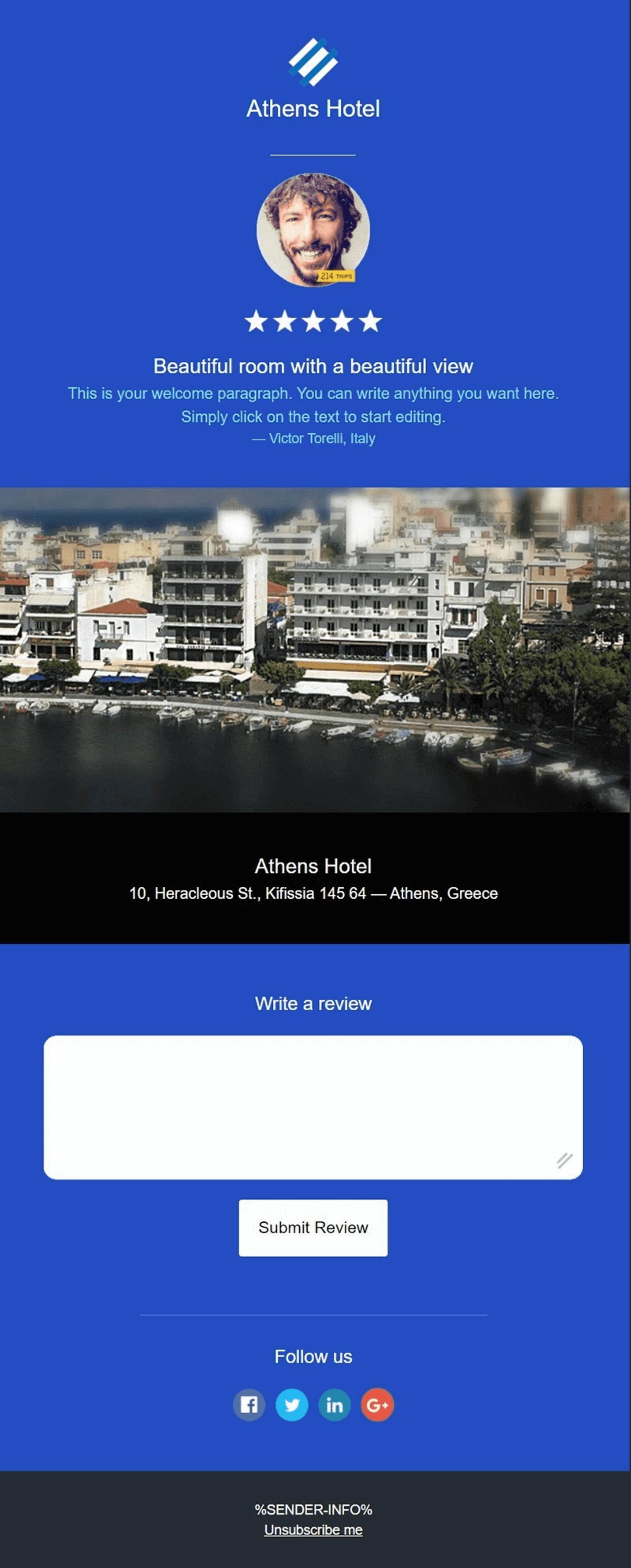
Authentic photos help you instantly create an emotional connection with your audience and spark their interest. Once they see a real person they can relate to, they’ll be more willing to pay attention to your offer. Just ask for consent before using your past or existing customers’ photos. You can also incentivize them to share their portraits by giving them a shout-out on your main website.
8. Let product photos tell your story
A commercial newsletter wouldn’t be complete without breathtaking product images accompanied by clever calls to action. You can pair product photos with lifestyle content showing the same products in action.
Consider including user-generated content (UGC) in your newsletter to boost customer trust. Photos and videos shot by real customers will help your email list see that people like them are using your products.

Don’t reveal too much information in your newsletter—let your product photos speak for themselves. Use quality visuals to give your customers a glimpse of what you’ve prepared for them, but clearly indicate that they should visit your website to learn more.
While your images should be of good quality, they shouldn’t be too perfect, or they’ll be mistaken for stock content. Look for models that represent your target audience and try to create authentic-looking photos, slightly imperfect and capturing real human emotions.
Newsletter’s Made Easy
Frequently asked questions
Here are some of the most commonly asked questions about newsletter design.
What are the 5 elements of an effective newsletter?
A well-designed newsletter should include a catchy headline, a CTA button, high-quality images, a click-worthy subject line, non-intrusive branding elements, and just enough white space. But it’s also important to format the newsletter for better legibility and make it mobile-friendly.
How do I create an attractive newsletter?
The simplest way to give your newsletter a professional and clean look is to use a pre-designed template. You can replace the default headlines, copy, fonts, icons, and images with your own. Also, add your logo and brand colors to the template. When choosing visuals for your newsletter, avoid overused stock photos and cliche illustrations—opt for more unique images that speak to your audience.
Where do I find editable newsletter templates and layouts?
ActiveCampaign has over 250+ customizable templates you can use for your next campaign. You can access them during your free trial or with any paid plan. To edit the template of your choice, sign in to your ActiveCampaign account and import the layout by copy-pasting its URL. Then, you can quickly edit your template in a drag-and-drop editor—no coding skills are required.
An easier way to a beautiful email
Creating a visually stunning and engaging email newsletter shouldn't be an uphill battle. With ActiveCampaign, you have the luxury of choice at your fingertips, boasting a library of over 250 responsive templates that marry form and function seamlessly. Whether you’re announcing a new product, sharing insightful articles, or simply keeping your community informed, these templates are designed to be customized swiftly to reflect your brand's unique essence.
Diving into the world of email automation, ActiveCampaign's platform is akin to having a digital maestro at your helm. With an extensive collection of automation recipes, your campaigns are orchestrated to reach your audience precisely when they're most receptive. It's not just about sending emails; it's about ensuring each message lands with impact and intention.
Beyond the initial send, the journey of your newsletter is tracked with ActiveCampaign's intuitive analytics tools. These insights illuminate the path to refinement, allowing you to understand your audience's interactions and engagement with your content. Through this data, you can fine-tune your strategy, ensuring your newsletters not only reach inboxes but resonate with the readers within.
In the ActiveCampaign ecosystem, every newsletter becomes a chapter in your brand's ongoing story, engaging subscribers with compelling content wrapped in beautiful design. And while the tools for crafting these narratives are readily available, the invitation to explore them is subtly extended. Delve into the potential of ActiveCampaign, where your next newsletter could be the catalyst for deeper connections and conversions.
Discover the ease and power of ActiveCampaign's email solutions—your story, beautifully told, awaits.

