What’s a good opt-in email example? Good news – we have 7 of them for you!
Getting people to give you their contact info is tricky. But, if you want to grow your business, you need a way to get leads.
This is why you need to have an email opt-in process. Lucky for you, we have 7 opt-in email examples and tips to help you successfully build your own email contact list (the less creepy way).
This post will teach you:
- What a good opt-in email example looks like (and the 3 things they all have in common)
- How opt-in forms suck leads into your business
- The best places to put opt-in forms for higher conversion rates (and the places that kill conversions)
- Whether a single or double opt-in process is the best option for you
You’ll be sending emails to people who actually want them in no time.
What does a good opt-in email example look like?
An email opt-in form doesn’t need to sparkle and shine—it just needs to work.
Some of the best email opt-in examples have very few words. And, some have more words. It will depend on the content theme, but the general rule of thumb is: simpler is better.
When it comes to the copy on an email sign-up form, definitely prioritize quality over quantity.
The following opt-in email wording examples include newsletter form sign-ups, interactive opt-in email examples, and lead magnet opt-ins.
Now, for the reason you’re probably reading this in the first place, here are 7 great opt-in email examples.
Send your own incredible opt-in emails
What is opt-in email marketing?
Opt-in email marketing is email marketing that gets sent to people who have willingly signed up for your email list. It's different from outbound emails or cold emails because people sign up to hear from a business instead of getting unsolicited emails.
Opt-in email marketing is for all marketing emails because:
- People are more likely to open emails they signed up for (you get a better email open rate and email clickthrough rate)
- Your email deliverability improves
- You aren't spamming people — they signed up, so you know they want to hear from you
Opt-in email marketing gives you better open rates, click rates, engagement rates, spam complaint rates (lower ones, that is), and conversion rates.
If you want to build an email list, make it an opt-in email list. You should never pay for email addresses.
7 great email opt-in form examples
Opt-in email example #1: I Will Teach You To Be Rich

3 minutes is nothing.
What this does well:
- It has a compelling headline (Asking a question like that brings out curiosity in people)
- It offers a motivating lead magnet that gives you a long-term life benefit
- It engages you in a unique way and promises to not waste your time (Not your average opt-in form)
Opt-in email example #2: Wrike
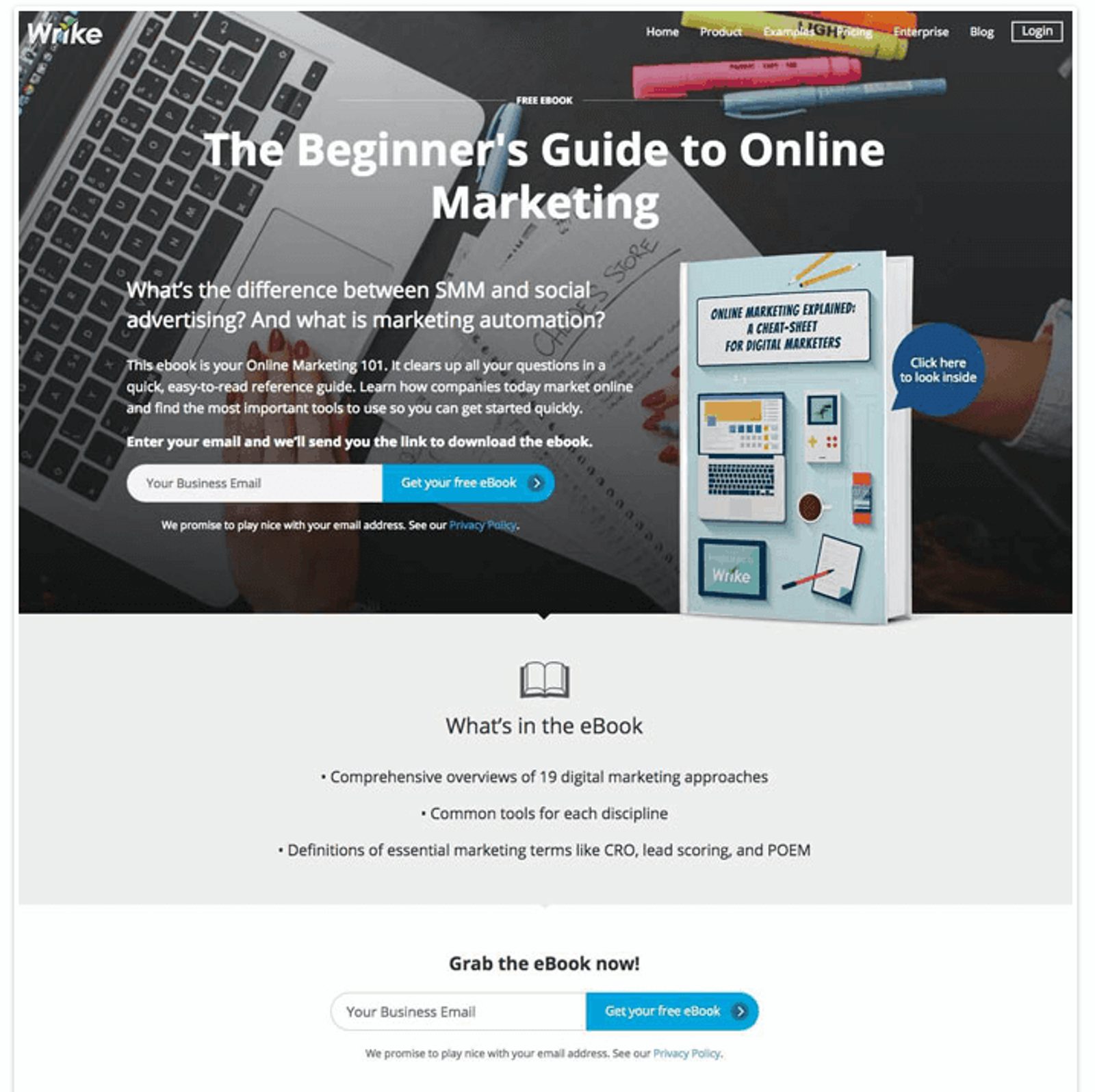
I can look inside before I download? What a great form feature.
What this does well:
- It has a clear call-to-action and provides plenty of details (But not too many. They still want you to download it after all)
- It inspires curiosity with a question (Yes, what IS marketing automation? You’ve gotta know!)
- It provides a valuable lead magnet (Hello, conversions. Lovely to see you)
Opt-in email example #3: Upworthy
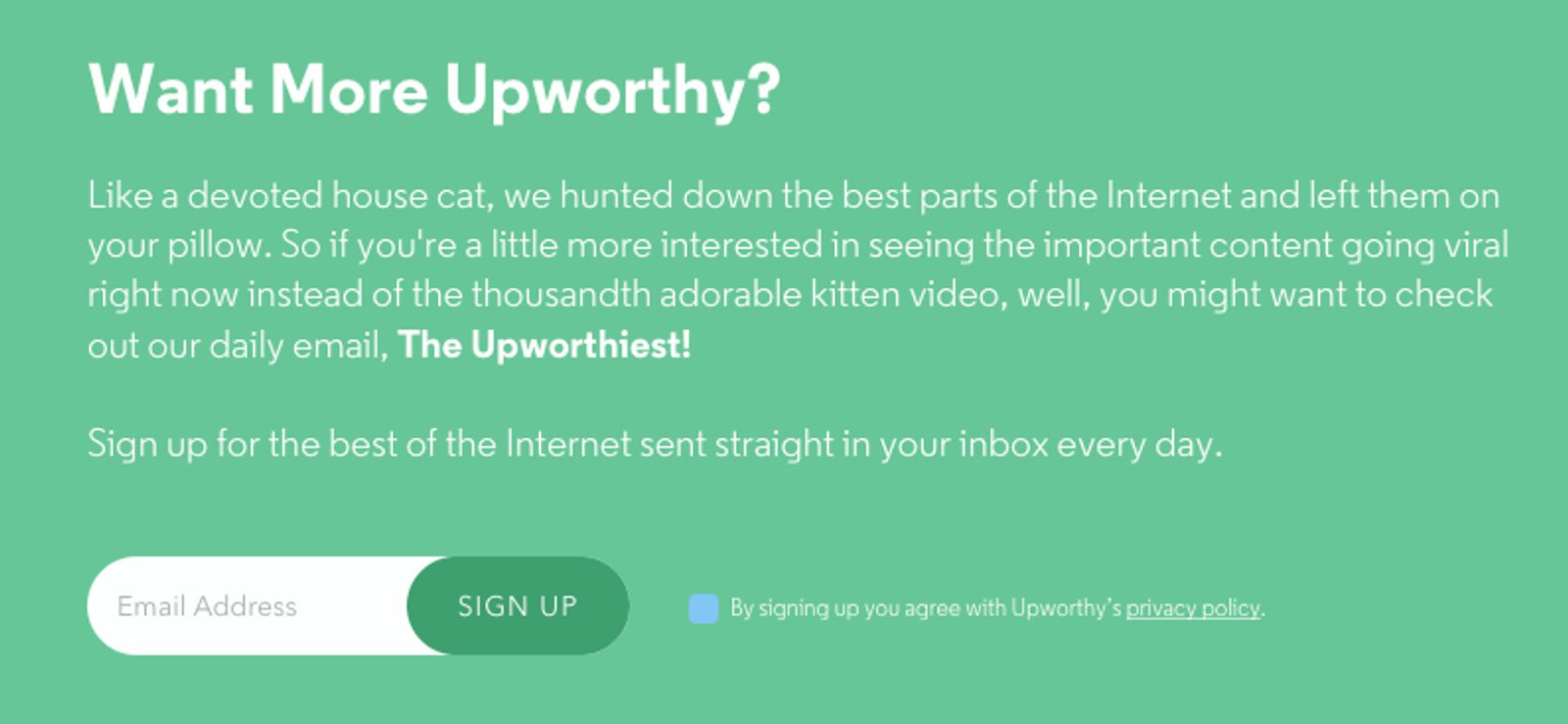
That email newsletter sounds Up-worthy of my time!
What this does well:
- The copy language creates a memorable image in the mind (“Cats” are a pretty popular trigger these days. Thank BuzzFeed for that)
- It creates urgency and solves the problem stated in the copy all at once (Never miss viral news again!)
- It is transparent about their privacy policy (It means no worries...for the rest of your days…)
- The value stays consistent with the CTA- the latest, uplifting news (No unnecessary downloads)
Opt-in email example #4: Larry Law Law

I don’t know, please tell me if I’m doing law school right, Larry.
What this does well:
- It speaks in personal language to the audience (Kind of READS THEIR MINDS is more like it. These are probably questions the audience has searched before)
- It has a progress bar to literally show you how fast sign-up is (We’re halfway the-ere…)
- It asks relatable questions and solves a problem in the call-to-action. (I certainly don’t know what to do for law school. Larry, HELP!)
Opt-in email example #5: Content Marketing Institute
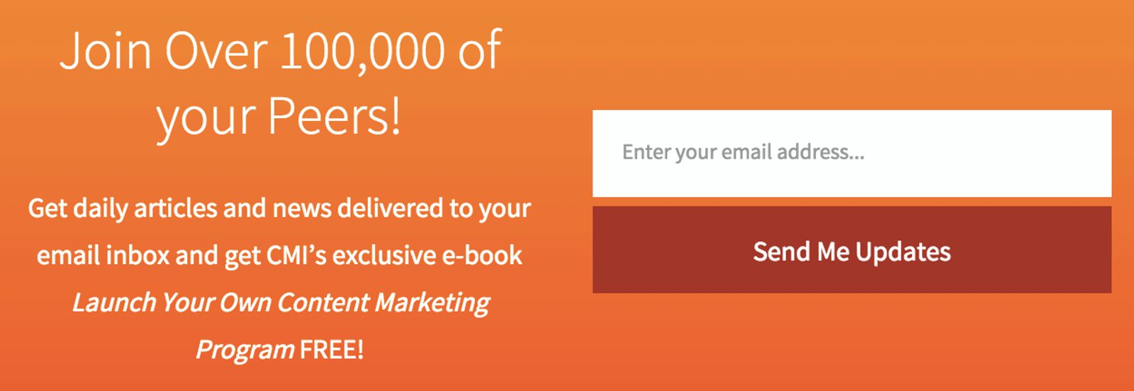
All the cool marketing kids are doing it.
What this does well:
- The copy makes potential subscribers want to be included (Also known as social proof, or FOMO. It’s real, and it’s here)
- It offers a valuable lead magnet (Forget searches, you’ll find it all here!)
- It has an easy-to-locate button (Location, location, location)
Opt-In Email Example #6: Summer Tomato
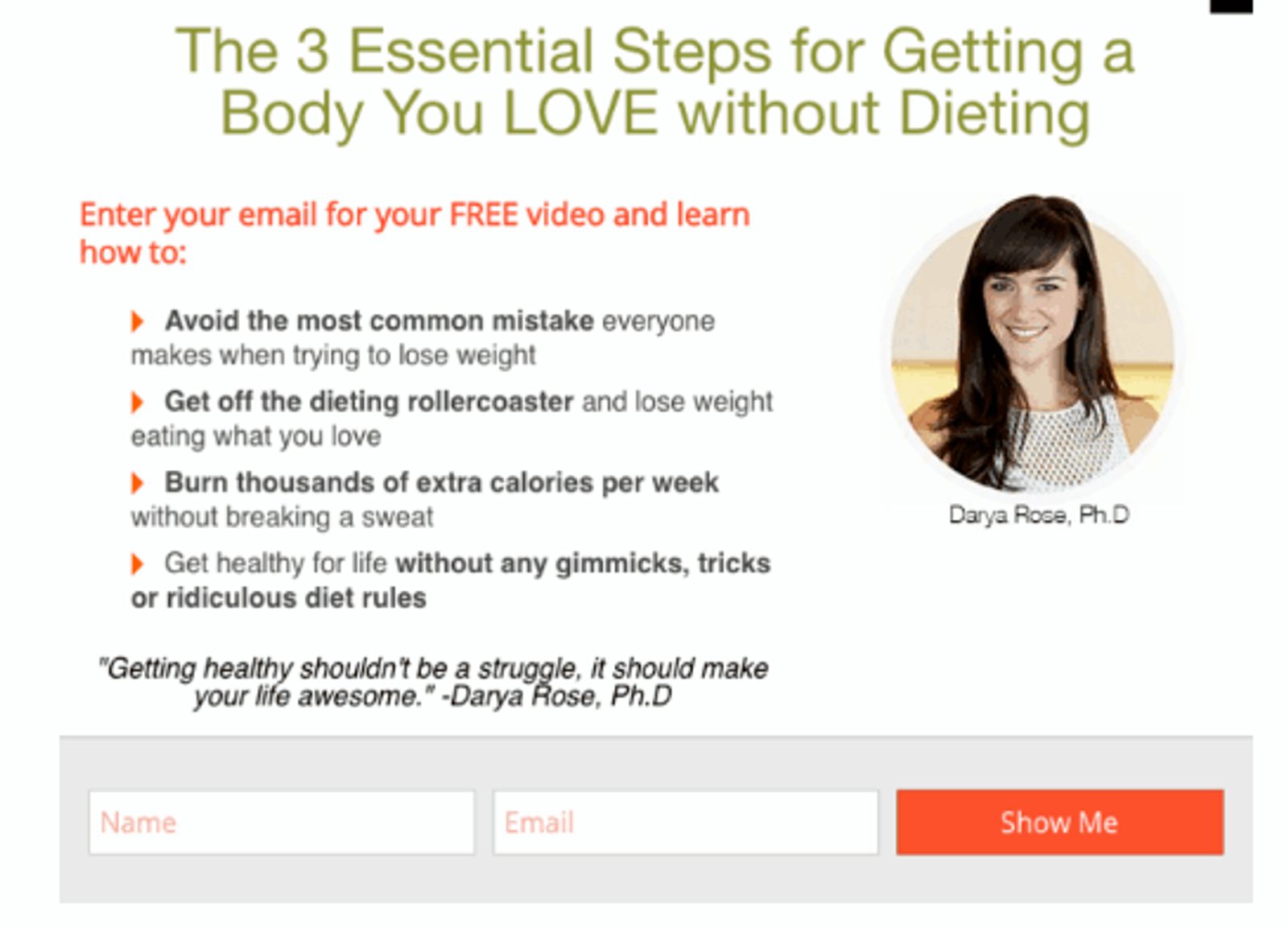
Does this mean I can eat cheeseburgers and succeed? Here’s my email address.
What this does well:
- It addresses a problem and offers a simple solution (She did a lot of the hard work for you. Now you just need to click a button)
- It uses personal, relatable language (“Get off the dieting roller coaster.” FINALLY. Yes, please)
- It offers a valuable lead magnet (Finally, that elusive golden ticket to easy weight loss is yours)
Opt-In Email Example #7: FabFitFun
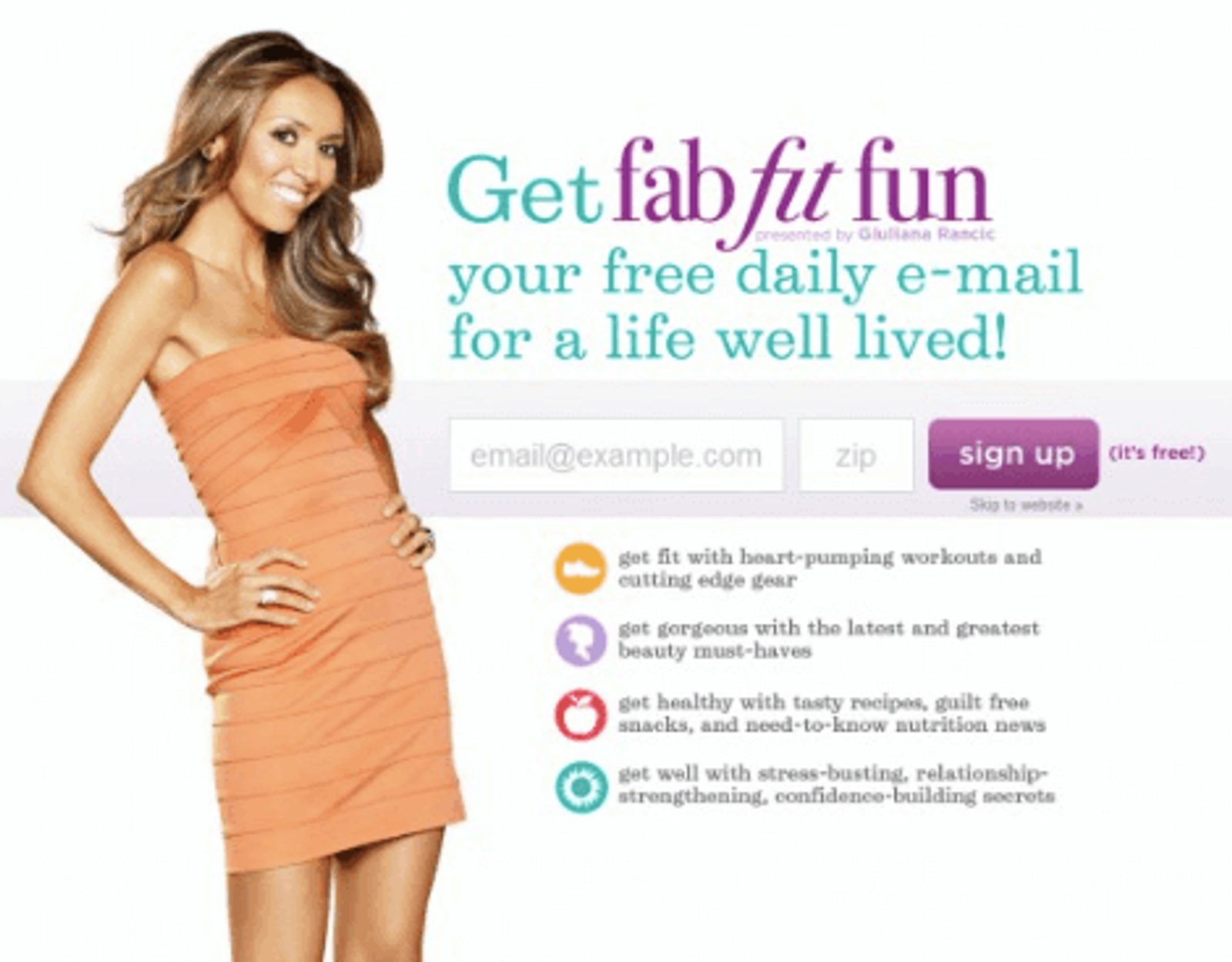
“Fab” FitFun job promoting this form, Giuliana.
What this does well:
- The design is aesthetically pleasing and on-brand (Bright colors and a recognizable, influential face)
- It provides specific, transparent details on what you will get
- It promises benefits that will come from receiving their communications (FabFitFun isn’t just about the awesome boxes)
So, what do these examples all have in common and accomplish for you and your customers?
- They provide valuable content
- They use relatable speech
- They offer solutions to address pain points.
Ultimately, that means more clicks, more customers, and higher conversions for you. Plus, a great value for your customers. Win-win-win-win!
Where do you place opt-in forms for the best conversions?
- Blog
- About
- Sidebar
- Header
- Landing Page
Location, Location, Location.
When Lord Harold Samuel, a real estate tycoon in Britain, was rumored to have coined this popular expression, he meant it for a real estate property. But, people quickly realized that the expression could apply to any number of scenarios.
Like email opt-in forms! Thanks, Harold.
Writing an email opt-in is only Part One. Part Two is to decide where you’ll use them.
If you want to increase your conversion rate, you need to put your opt-ins in the right places.
Do you want to get more email signups from your website? Email signup forms capture qualified leads from your website, but not if you aren’t using ideal form placement.
Here are 5 high-converting places you could place your email opt-in form:
1. Blog webpage and blog posts
Want to build your blog subscriber list? Have an opt-in on your blog page!

We make it really easy for you.
Putting them on blog posts is a pretty popular choice, and it’s a good one. If people are already on a blog post and are enjoying it, keep the party going! Give them the chance to get even more of your awesome blogs on a regular basis.
But, opt-in forms don’t exclusively have to be at the top or bottom of your posts. You can also include sign-up opportunities throughout the body of your posts.
Never miss a new blog post!
2. About page
Did you know that an About page can be one of the most frequently visited pages on a website?
Go ahead and check your Google Analytics. We’ll wait.
Whether you found that it was one of your most popular pages or in the top ten, About pages tend to get a lot of traffic. That’s a lot of traffic that could be seeing an email opt-in form and then subscribing.
Plus, subscribers who opt-in from an About page, like those subscribing to Galen Mooney’s Success Measured, tend to be more engaged and more likely to convert because they have already gotten to know you a little better.
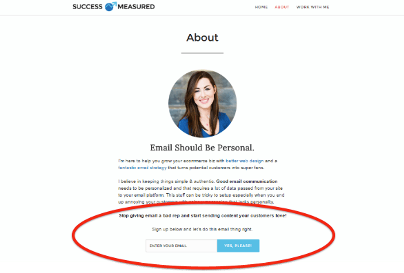
A first impression subscribe doesn’t get more personal than when it comes from your About Me page.
3. Sidebar
Most of a page’s content isn’t going to be off to the side. It’ll be right in the center.
This leaves plenty of room to put sign-up forms in the sidebar space. Not only is there room, but there’s an expectation.
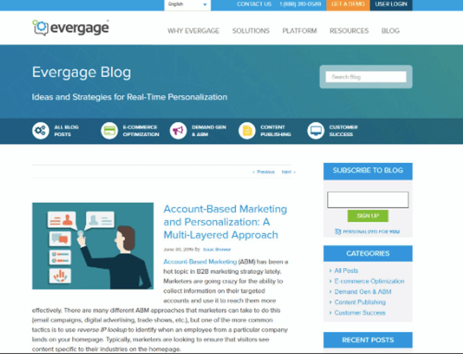
Eye-catching colors will draw the eye anywhere, including the sidebar.
Website visitors eyes often expect for the sidebars to include sign-up forms. It’s important to note, however, conversion rates for sidebar opt-in forms aren’t always as high as other places.
As a part of his Product Awareness Month challenge, Oli Gardner of Unbounce found that sidebar conversions were only at 0.09%. Out of 1,481 (desktop) visitors and 3,428 clicks, 0.09% is only 3 people.
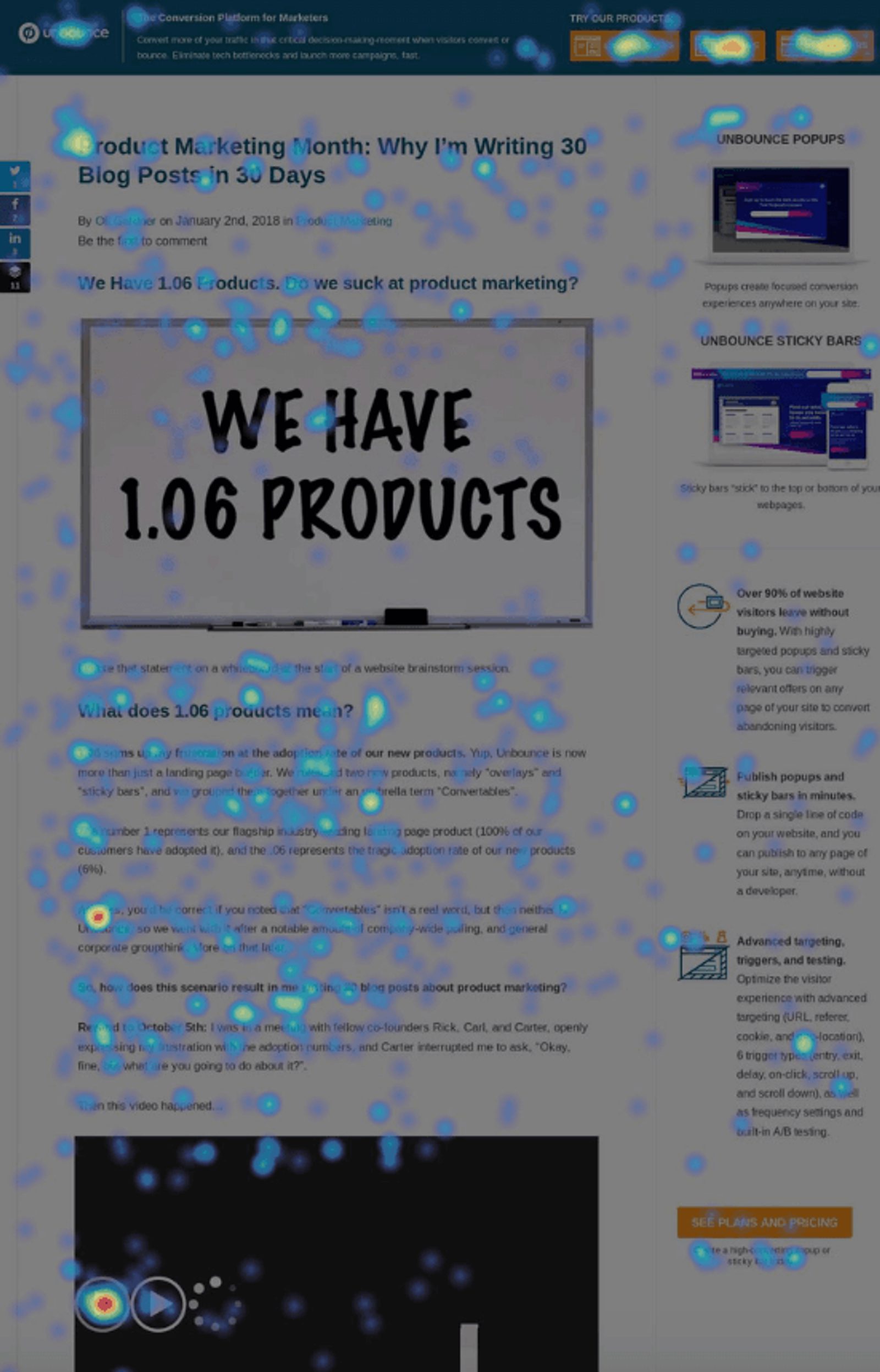
Clicks on clicks on clicks...but only so many conversions.
But, you should still consider them. They are good for meeting the expectations of people who expect to see sign-up forms on the side of a page.
4. Header
First impressions are everything, and having a form above the fold will be one of the first impressions a visitor has on that page.
Like the sidebar, this is another fairly common spot to place an email opt-in sign-up form. Top of page, top of mind!
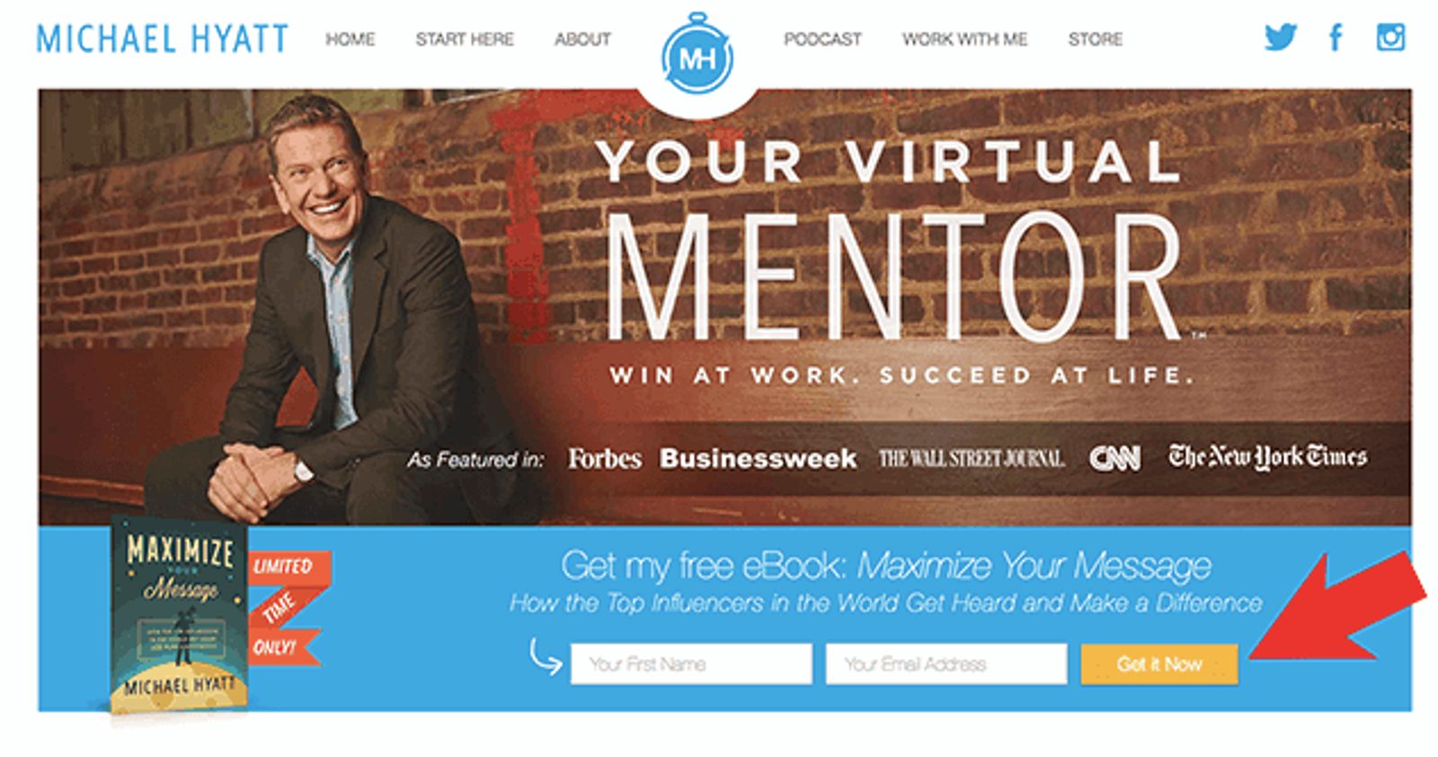
Above the fold is pretty hard to ignore.
5. Landing page
Are you offering a lead magnet to get visitors to sign up for your regular updates? Often, building a landing page for a digital download like that is a great way to place an email sign-up form.
(For more information on how to write a landing page that converts, check out this guide!
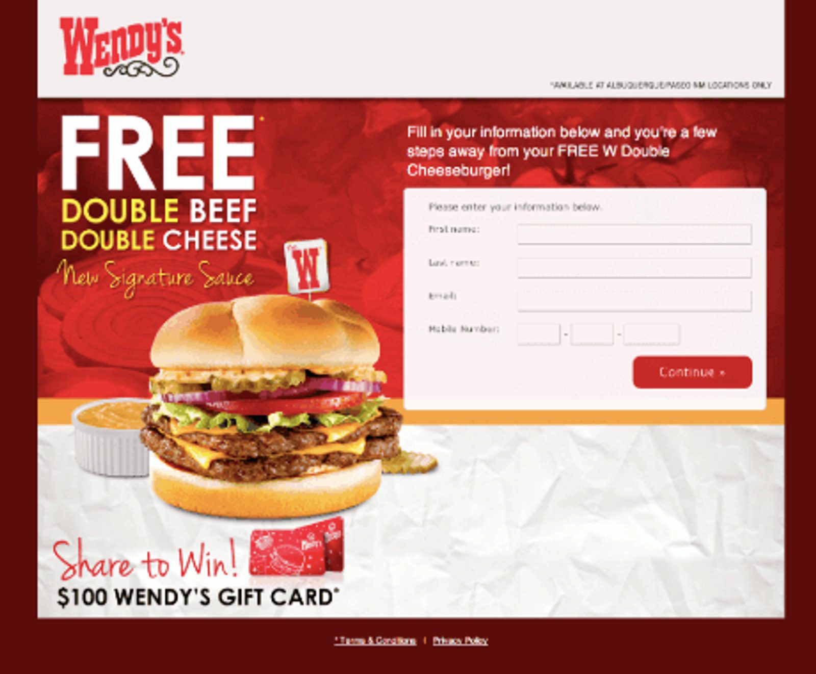
Good luck trying to resist a free cheeseburger. Wendy’s, please take every email address I’ve ever had.
A designated landing page just for email sign-ups can encourage undecided traffic that they should sign up for your list (and for your lead magnet).
So, why do you need opt-in email forms in all of these places? It’s a good way to learn which customers want different things, which can lead to some good segmentation opportunities.
And, of course, conversions! Gaining contact information at this email opt-in point opens doors to multiple conversion opportunities in the future.
Whether it’s to download content or buy from your business, you need a way to communicate with customers in order to get conversions.
It’s not over! One last decision: single or double?
You know where and you know how. Now the only other thing to decide on your opt-in forms is what.
What kind of opt-in process will you have – single or double?
The difference between double opt-ins and single opt-ins is simple: one requires customers to confirm their email address for the subscription, and one does not.
A double opt-in process involves an extra step (hence the double). Customers sign up via the form, then receive an email with a link that they must click to confirm their subscription.
Here’s a look at a confirmed opt-in email example from a double-opt-in process.

Click this button and you’re officially a wizard I mean subscriber. It’s like magic!
A single opt-in doesn’t require an email to be sent with a confirmation link to receive your emails. Subscribers simply fill out the opt-in form, and that’s that.
So, what’s the better option for your needs? We can’t tell you, only you can decide! But, here’s a few things to consider that may help you make the choice.
Advantages and disadvantages of double opt-ins
Advantages
- You’ll have a more engaged list. It’s a safe bet that people completing the extra step to confirm their interest are, in fact, interested. This gives you a much cleaner, engaged email list.
- You’ll see your deliverability improve. Sending emails to legitimately engaged people will enhance your sender reputation. The better the reputation, the better your deliverability rating.
- You’re less likely to be reported as spam. If they’ve taken the time to confirm, they probably won’t be surprised when you show up in their inbox. No spam status for you!
Disadvantages
- Forgetful customers could mean unclicked links. With so many emails coming in every day, it’s easy to lose some in the shuffle (including your confirmation email). Missing this email would make their initial form sign-up worthless to them and to you.
- It’s more work for the customer. Everyone wants the easiest process possible, and the extra step of a double opt-in email means extra work for them. Yes, we know that’s kind of silly. To us marketers, it’s just an extra email click, but to customers, it’s Everest.
- List growth can be slower. More steps to subscribe means more time to build the list. Single opt-ins with only one step tend to grow faster.
Advantages and disadvantages of single opt-ins
Advantages
- Your list will grow fast. Less time spent on fewer steps means faster list building. Simple as that.
- No subscribers are left in limbo. Without the possibility of forgetting to click that confirmation email, there’s no risk of losing potential subscribers in the limbo of halfway subscribed.
- There’s only one step. Customers don’t like work. They want every process to be easy. What’s easier than entering your info and only clicking once?
Disadvantages
- Being marked spam is more possible. The absence of confirmation that they subscribed to your list might make customers wonder why they are getting your emails at all. Or, they might change their mind about getting your emails and call it spam.
- Misspelled emails can hurt deliverability. Confirming an email with double opt-ins ensures correct email addresses. Submitting your information once does not. Sending to misspelled emails won’t help anyone.
- You have to be careful about legality. With new compliance regulations, single opt-ins may not be approved of in certain areas. Make sure to check what your compliance requirements are for gathering information.
Whatever you decide, you now have an opt-in email example (actually several) to follow as you create your own!
Want more information about creating forms for your email opt-ins in our platform? Check out this helpful guide on form-building in the Education Center.
Unsure what to send in your first email campaign? Find some inspiration with these email templates.


