Somewhere out there in the wilds of the internet, there may be a mythical website that converts visitors instantly. Visitors come to it and can’t help but dig deep to find a way to buy or get in touch.
Maybe this Fountain of Youth of websites exists. But for the rest of our websites, visitors need help. They need strong calls to action (CTAs) that help them find what they’re looking for and offer them what they need.
Where should you put CTAs on your website? What CTAs do you need to have on your website? Which situations are appropriate for each of your CTAs?
That’s what we’re going to tackle in this post. Here are the 6 major types of CTAs you’ll find on a great website:
- Newsletter subscription CTAs
- In-line content upgrades
- Purchase CTAs
- Learn more
- Social sharing
- Contact form submissions
1. Newsletter subscription CTAs
Website: “Subscribe to our newsletter!”
Visitor: “Hm. Well, I get dozens of emails a day. I’m already on 13 newsletters I don’t read. I’m visiting this website for the first time, and I don’t even really know what it’s about.”
Newsletter subscription CTAs are an important part of a website, but they need to be done well to be effective.
In other words, it isn’t enough to say “Subscribe to my newsletter.”
How can you make a newsletter subscription more compelling? One method is using a lead magnet (which we’ll discuss more in a moment). Lead magnets are very effective, but having a general-purpose subscription form on your site is sometimes valuable.
Check out this CTA from Andy Crestodina of Orbit Media.

The form itself is simple, but it uses what Andy calls the three Ps of email signup forms.
- Prominence: Your form needs to be easy to see and find
- Promise: Your form needs to offer a benefit to visitors
- Proof: Your form needs to offer proof of its promise
In this example, the complete CTA is “Join over 16,000 people who receive bi-weekly web marketing tips.”
It’s prominent because it’s clearly visible on the page. It promises “bi-weekly web marketing tips,” which you might want if you like the content you’re currently reading. And it proves its promise, because “16,000 people” are on the newsletter already.
A lot of marketers focus on increasing the prominence of their newsletter CTAs. You can do this by:
- Having a scrolling bar on your website
- Using a pop-up modal
- Having a modal slide in
- Adding movement to your subscription form (which draws the eye)
- Using an exit-intent popup, which triggers when visitors try to leave your site
So I guess ‘subscribe to our newsletter’ isn’t gonna work here, huh?
Newsletter CTAs are tricky on their own. It’s worth having one on your site—and the three Ps can make it more effective—but you might find that you get more subscribers to your newsletter when you try another tactic.
Lead magnets.
2. Lead magnet CTAs
A lead magnet is anything you offer a website visitor in exchange for their contact information. It can be a checklist, ebook, cheat sheet, email course, spreadsheet—anything your specific audience finds valuable.
Lead magnets almost always boost newsletter subscription rates.
It’s easy to see why—a standard newsletter CTA offers a vague benefit in the future. A lead magnet CTA offers a specific benefit right now.
All of the same factors that affect newsletter subscription rates also affect lead magnet CTAs. You still need to make a prominent, proven, strong offer. You’re just offering more in return for contact information.
A big factor that makes lead magnet CTAs more effective than a general newsletter subscription is the ability to customize the CTA to each page.
When you create a separate lead magnet for each of your top pieces of content, your subscriptions skyrocket. When Brian Dean of Backlinko first coined this technique, the “content upgrade,” he saw his subscriptions increase by over 700%.
If you need lead magnet ideas, we’ve put together a massive guide to lead magnets (with dozens of examples from different industries).
This is a lead magnet CTA
3. Purchase CTAs
Sometimes, you just want someone to make a purchase directly from your site.
If you run an ecommerce store, sell software or information products, or have premade service packages, you want people to buy from you directly.
The way you set up your purchase CTAs will depend heavily on the type of product or website you have.
- An ecommerce store usually needs to let visitors browse products. It might have multiple “Add to Cart” CTAs for different products.
- A website that sells info products is more likely to rely on long-form sales pages, landing pages, and emails. All of these would have only a single CTA.
- A software company with multiple plan levels needs CTAs for each plan
If you visit the pricing page for Moz, a software-as-a-service company that creates SEO software, you’ll see a good example of CTAs for different plan levels.
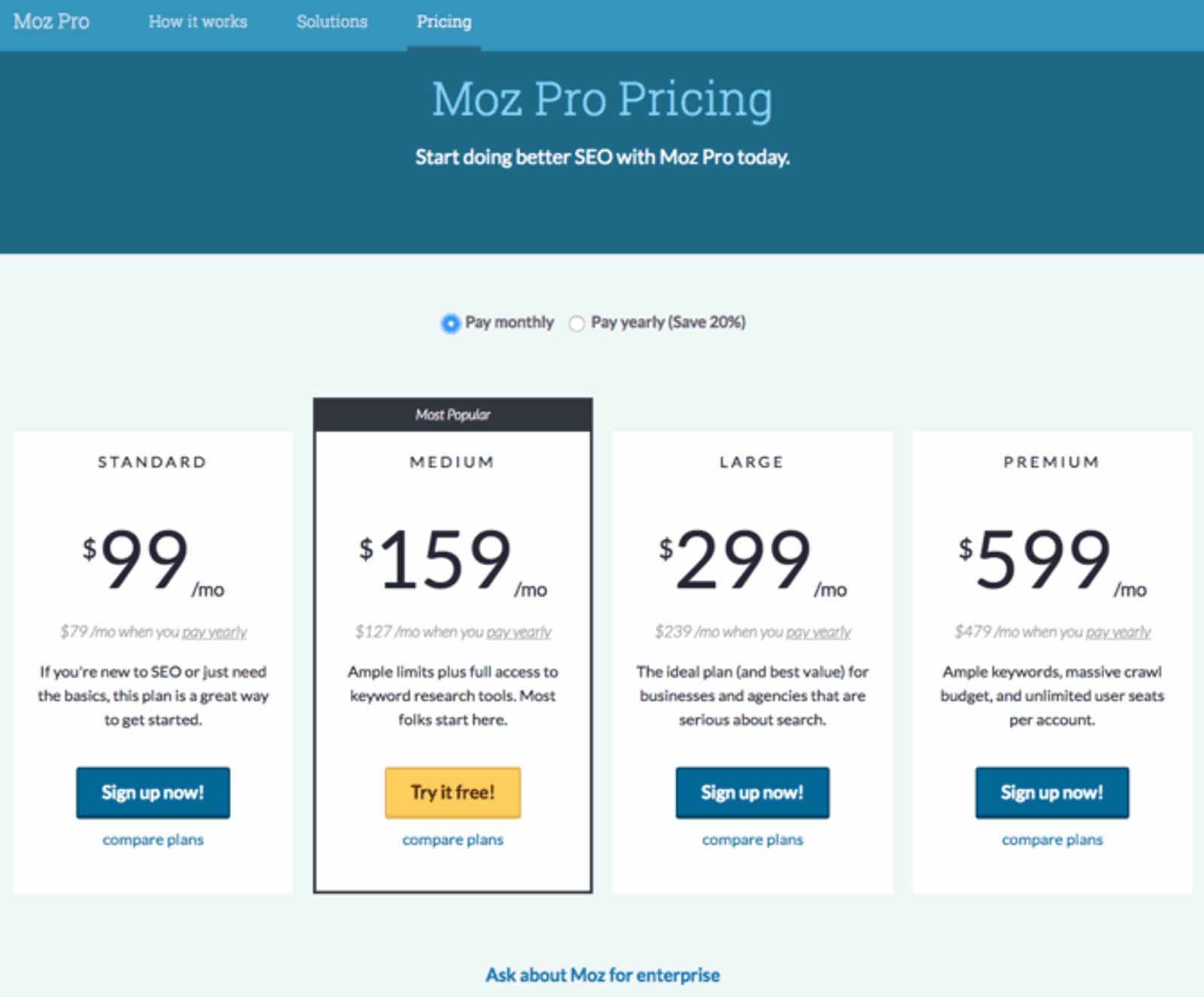
Moz wants to show you all of its plans, but it also knows its most profitable segment of customers. By showing the more expensive tiers but highlighting the medium tier, Moz is able to direct more attention to its ideal plan.
Also—someone interested in the medium tier is going to compare it to the more expensive tiers. Which makes it seem like more of a bargain.
You’ll see a similar technique being used at the end of this long-form sales page by AppSumo.
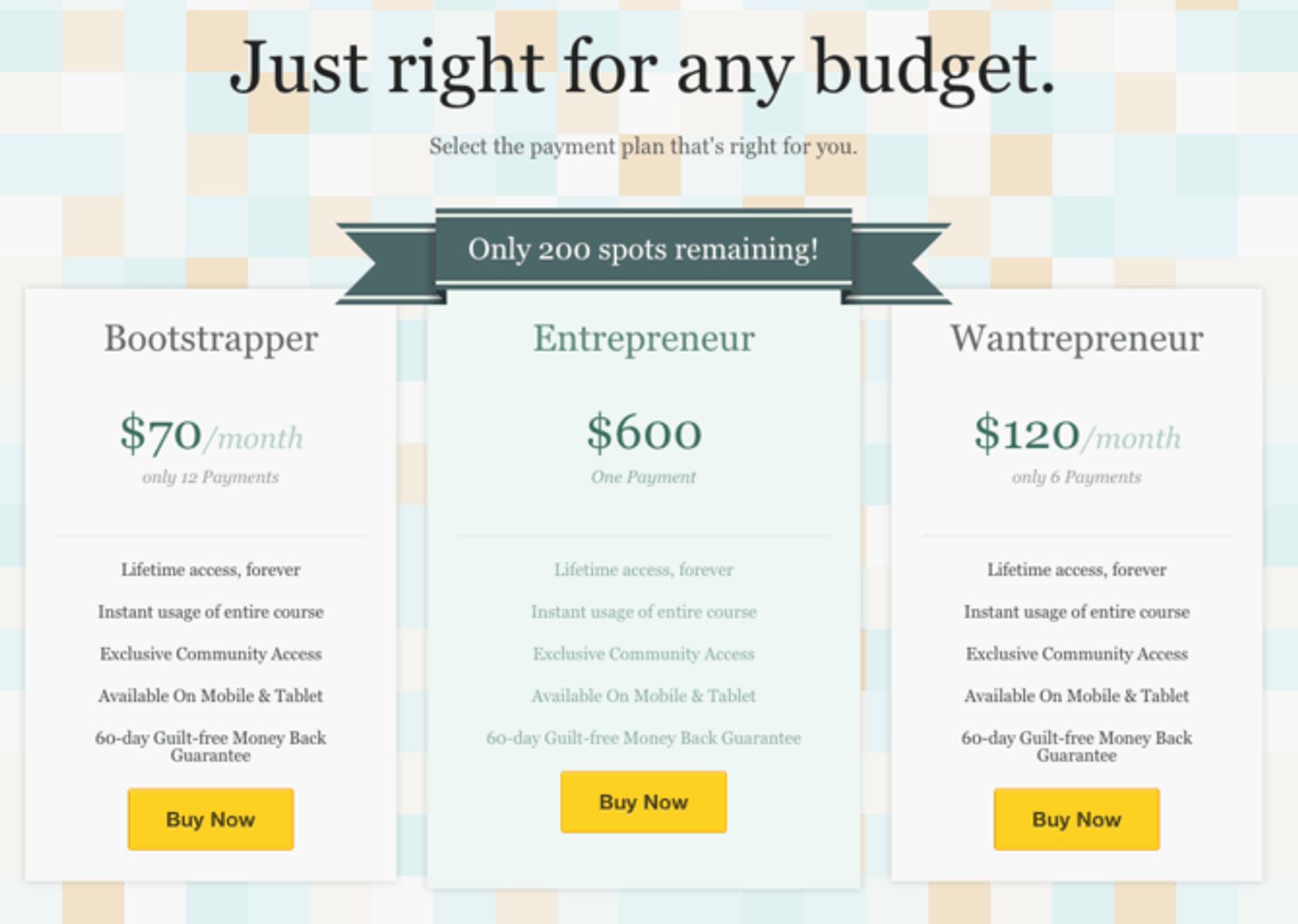
I think these three plan levels are the same product. But offering different payment plans does a few things.
- It creates choice, within a single offer. Whenever possible, you want to make just one offer. This is a clever way to put people in control while still only offering one product.
- It makes the product more accessible. A bootstrapping entrepreneur might have limited cash flow. Offering a plan for $70/month is actually a value add in that context.
Finally, let’s look at an ecommerce example—the food and drink page from Bulletproof.
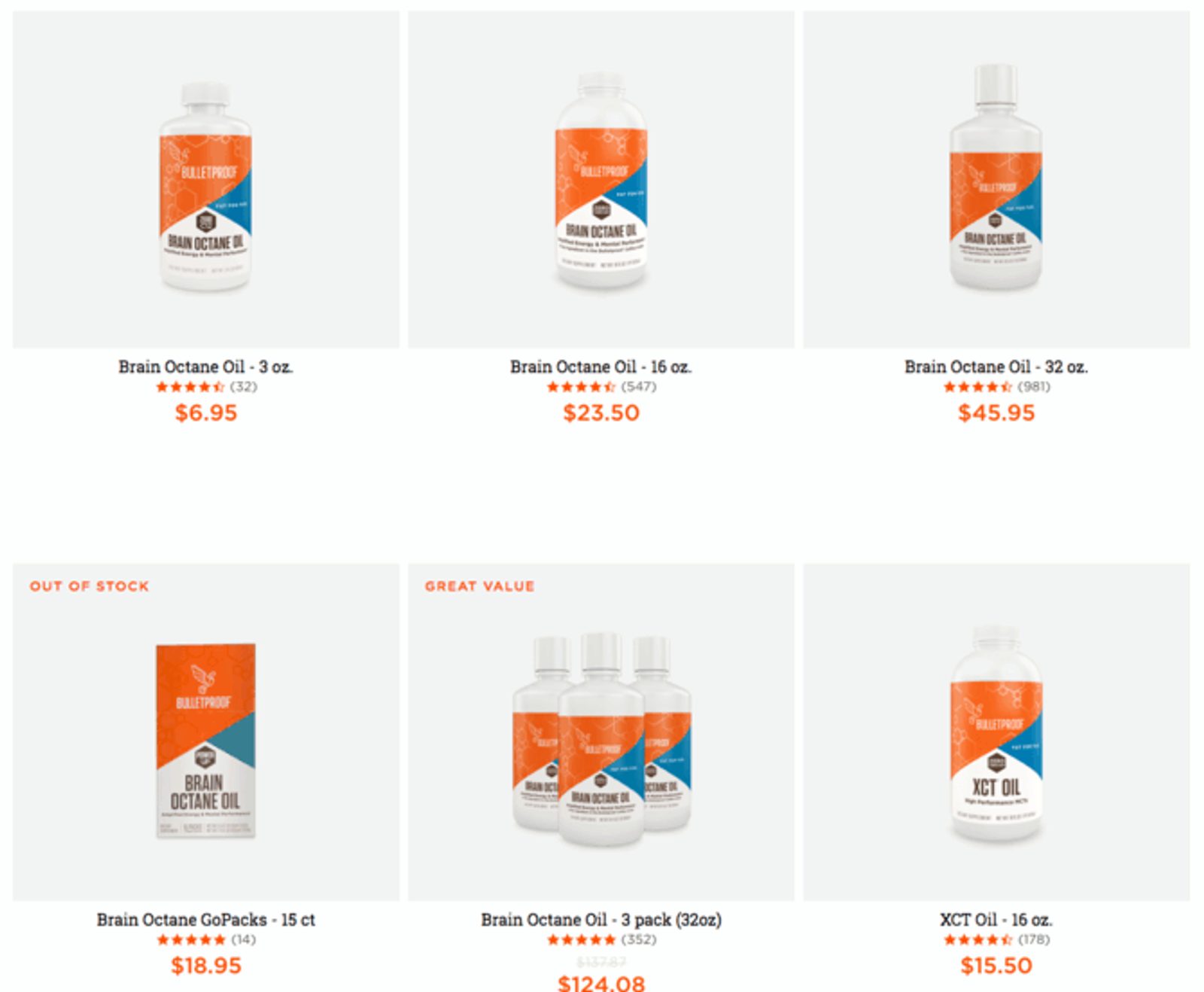
An ecommerce store needs to let people browse products, which makes it hard to restrict yourself to a single call to action.
One way to get around this problem is to run PPC or Facebook ads to landing pages for specific products. But even if you try that tactic (which is a good idea), you’ll still need some kind of gallery on your site.
The gallery on Bulletproof does a few things really well.
- It clearly showcases the products. No need to get fancy with product shots—clarity usually wins the day.
- It offers multiple sizes of similar products (similar principle to plan level comparisons).
- It highlights one offer (“Great Value”)
- It offers social proof through reviews and star ratings
- It offers social proof and creates scarcity by showing “Out of Stock” products
When you create purchase CTAs, try to make a single offer whenever possible. But when that isn’t possible, drawing attention to your ideal products and dialing up the proof can help.
4. Learn more CTAs
Sometimes your goal on a page is to pull people deeper into your site.
Most of the time, in most industries, your website visitors aren’t ready to buy from you right away. There’s information that they want—questions they need answered—before they’re ready to make a purchase.
This is especially true on your home page. If you offer multiple products and services or have multiple features to your product, it’s hard to know what people will be interested in when they first arrive on your site.
So what do you do? Invite them to “Learn More.”
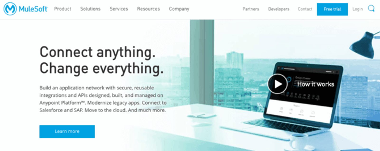
This kind of CTA is common, and it makes a lot of sense. You don’t know what people want when they visit your home page—but you can find out by figuring out what they click on.
Conversion rate optimization and SEO expert Angie Schottmuller argues that the purpose of the home page is segmentation.
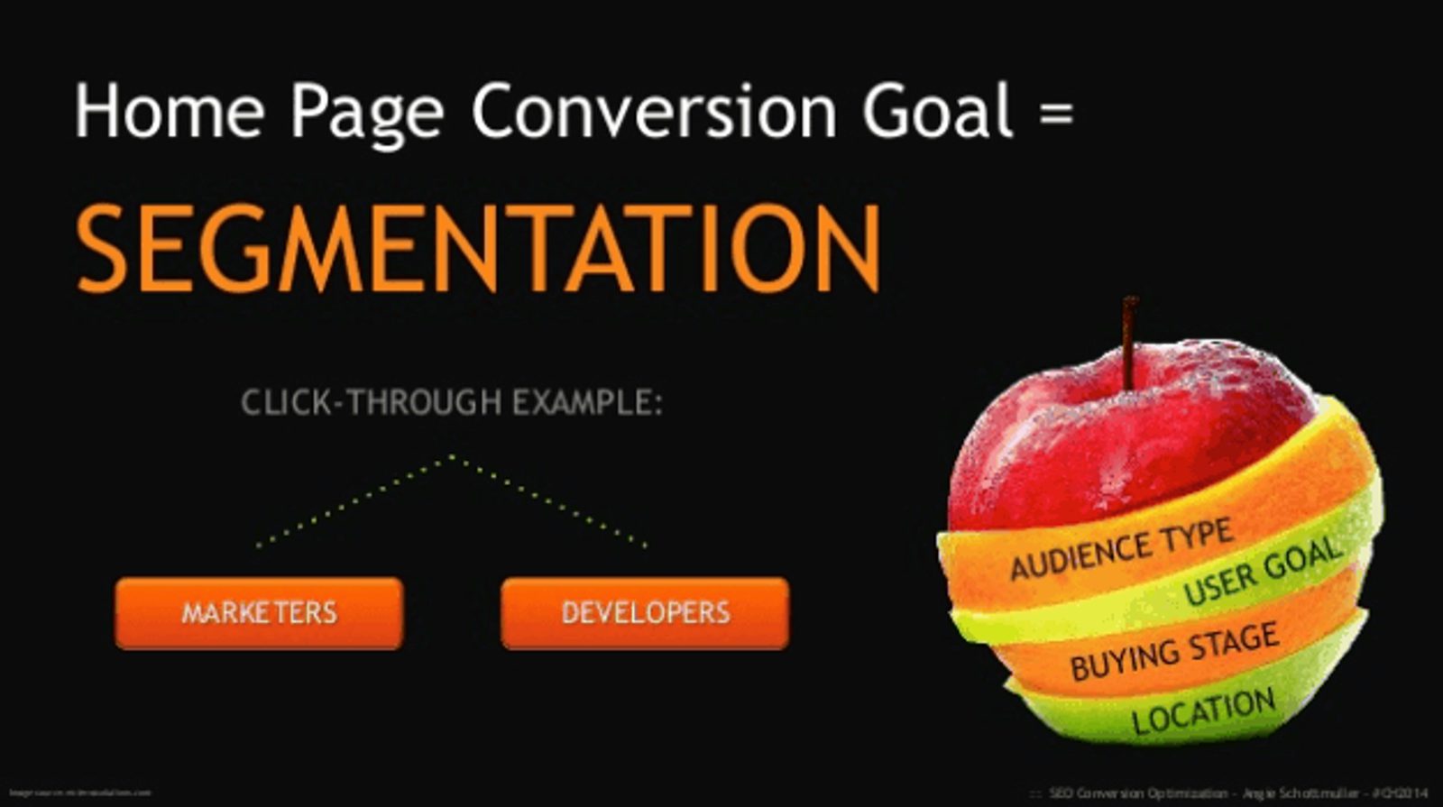
Don’t know who’s coming to your site? You’ll know more based on what they want to learn more about.
With that in mind, here are a couple of tips to optimize your learn more CTAs.
- Make sure your buttons can be used to segment. You should have separate buttons that appeal to different segments of your audience.
- Test other button copy. Sometimes “Learn More” sounds like work. Try making copy more immediate (e.g. “See [Feature] in Action”) to improve clicks.
This type of CTA is an important, and often overlooked, part of your website’s navigation.
5. Social sharing CTAs
Some blog posts are meant to spread.
If you’re trying to go viral, or have created a blog post engineered for success on social media, you might want to forgo a lead magnet in favor of social sharing.
There are three major types of social sharing CTAs.
- Social icons that link to your social media pages
- Social shares on the sidebar of posts
- In-line sharing CTAs
Social icons are the quickest to tackle, so we’ll cover those first.
Social icons
You probably do want to link to your social media pages from your website (some people will be looking for them).
You probably don’t want to do it all that prominently. At ActiveCampaign, we keep our social icons in our website footer.

Social media sites get enough traffic. You want people to come from social media to your website, not the other way around.
Keep social icons on the page for people who want them, but it’s find to bury them a bit in your footer.
Social shares sidebar
Social shares on the sidebar of posts can do two things really well.
- Promote sharing
- Provide social proof for your articles

You may have seen these lying around without realizing it.
“Wow! 166 people shared this post, so it must be pretty good.”
Ok, the thought probably isn’t that explicit. But that’s what you want people to think when they see your highly shared posts. A service like Sumo can help you add this to your site.
In-line social sharing CTAs
Finally, there are in-line sharing CTAs
Do you have especially compelling quotes in your blog post? Or a picture that would do well on social media?
Adding a “Click to tweet” or “Click to share” button is an easy way to promote social shares.
The reason? It decreases friction. Normally to share something, your reader has to find a quote they like, log in to their Twitter account, draft a tweet with a link to the post, and hit share.
Now all they need to do is click.
A service like Click to Tweet makes setting this up on your site super simple.
6. Contact requests and form submissions
Any time there’s a form on your site, you need to have a strong call to action.
There are a few different reasons you might ask site visitors to fill out a form.
- Free consultations
- Contact requests
- Free trials
- Demos
For many service-based businesses, in particular, the people who fill out contact forms are actually bottom-of-funnel leads. A contact request is the first step to an RFP or contract.
For software businesses, free trials and demos are common ways to make initial contact with new leads.
When you put together your forms and contact page, here are a few things to keep in mind.
- More fields = fewer conversions. More fields on your form means fewer people will fill it out. But the people who do fill out the form may be better-qualified leads, so this is worth testing.
- You still need copy. Too many contact pages are a form with no information. Tell people why they should contact you, and you’ll increase the number of people who actually do.
What you put on a contact form depends on your business.
It’s common to see popular bloggers lay out restrictions on who can contact them. By clarifying what they will and will not respond to, they reduce the number of spam requests.
A business like Orbit Media, on the other hand, is very clear that their form is the first step in starting a project.

Above all—make your forms clear. People should know exactly what to expect after they contact you.
CTAs for your website with ActiveCampaign
The types of CTAs you use on your website depend on your website’s goals.
But for every type of website, you’ll be using some mix of CTAs with different purposes.
- Turning visitors into top-of-funnel leads
- Qualifying top-of-funnel leads
- Converting leads into customers
Make your CTAs clear. Make them prominent. Offer something valuable. Your website conversions will improve.
And, make them in ActiveCampaign with our form builder that automatically connects users to your email list.


