
Email is a marvel of digital communication. It's instant, it's universal, and it's foundational to how we market, communicate, and build relationships online.
But behind the sleek drag-and-drop editors of modern platforms lies a tangled web of legacy systems, fragmented standards, and decades of decisions—some smart, others catastrophic—that still haunt email marketers today.
This article is for the modern digital marketer who might not know why their beautifully crafted email looks pristine in Gmail, but totally wrecked in Outlook. It’s for the junior brand manager confused about why “the same email” looks different on an iPhone versus a Samsung. And most of all, it’s for anyone who still needs convincing that extensive inbox testing — with tools like Litmus or Email on Acid—is not optional; it’s survival.
To understand why email is so frustrating (and so powerful), let’s rewind to its beginning.
The humble origins: A command line conversation
Email predates the web by decades. Its roots go all the way back to the early 1970s, when computers were enormous, interfaces were text-based, and communication happened over closed networks.
The first true email system emerged in 1971, when Ray Tomlinson, a programmer working on ARPANET (the forerunner to the internet), sent the first message between two machines. It was a throwaway test—probably something like "QWERTYUIOP"—but it introduced something revolutionary: the "@" symbol to designate a user as a host.
Back then, emails were plain-text only. No fonts. No colors. No images. Just text. This simplicity meant near-universal rendering, because... well, there wasn’t much to render. That was email’s golden era of consistency.
Then came HTML.
Enter HTML email: The blessing and the curse
In the late 1990s and early 2000s, marketers realized that email didn’t have to be boring. With HTML (the same language used to build websites), you could design beautiful, branded, image-rich messages.
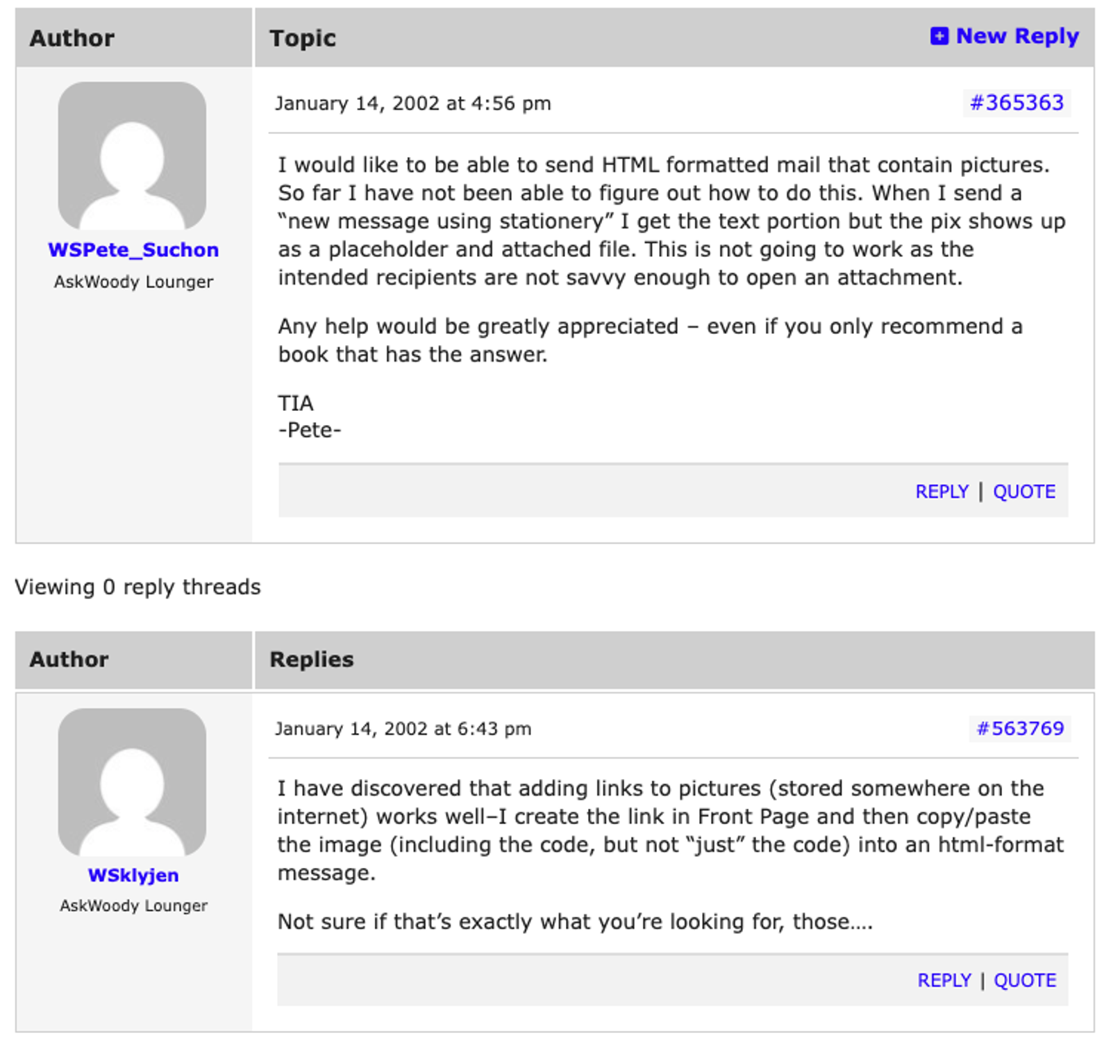
In the early 2000s, it was common to troubleshoot and share tips on using HTML. The above conversation talks about sending HTML formatted mail in Outlook.
But there was a problem: Email clients weren’t built to behave like web browsers.
Each email client—whether it was AOL, Yahoo, Hotmail, Gmail, or Outlook—had its own way of interpreting HTML. There were no universal rendering standards. Many didn’t support stylesheets or modern code. The inconsistencies were maddening.
By the mid-2000s, marketers had started to develop complex workarounds. Tables were used for layout. Inline styles became gospel. And every new campaign required at least a half-dozen inbox tests.
And just when things were starting to settle into a manageable chaos, Microsoft detonated a nuclear bomb in the middle of the email ecosystem.
The Outlook apocalypse: When Microsoft switched to Word
In 2007, Microsoft released Outlook 2007, a new version of their flagship email client. But instead of improving rendering support to match modern HTML standards, they did something completely irrational:
They switched Outlook’s rendering engine from Internet Explorer to Microsoft Word.
Yes. Word, a word processor, was now responsible for rendering HTML emails. This move was a disaster for email marketers. Microsoft Word was never meant to display HTML.
It had no support for things like:
- Background images
- Animated GIFs
- CSS float and positioning
- Proper margin and padding
- Modern fonts and typography
Suddenly, hundreds of email templates that worked fine in Outlook 2003 were broken in Outlook 2007. And because Outlook was (and remains) deeply entrenched in enterprise IT environments, the damage was widespread.
Even worse? Microsoft doubled down on the decision. Later versions of Outlook (2010, 2013, 2016, 2019, and even 365) all used the Word rendering engine. To this day, Outlook remains one of the most unpredictable and problematic inboxes for designers.
You want a perfectly aligned, mobile-responsive design with background images and pixel-perfect spacing? Outlook might just eat your dreams.
Why inbox testing matters (yes, even today)
Given this chaotic history, it should be no surprise that you absolutely must test your emails in real inboxes before hitting send. Here’s why:
1. There are no universal standards
Unlike web browsers, which have (mostly) converged around HTML/CSS standards, email clients are all over the place. Gmail doesn’t support the same code that Apple Mail does. Outlook uses Word. Android renders differently from iOS. Your customers see different things based on their devices.
2. A broken email hurts your brand
Emails that render poorly—misaligned images, missing buttons, unreadable text—don’t just look unprofessional; They actively hurt your brand trust. They reduce conversions. And they increase unsubscribes.
3. Rendering is more than aesthetics
Sometimes rendering issues break functionality—like making a CTA button unclickable or hiding a discount code. An unreadable email is bad. An unusable one is worse.
4. Dark mode, mobile, DPI… it all matters
We live in a multi-device world. Your email might render fine in desktop Gmail, but look like garbage on a high-DPI mobile screen in dark mode. Testing ensures you're covering all environments where your users live.
Enter Litmus and Email on Acid
These two platforms are the power tools of email QA. Here’s what they offer:
- Litmus: Lets you preview your email in 90+ clients and devices. It catches rendering issues, tracks engagement metrics, and integrates with your ESP (like ActiveCampaign).
- Email on Acid: Similar features, plus a strong focus on troubleshooting tools and robust pre-send checklists.
Both let you simulate real inboxes—Outlook, Gmail, Apple Mail, Android, Yahoo, etc.—and flag exactly where your design breaks down. They even show you how different email clients interpret the same code, side-by-side.
In other words: they save your ass from embarrassment before your boss, your client, or your entire mailing list ever sees the damage.
Final word: A legacy of inconsistency means vigilance today
The email ecosystem is a patchwork quilt of legacy decisions, non-standard implementations, and backwards compatibility issues. It's not your fault. But it is your responsibility.
Ray Tomlinson couldn’t have imagined a future where marketers would be testing background-image CSS hacks in 27 different versions of Outlook. But here we are.
So the next time someone tells you they “don’t have time to test,” remind them of this: The most dangerous button in marketing is “Send.” And the only way to make sure it doesn’t blow up in your face is to test like your reputation depends on it.
Because it does.
TL;DR checklist for email marketers
Before you hit send:
- Preview your email in at least 10 major inboxes (Outlook, Gmail, Apple Mail, iOS/Android, Yahoo, etc.)
- Test in both light and dark mode
- Check for image rendering issues and broken buttons
- Make sure your fallback fonts and alt text are in place
- Use Litmus or Email on Acid to get cross-client previews
- Send yourself a live version (not just a preview)
- Ask: would I be proud if this landed in my inbox?
Want to go deeper?
- Litmus’ State of Email reports: A goldmine for modern trends and standards
- Email Geeks Slack community: Support and war stories from fellow marketers
- Can I Email (https://www.caniemail.com): Like “Can I Use” but for email CSS/HTML support
Because in email marketing, beauty is in the eye of the client—the email client, that is. And only testing will tell you what they really see.