What is an email preheader? Do you need to know code to add a preheader? Are they different on mobile and desktop? What should you even put in your email preheader in the first place?
When you start diving into email development and the HTML/CSS side of email preheaders, things can get sticky quickly. But they don't have to – there are easier ways to add email preheaders (and know what to put in them). In this article, we'll explore how to write an effective email preheader, appropriate character limits, and preheader best practices that'll supercharge your next email marketing campaign.
This article is part of our Perfect Email series.
What is an email preheader?
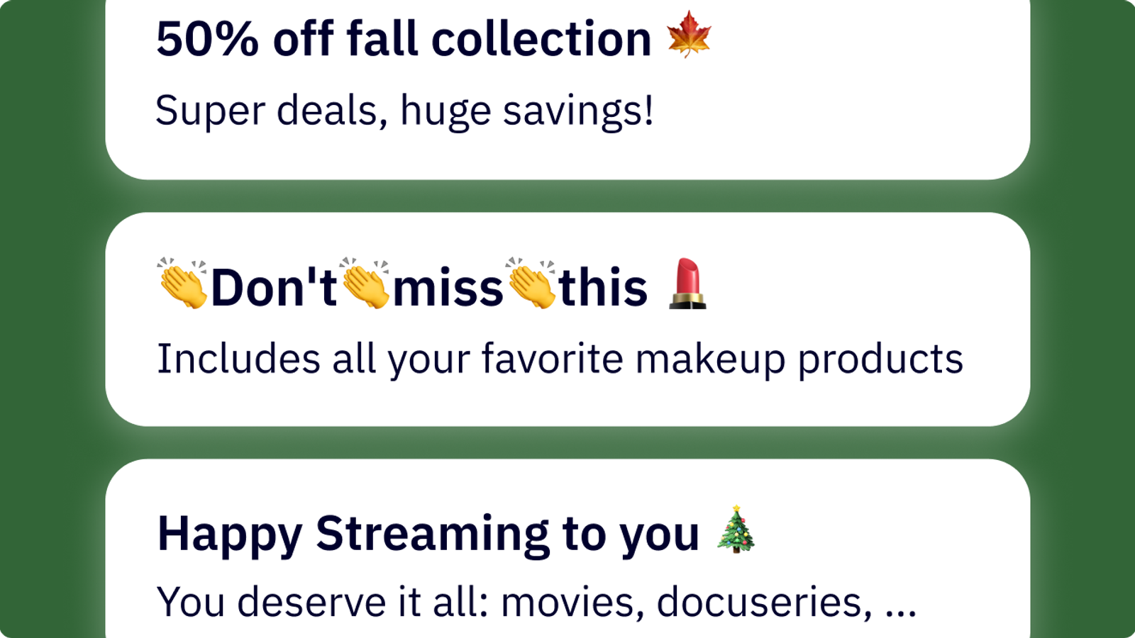
Email preheader text is a small line of text that appears after the subject line in an email inbox. Email preheaders give a short summary of the contents of an email, and may appear differently on mobile and web email clients.
You can add preheaders (also called “email preview text”) to your emails by using HTML and CSS. Or by choosing email software that lets you customize your email preheader text without code.
Here’s an example of what email preheaders look like in Gmail.

Here are the email preheaders for promotional emails as they look in an inbox. Notice that the text displays differently depending on the length of your subject line.
Email preheader appears differently in different email clients. Gmail, Outlook, Yahoo, and other mobile clients all have different ways of showing previews. Here’s an example of what preview text can look like on a mobile screen.
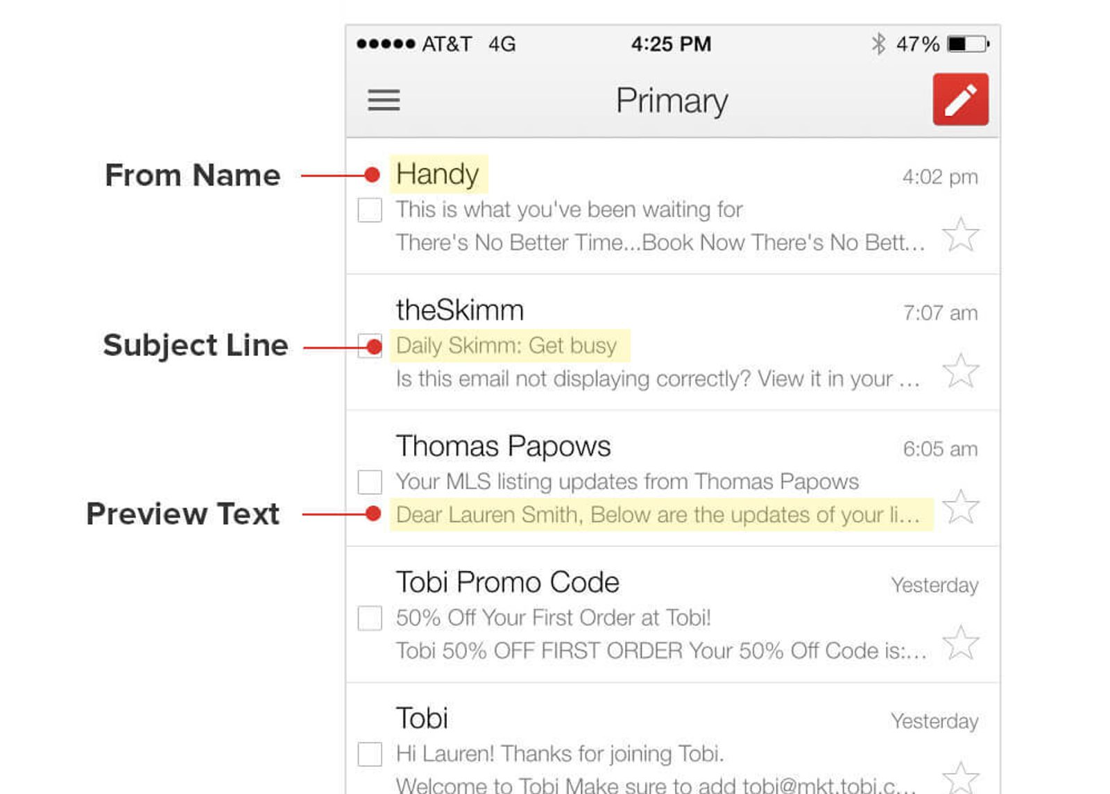
The from name, subject line, and preheader text can all show up differently in different clients. On mobile, your preheader text might not get cut off by having a longer subject line (Source, Litmus).
Email preheaders are a modern version of the old-school “Johnson Box,” a technique used in direct response copywriting to preview the subject of a sales letter. A Johnson Box, created by Frank H. Johnson, is a box at the top of a letter that summarizes key ideas in the email body – the goal is to get more people to read your letter.
In an article for AWAI, George Duncan of Duncan Direct Direct Associates explained the purpose of a Johnson Box:
“You have a fair amount of your message above the salutation before the person even gets into the letter, so they understand what territory they’re in. And then if they go on to read the letter, you’ve got them kind of saying ‘yes’ to you already.”
In the same way, an email preheader is a short summary of your email – and the goal is to get people to open your email.
Check out these email preheaders
How to add preheader text to an email campaign
You can add preheader text to an email by adding it through your email CRM software or manually adding a hidden div style to your HTML code. If you don’t add preheader text to an email campaign, email service providers may pull in the text for you based on the contents of your email.
Sometimes, auto-generated preheaders are enough. But often, you’ll want to use your email preheader text as a “second subject line” to build curiosity and get more email opens.
Here’s an example of preheader text gone wrong.

“Having trouble” is the first text in the actual email, so it's what gets pulled into the preheader. Nothing against Poetry Foundation, but a more descriptive preheader might increase their open rate and email effectiveness. (It could also be worse – sometimes an unsubscribe link shows up here).
How to add email preheaders with code
If you add email preheader text using code, you’re essentially telling email clients which text you want to be pulled into the email.
Email development has a lot of quirks (compared to your everyday HTML and CSS), and coded preheaders reflect that. Coded preheaders are tricky, so you might prefer to avoid them (if your email software allows it).
To add a preheader with code:
- Add text as the first text within the body tag of your email
- Put the text in a div style
- Use the div style to hide the text from the actual email
To email clients, your preheader text will show up as the first text in the email. When someone opens your email, that text will be hidden (because of the hidden div style).
This way, the email client will pull in the preheader text, but people on your email list won’t actually see it in your email design (so it doesn’t take up valuable design real estate).
Here’s an example of a hidden div style, from a real email we sent at ActiveCampaign.

The div style contains the first text in the body tag. Notice that its font size is 1, its color is white, its line height is one, max height/width 0, opacity 0, overflow:hidden – basically, there’s no way a person is ever going to see this text.
How to add email preheaders without code
Email development is tricky, and you might just want to use the email templates that are already available in your email marketing software.
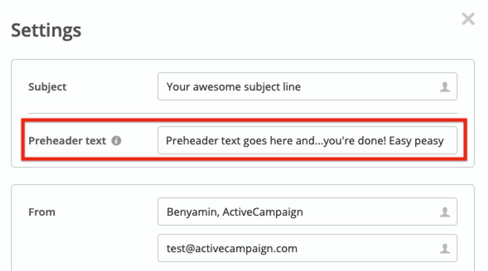
Not all email or marketing automation software lets you customize your preheader text without using code. In ActiveCampaign, you can change your preheader text in the same place you edit your subject line making email personalization easy.
Changing your email preheader is just as easy as changing your subject line. You can try it for yourself here.
How long should an email preheader be?
Your email preheader text should be between 40-130 characters long. This range makes sure that your preview text appears in both desktop and mobile email clients.
Because preheader length varies based on the email client, there isn’t really an ideal length. 100 characters or more is a perfectly reasonable number of characters to put in your preview text – just make sure that the beginning of your email preheader has the most important points.
Here are 3 things to keep in mind when you decide on the length of your preheader text:
- On many desktop clients, the length of your email subject line determines how much of your preview text is displayed.
- Mobile email clients typically show less of your preheader text. Most mobile preheader text is between 30 and 55 characters long.
- If your preview text is too short, email clients may pull in text from the beginning of your email.
Even if you don’t need all of it, it can be a good idea to write a long email preheader (with the important points at the beginning) so that you don’t accidentally display a line of text from the rest of your email campaign.

The preheader for this email was “Friendly Reminder.” But it's too short – so Gmail pulls in the first line of text from the email. The result is a little clunky for the email recipient to read and could have been avoided with a longer email preheader.
How do you write an email preheader? Four best practices
You can add a preheader to your email campaigns, but what should you put in it?
A great preheader can work as a second email subject line – it’s an opportunity for you to grab attention and convince more people to open your emails.
Here are four email preheader best practices email marketers should keep in mind:
- Add a call to action
- Don’t repeat the subject line
- Make your subject line and preheader text work together
- Use the preheader to build curiosity (don’t just summarize)
Add a call to action
Sometimes all you need to do is ask.
Just like your email has a call to action, adding a call to action to your preheader could get more people to open your email.
Here’s an example from copywriter Joel Klettke.

Pretty direct. Pretty effective.
A preheader call to action follows all the same rules as a normal call to action:
- Keep it short (you don’t have much room anyway)
- Make it sound easy
- Promise a benefit
Or, when all else fails, just ask people to open your email.
Don’t repeat the subject line
Why say the same thing twice?

New tutorials...free tutorials...basically the same thing. “Survive the winter” doesn’t add anything to make me click. Your subject line and preheader text shouldn’t say the same thing. The preheader is a chance to build on your subject line by…
- Adding details
- Building curiosity
Your subject line is probably only 30-75 characters long – adding preheader text gives you another 100 characters to play with!
Plus – even though email preheaders aren’t always prominent on desktops, mobile preheaders can be almost as prominent as the subject line.

Open Books uses the preheader text as a second subject line. On mobile, the preheader actually gets more space! Treat your email preheader as a second chance at a first impression. Put more work into it than just repeating the subject line.
Make your subject line and preheader text work together
Like Open Books, you can use your email subject line and preheader together to make your message hit stronger.
Your email preheader shouldn’t just repeat your subject line. But it shouldn’t be totally different either. You can use the preheader to build on a great subject line – and get more people to open your email.
Check out this example from Brendan Hufford.

The subject line opens a curiosity gap. And the preheader builds on it. When your subject line and preheader work together, you can build curiosity. Speaking of which...
Use the preheader to build curiosity (don’t just summarize)
In 1994, behavioral economist and Carnegie Mellon professor George Loewenstein published a paper titled The Psychology of Curiosity. The paper is a huge analysis of the psychology research on curiosity – it’s 24 pages long and has been cited 1400+ times.
To spare you a bunch of technical reading (although it is great), the marketing gold is on page 17.

In other words, how can you make someone else curious?
Loewenstein names five ways that you can make someone else curious. I’m using three of them right now (will you be able to figure out which ones, after I show them to you?).
Here are the six ways to make people curious (plus an extra sixth way):
- Ask a curiosity-inducing question
- Start a sequence of events, but don’t finish (e.g. an unfinished story)
- Violate expectations
- Imply that you have the information they don’t
- Imply that they used to know something that they’ve since forgotten
- Create a sense of urgency
The great thing about this list – you can literally use it as a checklist. How many of these does your email preheader use? Or your subject line, for that matter?
An example will help. Which headline is the most intriguing?
• How to earn half a million dollars a year
• How can you earn half a million dollars a year?
• Do you have the courage to earn half a million dollars a year?
The first one uses method four. The second one adds method one by asking a question. They’re both boring (and a little scammy).
The third one asks if you have courage.
It still asks a question. It still implies knowledge. But it breaks your expectations, and that’s why it became the headline for one of Eugene Schwartz’s classic ads.
When you write your preheader, go through each of these points. How can you add more of them to build curiosity?
(Warning: This technique can be too powerful. Only use three at a time, or you could come across as clickbait.)
Email preheaders will keep evolving
What do trends have to do with email preheaders? How are email preheaders of today different from email preheaders in the past?
There are a few trends and changes that could affect your email marketing:
- Workplace messaging (like Slack) replaces a lot of workplace email
- More people do email marketing (because it works, and automation is getting better)
- A person’s inbox is likely to have more promotional emails – which means you need to make your emails more enticing (helloooo preheaders!)
- Assistants like Alexa, Siri, and Google Home can read emails aloud, which would include email preheaders
We’ll see how the trends shake out. In the meantime, you can get better results by absolutely nailing your email preheaders and sending engaging emails. And how can you do that? With a versatile and powerful marketing automation platform that allows you to build beautiful emails, personalize them, segment your audience, and understand the data behind your recipients being engaged or totally uninterested.
ActiveCampaign gives you the power to elevate your email campaigns and understand the behaviors and interests of everyone on your email list on a much deeper level.
Try us out for free and sign up for a trial in the box to the right →


