Landing Page
Definition
A landing page is a standalone web page created about a specific topic to gather contact information from a potential lead, such as their email address and name.
You’ve spent time creating an amazing digital marketing campaign that revolves around email, social media, paid ads, and even in-person events, but now what?
Whether they’re potential customers, email subscribers, event attendees, or any other type of lead, you need a place to send them.
You need a landing page.
But, what is a landing page? And how do you create one, even if you don’t have a website (which, let’s be honest, you really should have one!)?
Let’s find out.
Table of Contents
What is a landing page?
A landing page is a standalone web page created about a specific topic to gather contact information from a potential lead, such as their email address and name.
Let’s pick that apart a little bit.
A landing page is where visitors “land” on your site after clicking on a link in the amazing emails, social media posts, or paid ads you created for your online marketing campaign. This page should be specific to what they clicked on, and they should know without having to click or scroll that they’ve landed in the right place.
What is a landing page used for?
Landing pages are designed to funnel traffic toward a specific action. They are called landing pages because marketers typically send traffic to them from other online destinations, like a Facebook Ad, and the visitor “lands” on this page.
For example, let’s say a business selling streetwear online creates a Facebook Ad offering a coupon. This ad targets prospective customers who fit a specific demographic (such as an interest in streetwear, users between a certain age, etc.). When a person clicks on this ad, they are taken to a landing page where they can fill out their name and email address to receive their coupon.
Landing pages are optimized for conversions, turning visitors into customers. This means they are designed with a specific goal in mind, depending on where the intended audience is in their customer journey. Here are a few different examples of conversion, all of which can be tracked in Google Analytics:
- Monitoring pageviews are a simple type of conversion that counts how many visitors a landing page has had. This is a common type of conversion in the attention stage.
- Collecting a visitor's email address and name is another type of conversion. It is most common at the interest stage, though it is also found at the other stages.
- Signing up for a free trial or demo of a product or service. This type of conversion is most common at the desire stage.
- Converting a lead to a customer (i.e., getting the sale) is probably the most common type of conversion. It is an example of a conversion at the action stage.
However, no matter what type of conversion you’re focusing on, nearly all landing pages lack the typical website navigation—headers, footers, external links, etc.—and have a prominent opt-in form. An opt-in form uses form fields to allow visitors to input their information and submit it to you willingly, whether that’s their name and email address or payment information.
Are landing pages good for search engines?
Landing pages are no better or worse than any other page for search engines.
Any page you create can rank on Google or other search engines by default. If you want organic traffic coming to your landing page, you need to make sure to follow search engine optimization (SEO) best practices.
This means creating a high-quality page with valuable content for the specific search you are trying to rank for.
However, there are also reasons why you might want to hide (i.e., add a “noindex” tag) your landing page from a search engine, such as exclusive offers or pages for specific audiences.
Here are a few other examples of when it might be better not to let Google find your landing page:
- Competitor-focused campaigns: If you’re running a competitor-focused ad campaign, you want only those you target to find your landing page. If someone from Google lands there, they might be confused or put off and think you’re “attacking” your competitor.
- Short-term campaigns: Google won’t know when your campaign ends if you’re running a short-term campaign. This means potential leads might run into a broken page (a 404) and lose trust in your company.
- Competing against your own rankings: Let’s say you have a long-term landing page ranking high on Google but create a second landing page for a specific ad campaign. Chances are, both pages will have the same keyword. If you don’t hide the second landing page from Google, you will be competing against yourself.
- A/B testing: If you are testing a landing page and want to keep your metrics clean, you won’t want it available through a search engine.
Who is a landing page’s target audience?
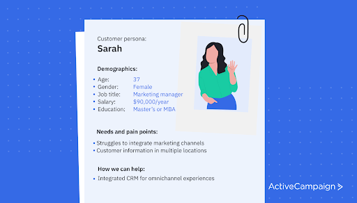
The target audience for your landing page can and should change for each one you create. If you had the same audience for everything you put out, there’s a good chance that the criteria are too broad.
For example, Happy Families helps teach families how to connect in unique and meaningful ways and helps parents raise strong, caring children. They provide everything from in-person talks to blog posts, webinars, and more. When creating a landing page for an upcoming event, they consider who might benefit most from what they have to say.
One of their offered webinars focuses on raising boys. While some of the webinar content may be useful for families of all types, they explicitly target parents of boys on this page.
It’s also important to mention that when we talk about potential leads to your landing page, this doesn’t mean they have to be brand new to your business. Many landing pages target a segment of an existing audience to push them further down the sales funnel.
How do landing pages work?
Landing pages are very specific pages formatted to convert visitors into leads. They work by optimizing the page for a single goal that points to a single call-to-action (CTA).
They are usually not linked from a website's menu and often not even connected directly to a website at all. They serve more as a place for users to “land” from outside the business's site, such as from social media or ads.
While every landing page will be slightly different, here are a few key elements that every landing page should have:
- A single goal: You should have a separate landing page for each action (i.e., signup, download, sale, etc.) you want your visitors to take.
- A primary key idea and benefit for visitors: Each landing page should focus on one key idea, and that key idea should lead to a benefit for the visitor (i.e., downloading an ebook or signing up for a mailing list).
- One target audience: If you have multiple target audiences, they should each have their own landing page so you can focus on their specific needs.
We have a great post on how landing pages work if you want a more in-depth explanation.
Can’t any page be a landing page?
Technically any page can be a landing page, but it’s not recommended. Using a blog post or other page where visitors can be easily distracted will lower your conversion rate and decrease the effectiveness of your campaign.
As we will get into more detail later, a landing page should be very specific to the action you want visitors to take. They usually include a single CTA and all the content on the page points users in the direction of that CTA.
What makes a landing page different from a homepage?
Websites are built for exploration and drive visitors to discover new resources and answer their questions. Landing pages are created for visitors to take one specific action (conversion).
While it might sound like you could set up your homepage to be an ideal landing page (after all, the URL is simple, and it’s the place where your viewers can get all the information about you and your company), the homepage is just too distracting.
Your landing page should have a single goal: convert the visitor to take a single action, usually through a CTA and form. This is the opposite of your homepage, which should have many goals and push your visitors to explore everything you have to offer.
Types of landing pages
You can use landing pages for just about anything. No matter the industry, topic, or step in the customer journey, they give your leads a place to learn more and make that all-important conversion.
However, not all landing pages are created equally. Some are targeted toward sales, while others are meant to inform or be shared. Your user experience should be taken into consideration when you choose which type is right for you.
Let’s take a look at the different types of landing pages and how they can be best used to reach your primary goal.
Most popular types of landing pages
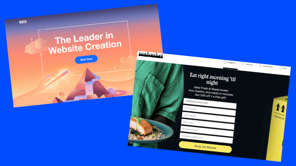
There are two main types of landing pages: lead generation and click-through.
Lead generation
Lead generation landing pages are meant to collect lead data by having them fill out a data capture form. What and how these pages are used varies greatly depending on the need. They are the most common type of landing page.
While they are most often found in the middle of the sales funnel, they can be used at any point to bring awareness to a specific goal.
Lead generation landing pages usually ask for visitor data in exchange for some sort of incentive, such as an ebook, infographic, or access to specialized templates. Another type of conversion—most often used by SaaS companies—is a free trial form. Visitors enter their email to get a free, limited-time version of the software the company is selling.
When considering what stage of the funnel to use a lead generation landing page, consider both the data you are asking for and the incentive you are offering.
If you ask for too much data from someone in the awareness stage, they are more likely to ignore your offer and leave your page. The same is true for leads later in the funnel where you might offer free products and only require an email address.
In both of these examples, the balance between offer and incentive isn’t even and is less beneficial to one side or the other.
Click-through
Where lead generation relies on forms for data collection, click-through pages pass a visitor onto another page where the actual goal of your campaign rests.
An excellent example of a click-through landing page in ecommerce is when you offer a coupon code for a specific item you’re selling. The click-through landing page will lay out what the product is, why you should buy it, and what discount you will receive if you add it to your cart right away (i.e., click-through to your cart).
Another example of this could be a welcome page using dynamic content. For example, if you have very specific information that you want to provide to your mailing list before they enter the rest of your site, you can create a click-through page providing that information.
Other types of landing pages
Lead generation and click-through landing pages are the basis for every landing page. However, there are other types of landing pages designed and used for more specific use cases.
Splash page
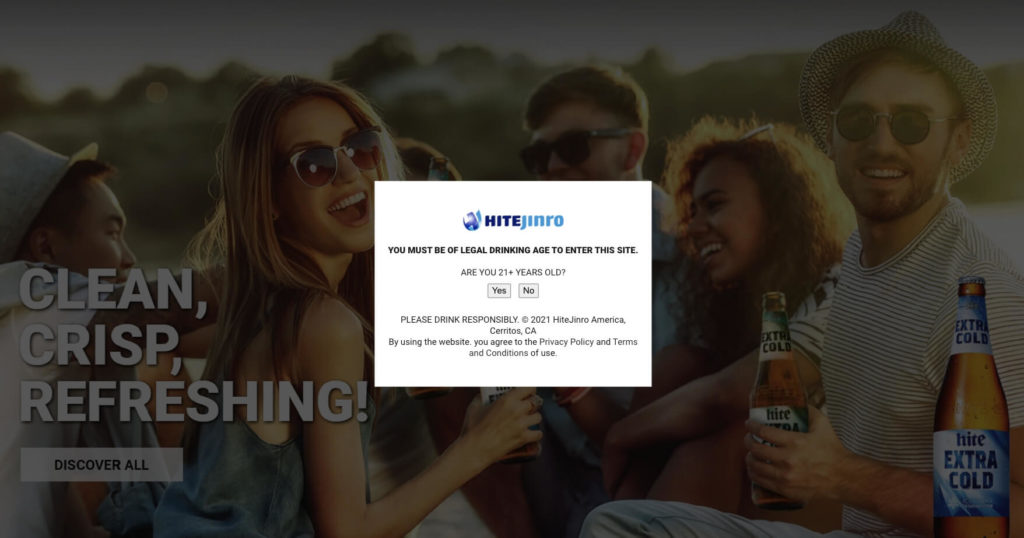
Splash pages are usually simple and collect very little data. They are often used to verify information or give visitors an option to select from.
The design of a splash page depends on its use but can range from a simple yes/no question to a few images and sentences.
For example, a website that talks about or sells alcohol may require U.S. visitors to verify they’re over 21 before even viewing the website. Or, you might click on a link and be presented with the option to view the website in either dark mode or light mode, changing the background and text color.
Squeeze
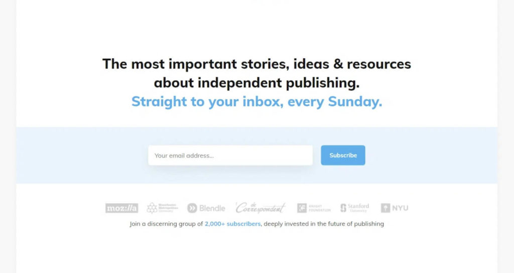
A squeeze landing page is similar to a lead-generation page in that it collects potential lead data. However, squeeze pages are often used at the top of the marketing funnel during the awareness phase and only collect minimal information, such as an email address or email address and name.
Filling out a form on a squeeze page usually adds the potential lead to a general contact list rather than a specialized list or download form.
Squeeze pages share many elements with a lead-generation page, such as bold headers and a clear and specific CTA, but tend to have only a few images or sentences. While not always necessary, adding social proof to a squeeze page can help increase your landing page conversion rate.
Sales
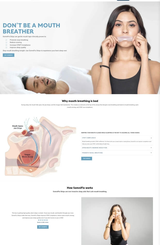
Sales pages are at the bottom of the funnel and are used when your potential customers are ready to convert. When a lead lands on a sales landing page, the contents of that page should provide the final push to sign up for your service or buy your product.
Your product or service determines what an ideal sales landing page will look like. For example, a SaaS company with many features might have a long page that lists each one and explains them.
On the other hand, a company offering a simple service might only need a few paragraphs and a pricing guide or signup form.
The hardest part about a sales page is creating a persuasive landing page without over- or underselling your product or service, so get your sales team involved.
Informational (or infomercial)
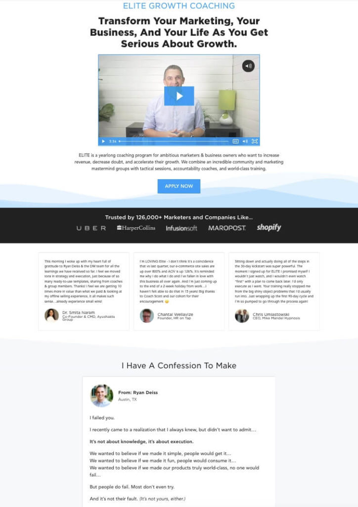
Informational landing pages tell the reader a story in hopes of getting them to convert. Informational pages can be used at many different parts of the sales funnel, from collecting emails in the awareness stage to getting the sale during the action stage.
For example, an informational landing page could be used at the beginning of the funnel to bring awareness to your brand. It could also be used in the middle of the funnel as part of an advertising campaign.
These pages tend to be the longest type of landing page and include many sub-headers, images, and other content that breaks up the text. They also often have many instances of your CTA spread throughout the page, giving potential leads the chance to convert at any time.
Writing these pages can be challenging since the goal is to keep the reader engaged until they’re ready to convert. This is why they’re often called infomercial landing pages in “honor” of late-night TV infomercials.
Sharable (or viral)
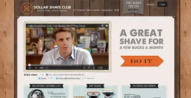
Sharable landing pages are exactly what they sound like: pages meant to be shared. The goal of any shareable page is to bring new awareness to your brand.
How long and what these pages contain highly depends on what you’re trying to bring awareness to. These pages often consist of images, video, audio, and copy that tell a story in a fun and engaging way. Sharable landing pages are another place where social proof is essential and can lead to higher conversion rates.
Unlike many of the other pages we’ve talked about, a shareable landing page has a CTA that pushes the reader to share the page rather than provide their email address.
Why is a landing page important?
When you roll out your marketing campaign, you’re missing out on potential leads if you skip incorporating a landing page. A landing page gives these leads what they expect.
For example, let’s imagine someone clicks on a search ad on Google that promises them access to the best newsletter on the internet. They will expect to land on a page that details the newsletter and gives them a simple way to sign up. They aren’t expecting to see the services you offer or the blog posts you’ve created around your business.
In fact, seeing content not associated with the ad they click on has a high chance of causing them to leave the page before they interact at all, known as “bouncing.”
Why landing pages are great for increasing conversion
Landing pages are great for increasing conversion because they are hyper-focused on one thing and one thing only: turning visitors into leads.
Focusing your landing page means your potential lead isn’t distracted by other content or anything else on your website. Even your navigation menu should be gone. Your visitors’ entire path should be landing on the page, learning about the offer you detailed in the content that got them there, and then filling out your form. Following this path leads to a higher conversion rate than using any other type of page.
When should you use a landing page?
You should use a landing page whenever you have an offer for your potential leads that you want them to be aware of.
This usually comes from a direct click on social or search ads, an email, or anywhere else you reach out to your potential audience.
How many landing pages should you have?
Since your landing pages should be hyper-focused, you should create a new page for each goal. This may mean multiple landing pages for a single campaign if you have multiple goals or target audiences.
For example, you may have a campaign that includes bringing awareness to your brand with an infographic, increasing that awareness and interest with a webinar, and a free trial for those further in the funnel.
Each of these will need its own landing page with content specific to that offer and target audience.
You may think that having a separate landing page for each campaign and each goal might be a bit much, but this is the best way to increase conversion, whether that's driving downloads, free trials, or direct sales.
Why every promotion needs its own landing page
There are two main reasons why each of your goals should have a landing page: eliminate distractions and give your potential leads what they expect.
As mentioned above, a landing page should 1) be free of ways to leave the page and 2) be hyper-focused on one goal. The visitor who lands on your page should be presented with as few options as possible, and everything should drive them toward your desired action.
If you try to stuff multiple CTAs, offers, or incentives into a single landing page, visitors will be more easily confused and less likely to take the action you seek. This is especially true if you’re using the same landing page for multiple campaigns or offers.
How effective are landing pages?
Your landing page’s effectiveness will depend on how optimized your efforts are in bringing in potential leads. The design of your landing page also plays a significant role. If your social ads or email copy aren’t explicit about what to expect, your landing page will be much less effective.
For example, if you promise an ebook but instead your page offers a webinar, your visitors are far less likely to convert. Even if that webinar might offer them more than the ebook would, because you didn’t meet their expectations, the chances of them bouncing are much higher.
How to measure the effectiveness of a landing page
While every part of a marketing campaign is measured differently, a landing page’s effectiveness is usually determined based on its conversion rate. This is calculated by taking the number of visitors to the page and comparing it to the number of successfully completed actions.
For example, if your page received 1000 visitors and 15 of them submitted your CTA, you would have a 1.5% conversion rate.
Your overall conversion rate is the best place to start, but it’s not the only method to judge the effectiveness of a successful landing page. For software-as-a-service (SaaS) businesses, where trials can be an important metric, a page could be judged simply on how many trials the page generated.
When determining the effectiveness of a campaign, it’s also a good idea to get more granular and understand how many people are converting based on how they got to your page.
For example, if you are running an ad on Facebook, promoting the landing page to your email list, and sharing the link organically on your Twitter account, knowing which is performing the best will help you refine the others and increase conversion even more.
However, it’s also essential to take that one step further and consider your bounce rate, especially if you have multiple channels pointing toward your landing page. A higher bounce rate from your Facebook ad might mean your ad copy and landing page content don’t match up, and it’s time to test different versions of your ad.
You’ll need to set up an analytics service, such as Google Analytics, to track these numbers. This will allow you to track all types of conversions and other data that can be useful in future campaigns.
What is a good landing page conversion rate?
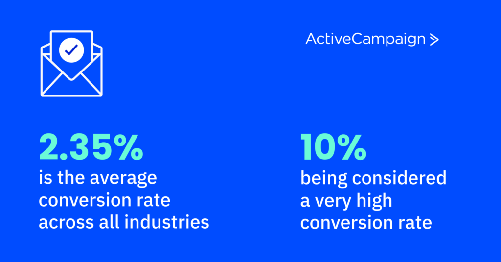
2.35% is the average conversion rate across all industries, with 10% being considered a very high conversion rate.
While this number is important to keep in mind, it doesn’t take into consideration whether the landing page is focused on cold leads, hot leads, previous customers, or any other aspect of your target audience.
If you are running your first campaign with your first landing page, a range of 2% to 10% should definitely be your goal, but it’s more important to compare your conversion with your previous campaigns.
For example, suppose you’re running an email campaign that targets your current audience and hit a 15% conversion rate during your first offer. In that case, you shouldn’t be satisfied with a 2% conversion rate if you run a similar campaign to the same audience 6 months later.
Why is my landing page not converting?
There could be many reasons why your landing page isn’t converting. Complicated signup forms, poor CTAs (or no CTAs at all), too much irrelevant content on the page, and many more are all reasons for a low conversion rate.
Similar to conversion rate optimization, landing page optimization is important in creating an effective landing page. Once you have all the common elements that make a good landing page (more on that below), you’ll want to continuously test each element of your page, known as A/B testing, to improve your landing page during the campaign.
These lessons should also carry over into other campaigns that you run in the future.
What makes a good landing page?
A good landing page should always cater to its specific intended audience. This is why knowing your target audience and goal is so important.
Let’s dive a little deeper into what makes a good landing page.
Focus on one goal, not your company
Keep a laser focus on the goal you set for your potential leads, no matter where they’re coming from. Don't link to the new blog post you just published if you want them to download the ebook you spent weeks creating.
You should also make sure that your landing page is first and foremost about what you’re offering them, not about your company itself. Landing pages aren’t the space for you to detail why you started your business.
This doesn’t mean you shouldn’t keep the page branded with your logo and company colors; the page should definitely represent your business. It just means that these elements shouldn’t be a distraction or lead your visitors off the page.
Target a specific audience
Know who the target audience coming into your landing page is and make sure everything on the page reflects them.
This means understanding your target audience before you create your landing page. One of the best ways to do this is by creating a buyer persona that reflects your ideal customer.
It also means that you should use language specific to your target audience. This means avoiding jargon on a page meant for people brand new to the subject and using industry-specific terms for those who are part of the industry you’re targeting.
There’s nothing wrong with making a second buyer persona and landing page for the same goal if you have two target audiences!
Be free of distractions
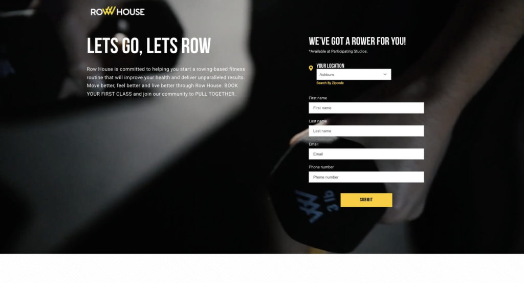
Get rid of your navigation menu, sidebars, any internal or external links, and anything else that might tempt a potential lead from leaving the page before signing up for your offer.
The only exception to this might be a social share button or section that will allow for easy sharing of your landing page.
Have a single CTA that is simple, obvious, and above the fold
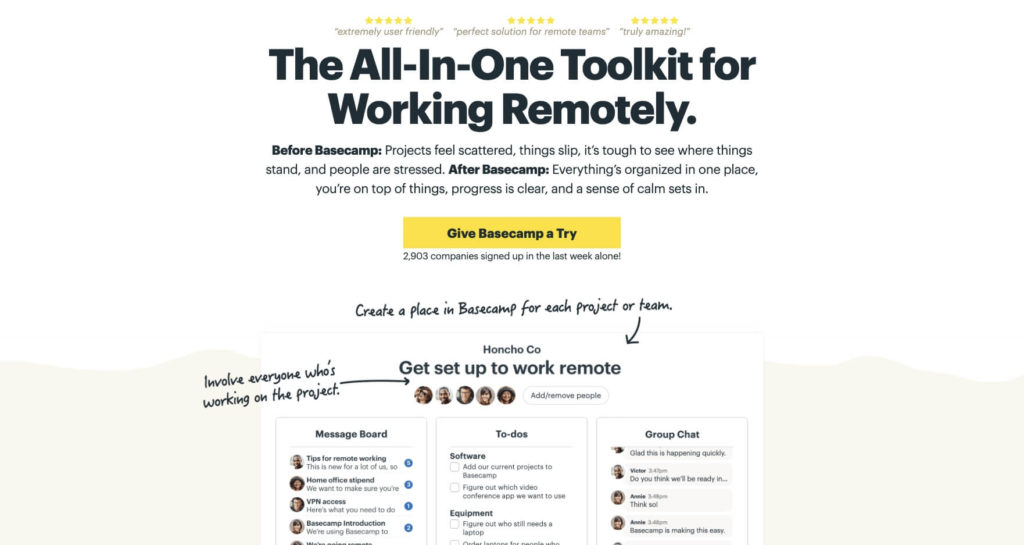
The most crucial part of your landing page is known as “above the fold.” This is the area that is seen first as soon as the page loads. Everything below where you start scrolling is known as “below the fold.”
Your first CTA should be above the fold for anyone who lands on your page ready to fill out and submit their information. Use arrows, colors that pop, and images to point out your CTA so it can’t be missed.
Be sure to include additional chances for them to convert to this CTA as they scroll the page. In other words, repeat your offer, use more arrows, more colors, and another signup box.
However, you don’t want to exhaust your visitors and do this after every paragraph. A good rule of thumb is to have one at the top (above the fold), one halfway down the page, and one at the bottom. Depending on the length of your page, however, it may make sense to have more or fewer. A/B testing can be beneficial here to figure out what works best for your audience.
Collect only specific and relevant information
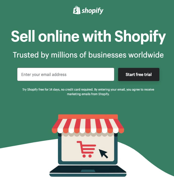
Don’t overwhelm or take advantage of your potential leads. Only ask for information relevant to what you’re offering and potential leads will be much more likely to part with their data.
For example, if you’re doing a webinar that is part of your marketing funnel with the goal of in-person course signups, don’t ask for their full home address. Instead, just ask what city they live in or provide a drop-down with all the locations you offer.
Optimize for mobile traffic
Nearly 60% of global internet traffic now takes place on mobile. Your landing page needs to share a similar experience across all devices, called a responsive design. Creating a responsive design means making sure the contents on your page grow or shrink dynamically to fit any size screen or device, including tablets and smartphones.
While having a mobile-friendly experience is essential for all landing pages, it is especially true if you’re promoting your landing page in person or through physical media, such as flyers or business cards.
How to create your own landing page
There are many ways to create a landing page, some that require technical skills and others that don’t. Here are the 3 most common ways to create landing pages.
On your website
You can create a fantastic landing page directly on your website with some technical skills. Depending on how your website is built, adding a new page, getting rid of the header and footer, and creating your content may be simple.
This is a great way to keep your landing page and website cohesive and in the same place.
However, it’s not as easy as it may seem to get rid of these distractions on many websites without some coding knowledge. If your website is coded from scratch by a developer, creating a landing page will require extra cost and time to develop. In that case, one of the following options might be best for you.
Using a landing page builder
Landing page builders are services specifically designed for creating landing pages. They are most often built on drag-and-drop platforms, so little to no technical skills are required.
While they tend to be easy to use, many have limited options for placing them on your site and may limit how you collect data.
Another downside of using a landing page builder is that they have a cost associated with them, usually per page.
Through your existing CXA/CRM platform
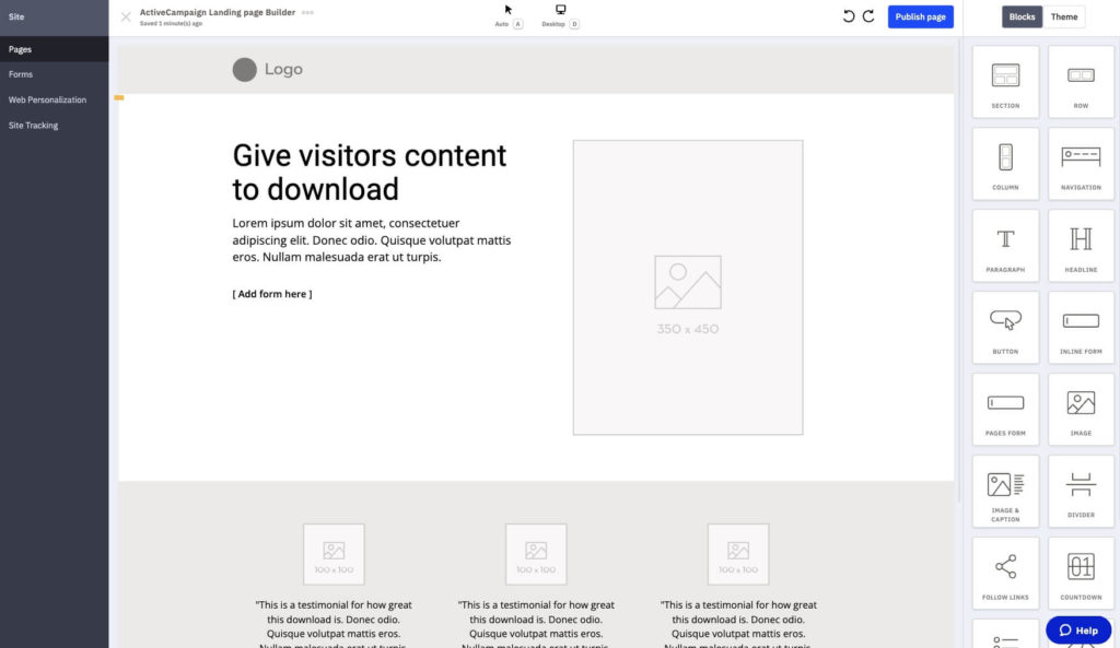
Many Customer Experience Automation (CXA) and Customer Relationship Management (CRM) platforms have landing page builders built into their service. If you already have a CXA or CRM platform for your business, you may have a landing page builder just waiting for your content.
For example, ActiveCampaign has an extensive page builder known as “Pages” built into our CXA platform, making it easy to design beautiful landing pages.
The best part of using a landing page builder through your existing CXA or CRM platform is that it is already fully integrated into your customer database!
What about mobile landing pages?
Most landing page builders will come with mobile landing page optimization built-in. This means you won’t have to do much work to get them looking good, no matter what device your potential leads are using.
If you create landing pages through your website, whether with a content management system (CMS) like WordPress or coded from scratch, you’ll have to make sure the site is responsive and take extra care to format it for both computer monitors and mobile users.
Types of landing page offerings
Now that we’ve talked about the different types of landing pages let’s dive deeper into the offers commonly used to collect visitor data.
Email newsletter signup
The most common landing page offer is an email newsletter signup. On this type of landing page, a visitor gives their email address for use in your email marketing campaign in exchange for being added to a regular newsletter.
Newsletters can have various types of content, from simply sharing the latest blog posts to promoting exclusive content for your list.
Much like a good landing page, a good newsletter should have a single goal and a single CTA. You can also use your email newsletter to promote your business, products, or services. However, make sure you provide your subscribers with more value than just selling your product or service. A basic rule is for every promotional email you send, send 3 value-added emails in between.
Infographics
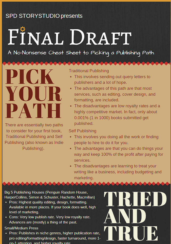
Infographics are simple images or PDFs that provide visitors with an overview of a process or information on a topic. They are most often used to walk a user through multiple steps or give statistics.
Many infographics take a blog post (or series of posts) and boil them down to the essential information.
When asking for user data to obtain an infographic, balance is key.
If you’re providing a 3-step plan on a simple subject they can find elsewhere, asking for much more than their email is probably not a good idea. On the other hand, if you’re providing very specific, proprietary information, you might be able to ask a visitor for more data.
Ebooks
Ebooks are similar to infographics in that they range from quick and general to complex and proprietary. They are almost always offered in PDF format and contain at least a few pages of information.
In contrast to an infographic, ebooks are meant to expand upon what is offered freely. One common use for ebooks is to take a blog post (or series of posts) and elaborate on the subject, giving additional information that you didn’t provide within the posts.
In addition, ebooks are optimized to be read using a computer, tablet, or phone.
Whitepapers
Whitepapers are similar to ebooks in that they tend to be in PDF format and contain information you can’t get elsewhere. Whitepapers also tend to focus more on facts and statistics and less on step-by-step instructions or telling a story.
The most common use of whitepapers is to break down complex topics and dig deep into solutions or opinions. The main goal of a whitepaper is comprehension, rather than just providing information.
Online course enrollment
If you have an online course, you can use a landing page to provide information and offer enrollment.
This allows you to have all your course information in one place, easily accessible to both current and prospective students.
Event registration
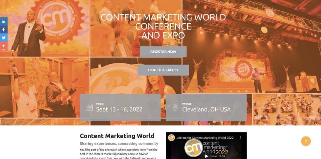
While there are many ways to manage event registrations, using a landing page is probably the simplest.
By using a landing page, you can provide all the information about your event in one place while also giving visitors an easy way to register.
Ensure that you provide all the relevant information on your landing page, such as the dates, times, and location of the event (whether virtual or in-person).
Free trials
[free-trial headline="Landing Pages Don't Have To Be Hard" description="Create your first landing page free with a 14-day free trial of ActiveCampaign"]If you provide a service that has a free trial or demo, creating a landing page around this offer can provide all the necessary information and increase conversion.
This gives your free trial or demo a place to live and allows you to use that page in your marketing.
Depending on your target audience, you can use free trials and demos to collect more information than other types of offers. It’s very common to ask for what company the visitor works for, their job title, and any additional information that might be useful for you, in addition to their name and email.
Community membership
If you have a community around your brand, product, or service, you can create a landing page for signing up.
Whether your community lives on your website, Facebook, or somewhere else, collecting potential member information this way is a great way to moderate who joins.
Conclusion
No matter your marketing goals, creating high-quality landing pages for each campaign and target audience will help you convert more leads.
The best way to create landing pages and manage your data is with a CRM that can do both. Get started today with a free 14-day trial of ActiveCampaign.